Last Updated on May 23, 2016 by Laura Coronel
(Illustration by Mat Helme, Treehouse)
Contents
Perceived Performance Is a Measure of How Quick a User Thinks Your Site Is, and That’s Often More Important Than Its True Speed
Performance is important. It can mean the difference between making a sale, or losing a customer to the competition. Your website needs to respond quickly to requests from users and this means optimising your site with performance in mind. I’ve written about performance optimisation in the past, but from the viewpoint of you, the developer. Examining network timelines and PageSpeed scores is all well and good, but there’s a whole area of performance optimisation that this technical stuff doesn’t cover.
Perceived performance refers to how fast a user thinks your website is, not necessarily how fast your technical stats say it is. When it comes to optimising your websites, it’s what the user thinks that really matters, not the technical wizardry that’s going on behind the scenes.
In this post, you’re going to learn about a few key concepts of perceived performance, and some techniques you can use to make your websites feel faster.
Note: Using the techniques outlined in this post are in no way a substitute for good (traditional) performance optimisations. Instead, you should use these techniques to compliment your existing optimisation strategies and further enhance the overall user experience.
Response Times and Perceived Performance
One of the biggest bottlenecks in usability is response times — waiting for new content to load, or an operation to complete. In his book Usability Engineering, Jakob Nielsen identifies three main response time limits.
- 0.1 seconds — Operations that are completed in 100ms or fewer will feel instantaneous to the user. This is the gold standard that you should aim for when optimising your websites.
- 1 second — Operations that take 1 second to finish are generally OK, but the user will feel the pause. If all of your operations take 1 second to complete, your website may feel a little sluggish.
- 10 seconds — If an operation takes 10 seconds or more to complete, you’ll struggle to maintain the user’s attention. They may switch over to a new tab, or give up on your website completely. Of course this depends on what operation is being completed. For example, users are more likely to stick around if they’ve just submitted their card details in the checkout than if they’re waiting to load a product page.
Jakob Nielsen originally published these three limits back in 1993. I think the first two are still reasonable, but I would speculate the upper limit is now closer to 5 seconds. As internet speeds have increased, we’ve grown used to browsing the web at a lighting pace. The ability to multi-task has also shortened our attention span as we’ll tend to switch to something else if a web page is taking too long to load. Some even say that we now live in an A.D.D. Culture, in which attention has become the most valuable resource.
Free trial on Treehouse: Do you want to learn more about obtimising your website and other front-end tips? Click here to try a free trial on Treehouse.
Loading Dialogs
You now know about the response limits you need to aim for, but what if it’s just impossible to complete an action in 100ms? There’s always going to be operations that take time to finish. Whether you’re loading content over a network, or manipulating a particularly large data set on the client (think: sorting tables), some operations simply take time. In these instances, it’s best to use some sort of loading dialog to show the user that something is happening and that your website hasn’t just locked up. How you choose to display this loading dialog can have a big impact on your websites perceived performance. Let’s explore.
#renio interesting! Facebook did A/B testing to determine that users blamed FB on left, iOS on right, for slowness. pic.twitter.com/zEVbTime1Q
— deeje (@deeje) January 31, 2014
This tweet by @deeje was doing the rounds earlier this year showing how Facebook found that changing the appearance of the loading animation impacted who users perceived to be behind the slow loading time (Facebook or iOS).
Loading animations like spinners are good, but progress bars (with a percentage figure) are even better. If you can, it’s always best to display a progress bar to the user that gives them realtime feedback on how much “work” is left to do before they can continue using your website. Of course, there will be times when you simply don’t know how much work needs to be done and therefore cannot use progress bars.
Note: There was a great study (pdf) conducted by researchers from the Human Computer Interaction Institute at Carnegie Mellon University that found varying the animations on progress bars can also affect perceived performance.
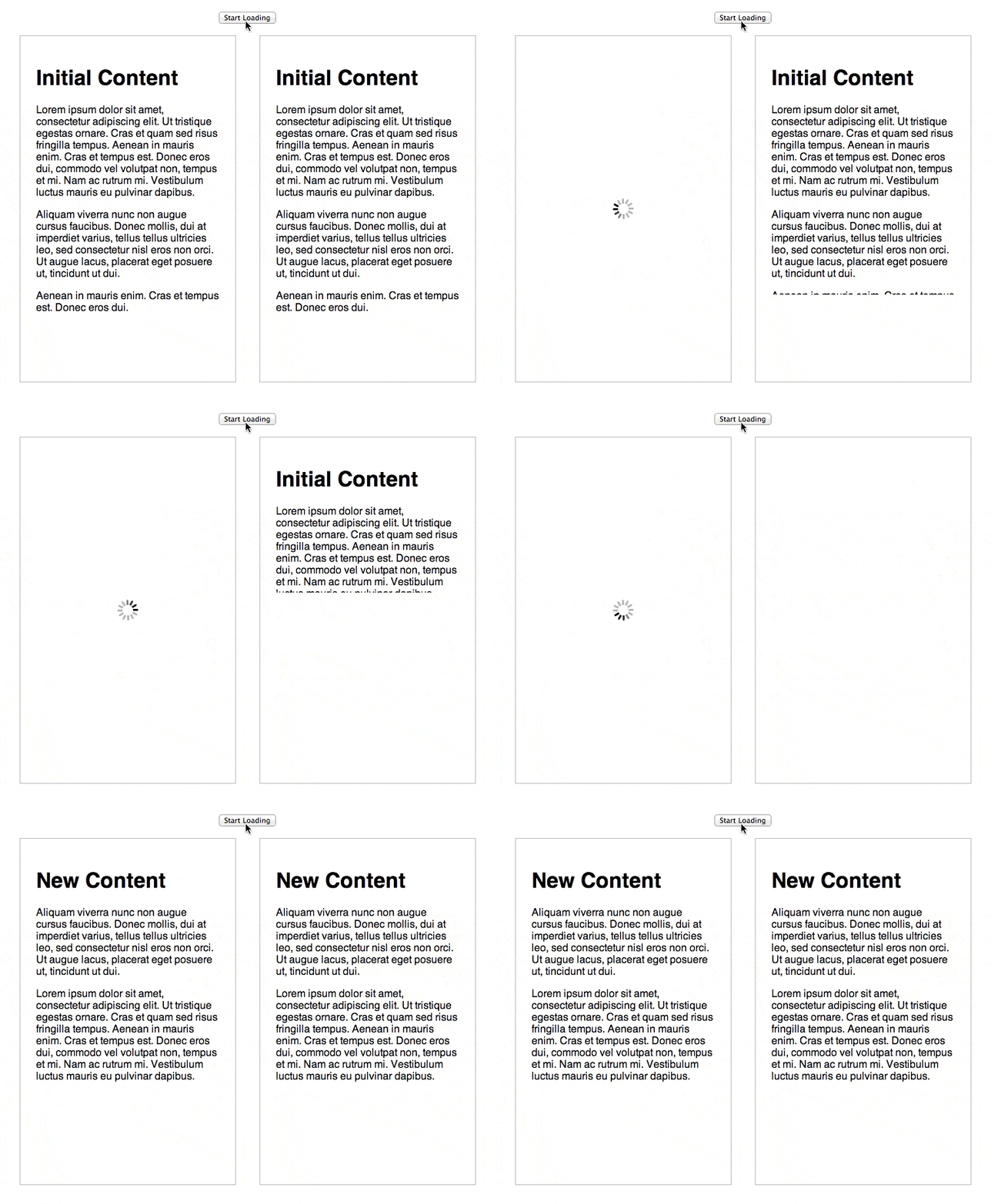
If you cannot use progress bars, another option is to mask loading time by using animations. Research has shown that you can significantly reduce the feeling of waiting by keeping a user’s attention occupied. Say that you’re loading some content from the server that is going to take 1 second. You could mask this loading time by applying a 1-second animation that slides out the current content and then slides in the new content loaded from the server. If the content loads before the animation has completed, the user may be none the wiser that the new content had to be fetched from the server. If the animation completes before the content is loaded, you can fall back to displaying a loading spinner. In this case, users will still feel as though they are waiting for a shorter amount of time as they will have been distracted by the animation.
Note: Many browsers now support hardware acceleration for CSS3 animations. Make sure that you take full advantage of this in order to make your animations smooth. I’ve found jQuery Transit really handy for managing animations in the past. The library will use CSS3 animations when available, or fall back to JavaScript animations in older browsers.
While this strategy can come in very handy, it’s important to use these animations carefully. Having a lot of long-running animations may make it hard for a user to navigate through your website, resulting in a negative user experience.
Traditionally mobile browsers have waited 300ms after a user touches a button to see if the user will make a double tap. Refer back to the three main response limits we looked at earlier, and you’ll notice we’ve already blown the ideal 100ms response time by 300 percent before we’ve even started to execute an operation!
In the past, developers have got around this problem by disabling zooming using the following meta tag:
<meta name="viewport" content="width=device-width, user-scalable=no">
This isn’t ideal, though, because pinch-zooming can be a very useful feature.
Luckily, browser vendors have identified this as a problem and a few months ago the Chrome team led the way by removing the 300ms delay in Chrome 32. To do this, they also removed the feature that allows a user to zoom by double-tapping on the page, but have retained pinch-zooming. Firefox has since removed the delay also. A polyfill called FastClick has been developed by FT Labs that will remove the delay in other browsers.
Another way of ensuring that button clicks appear responsive is to use states on your buttons. This allows you to apply different styling when a button is focused, hovered, or pressed. The :active state is particularly important for making your applications appear responsive. This state is triggered when the user clicks on an element.
button:active {
    /* Change the styling */
    background-color: rgba(0,0,0,0.5);
}
To get the ‘:active’ state working in some mobile browsers, you may need to apply this JavaScript hack to your page.
document.addEventListener("touchstart", function(){}, true);
Some browsers will apply a default styling to active buttons. You can remove this by adding the following style rules to your buttons.
-webkit-tap-highlight-color: rgba(0,0,0,0);
-webkit-tap-highlight-color: transparent;
These rules will set the highlight color to be transparent.
Final Thoughts
It’s easy to get caught up with examining network timelines and optimising page assets to increase performance. But when it comes down to it, perceived performance can be more important than actual performance.
The user is king and if he thinks your site is slow, it doesn’t matter how high your PageSpeed score is. You’ve got a real problem. Don’t get me wrong. I’m not advocating you forget about traditional performance optimisations. All that stuff is still super-important, but it’s invisible to the user. It’s the visible things that make a difference to perceived performance. Making sure that you have :active states on your buttons, appropriately used animations to mask loading times, and progress bars all help to make your website feel fast to the user. After all, that’s what really matters.
There’s a huge area of study surrounding perceived performance. In this post you’ve barely scratched the surface. If you’re interested in learning more, I recommend that you check out some of the links below.


Hello Matt,
I share your view that if there is a user who has the perception that it is slow, we have a real problem. And we have to solve the real problems…
Congrats and thanks to share this. 🙂
Thanks, very useful and elevator joke!!!
great article, thanks.
Love the advice on using button states, which I did not know about! And totally agree that perceived performance is what counts. The animation hack gives me tons of ideas for one pagers we’re currently working on. Thanks for sharing, Matt.
Thanks for reading Victor!
good one
Great article. It reminds me of an old old joke:
The tenants of a tall building were constantly complaining about how slow the elevator was.
A mechanical engineer looked at the problem and reduced wait times by 25% by increasing the speed of the elevator. The total cost of the project was 100,000$. The tenants still complained.
A software engineer looked at the problem and reduced wait times by an additional 25% by programming a smart elevator system. The total cost of the project was 200,000$. The tenants still complained.
An architect looked at the problem and put a mirror in the main lobby. The total cost of the project was 1000$. The tenants were so busy checking themselves out in the mirror that they forgot that they were waiting for the elevator.
Ah, that’s why there are all these mirrors in and around elevators!
This post really useful to me