Last Updated on October 16, 2018 by Laura Coronel
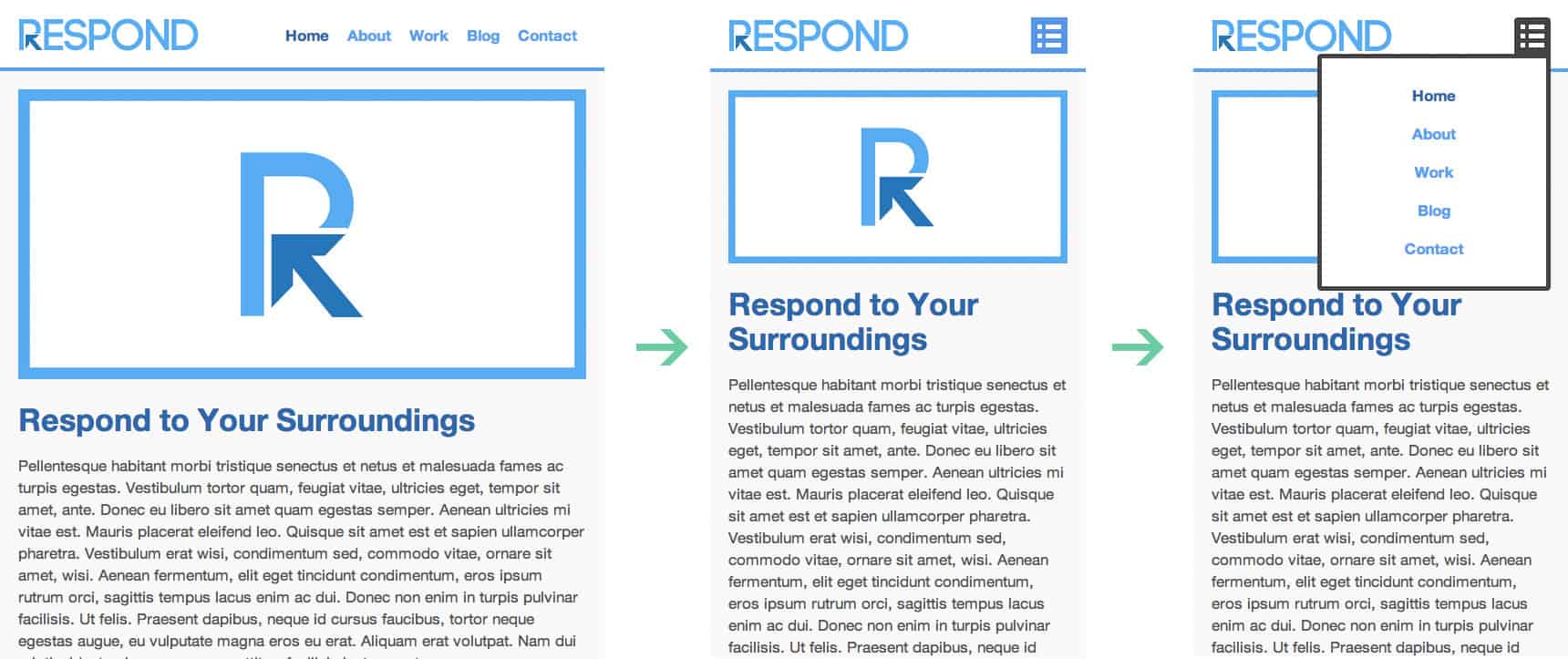
In this tutorial we will go over the process in coding a very basic CSS responsive navigation menu. We will transform a basic non-list style navigation to a drop down menu using media queries in our stylesheet. There’s no need for javascript in this tutorial. We will walk through the build in this order HTML > CSS > Media Queries.

HTML Code
As for the HTML we will be using the HTML5 doctype as we will be using HTML5 tags. Also we want to make sure we have our view port tags in there as well. This is what the code will look like:
<!doctype html>

<html lang="en">

<head>

<meta charset="utf-8">

<title>Responsive Header Nav</title>

<meta name="description" content="Responsive Header Nav">

<meta name="author" content="Treehouse">

<meta name="viewport" content="width=device-width; initial-scale=1; maximum-scale=1">

<link rel="stylesheet" href="css/styles.css">

<!--[if IE]> <script src="http://html5shiv.googlecode.com/svn/trunk/html5.js"></script><![endif]-->

</head>

<body>

<header>

<a href="#" id="logo"></a>

<nav>

<a href="#" id="menu-icon"></a>

<ul>

<li><a href="#" class="current">Home</a></li>
<li><a href="#">About</a></li>
<li><a href="#">Work</a></li>
<li><a href="#">Blog</a></li>
<li><a href="#">Contact</a></li>

</ul>

</nav>

</header>

<section>

<img src="img/featured.png" alt="Respond" />

<h1>Respond to Your Surroundings</h1>

<p>...Filler Text</p>

<p>...Filler Text</p>

<p>Filler Text</p>

</section>

</body>

</html>
CSS Code
For the CSS I’m going to run a compressed reset at the top. Below that, we will style the header to be positioned fixed at the top. The logo inside the header will float: left and the nav float: right. The rest is basic content styles for example purposes.
/*RESET*/
html, body, div, span, applet, object, iframe, h1, h2, h3, h4, h5, h6, p, blockquote, pre, a, abbr, acronym, address, big, cite, code, del, dfn, em, font, img, ins, kbd, q, s, samp, small, strike, strong, sub, sup, tt, var, b, u, i, center, dl, dt, dd, ol, ul, li, fieldset, form, label, legend, table, caption, tbody, tfoot, thead, tr, th, td {margin:0; padding:0; border:0; outline:0; font-size:100%; vertical-align:baseline; background:transparent;} body {line-height: 1;}ol, ul{list-style:none;} blockquote, q{quotes:none;} blockquote:before, blockquote:after, q:before, q:after{content:'';content:none;} :focus{outline:0;} ins{text-decoration:none;} del{text-decoration:line-through;} table{border-collapse:collapse; border-spacing:0;}

/*MAIN*/
body {
	font-size: 1.05em;
	line-height: 1.25em;
	font-family: Helvetica Neue, Helvetica, Arial;
	background: #f9f9f9;
	color: #555;
}

a {

	color: #4C9CF1;
	text-decoration: none;
	font-weight: bold;

}

a:hover {

	color: #444;

}

img {

	width: 100%;

}

header {

	background: #fff;
	width: 100%;
	height: 76px;
	position: fixed;
	top: 0;
	left: 0;
	border-bottom: 4px solid #4C9CF1;
	z-index: 100;

}

#logo{

	margin: 20px;
	float: left;
	width: 200px;
	height: 40px;
	background: url(../img/logo.png) no-repeat center;
	display: block;

}

nav {

	float: right;
	padding: 20px;

}

#menu-icon {

	display: hidden;
	width: 40px;
	height: 40px;
	background: #4C8FEC url(../img/menu-icon.png) center;

}

a:hover#menu-icon {

	background-color: #444;
	border-radius: 4px 4px 0 0;

}

ul {

	list-style: none;

}

li {

	display: inline-block;
	float: left;
	padding: 10px

}

.current {

	color: #2262AD;

}

section {

	margin: 80px auto 40px;
	max-width: 980px;
	position: relative;
	padding: 20px

}

h1 {

	font-size: 2em;
	color: #2262AD;
	line-height: 1.15em;
	margin: 20px 0 ;

}

p {

	line-height: 1.45em;
	margin-bottom: 20px;

}
Adding Our Media Queries
Now it’s time for the Media Queries. For this basic example, I’m only going to layout the nav to respond to 640px or lower. The idea here is to have the nav menu disappear and the menu-icon appear in its place. Then once the menu-icon is selected or hovered, the nav menu will reappear below the menu-icon in a list order. Also we want to position the header absolute as we might need to scroll the navigation options. Here is our code:
/*MEDIA QUERY*/
@media only screen and (max-width : 640px) {

	header {

		position: absolute;

	}

	#menu-icon {

		display:inline-block;

	}

	nav ul, nav:active ul {

		display: none;
		position: absolute;
		padding: 20px;
		background: #fff;
		border: 5px solid #444;
		right: 20px;
		top: 60px;
		width: 50%;
		border-radius: 4px 0 4px 4px;

	}

	nav li {

		text-align: center;
		width: 100%;
		padding: 10px 0;
		margin: 0;

	}

	nav:hover ul {

		display: block;

	}
Conclusion
This example is very basic and allows you to understand the process of building a responsive navigation. If you wish to have a more robust navigation menu you might want to go a different route. It’s truly amazing what you can do with CSS Media Queries. Play around with the code and see what you can come up with.
If you’re looking to take your CSS skills to another level, check out our Techdegree in Front End Web Design. Our faculty of tech professionals guide learners like you from mastering the fundamentals of HTML/CSS to polishing the skills of a job-ready designer. Try the program out with a free seven-day trial today.


Simple example. Worked great. Thank you very much.
Thanks for the tutorial…
While currently enrolled in the front-end techdegree I was discouraged to use max width media queries for responsive design.
Thanks Mat for the nice tutorial.
Although JavaScript can help us a lot in creating a professional responsive header, styling pseudo CSS classes is an awesome trick to open and close the dropdown menu without using JavaScript. That was great 🙂
Also for anyone interested in building a more professional header, navigation, or menu, this jQuery plugin and CSS framework can help a lot: https://myflashlabs.github.io/24component-bars/
Thanks a heap man,
Ali
First of all please let me say that using JS is not considered to be more professional.
Dong the plumbing with something that always works (HTML, CSS) however, is best practice.
There nothing wrong with JS, but it should not add required functionality for a website to work because JS won’t always work (for example some users disable JS).
A lot of people get this wrong.
oh cool! i’ll use this in my blog, thank you so much!
I love this design — how do you modify this code so that you can center the navigation menu? I’d like the navigation items (e.g. home, about, work, etc.) to appear centered at the top of the page (when they are not in drop-down form). Thanks for any help.
Hi Eric! As this is an older post, I’d recommend hopping over to the Treehouse Community to ask your question. Ours students and teachers are always happy to help!
The desktop and mobile navigation menus work great. The only improvements I need help with are making the mobile nav links bigger and retracting the nav menu by clicking on the menu icon again. Please let me know if this is possible. Thanks!
Hi there! This is a great question to ask in the Treehouse Community, where teachers and students are always happy to help.
nice tutorial…thanks a lot.
Would it be possible to use some jquery to change the state?
Great Tutorial!
I was always wondering how to make a mobile navigation like this. One question though, is it ok to use this code as a basis for a website I’m building? I know it’s rather basic stuff but i thought I’d better ask before using it.
I think you mean visibility: hidden; or display:none; here:
…
#menu-icon {
display: hidden;
…
good article on css menu.
http://www.freemenu.info/2013/04/menu103.html
Cool tutorial i have found a website with good menu bars and other css designs you may like the designs.
http://freebietemplate.com/css-designs/css-designs.html
have a nice day
wonderful, exactly what I was looking for, many thanks
when i publish the a site with this menu the links dont work on mobile only on desktop. Any solutions??
great post
how can this be used in a mobile device if there are hovers?
great article and wrote in the way to grab every detail easily. Thanks @twitter-408154147:disqus
Hi! everybody,
The menu (e.g.: a ) & menu items should adapt and change their look depending on the screen size of the browser.
The reason why I want that is because the menu items will be squeezed together, when the user navigates on your webpage.
umre http://bit.ly/14Rec2v
Wouldn’t the CSS for “#menu-icon” be “display: none;” or “visibility: hidden;”?
Here’s a responsive nav I created a while ago that has drop-downs. Its on Github so feel free to have a play.
https://github.com/MartinBlackburn/responsive-nav
Reliance on :hover means this won’t work on mobile as soon as you replace the dummy anchor links with proper links. Don’t waste your time trying to implement this and stick to a tried and test javascript solution/psuedo-element solution (see Twitter Bootstrap etc.). Nice clean design though.
Yeah agreed. I was really disappointed to find out that this solution wouldn’t work due to the hover class just staying there on touch screens. Although I found an interesting work around at Stackoverflow. Instead of hover, you assign a checkbox to the element and look for :checked in css.
Here is the link below if anyone is interested:
http://stackoverflow.com/a/32721572
Hi! Is it an easy fix adding an fade in, ease-in-out on the menu?
Thanks for the tutorial. The one problem is that doesn’t work if below the menu have, for example, a image with a link. When click in a link in the menu, he always go to link for the image below. Anybody knows how to fix this?