


In this tutorial we will go over the process in coding a very basic CSS responsive navigation menu. We will transform a basic non-list style navigation to a drop down menu using media queries in our stylesheet. There’s no need for javascript in this tutorial. We will walk through the build in this order HTML > CSS > Media Queries.

HTML Code
As for the HTML we will be using the HTML5 doctype as we will be using HTML5 tags. Also we want to make sure we have our view port tags in there as well. This is what the code will look like:
<!doctype html>

<html lang="en">

<head>

<meta charset="utf-8">

<title>Responsive Header Nav</title>

<meta name="description" content="Responsive Header Nav">

<meta name="author" content="Treehouse">

<meta name="viewport" content="width=device-width; initial-scale=1; maximum-scale=1">

<link rel="stylesheet" href="css/styles.css">

<!--[if IE]> <script src="http://html5shiv.googlecode.com/svn/trunk/html5.js"></script><![endif]-->

</head>

<body>

<header>

<a href="#" id="logo"></a>

<nav>

<a href="#" id="menu-icon"></a>

<ul>

<li><a href="#" class="current">Home</a></li>
<li><a href="#">About</a></li>
<li><a href="#">Work</a></li>
<li><a href="#">Blog</a></li>
<li><a href="#">Contact</a></li>

</ul>

</nav>

</header>

<section>

<img src="img/featured.png" alt="Respond" />

<h1>Respond to Your Surroundings</h1>

<p>...Filler Text</p>

<p>...Filler Text</p>

<p>Filler Text</p>

</section>

</body>

</html>
CSS Code
For the CSS I’m going to run a compressed reset at the top. Below that, we will style the header to be positioned fixed at the top. The logo inside the header will float: left and the nav float: right. The rest is basic content styles for example purposes.
/*RESET*/
html, body, div, span, applet, object, iframe, h1, h2, h3, h4, h5, h6, p, blockquote, pre, a, abbr, acronym, address, big, cite, code, del, dfn, em, font, img, ins, kbd, q, s, samp, small, strike, strong, sub, sup, tt, var, b, u, i, center, dl, dt, dd, ol, ul, li, fieldset, form, label, legend, table, caption, tbody, tfoot, thead, tr, th, td {margin:0; padding:0; border:0; outline:0; font-size:100%; vertical-align:baseline; background:transparent;} body {line-height: 1;}ol, ul{list-style:none;} blockquote, q{quotes:none;} blockquote:before, blockquote:after, q:before, q:after{content:'';content:none;} :focus{outline:0;} ins{text-decoration:none;} del{text-decoration:line-through;} table{border-collapse:collapse; border-spacing:0;}

/*MAIN*/
body {
	font-size: 1.05em;
	line-height: 1.25em;
	font-family: Helvetica Neue, Helvetica, Arial;
	background: #f9f9f9;
	color: #555;
}

a {

	color: #4C9CF1;
	text-decoration: none;
	font-weight: bold;

}

a:hover {

	color: #444;

}

img {

	width: 100%;

}

header {

	background: #fff;
	width: 100%;
	height: 76px;
	position: fixed;
	top: 0;
	left: 0;
	border-bottom: 4px solid #4C9CF1;
	z-index: 100;

}

#logo{

	margin: 20px;
	float: left;
	width: 200px;
	height: 40px;
	background: url(../img/logo.png) no-repeat center;
	display: block;

}

nav {

	float: right;
	padding: 20px;

}

#menu-icon {

	display: hidden;
	width: 40px;
	height: 40px;
	background: #4C8FEC url(../img/menu-icon.png) center;

}

a:hover#menu-icon {

	background-color: #444;
	border-radius: 4px 4px 0 0;

}

ul {

	list-style: none;

}

li {

	display: inline-block;
	float: left;
	padding: 10px

}

.current {

	color: #2262AD;

}

section {

	margin: 80px auto 40px;
	max-width: 980px;
	position: relative;
	padding: 20px

}

h1 {

	font-size: 2em;
	color: #2262AD;
	line-height: 1.15em;
	margin: 20px 0 ;

}

p {

	line-height: 1.45em;
	margin-bottom: 20px;

}
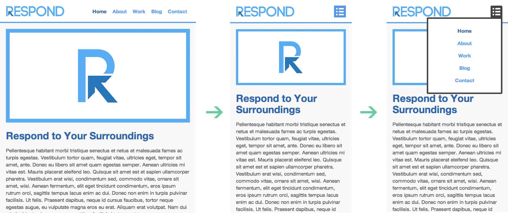
Adding Our Media Queries
Now it’s time for the Media Queries. For this basic example, I’m only going to layout the nav to respond to 640px or lower. The idea here is to have the nav menu disappear and the menu-icon appear in its place. Then once the menu-icon is selected or hovered, the nav menu will reappear below the menu-icon in a list order. Also we want to position the header absolute as we might need to scroll the navigation options. Here is our code:
/*MEDIA QUERY*/
@media only screen and (max-width : 640px) {

	header {

		position: absolute;

	}

	#menu-icon {

		display:inline-block;

	}

	nav ul, nav:active ul {

		display: none;
		position: absolute;
		padding: 20px;
		background: #fff;
		border: 5px solid #444;
		right: 20px;
		top: 60px;
		width: 50%;
		border-radius: 4px 0 4px 4px;

	}

	nav li {

		text-align: center;
		width: 100%;
		padding: 10px 0;
		margin: 0;

	}

	nav:hover ul {

		display: block;

	}
Conclusion
This example is very basic and allows you to understand the process of building a responsive navigation. If you wish to have a more robust navigation menu you might want to go a different route. It’s truly amazing what you can do with CSS Media Queries. Play around with the code and see what you can come up with.
If you’re looking to take your CSS skills to another level, check out our Techdegree in Front End Web Design. Our faculty of tech professionals guide learners like you from mastering the fundamentals of HTML/CSS to polishing the skills of a job-ready designer. Try the program out with a free seven-day trial today.