
Last Updated on May 21, 2015 by
The development of HTML5 has introduced a series of new elements that can be used to create common UI components like date pickers and autocomplete dropdowns. Two of these new elements are <progress> and <meter>.
In this post you’re going to learn how to use the <progress> and <meter> elements in your web applications. You’ll also be learning how to style these elements so that they fit with the rest of your design.
Contents
Introducing the Progress Element
The default progress bar in Google Chrome.
The <progress> element gives you a really easy way of creating progress bars for your web app. These can be useful for things like displaying the progress of a file upload, or the user’s place within a multi-page form.
<progress value="50" max="100"></progress>There are two attributes that you need to specify on a <progress> element, max and value. The max attribute specifies how much work the task requires in total, and the value attribute specifies how much of this work has been completed.
progressElement.position;The browser will automatically calculate the percentage of the work that has been completed and adjust the length of the progress bar accordingly. You can access this percentage in JavaScript using the <progress> element’s position property. This will be a value between 0.0 and 1.0
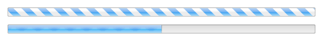
Indeterminate (top) and determinate (bottom) progress bars.
Progress elements that have a value attribute are known as being determinate. If the element doesn’t have a value attribute it’s referred to as being indeterminate. The browser will display determinate and indeterminate progress bars differently (as shown in the figure above).
Styling Progress Bars
You can apply your own custom styling to <progress> elements using pseudo-classes. These classes vary slightly between different browsers.
To get started you need to remove the default styling that’s applied by the browser. You do this by setting the appearance rule to none.
/* All Progress Bars */
progress {
    /* Reset the default appearance */
    -webkit-appearance: none;
    -moz-appearance: none;
    appearance: none;
}

/* Determinate */
progress[value] {
    /* Reset the default appearance */
    -webkit-appearance: none;
    -moz-appearance: none;
    appearance: none;
}

/* Indeterminate */
progress:not([value]) {
    /* Reset the default appearance */
    -webkit-appearance: none;
    -moz-appearance: none;
    appearance: none;
}
You can specifically target determinate or indeterminate progress bars using the progress[value] and progress:not([value]) selectors. The first will match elements with a value property (deterministic), and the second elements without a value property (indeterminate).
In Chrome and Safari the -webkit-progress-bar pseudo-class will target the track of the <progress> element, and -webkit-progress-value will target the bar itself.
progress::-webkit-progress-bar {
    background: #EEE;
    box-shadow: 0 2px 3px rgba(0,0,0,0.2) inset;
    border-radius: 3px;
}

progress::-webkit-progress-value {
    background-color: #CC0000;
    border-radius: 3px;
}
In Firefox there is only one pseudo-class for styling progress bars -moz-progress-bar. This looks similar to -webkit-progress-bar but functions differently. Unlike in Chrome/Safari, this class targets the bar and not the track of the progress element. To target the track you need to apply your styling rules directly to the element as shown below.
progress {
    background: #EEE;
    box-shadow: 0 2px 3px rgba(0,0,0,0.2) inset;
    border-radius: 3px;
}

progress::-moz-progress-bar {
    background-color: #CC0000;
    border-radius: 3px;
}
Both of these examples will create the progress bar shown in the following image.
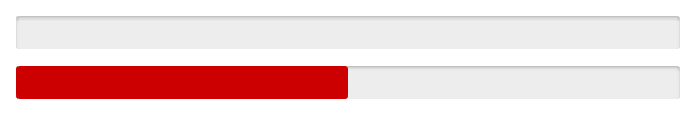
Styled progress bars in Google Chrome.
The Meter Element
The next element that we’re going to look at is <meter>. This element is visually similar to <progress> but has a very different purpose. While <progress> is used to convey how much work in a task has been completed, the <meter> element is used to display a measurement on a known scale. This could be something like the current disk usage on your computer, or a temperature measurement (within a defined range).

Default meter elements in Google Chrome.
<meter min="0" max="100" low="25" high="75" optimum="50" value="50"></meter>The scale for a <meter> element is split into three parts: low, medium, and high. The default color of the meter bar is dependent on which of these parts the measured value falls within.
There are a number of HTML attributes that can be used to define the scale of a <meter>element.
min– The minimum value on the scale.max– The maximum value on the scale.low– The upper-boundary of the low section on the scale.high– The lower-boundary of the high section on the scale.optimum– The optimum value.value– The measurement.
The only one of these attributes that must be specified is value. If you choose not to specify any other attributes the browser will assume the scale is between 0 and 1. You should therefore ensure that your value falls between these numbers.
Styling Meter Elements
As with <progress> elements, the way that you style a <meter> element differs between Chrome/Safari and Firefox.
You start by resetting the default appearance as you did with <progress> elements.
meter {
    /* Reset the default appearance */
    -webkit-appearance: none;
    -moz-appearance: none;
    appearance: none;
}
There are four pseudo-classes that are used to style <meter> elements in Chrome and Safari:
-webkit-meter-bar-webkit-meter-optimum-value-webkit-meter-suboptimum-value-webkit-meter-even-less-good-value(yes, seriously)
There’s also -webkit-meter-inner-element but we won’t be using that for styling.
The -webkit-meter-bar pseudo-class sets the styling for the background of the element. (When learning about <progress> elements I referred to this as the track.)
The -webkit-meter-optimum-value, -webkit-meter-suboptimum-value, and -webkit-meter-even-less-good-value pseudo-classes are used to apply different styling rules to the bar depending on which part of the scale the value falls in (low, medium, or high).
meter::-webkit-meter-bar {
    background: #EEE;
    box-shadow: 0 2px 3px rgba(0,0,0,0.2) inset;
    border-radius: 3px;
}

meter::-webkit-meter-optimum-value {
    background: #86CC00; /* Green */
    border-radius: 3px;
}

meter::-webkit-meter-suboptimum-value {
    background: #FFDB1A; /* Yellow */
    border-radius: 3px;
}

meter::-webkit-meter-even-less-good-value {
    background: #CC4600; /* Red */
    border-radius: 3px;
}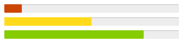
Styled meter elements in Google Chrome.
The naming conventions for the Firefox pseudo-classes vary a little from the ones we looked at earlier.
-moz-meter-bar-moz-meter-optimum-moz-meter-sub-optimum-moz-meter-sub-sub-optimum
Like with <progress> elements, in Firefox the -moz-meter-bar pseudo-class refers to the bar and not the background (or track) of the element. You will therefore need to apply styling for the track directly to the element.
meter {
    /* For Firefox */
    background: #EEE;
    box-shadow: 0 2px 3px rgba(0,0,0,0.2) inset;
    border-radius: 3px;
}

meter::-moz-meter-bar {
    border-radius: 3px;
}

meter:-moz-meter-optimum::-moz-meter-bar {
    background: #86CC00;
}

meter:-moz-meter-sub-optimum::-moz-meter-bar {
    background: #FFDB1A;
}

meter:-moz-meter-sub-sub-optimum::-moz-meter-bar {
    background: #CC4600;
}
This CSS is the Firefox equivalent of the WebKit code above.
Browser Support for Progress & Meter Elements
Chrome, Firefox, Safari, and Opera all include support for <progress> and <meter> elements. Internet Explorer introduced support for the <progress> element in IE10, as did Safari with iOS7. However, neither IE10 or iOS Safari currently support the <meter> element.
More information about browser support
Summary
In this blog post you’ve learned about the <meter> and <progress> elements and where they should be used. You’ve also learned how to apply custom styling to these elements using a variety of CSS pseudo-classes.
We’re starting to see more and more of these new UI components enter browsers. You no longer need to use JavaScript libraries to create things like progress bars and date pickers. I personally welcome this change. It’s nice to see browsers implementing native versions of commonly used UI components. It makes our jobs just that little bit easier.


Thanks, any idea if IE10 or iOS Safari will ever support the element, if so when?
thanks.. very helpful blog
スーパーコピー商品、ブランドコピ ー財布、偽物バッグコピー財布コピーN 級品、ブ ランドスーパーコピー商 品、グッチ財布コピー,ミュウミュウ 財布激安。ブランドスーパーコ ピー銀座、ランドスーパーコピー財布。ブラ ンドスーパーコピー代引き、ブランドスーパーコピー専門店、ご購入する度、ご安心とご満足の届けることを旨にしておりますよろしくお願いします ありがとうございます
スーパーコピーブランド格安販売店はこちらへ!品々の激安価格に持ったスーパーコピーブランド 代引きの新作はお客様に提供されます。安心、迅速、確実、お客様の手元にお届け致します。★弊社は9年の豊富な経験と実績を持っております。★一流の素材を選択し、精巧な作り方でまるで本物のようなな製品を造ります。★品質を重視、納期も厳守、お客様第一主義を貫きは当社の方針です。★驚きの低価格で商品をお客様に提供致します!★早速に購入へようこそ! http://www.ooowatch.com/kabann/vuitton/index.html
Cool stuff Matt!
Definitely going to try and use this on a future project.
Awesome!
Thanks for reading 🙂