Last Updated on March 19, 2026 by Laura Coronel
HTML provides two native elements for representing numeric values visually: <progress> and <meter>. They look similar but serve distinct purposes, and choosing the right one affects both the semantics of your markup and how assistive technologies communicate the information to users.
Contents
Choosing the Right Element
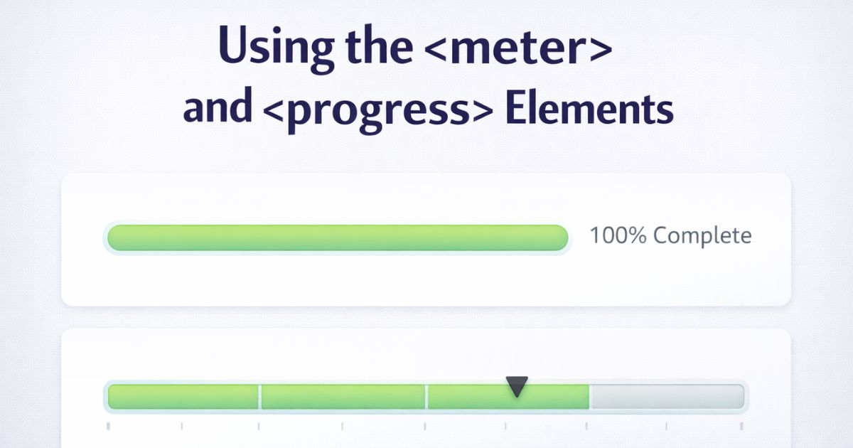
Use <progress> when representing the completion of a task — a file upload, a multi-step form, a loading operation. The value moves toward a known end point.
Use <meter> when representing a scalar measurement within a defined range — disk usage, battery level, a quiz score, a rating. The value isn’t progressing toward completion; it’s a reading on a scale.
The distinction matters because browsers and screen readers treat them differently. A <progress> element communicates “this task is X% done.” A <meter> element communicates “this measurement is X within a range of Y to Z.”
The Progress Element
Basic usage
The max attribute sets the total work required. The value attribute sets how much has been completed:
html
<label id="upload-label">Uploading file...</label>
<progress id="upload" value="65" max="100" aria-labelledby="upload-label">65%</progress>
The text between the tags is fallback content for browsers that don’t support the element — in practice this is no longer necessary, but it’s good habit.
Indeterminate state
Omit the value attribute when the total amount of work isn’t known. The browser renders an animated indeterminate bar to communicate that something is happening:
html
<label for="loading">Loading results...</label>
<progress id="loading"></progress>
Updating with JavaScript
In real applications <progress> is updated dynamically. Here’s a simulated file upload that increments the bar every 200ms:
js
const bar = document.getElementById('upload');
const label = document.querySelector('[for="upload"]');

const simulate = () => {
  const interval = setInterval(() => {
    if (bar.value >= bar.max) {
      clearInterval(interval);
      label.textContent = 'Upload complete';
      return;
    }
    bar.value = Math.min(bar.value + 5, bar.max);
    label.textContent = `Uploading file... ${bar.value}%`;
  }, 200);
};

simulate();
Updating the associated <label> alongside the element keeps sighted and screen reader users equally informed.
Styling Progress
Simple colour with accent-color
The quickest cross-browser way to change the fill colour is accent-color. One line of CSS, works everywhere:
css
progress {
  accent-color: #5ece7f;
}
Deeper styling with pseudo-elements
For full visual control — custom track colour, border radius, height — use the WebKit pseudo-elements. Be aware that results vary across browsers and these pseudo-elements are non-standard:
css
progress {
  appearance: none;
  width: 100%;
  height: 8px;
  border-radius: 4px;
  border: none;
}

progress::-webkit-progress-bar {
  background: #e9ecef;
  border-radius: 4px;
}

progress::-webkit-progress-value {
  background: #5ece7f;
  border-radius: 4px;
}
Full custom control with a div
When you need consistent styling across all browsers with no caveats, a <div> with the appropriate ARIA roles gives you complete control:
html
<div
  role="progressbar"
  aria-valuenow="65"
  aria-valuemin="0"
  aria-valuemax="100"
  aria-label="File upload progress">
  <div class="progress-fill" style="width: 65%"></div>
</div>
css
[role="progressbar"] {
  background: #e9ecef;
  border-radius: 4px;
  height: 8px;
  overflow: hidden;
}

.progress-fill {
  background: #5ece7f;
  height: 100%;
  border-radius: 4px;
  transition: width 0.2s ease;
}
If you go this route, keep aria-valuenow in sync with the visual width whenever the value changes.
The Meter Element
Basic usage
<meter> represents a value on a known scale. The min, max, and value attributes define where the reading falls:
html
<label for="disk">Disk usage</label>
<meter id="disk" min="0" max="100" value="72">72 GB used of 100 GB</meter>
Semantic range attributes
<meter> has three additional attributes that let you define meaningful zones on the scale. The browser uses these to determine which colour to render the bar:
low— the upper boundary of the low zonehigh— the lower boundary of the high zoneoptimum— the ideal value; tells the browser which zone is “good”
html
<label for="score">Quiz score</label>
<meter
  id="score"
  min="0"
  max="100"
  low="40"
  high="70"
  optimum="100"
  value="85">
  85 out of 100
</meter>
With optimum="100, a value in the high zone (above 70) renders green, medium zone yellow, and low zone red. If optimum were set to a low value, the colouring would invert accordingly.
Styling Meter
The same approach applies as with <progress>.
Simple colour with accent-color
css
meter {
  accent-color: #5ece7f;
}
Note that accent-color applies a single colour and does not respect the low/medium/high zone colouring. For zone-aware styling you’ll need the pseudo-element approach.
Zone-aware styling with pseudo-elements
css
meter {
  appearance: none;
  width: 100%;
  height: 8px;
  border-radius: 4px;
}

meter::-webkit-meter-bar {
  background: #e9ecef;
  border-radius: 4px;
}

meter::-webkit-meter-optimum-value {
  background: #5ece7f; /* green — value in optimum zone */
  border-radius: 4px;
}

meter::-webkit-meter-suboptimum-value {
  background: #ffc107; /* yellow — value in acceptable zone */
  border-radius: 4px;
}

meter::-webkit-meter-even-less-good-value {
  background: #dc3545; /* red — value in poor zone */
  border-radius: 4px;
}
As with <progress>, these pseudo-elements are WebKit-specific and results will vary in Firefox. For fully consistent cross-browser styling, a custom <div> implementation gives more reliable control.
Accessibility
Both elements need context to be useful to screen reader users — the visual bar alone doesn’t communicate what is being measured or what the value means.
Always associate a <label>:
html
<label for="battery">Battery level</label>
<meter id="battery" min="0" max="100" value="42">42%</meter>
Include visible descriptive text near <meter> explaining the scale and what the value represents. Screen readers will announce the value and range, but not what those numbers mean in context:
html
<label for="rating">Average rating</label>
<meter id="rating" min="0" max="5" value="4.2">4.2 out of 5</meter>
<p>Based on 348 reviews</p>
For <progress> used as a <div>, keep aria-valuenow, aria-valuemin, and aria-valuemax updated in JavaScript whenever the visual value changes. A stale aria-valuenow means screen reader users hear a different value than what’s displayed.


Thanks, any idea if IE10 or iOS Safari will ever support the element, if so when?
thanks.. very helpful blog
スーパーコピー商品、ブランドコピ ー財布、偽物バッグコピー財布コピーN 級品、ブ ランドスーパーコピー商 品、グッチ財布コピー,ミュウミュウ 財布激安。ブランドスーパーコ ピー銀座、ランドスーパーコピー財布。ブラ ンドスーパーコピー代引き、ブランドスーパーコピー専門店、ご購入する度、ご安心とご満足の届けることを旨にしておりますよろしくお願いします ありがとうございます
スーパーコピーブランド格安販売店はこちらへ!品々の激安価格に持ったスーパーコピーブランド 代引きの新作はお客様に提供されます。安心、迅速、確実、お客様の手元にお届け致します。★弊社は9年の豊富な経験と実績を持っております。★一流の素材を選択し、精巧な作り方でまるで本物のようなな製品を造ります。★品質を重視、納期も厳守、お客様第一主義を貫きは当社の方針です。★驚きの低価格で商品をお客様に提供致します!★早速に購入へようこそ! http://www.ooowatch.com/kabann/vuitton/index.html
Cool stuff Matt!
Definitely going to try and use this on a future project.
Awesome!
Thanks for reading 🙂