
Last Updated on May 21, 2015 by Laura Coronel
The blank slate or “empty state” is when an application has no data. In other words, it’s what an app looks like the first time someone uses it. Not only is the blank slate a critical part of UX, but it can also be used to educate customers and increase their overall happiness with the experience.
Contents
The Blank Slate is the First Impression
The first time you use an app, there are no posts, comments, status updates, notifications, or any of the things you might expect in an app that you’ve been using for a while. The first-run experience is when lasting impressions are made, which makes the blank slate one of the most important pieces of UX. It’s an opportunity to educate your customers about how your app works and how it will help them be awesome.
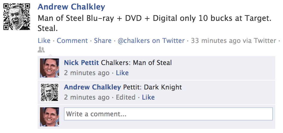
After you’ve been using an app like Facebook for some time, you’ll start to populate it with friends like Andrew.
A great app should make people feel like they can conquer their goals with confidence. While you should provide outstanding customer support, you should also strive to make your app so easy-to-use that customers feel pride in their own self-reliance. The blank slate is your greatest opportunity to educate customers because it’s when they’re the most engaged. They’ve probably just paid you money (or they’re considering paying, in the case of a free trial or in-app purchases) and they want to make sure they’re getting the most out of their hard-earned cash. This is your moment to demonstrate how your app can give them super powers.
Educate Customers in Small Bits
The blank slate should educate (it rhymes, so it must be true) through clear and communicative design. Unfortunately, educating people is difficult. Most customers don’t want to read an instruction manual before they start using a web app or a mobile app, and they shouldn’t have to. They should be able to just get started. This means that a blank slate is more than a single screen. Rather, it’s best constructed as a steady stream of bite sized information that allows them to learn about the app while simultaneously using it to accomplish their goals. Each action should build on the last.
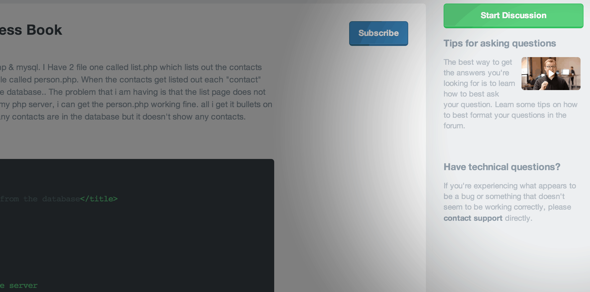
In the sidebar of the Treehouse Forum, there’s guidance about how to get answers and how to get technical help if you need it.
Highlight What’s Unique
When a customer hits your app for the first time, the things that they’ve never seen before will stand out first. Fortunately, these unique features also tend to be the most important parts that make your app special. The design of the blank slate should break down these abstract ideas and imbue them with functional utility so that customers can move on and do great things. Don’t be afraid to add a little extra help text or a small picture in these areas. It’s really important that they get the right idea the first time.
Use Dummy Data
Before presenting the customer with a “blank” screen (which, as we’ve learned, isn’t really blank), it can be helpful to show them what the screen will look like after they’ve used the app for some time. This type of education usually happens in the marketing, before the customer has logged in for the first time. However, after login, it may still be helpful to show a screenshot or an overlay to give them an idea of what the app will look like soon.
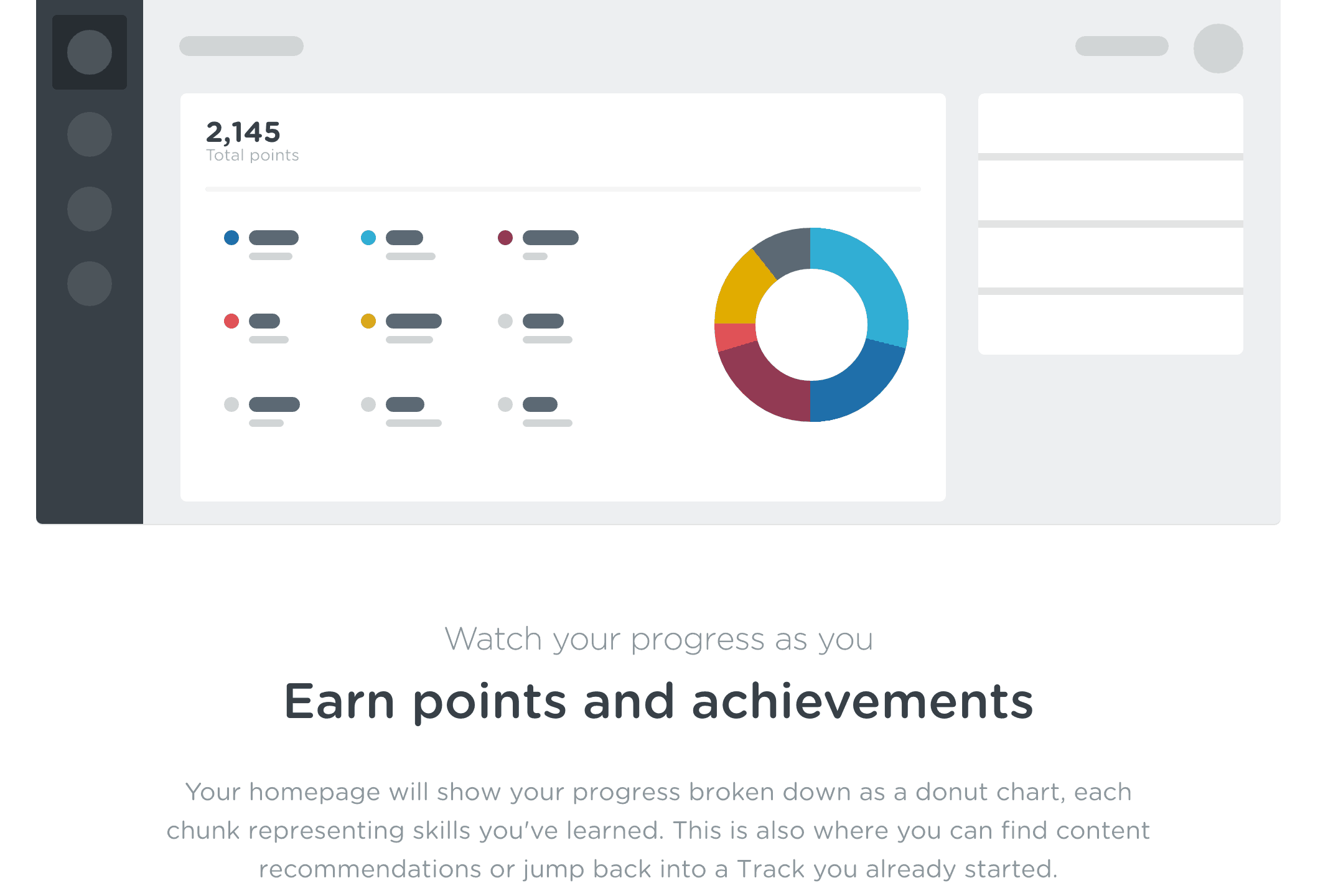
This is an image from the Treehouse Features page. In this illustration, potential new students can get an idea of what their profile might look like after they’ve been using Treehouse for a bit.
Make the Next Action Obvious
On a screen with no data, you should tell the customer exactly what they can do to populate that screen with information. This could be as simple as drawing an arrow to an important area of the screen or presenting the customer with a single button that allows them to get started.
Beyond the first-run experience, there might be instances where your application simply runs out of user generated content. In these instances, try your best to anticipate what the customer might want to do next. Give them simple and immediate access to the next action.
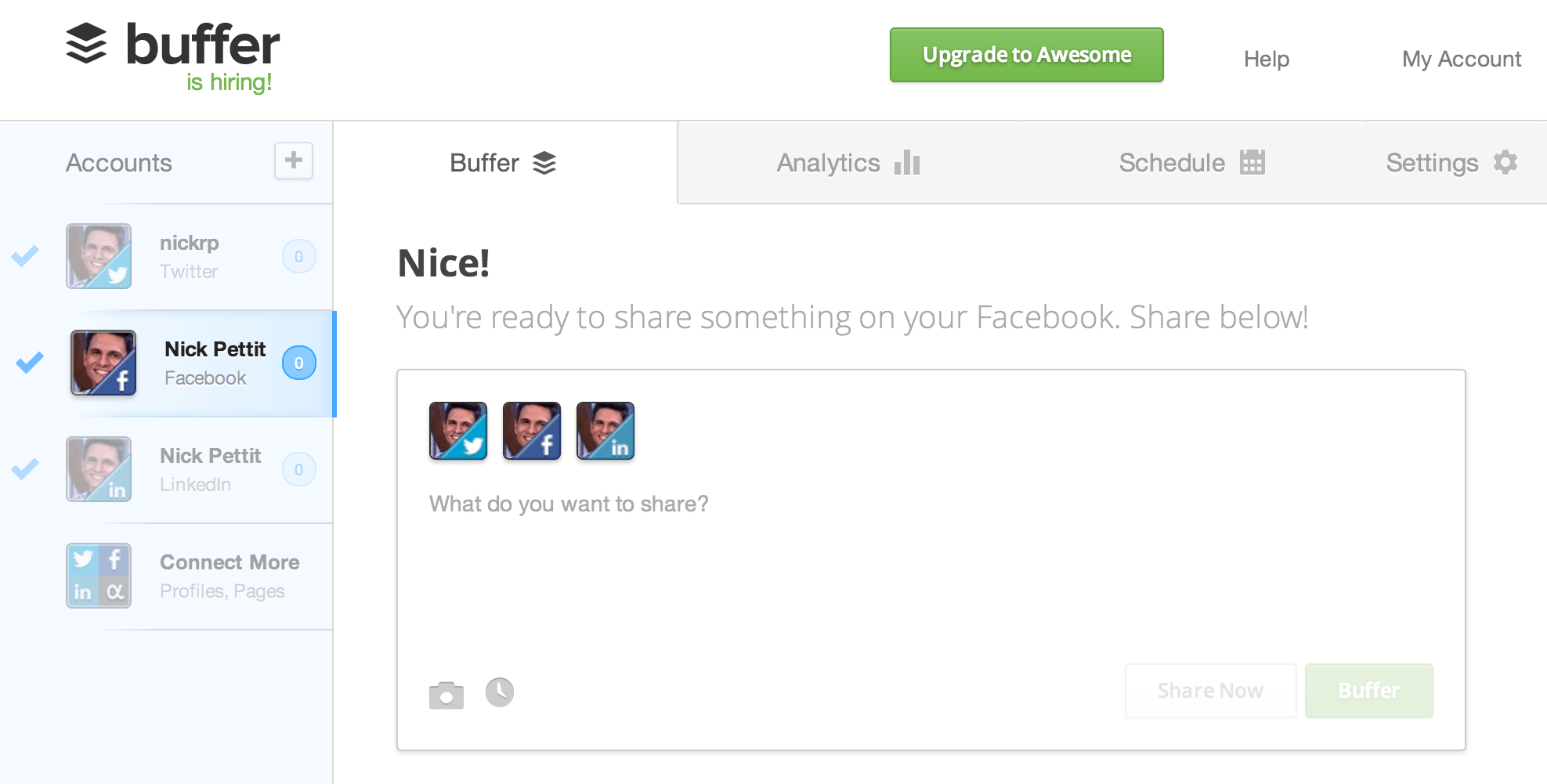
Buffer is an app that allows you to schedule upcoming social media updates. If you don’t have any updates in your queue, Buffer makes it easy to add new ones immediately.
Create Helpful Errors
Nothing is more frustrating than zooming through an app and then getting stuck. It will happen sooner or later, so when it does, make sure that your error messages are meaningful and helpful. Identify the issue in plain language and then tell the customer how they can fix the problem or get more help if they need it.
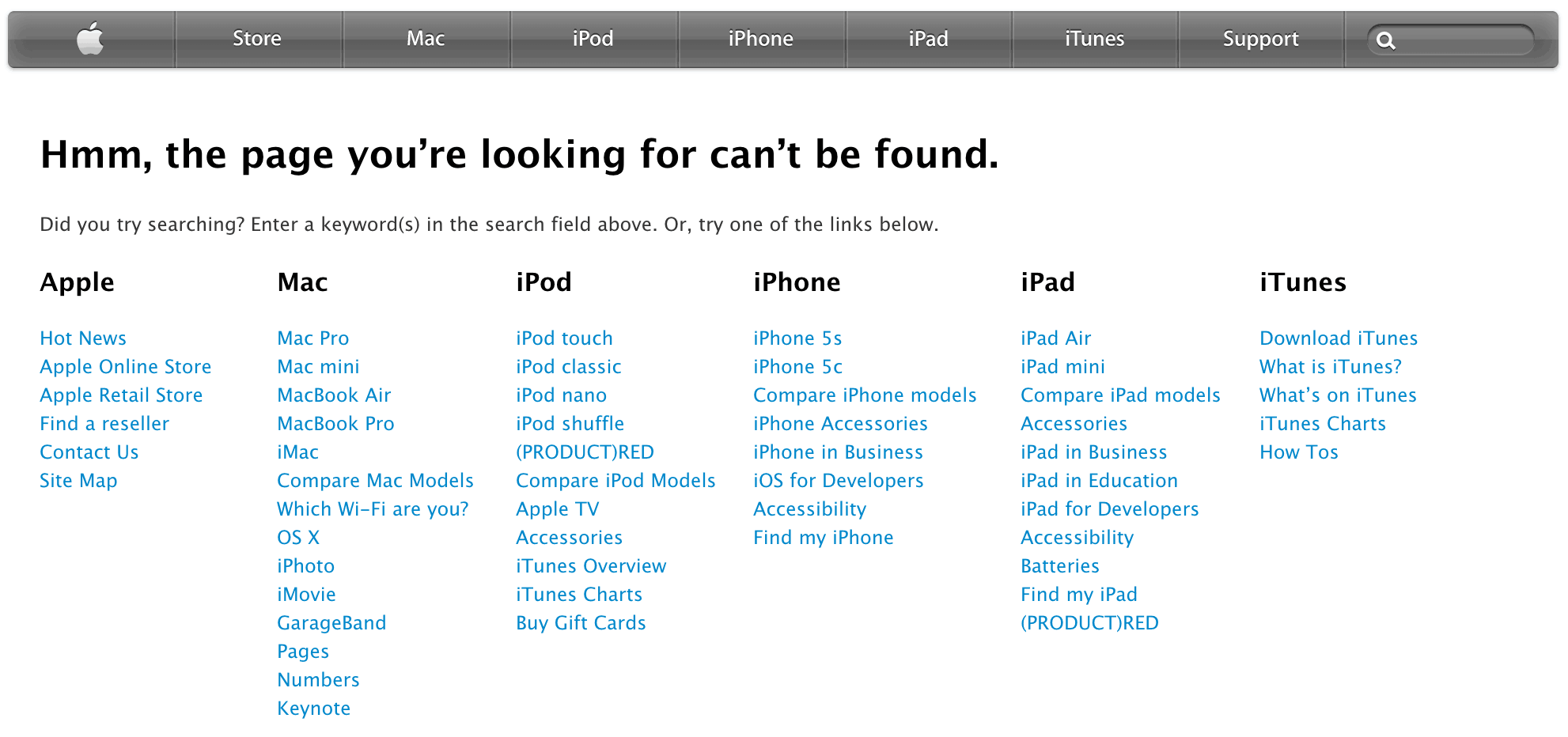
Apple’s 404 page recommends the search functionality. Alternatively, the site visitor can get back on track quickly using one of the site links.
Most often this applies to form validation, but the same concept stands for 404 pages and application errors. If your shiny new app hits a problem, try to recover gracefully by giving the customer some options. Maybe you can help them go back to the previous page, look for help in a customer support forum, or just go back to the home page. As an aside, it’s also a good idea to monitor when these instances occur in your app so that you can fix them quickly.
More Tips
Every app is unique in its own way. If you have a great example of a blank slate or additional tips you’d like to share, let me know in the comments!


Thx for some good reading. Having had u as teacher (& Guil 🙂 since i started web designing you deliver with the best in this industry!
Interesting read Nick. Will have this in mind when developing my next projects!