If you’re like me, then you’ve had a love/hate relationship with Photoshop for almost a decade. The software is bloated, it crashes right at the moment you forgot to hit save, and it produces a design that is nothing more than a useless and non-functioning image to send to clients. Despite loathing the software that is the staple of our industry, we can’t live without it. High fidelity mockups have spoken in a way that we just can’t beat with any other applications… until now. Let’s explore the next stage in the evolution of the web and one where Photoshop is a waste of our valuable time. Here’s how to kill Photoshop and do responsive web design in real-time with the only app we need: the browser.
Contents
Why Kill Photoshop?
1. It’s Double the Work.
The main reason to kill Photoshop is because it doubles or even triples your current workload. You can spend hours of your precious time inside of Photoshop and what do you get? A picture.
2. Clients Can’t Use It.
This brings me to my second point. Photoshop produces a mockup that clients simply can’t use. To quote Steve Jobs, “Design is how it works”, and if your clients can’t use what you’ve built then you’re missing a huge piece of the puzzle. Once your clients get to use your design and they find that it doesn’t work for them, if you’ve used Photoshop you’re back to square one.
3. You Can’t Make Changes Live.
If you’re designing in the browser you can make changes to your design in real-time. Let’s say you have a client drop in the office and they want to change the color of the main headline (or gasp, the size of the logo), but they’re not quite sure what color they want it to be. You launch your browser with a single tool (more on this later) and iterate as many colors quickly to find the perfect shade of light-ish, aqua-ish, color of my second wife’s Mercedes, blue. (you know exactly what I mean)
4. CSS is Ready.
For years there were certain things that we needed Photoshop for that CSS just couldn’t do. These included things like buttons, shadows, borders, etc. Now that CSS is all grown up, we can do many of the stylistic elements that we crave in CSS, and Photoshop is needed less and less with every new release.
5. Photoshop is Expensive.
Part of the beauty of the web is that it’s income-agnostic. Anyone can get into web design with a basic PC (gross) or an older model of Mac (yum, that’s better). The problem for years has been that you needed a machine that could handle the load it required for the latest version of Photoshop that you had to mortgage your home to get in the first place. You can keep from having to sell your little sister to buy Photoshop now that you can design straight in the browser.
6. Photoshop is Static.
Now that we’ve established that Responsive Web Design is the future of the web, why spend time designing a website in Photoshop that isn’t fluid? If you feel the urge to design each breakpoint (where the Responsive Design breaks) in Photoshop, then return to my first point and change “Double the Work” to “Six Times the Work”.
7. Photoshop Has No Prototype Value.
Sure you can prototype the look of a website inside of Photoshop, but you can’t iterate on the fly. The new evolution of the web places an enormous value in the ability to let a design evolve with use. Designing in the browser also affords you the luxury of creating multiple style sheets for your markup to drastically change the look and feel of your site with just a few changes in the style sheet link. From there, you can again fine tune your design live to really hone in on what the client wants.
8. You Start with Content, Not Style.
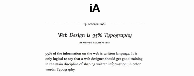
A good web designer understands the holy grail of designing for the web: great markup. Content out or the content first approach to design isn’t just a fad, it’s gospel. In his famous article, The Web is 95% Typography, Oliver Reichenstein of Information Architects, argues:
“95% of the information on the web is written language. It is only logical to say that a web designer should get good training in the main discipline of shaping written information, in other words: Typography.”
It’s important to note that “shaping written information” refers to style, but my point here is that if the content that you use is 95% of your design, then the majority of your time in Photoshop is wasted on 5% of a great design. In that light, you’re also spending that time in the wrong order. Designing your content first and coding semantic, standards-based markup is the foundation of a great design and not something you approach as an after thought of Photoshop. Having this markup first allows you to iterate your styles quickly without having to reinvent the wheel every time you make a change.
Conclusion
The next era in designing for the web is a more advanced, mature and intelligent one. It’s about streamlining, semantics, great markup, responsive or fluid design, great typography, web fonts, content first, rapid prototyping and advanced javascript. My argument is that html, CSS and the browser tools we need have all advanced us past the point of needing Photoshop. If you want to be a great designer moving forward, I would start thinking about “Killing Photoshop”. …and here’s a bonus reason to kill Photoshop: no more spinning beach balls! In part 2, we’ll take a look at the tools you’ll need to start your new strategy for responsive web design in the browser.



If you want a responsive web page that looks good on all devices like desktops, tablets, and phones. To create a sophisticated web page is about using CSS and HTML to resize, hide, shrink, enlarge, or move the content to make it look good on any screen.
From the last few years, I am working as a photo editor. If anyone wants to edit any image, there is no other way to using photoshop. In the near future, designing for the web is a more advanced, mature and intelligent one. But at this time, I think learning Photoshop is beneficial for everyone.
Hi, Josh! What do you think to kill about photoshop in 2017? Most of the time its destroyed valuable work and time. A few days back I have worked 10 images with photoshop but forget to save the file. Due to load shedding problem, I lost the file. It was some terrible moments for me. When we worked, Have any autosave option in photoshop or other software.
Hi! Quick question that’s entirely off topic.
Do you know how to make your site mobile
friendly? My website looks weird when browsing from my iphone4.
I’m trying to find a theme or plugin that might be able to fix this problem.
If you have any recommendations, please share.
Cheers!
Photoshop is very useful though
Not only Photoshop 😉
One doubt….how can we visualize the websites for clients? With out PS?
The point of using PS is so the client can have a glimpse of what the final look in a short amount of time.
Scenario:
You give the client 3 designs to choose form so you quickly design 3 templates in PS and show it to the client. The client then picks one and then you go ahead and do the HTML/CSS
No Photoshop:
Do 3 designs in HTML/CSS and show it to client where only one of them will be used
Also, with PS, the designer can focus on the design without worrying about the code. Same concept why we use wireframes and “lorem ipsum”
It’s a design tool. What you design within it, is purely up to your imagination. You as a designer should be able to understand the tool and its place within the process of professional design. The tool can Fireworks, Photoshop, paper, or an etch a sketch.
Tools or CSS code don’t actually make you a great designer. Your individual creativity and experience with multiple tool sets do.
He forgets most clients want to see a visual of what you are selling in your client pitch, before they began paying the higher cost of development.
Ideation, wireframe and design, comping and revision, development and refining, all need to be collaborative parts of standard process. And that’s just for a normal site.One still needs to work in Photoshop or Fireworks to optimize image assets for web, phone, and tablet, all with consideration for retina displays. There is no killing Photoshop or Fireworks!
Josh, I’m really glad I found this thread because I recently did some spec web development work for a designer who had prototyped everything in PS. As a result I had to import everything in layers into FW and when I started to optimize the images I couldn’t get them to vector quality. I also had a problem color matching. The client in this case was someone by the name of Darcy Merka out of Vancouver. He then didn’t use my work and had the cheek to tell me I didn’t have the right tools for the job because I didn’t have PS. I’m glad I can now show him this article as well as the millions of others I’ve found saying the same thing – PS is outdated and on the way out.
The problem is there are an overload of programmers who know nothing about graphic design. And “trained” graphic designers who do not know enough about code (or even want to). For those reasons, it will prove near impossible to “kill” photoshop anytime soon.
Great article! I recently made a template for in-browser web design prototyping. I call it Webstiles. It’s like Style Tiles, but native to the browser, and has a few more features as well!
Have a look! http://webstiles.namanyayg.com/
(PS. Would LOVE feedback!)
I would say a BDD development process of meeting the client’s needs with whatever backend technology you use, an actual non-static prototype as a result of designing-in-the-browser, and style tiles trumps a photoshop static file in most cases than the other way around as far as client deliverables is concerned.
By creating static photoshop files, you first and foremost give the wrong impression that the design should look the same on every browser. You don’t want that of course.
By rapid prototyping, you immediately can show how the goals of a client can be best met with a more capable browser vs. others through rapid prototyping instead of photoshopping a mockup.
At the end of the day, you should make the most of what you know now when it comes to providing a clear message on how you can realize a client’s wants with a potential project dealing with you. We don’t have all the time in the world to master or get better at one method over another at times.
That said, regarding thinking too much into browsers is a personal problem, not a problem with the process. An important part of designing anything is embracing constraints and working around them.
By rapid prototyping, you challenge such constraints directly and can quickly create, find, and think of solutions around them towards what you originally imagined. You can use caniuse.com to directly to think of solutions of imagining what you imagine or simply embrace the constraints with clever alternatives that still meet the clients needs.
Therefore, that argument is rather weak, I think.
Here’s the thing; I agree with a lot of what’s being said here, and while I’m getting accustomed to designing in-browser, I still don’t like this article because of the title. Because for one thing, it’s entirely subjective and people should be allowed to use the tools they see fit for the requirement. Photoshop may be static but it could still be useful for wireframing and a frame of reference.
For two, and I quote:
“If you want to be a great designer moving forward, I would start thinking about “Killing Photoshop”.”
In your opinion. What you’re saying is A right, not THE right. There’s only so much you can do wrong as a web designer but there are many ways to achieve your objective, in my opinion.
And for three, the title itself. I really want to like this article, but I see the title as link bait. I really think this makes sense, but I’m tired of people telling everyone else to “kill” Photoshop. I will say there’s nothing wrong with in-browser design but on a responsive basis, the browser should be relied on. Photoshop, however, can’t be ignored, only leave it down to a preference. Particularly if you use it for certain assets.
There’s an expression in portuguese that say “for a bad kisser, even the lips disrupts”. What you area saying is your opinion. Photoshop was born as a photo editor and kept it’s strong name, but it has to many resources for several other works, and I know tons of people who knows how to get it above of this discussion itself.
Sorry man. I stopped reading when you said ” Let’s say you have a client drop in the office and they want to change the color of the main headline”. A client should never take the reins when we are talking about design. It results in worst projects that you’v studied most days of your professional life to make them better.
I’m reading again and it became strange to me: I’m saying that he/she never must be able to enter in the sandbox. Only if he’s a designer.
(sorry, I know this comment is old! haha)
I agree with you that this is how it *should* be, and in a perfect world this is how it is…but try telling your client “No, I won’t make that change”. YES you should push your professional opinion, maybe even verge on arguing, but unless you have the clout (and financial security) to do so, you probably don’t want to tell a client “no – no question” or “get out my sandbox”, as you will most likely lose that client. All this does is encourage a designer vs client relationship that is very unhealthy.
I agree with Fireworks being WAY better (and most importantly more intuitive) than Photoshop but still it falls into the same category of problems: Expensive and too many irrelevant features. To put it simply none of them are dedicated web design tools, they just happened to have some features that are useful in that area. I use Artisteer plus lots of extra customisation afterwards with jEdit,Notepad++,Firebug+Web Developer plugins for Fireofox and nowadays Netbeans which supports HTML5 development out of the box. Still this combination of tools is painfully time consuming and more importantly not design oriented leading to problems. Luckily, there is an emerging series of in-browser design tools that is pinpointing the future, I hope…
I don’t use Photoshop for Web Design, but I recommend just jumping right into the browser and starting coding anymore. I use to do that when I just started but as I became better I realize that leads to sloppy work. You also waste time trying to work on the fly, trying something that in your mind looked great but then you see it on the canvas and it’s not so great.
When I start a new design now, I always start off with color schemes. 2 sets, 1 containing the primary colors that will carry the narrative of the site, then the secondary color that will play a big role in smaller parts of the UI that will work nicely for the complete project.
After that, I prototype, nothing fancy just something to give myself a navigation and an idea of where everything is going to go, this cuts out guess work later and pauses in workflow.
That aside why would you use PS for web design anyway, isn’t that what Dreamweaver is for?
Improve PageRank and make money with your blog !
https://blog.teamtreehouse.com/
dt7zp7vlj5qg6mc6iy