
Last Updated on May 21, 2015 by
Developers often use test driven development to write simple and reliable code. Sometimes too much testing can slow down the development of a product, but in general, it’s a smart idea. The web design community doesn’t have a perfect analog to written software tests, but a few simple aesthetic exercises or “design tests” can serve a similar function. In order to perform these tests, you’ll need to open a screenshot of your website in an image editing program like Photoshop, although a simple photo editing app will do fine as well.
Update: Thomas Park created these amazing design test bookmarklets so you can do this in any modern browser! Photoshop not required.
Below is a screenshot of a portfolio website that will be used as project material in a soon-to-be-announced Treehouse course.
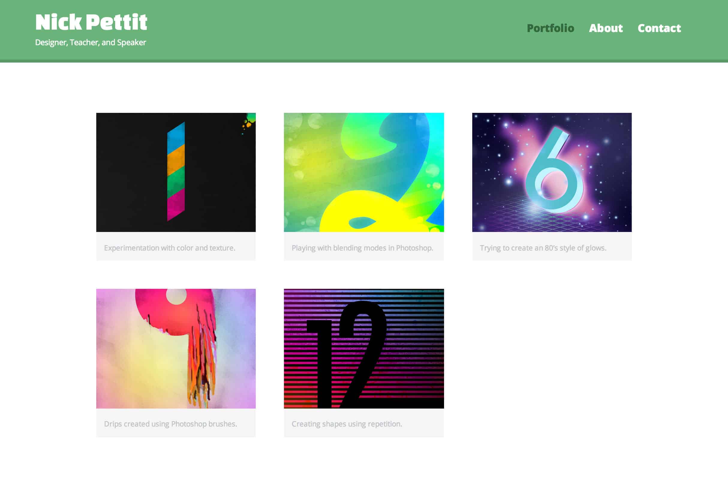
This screenshot of the project is the portfolio page which is intended to showcase design work. Take a few moments to examine the aesthetics of this layout before moving on.
The Desaturation Test
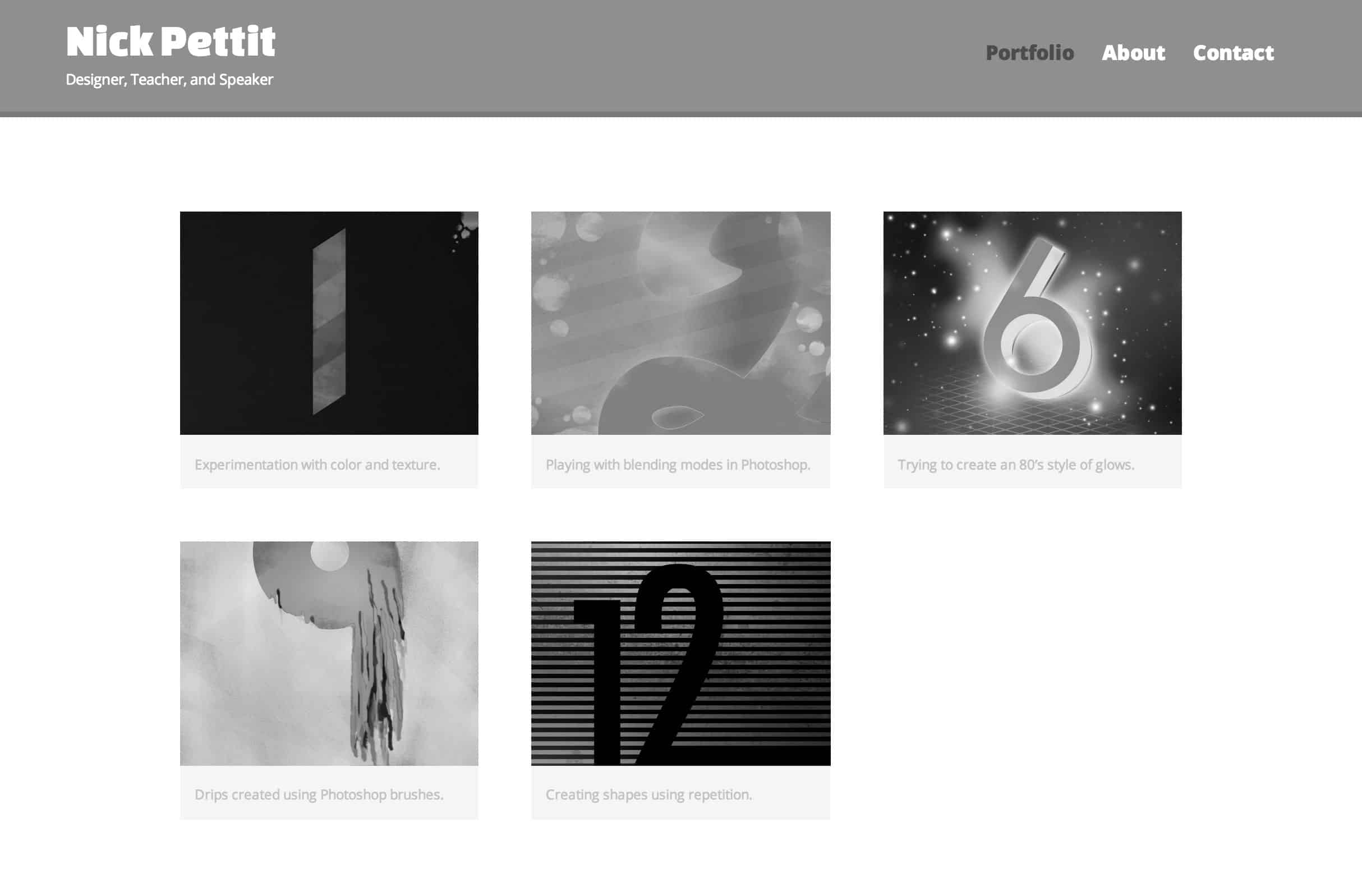
With your screenshot loaded into your image editing application, desaturate the colors completely. The purpose of this test is to find areas of the image that might have a lot of contrast in color but not enough contrast in value (the difference between light and dark). For example, take a look at the portfolio piece in the top center. The number 2 has some well defined yellow edges in the color version, but as soon as it’s black and white, the lines become a bit fuzzy. This particular instance isn’t too bad, but if you run this test and find page elements that appear to blend together (especially text) then you should reconsider the colors and values.
Contrast in value is desirable for many reasons. First, humans are much more sensitive to changes in value than changes in color, so if you’re trying to highlight some page elements or make text legible, contrast is paramount. Secondly, there are millions of people that have some form of color blindness or related vision impairment. If you’re able to differentiate between two page elements using both color and value, then you’ll make your site accessible to more people.
If you only do one of these three tests, make sure it’s this one. In most cases, you’ll uncover at least one area of poor contrast that should be fixed.
The Blur Test
In this test, you’re looking at several things. Contrast in values comes to mind, but this is also a great way to look at the mix of color saturation across the screen. For example, if you’re going for a more subdued look, you probably don’t want bright complimentary colors sitting next to each other.
It’s also a helpful technique for examining your composition. For example, in this layout, the “heavy” and dark portfolio pieces are evenly distributed in a checkerboard pattern with the “light” and colorful pieces. This adds a bit more variety and makes each piece stand on its own just a little bit more than if all the lights and darks were clumped together. I should note that this can be slightly situational. In the case of this portfolio site, we wouldn’t want an extremely graphic and colorful header to overpower the image gallery. Rather, the header should be subtle and allow the gallery to shine.
Accessibility also comes to mind once more in this test. By starting out with a small amount of blur and slowly ramping it up, you can visualize which pieces of text on your page are the most legible to people with varying degrees of vision impairment. Adjusting the amount of blur can also highlight the “scannability” of your design and show which elements people might pick up on first.
The Upside-Down Test
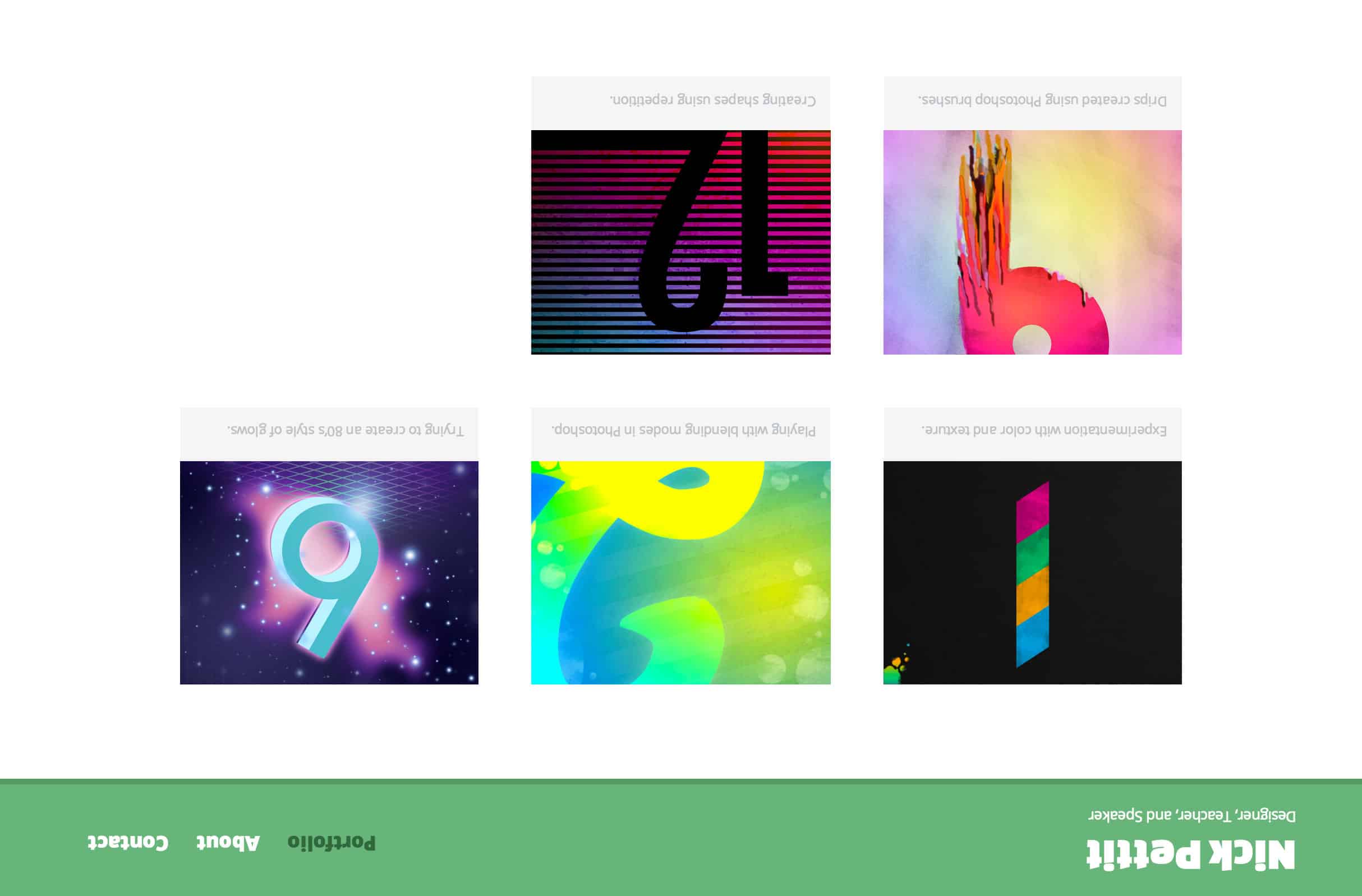
Last but not least is the upside-down test. By flipping your design 180 degrees, you can isolate the composition and balance. You may even want to take this a step further and draw a line straight down the middle of the page. This will help you to identify issues with the composition where one side might feel too heavy versus the other side. Fortunately, this layout is fairly symmetrical, so there’s not much to worry about. If, however, all the dark imagery was in a single column down one side of the page with only light text to balance it on the other side, a balance problem might be much more apparent. More simply, if you’re in need of a fresh perspective (literally and figuratively) on the aesthetics of your website, this test might help.


プラダ スーパーコピー,プラダ 財布 コピー,プラダ 新作 財布ブランド財布コピー,ブランド スーパーコピー 財布,プラダ スーパーコピー 財布,シャネル財布コピー,グッチ スーパーコピー 財布,エルメス スーパーコピー 財布,ルイヴィトン長財布コピー,スーパーコピー財布,エルメスコピー財布,各種のブランドはかばんをコピーします偽物ブランド,激安偽物,ブランド財布コピー,エルメス財布コピー,ブランドのコピーブランド財布,ルイ?ヴィトンブランド財布コピー,偽ブランドグッチ財布,D&G,コピー財布偽物,偽物時計コピー,時計,ボッテガベルト,,靴,その他のバッグコピー,ブランド財布激安,ブランド激安販売,偽ブランド激安市場,通販送料無料專門店 ルイヴィトンコピー 当店ルイヴィトン コピー 財布、ルイヴィトン コピー バッグ 全MAX80%OFF!期間限定SALE。最短即日発送。送料無料ルイヴィトン コピー,ルイヴィトン コピー 財布,ルイヴィトン コピー バッグ
ロレックスコピー販売、代引きロレックス時計コピー通販、全て新品、高い品質、激安、送料無料。ロレックス時計コピーなど世界中有名なブランドレプリカを格安で通販しております。N級品スーパーコピーブランドは 業界で最高な品質に挑戦しますロレックコピー,ロレックコピー代引き,ロレック激安,ロレックス偽物 ,最高級ロレックコピーロレックス時計コピー,フェラーリコピー時計,パネライコピー時計,パテックフィリップコピー時計,ヴァシュロン.コンスタンタンコピー時計,エルメスコピー時計,カルティエコピー時計ルイヴィトンコピー、 ロレックスコピー、シャネルコピー、グッチコピー、エルメスコピー、 ボッテガヴェネタコピー、 バーバリーコピー、ミュウミュウコピー、トリーバーチコピー、バレンシアガコピー、ディオールコピー、ブルガリコピー、ブラダコピー、 ドルチェ&ガッバーナコピー、オメガコピー、フランク ミュラーコピー、gagaコピー。古驰拷贝, 靴/サンダル,サングラスコピー欧米O級品オーダー服各種のブランドの服、靴、、財布、腕時計の複製品をかばん一番ブランドliveブランドコピー服,ブランドバッグコピー,ブランド時計,ブランド靴シリーズ欧米O級品コーナーラッピング用品 http://www.brandiwc.com/brand-24-copy-0.html
ブランドスーパーコピーバッグ、財布、時計プラダ スーパーコピー,プラダ 財布 コピー,プラダ 新作 財布ブランド財布コピー,ブランド スーパーコピー 財布,プラダ スーパーコピー 財布,シャネル財布コピールイヴィトン 財布 コピー,ルイヴィトン 財布 コピー 代引き,ルイヴィトン財布スーパーコピー,ルイヴィトン 財布 スーパーコピー 代引き,ヴィトン財布代引き,ヴィトン財布 人気,ヴィトン財布 激安,モノグラム 財布,マルチカラー 財布,ルイヴィトン財布新作,ルイヴィトン バッグ 新作,ルイヴィトン スーパーコピー 即日発送ルイヴィトン スーパーコピー 専門店ルイヴィトン スーパーコピー バッグルイヴィトン スーパーコピー 財布ルイヴィトン スーパーコピー 長財布2015年新作 ルイヴィトン スーパーコピールイヴィトン コピー,ルイヴィトン コピー 財布,ルイヴィトン コピー バッグ
ブランドコピーの専門店スーパーコピー豊富に揃えております、最も手頃ず価格だお気に入りの商品を購入。弊社フクショー(FUKUSHOW)ブランド腕時計、雑貨、小物最新作!エルメス バーキンスーパーコピー時計N品のみ取り扱っていまずのて、2年品質保証。エルメス食器,スーパーコピーブランド激安販売シャネル 財布スーパーコピー,スーパーコピーブランド 財布激安販売エルメス スーパーコピー,スーパーコピーブランド激安販売売スーパーコピーロレックス スーパーコピー,スーパーコピーROLEX激安販売IWC スーパーコピー,スーパーコピーIWC時計激安販売エルメス時計スーパーコピー,スーパーコピーhermes時計激安販売ボッテガ ヴェネタスーパーコピー,スーパーコピーブランド財布激安販売スーパーコピー時計スーパーコピーブランドバッグ時計コピー激安販売 http://www.ooobag.com/index.html
色は非常に目立つジッパーです。初秋からはアウターとして、冬にはインナーとしてかなり長い期間着ていただけると思います。当然春先にも重宝します。まだまだ暑いからなんて言ってると、欲しいときにはなくなっちゃいそうですよ!お早めにチェックしてみてください。因みに弊社では、ゴルファーの方に人気です。
人気スーパーコピーブランド時計激安通販専門店私達は長年の実体商店の販売経験を持って、先進とプロの技術を持って、高品質のスーパーコピー時計づくりに 取り組んでいます。最高品質のロレックス時計コピー、カルティエ時計コピー、IWC時計コピー、ブライトリング時計コピー、パネライ時計コピー激安販売中商品の数量は多い、品質はよい。海外直営店直接買い付け!★ 2015年注文割引開催中,全部の商品割引10% ★ 在庫情報随時更新! ★ 実物写真、付属品を完備する。 ★ 100%を厳守する。 ★ 送料は無料です(日本全国)!★ お客さんたちも大好評です★ 経営方針: 品質を重視、納期も厳守、信用第一!税関の没収する商品は再度無料にして発送します http://www.ooowatch.com/tokei/chanel/index.html
Great suggestions. I especially like the Upside-Down test. You could also do these with pure CSS.
body {
-webkit-filter: grayscale(100%); /*Desaturation*/
-webkit-filter: blur(6px); /*Blur*/
transform: rotate(180deg); /*Upside-Down*/
}
Blur Test is an Good example, as a logo should stand out, if eye sight is blury
We even reserved one final edit pass — of entire books — for proofreading/scanning the whole thing upside down. That foiled the brain’s tendency to see what it expected, and a surprising number of typos were caught that way.
Hey there, You’ve done an excellent job. I will certainly digg it and personally recommend to my friends. I am sure they will be benefited from this web site.
I love the idea of blurring the shot to see where your concentration of colors lies – I would note that looking at the screenshot upside down is a common technique I use when sketching too – it’s an easy way to remove yourself from the design and look at it objectively! Great post!
The only useful test here is the one for those with colour blindness, the others, as a designer, you should be able to figure out without having to test. crickey, one of the most important tool for the designer is his eyes, balance, geometry and colour don’t need silly tests, they just need good eyes and judgement.
Thank you Nick! Time to test it out for a bit
Nick is awesome.
This is awesome. Thanks for great tips.
Great article! I will certainly have to apply these techniques to my next builds!
Learnt! Thanks for sharing.
Kern typography upside down also, as you see the objects as shapes, not letters.
Thanks for the post Nick! I will have to try these!
Interesting ideas for testing – especially the upside down test. Thanks!