


Developers often use test driven development to write simple and reliable code. Sometimes too much testing can slow down the development of a product, but in general, it’s a smart idea. The web design community doesn’t have a perfect analog to written software tests, but a few simple aesthetic exercises or “design tests” can serve a similar function. In order to perform these tests, you’ll need to open a screenshot of your website in an image editing program like Photoshop, although a simple photo editing app will do fine as well.
Update: Thomas Park created these amazing design test bookmarklets so you can do this in any modern browser! Photoshop not required.
Below is a screenshot of a portfolio website that will be used as project material in a soon-to-be-announced Treehouse course.
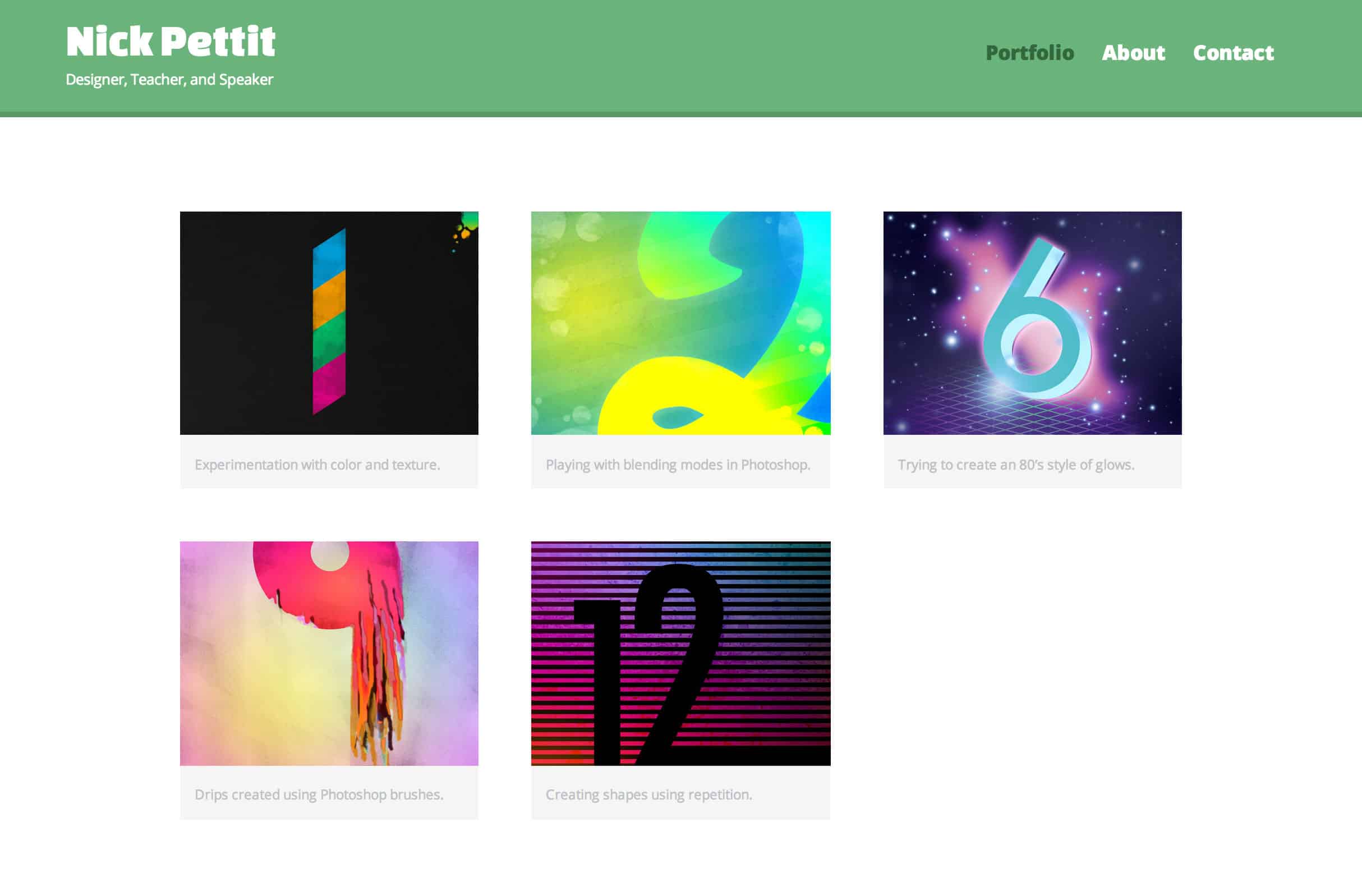

This screenshot of the project is the portfolio page which is intended to showcase design work. Take a few moments to examine the aesthetics of this layout before moving on.
The Desaturation Test
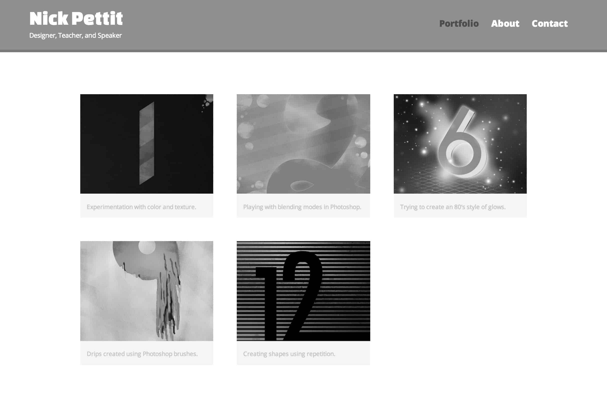
With your screenshot loaded into your image editing application, desaturate the colors completely. The purpose of this test is to find areas of the image that might have a lot of contrast in color but not enough contrast in value (the difference between light and dark). For example, take a look at the portfolio piece in the top center. The number 2 has some well defined yellow edges in the color version, but as soon as it’s black and white, the lines become a bit fuzzy. This particular instance isn’t too bad, but if you run this test and find page elements that appear to blend together (especially text) then you should reconsider the colors and values.
Contrast in value is desirable for many reasons. First, humans are much more sensitive to changes in value than changes in color, so if you’re trying to highlight some page elements or make text legible, contrast is paramount. Secondly, there are millions of people that have some form of color blindness or related vision impairment. If you’re able to differentiate between two page elements using both color and value, then you’ll make your site accessible to more people.
If you only do one of these three tests, make sure it’s this one. In most cases, you’ll uncover at least one area of poor contrast that should be fixed.
The Blur Test
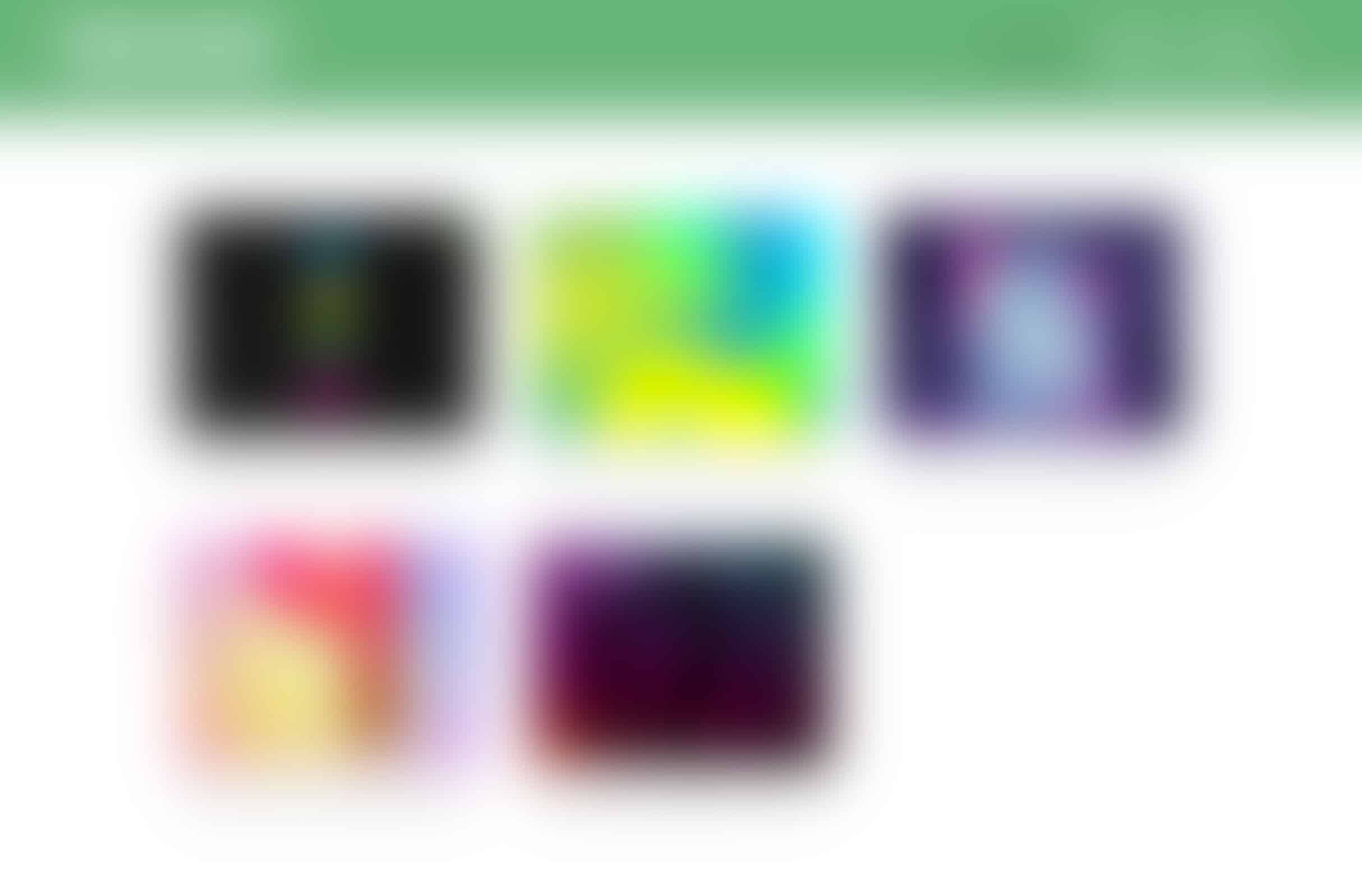
In this test, you’re looking at several things. Contrast in values comes to mind, but this is also a great way to look at the mix of color saturation across the screen. For example, if you’re going for a more subdued look, you probably don’t want bright complimentary colors sitting next to each other.
It’s also a helpful technique for examining your composition. For example, in this layout, the “heavy” and dark portfolio pieces are evenly distributed in a checkerboard pattern with the “light” and colorful pieces. This adds a bit more variety and makes each piece stand on its own just a little bit more than if all the lights and darks were clumped together. I should note that this can be slightly situational. In the case of this portfolio site, we wouldn’t want an extremely graphic and colorful header to overpower the image gallery. Rather, the header should be subtle and allow the gallery to shine.
Accessibility also comes to mind once more in this test. By starting out with a small amount of blur and slowly ramping it up, you can visualize which pieces of text on your page are the most legible to people with varying degrees of vision impairment. Adjusting the amount of blur can also highlight the “scannability” of your design and show which elements people might pick up on first.
The Upside-Down Test
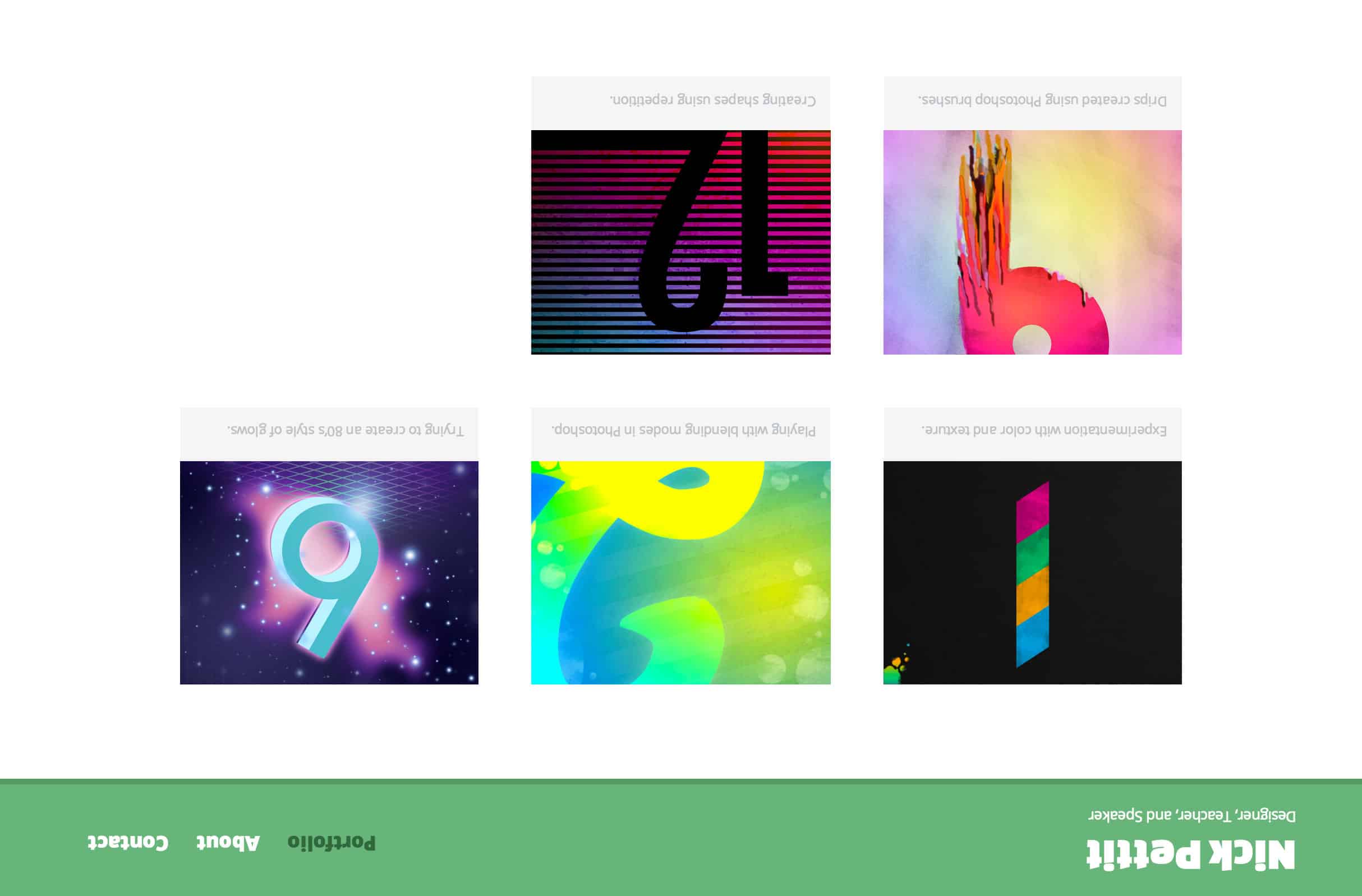
Last but not least is the upside-down test. By flipping your design 180 degrees, you can isolate the composition and balance. You may even want to take this a step further and draw a line straight down the middle of the page. This will help you to identify issues with the composition where one side might feel too heavy versus the other side. Fortunately, this layout is fairly symmetrical, so there’s not much to worry about. If, however, all the dark imagery was in a single column down one side of the page with only light text to balance it on the other side, a balance problem might be much more apparent. More simply, if you’re in need of a fresh perspective (literally and figuratively) on the aesthetics of your website, this test might help.