Having a user-friendly website in the modern day is no longer advised. Instead, it’s required.
If your website isn’t user-friendly, traffic will bounce faster than you can blink.
In fact, poor usability on your website directly impacts ranking factors for both mobile and desktop.
The only problem is: improving your website and making it more user-friendly isn’t just a simple fix.
There is rarely a single step that turns your website into a UX dream overnight.
It can require tons of A/B testing, revamps, and total redesigns.
But before that, you need to plan.
Instead of jumping into the deep end and enlisting the latest miracle tactic to fix your website, you need to understand your website.
In this post, I’ll show you how to do just that. But first, what defines a user-friendly website, and what are mind-maps?
Contents
- 1 What Defines a User-Friendly Website?
- 1.1 Website speed/page speed: How fast your website loads.
- 1.2 Site/information architecture: how your website and pages on your site are structured.
- 1.3 Feature usability: how intuitive and useful are your features? Do they create an experience that is user-friendly, or do they hinder it?
- 1.4 User intent: what a searcher is expecting to get when landing on your website.
- 2 What is a Mind-Map?
- 3 Mind-Maps Help You Plan User Behavior and Overcome Roadblocks
- 4 Plan Page Content Using Mind-Maps to Optimize For Intent And Speed
- 5 Conclusion
What Defines a User-Friendly Website?
Before we can dive into using mind-maps and building a more user-friendly site, we need to define what exactly is considered “user-friendly” these days.
With buzzwords and tactics circling the internet, it’s hard to know what to focus on to improve the user experience.
Thankfully, I’ve done the research and I have the experience. As well as expert opinions on the subject to help inform you on what factors to focus on first.
Here we are going to use the Pareto Principle, otherwise known as the 80/20 rule.
Meaning we will focus on 20% of user-friendly adjustments that net you 80% of the results.
Currently, these are the biggest factors for good user experience:
Website speed/page speed: How fast your website loads.
According to the latest data, shooting for under three seconds is the best practice:
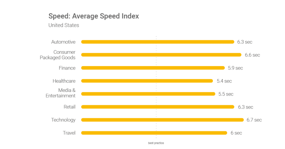
Image Source: Think With Google
Website building expert Nick Schäferhoff says “A slow-loading site increases your bounce rate. If that happens, the big G (Google) will take note and downvote you since they consider this behavior a sign of a low-quality site.”
Slow speeds on your site are one of the biggest killers of the user experience. And as expert Nick Schäferhoff states, Google takes close notes on this user-friendly factor.
Site/information architecture: how your website and pages on your site are structured.
Information architecture is the bridge between design and development. IA involves how information is stored, displayed, and accessed on your site by users.
For example, taking a look at Amazon, you have a clear path of IA from the moment you land on their site:
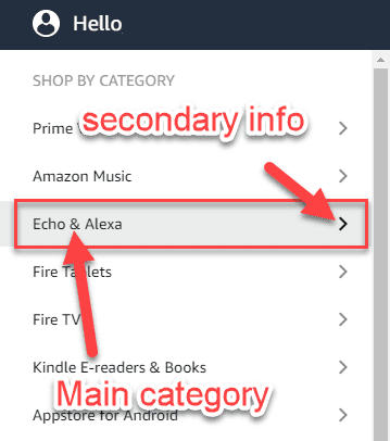
Information is easy to access and interpret as a user, providing a seamless and stress-free experience.
Feature usability: how intuitive and useful are your features? Do they create an experience that is user-friendly, or do they hinder it?
For example, features like sliders can be great to showcase products or service offerings in condensed spaces, as Right Inbox does:
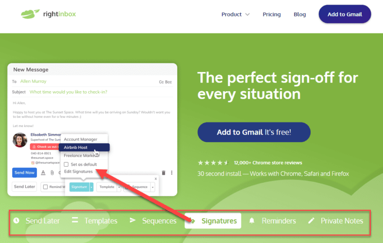
Image Source: Right Inbox
But they might be less user-friendly if you load them with seemingly endless options.
User intent: what a searcher is expecting to get when landing on your website.
Creating a user-friendly website is more than just technical. It also is highly dependent on your content and matching the intent of searchers.
If your searchers are looking for courses and tools to learn web design…

…you better deliver on that promise if you want your site to be user-friendly:
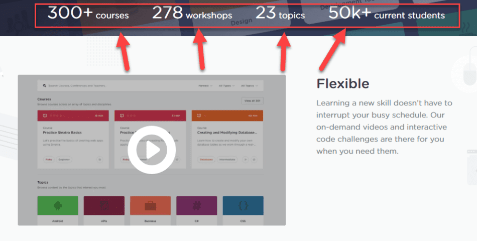
Now that you’ve got a solid grasp on key aspects of a user-friendly site, it’s time to plan out your changes using mind-maps.
What is a Mind-Map?
As a quick refresher, mind maps are ways to brainstorm and list out information in a visual way:
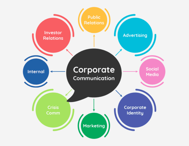
Image Source: VennGage
They can help you structure complex ideas into simpler outlines that you can later execute on.
Whether it’s mind-mapping your information architecture for user behavior or planning content ideas for intent, mind-maps are fantastic for breaking down information into actionable steps.
Here is how to put them to use.
Mind-Maps Help You Plan User Behavior and Overcome Roadblocks
While it’s amazing to see great websites and take their work as inspiration for your own project, that rarely results in a user-friendly site.
Why?
Every business is different. Each business offers unique value, branding, and customers.
Meaning experiences can rarely be replicated and still provide a great experience for people on your site.
Before you even touch a line of code, mind-mapping existing user behavior can save you countless hours in the development stage.
A mind-map of user behavior will help you better understand common paths on your current site, roadblocks, and ways to improve.
So, how do you get started?
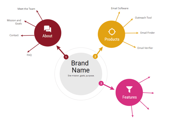
First, start with a mind-map template. The goal here is to start listing your information architecture. I.e, how data is structured on your site currently or how you want it to be structured in the future:
Once you have a basic idea of structure, it’s time to take it further, developing your IA into a user-flow of how you want traffic to “behave” on your site:
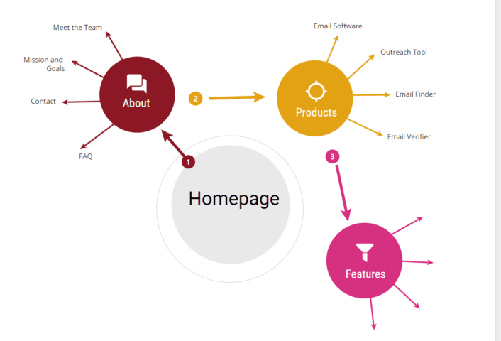
In this example, I want to build a more user-friendly site that is simple to follow. So, I start by listing out my most important pages:
Homepage -> About (to learn more about the company and why they should stay) -> products (see what we offer and if it fits their intent) – > features (get a more in-depth look at what tools work for their needs).
While this all sounds great in theory, you might be dead wrong. In this case, fire up Google Analytics. Using analytics you can get an average understanding of the typical behavior on your site:
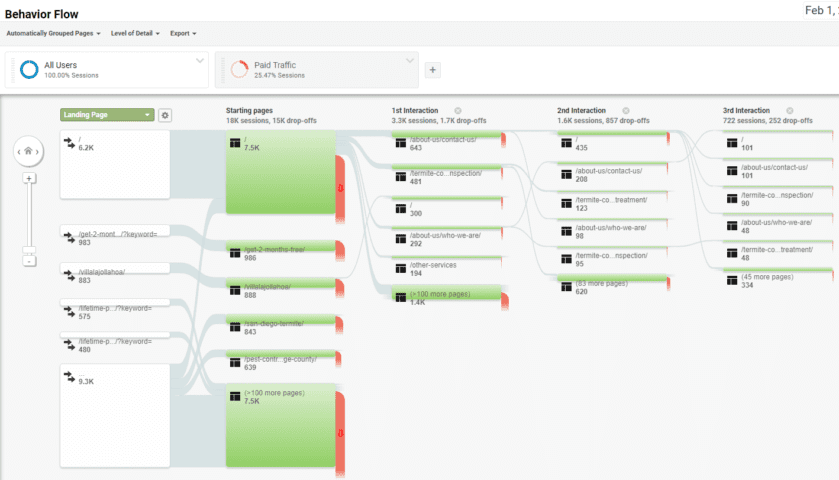
The behavior flow on Google Analytics shows you a high-level overview of common paths taken on your site.
In other words, it shows how real users engage with your information architecture, whether you intended it to be that way or not.
Using this information, start to compare your mind-map ideas of user-friendly site design to actual engagement.
Do your goals align? Great!
Is the Behavior Flow on Analytics far off from your mind-map? If so, your site structure is likely not as intuitive or user-friendly as it could be.
For example, if first-time users are landing on your homepage and then visiting a product and bouncing, your site might be optimizing too heavy towards selling, rather than showcasing your brand.
Using a mind-map, you can start to list out these roadblocks and how to shift site design from CTAs to structure to influence behavior, creating a more seamless and user-friendly journey.
Plan Page Content Using Mind-Maps to Optimize For Intent And Speed
Both user intent and page speed are big factors in whether your site is user-friendly or not.
Slow sites are terrible to explore, leading to bounces and poor rankings.
Poor content (that doesn’t match user intent) leads to frustrating experiences and more bounces.
Correcting both can lead to a friendly site experience that keeps people coming back time and time again.
To get it done, mind-mapping is an amazing tool.
First off, mind-maps are great for content planning that matches user intent and is easy and fluid to consume.
Content structure is a huge portion of a user-friendly site. After all, most of your traffic is likely coming from organic visits to blog content.
If your content is structured poorly, readers will be left confused, cementing negative brand awareness.
On the positive side, well-structured content is easy to read and keeps you coming back for more.
For example, in a post from MailShake on mapping out your sales process, the outline and flow of the content is mapped perfectly for user intent:
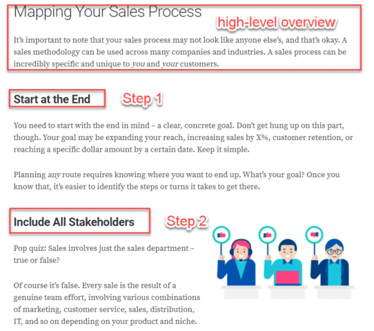
The structure of this post follows a logical, informative flow.
Instead of just finding a target keyword list and writing, sit down with your mind-map and brainstorm your headline. Then, add branching off H2s for subheaders in a logical order. Start to further break them down with H3s and more.
So, what about site speed?
For site speed, mind-maps will help you lay out a concrete plan for each page’s individual elements.
Whether that’s videos embedded, social sharing, or interactive elements.
As you mind-map, note that each of these features impacts site speed in a negative way.
While in theory multiple interactive elements on your page sound fantastic, it can be a UX nightmare.
Using your mind-map you can start to eliminate elements that don’t play a key role in the conversion process or provide slower experiences.
Mind-maps are one of the best ways to build a user-friendly site.
They allow you to slow down, plan in advance, and understand user needs before diving into coding and development.
Conclusion
Building a user-friendly website is no longer an option. It’s a need.
Consumers won’t stick around on your site if it’s not user-friendly.
And if you aren’t building user-friendly sites, people won’t trust your work to perform.
Using mind-maps can help you understand website goals and match those goals to a logical, consistent user-friendly experience.
Utilize them today to better plan and execute on your vision to create a site that not only looks great but is user-friendly as well.
Alex Sloane is a freelance writer and content optimization specialist. He has worked with dozens of SaaS and B2B companies to capture more organic traffic from better content. Recently making the full-time jump to freelance work, Alex loves forming new partnerships.




I have never thought about how useful the behavior flow on Analytics can be; surprising how often people (including me) neglect this section. This post is so helpful in developing a mind map for building a great website.
Excellent article Alex. Mind maps can be pretty useful for both creating site architectures and also visualize the flow of users through pages. Loved this piece.
Ram