Last Updated on May 21, 2015 by Laura Coronel
Recently I tweeted about my experimentations with an idea that I’m calling multiplane design.
I’ve been experimenting with multi planing using 3D and SVGs: http://t.co/l4h1slT4jK Only works on desktop Chrome/Safari (for now).
— Nick Pettit (@nickrp) August 4, 2013
Right now this experiment only works well in Chrome and Safari on the desktop; other browsers will have mixed results that I can’t account for yet. I learned a lot while making this, so I’d like to explain my thought process and then discuss some practicalities. Click the demo button and then scroll down to see it in action.
See the Demo Download the Code
Contents
It Was All Started by a Mouse
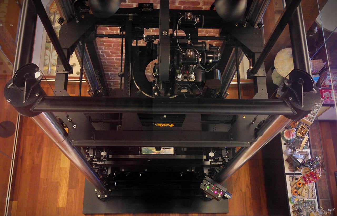
On a recent trip to San Francisco, I paid a visit to the Walt Disney Family Museum. It’s a beautiful building next to the Golden Gate bridge that showcases Walt’s life and his ideas. Many things stood out to me, but I was most impressed by the multiplane animation camera they had on display:

The multiplane camera uses moving layers of painted glass to create a parallax effect, giving the illusion of 3D depth to 2D images. The camera was first tested in the 1937 Academy Award winning short The Old Mill and was then used in many subsequent Disney feature length cartoons. Here’s a video of Walt explaining the technology:
Multiplane Design
My fascination continued long after my museum visit. I thought, “Surely someone has built this in a web browser.” My Google searches didn’t find anything decent, so I started thinking about creating it myself using layered transparent images. Here’s how I did it.
Choosing Technology
Browser support for CSS 3D transforms is pretty decent these days, so that seemed like the obvious choice for translating the planes and creating the environment. My backup plan was to scale 2D elements and create some faux 3D parallax, but fortunately I didn’t feel the need to dig into it.
Next, I figured that some of the planes would need to be scaled to extremely large sizes but still look good up close. Bitmap images would be completely impractical in this case, but vectors are perfect, so I decided to use SVGs. I should note, browser support for SVGs in CSS background images is good enough for experimentation, but Firefox will pixelate SVG backgrounds when the elements are scaled using a transform. I’m hoping this problem is fixed soon, but one workaround might be to include the image in the HTML instead of using a background.
With my technology choices in mind, I went back to Google and I came across the Beercamp SXSW 2011 website that made the rounds a few years ago. The site doesn’t use any SVG images, but it creates a 3D environment using layered elements, and it even allows you to scroll through them! I downloaded the HTML/CSS/JS, picked it apart, and came up with my own stripped down version. At this point, I knew that with a little more work, multiplaning in the browser was possible.
SVG Assets
Next, I needed to create a scene. My illustration skills are still a work in progress, so I looked through some old Treehouse visual assets and I found this wonderful illustration by Griffin Moore that was never used:

I took the file into Illustrator and modified it for my purposes. I added a dark green hill in the foreground, made the background mountain much larger with a snowcap, and then rearranged the rest of the details. Here’s the result:

After some experimentation, I also scaled each object in Illustrator to match their relative distance and perspective in the scene. For example, the trees in the foreground are much larger than the tiny trees in background. Initially I thought that the 3D environment in the browser would be enough to take care of this (and I can still think of a few ways to make this happen), but that’s not really how this demo works.
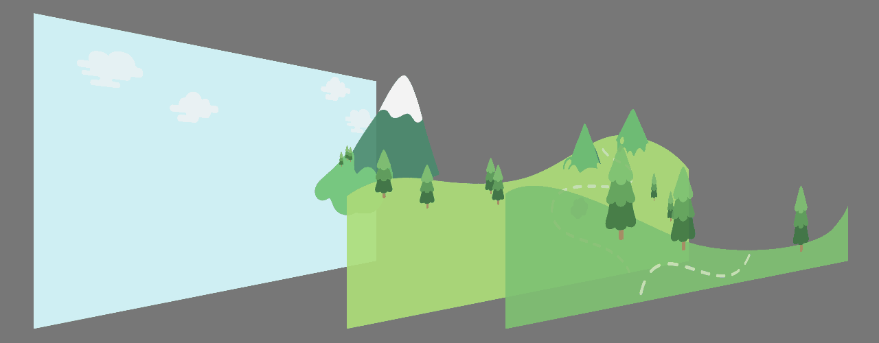
I saved each of the 4 planes as a separate SVG: the grassy foreground, hilly middle ground, the big snowcapped mountain, and finally the cloudy background. Normally you want to size your Illustrator artboard to the size of the SVGs, but I made all 4 SVGs the exact same size and trimmed the artboard to the size of the largest layer. There’s probably a better way to do this, but it worked for me. Here’s a diagram that shows the split between my planes:

Building Scenes with 3D Transforms
Once I mapped each SVG to its own plane, things were starting to come together. After some more digging, I realized the Beercamp SXSW 2011 code actually does something pretty clever that I’d never thought of. The concept of a 3D camera doesn’t quite exist in CSS in the same way that it exists in 3D modeling programs and video games. However, the Beercamp site moves the entire 3D environment along the Z plane, which basically simulates a ‘camera’ and allows you to dolly forward. It does a couple of other cool things like remapping the scroll event to the Z movement of the environment. I was planning to remap scrolling to the relative movement of each individual plane, which is a little more true to Disney’s multiplane camera, but this method is way easier for now.
The last step was to appropriately space each plane relative to one other by translating them along the Z axis, then scale them to fill the browser window. The translation was the fun part; planes that are closer will whiz by quickly, while planes that are far away will appear to move very slowly. The scaling I still don’t understand, and honestly, I just guessed the values until it looked good and had some bleed on the sides. I started reading about the math behind CSS transforms to try and solidify my understanding, but after a few minutes I decided to save that mystery for another day. If you understand this, an explanation in the comments would be appreciated.
What’s Next?
There are a lot of technical problems with this creation (browser support, mobile devices, and so on), but those all seem solvable. I’m more interested in experimenting with practical applications of this. The Beercamp site might be one way to go about things, but that’s not quite the same feeling as moving through a multiplane scene.
A site like this cannot avoid being classified as experiential, so perhaps it’s silly to look for a concrete functional driver. Rather, it might be more useful for creating experiences that are meant to transport you to a place, like the setting of a film or a video game. Heck, you could even bring this full circle and use it on a Disney theme park website.
Taking a step back, I think the timing for this sort of thing is right for what’s in vogue. Flat design is all the rage and it could serve as a nice evolution on the style. How would you use this in a practical setting? I’d love to hear your thoughts in the comments.


If you were to do this technique again today (mult-planing with 2d material), would you take a different approach with the given landscape?
Thank you for sharing this. Excellent.
Hi, that’s a great coincidence, as around that time I uploaded on github a jQuery plugin that enables this exact 3D navigation – it’s just plug n play and you can customize some of its variables and events. Feel free to have a look if it helps with your experiments.
The link(with demo) is here: https://github.com/martzoukos/Pane3D
Whoa, just now saw this comment. That is a crazy coincidence.
You might also want to check out this one: http://wagerfield.github.io/parallax/
Looks like many of us all had the same idea at the same time. 🙂
That’s an amazing demo. CSS transitions ftw! 🙂
Great article, im not sure if SVG’s are the best solution due to file size for some clients projects and the impact on load times especially on mobile / data connections, but i suppose it depends on a particular projects scope.
I found another site that appears to use exactly this technique. http://www.winningontheroad.com/
tested it with firefox nightly (v. 26a) the svg got a little blury but it renders nicely… in ie11 on the other hand… the screen is blank, poor ie…
This is inspiring, thanks a lot for sharing. It would be great this function on a touch device.
Absolutely brilliant! I learnt about Disney’s multiplane technology not too long ago and found it really fascinating (and went and got a copy of Bambi immediately after, to see it in action). Using it in web design is just brilliant 😀
Awesome man. Very nice dear. Really it is. And thanks a lot for sharing this.
I’ve been enjoying the parallax effects on Hobo Lobo (dot) net. Really cool, and anything which can lower the bar will surely raise creativity.
sweet, thanks for the inspiration Nick!
I love the research behind it all.
This is absolute genius!
I second Josh’s comment. Really great article and I especially enjoyed the history.
Wow, great article Nick!
It’s possible to create some really awesome UIs with this.
So many ideas…
Nick, this is an amazing article. This was a great experiment looking into the future. Our hardware will change drastically in the next few years and I think this type of design will be exactly how we’re engaging with the new interfaces. Well done my man. Well done.
Thanks, Josh!
It would be great to get pinch zooming to work on this.