Last Updated on June 11, 2019 by Laura Coronel
Mobile devices came to conquer the planet, and they won. Well . . . mobile devices at least seem to dominate the way in which we access the Web. As a result of the mobile revolution, we no longer have the luxury of deciding whether or not our sites provide a usable experience on smaller screens. In fact, Google is now factoring mobile friendliness into its search rankings.
In an effort to ensure our sites make the grade, many of us turn to Bootstrap and Foundation. These front-end frameworks provide so much out of the box that it is easy to download them, throw a few class names in our HTML, and call it good without thinking. Unfortunately, these frameworks can be heavy and provide a lot of functionality we neither want nor need.
If you’re using Bootstrap or Foundation simply for the grid, you have better options. Think of the grid like a bit of tomato sauce. All you want is the sauce. Sadly, you’re getting a whole pizza. What if you wanted to make ravioli? Just pull apart the pizza, hide all the toppings somewhere else, scrape off the sauce, and then you can start. Wouldn’t you rather start with what you asked for–a little sauce?
If you’ve ever looked for a framework that lets you pick the features you want, doesn’t dictate your design, and keeps your code semantic, Bourbon and Neat may be exactly what you’re looking for. Let’s see how we can ditch the heavy frameworks and take control of our design.
Contents
Sass
First things first, Bourbon and Neat are Sass libraries. Unfortunately, this tutorial won’t do you much good if you don’t have a basic understanding of Sass. Fortunately, there are great resources for learning Sass here on Treehouse. Once you start with Sass, you’ll never go back to writing plain CSS.
You Have Some Basic Sass Experience
One of the great benefits to writing Sass or Less is the ability to use and manipulate Sass or Less libraries and frameworks. At the end of this article, you may decide that Bootstrap or Foundation is still the right choice for your project. The point here is not to disparage those frameworks in any way. I want you to have options. However, if you’re using only the pre-compiled CSS rather than Sass or Less, you’ve already given up a lot of the control.
OK, OK . . . I’ve sold you on the whole Sass thing, but why should you try Bourbon and Neat? Let’s get started and let these libraries show you.
Installation
This tutorial includes installation instructions for both Mac and Windows. There’s no need to read both unless you’re curious, so just skip to the one you need.
Installing Bourbon and Neat on Mac
To install Bourbon and Neat you first need Ruby and Sass installed. The good news is that Ruby is already installed on a Mac, so you’re halfway there.
The easiest way to install Sass is via the terminal, so go ahead and open Terminal. If you want more installation options, definitely check out the Sass installation documentation.
Once you have terminal open, installing Sass is as simple as running gem install sass
If you get an error saying something such as “While executing gem …(Gem:FilePermissionError) You don’t have write permissions for . . . ,” you likely need to run the command using sudo. sudo gem install sass
With Sass installed, we can get Bourbon and Neat installed next. Thankfully, these are easy, too. To install Bourbon, run gem install bourbon
Before you ask, yes Neat does rely on Bourbon, so you will need to install Bourbon before you install Neat. You can’t use Neat on its own, so go back a step and install Bourbon if you skipped ahead. Installing Neat is just as simple as you guessed. Run gem install neat
Now that Bourbon and Neat are installed, let’s navigate over to our Sass project and add the Bourbon and Neat libraries in the appropriate directory. For this example, I created a sample project called sass_demo_project in my Sites directory. Let’s cd to that directory by running cd ~/Sites/sass_demo_project
Inside my project directory I have another directory called scss and there are a few files inside of it. These files are some of the standard partials you might have in a Sass project such as “_mixins.scss,” “_variables.scss,” and “_reset.scss.” There is also my core manifest file (the one that pulls everything together and gets compiled to CSS by Sass) called “app.scss”. Now, aside from these standard files, I like to create a directory called “libraries.” I tuck all my third-party libraries into this “libraries” directory. This practice allows me to keep things tidy and maintainable.
Let’s cd from our main project directory into that libraries directory and add Bourbon and Neat to our project.
cd scss/librariesbourbon installneat installThat’s it. You should now have Sass, Bourbon, and Neat installed. You should also have Bourbon and Neat added to your project. Now we can start using the tasty grid, mixins, and variables.
Installing Bourbon and Neat on Windows
To install Bourbon and Neat you first need Ruby and Sass installed. Though it isn’t difficult to install Ruby or Sass on a Windows machine, it will take a few minutes, so let’s dive in.
To install Ruby on Windows, there is a helpful little package called RubyInstaller. For a full guide, check out the RubyInstaller documentation. At the RubyInstaller site, you can choose the Ruby build that best suits your environment. As noted in their documentation, “If you don’t know what version to install and you’re getting started with Ruby, we recommend you use Ruby 2.1.X installers.” Download RubyInstaller and run the package.
A big plus of installing Ruby with RubyInstaller is that it comes with a command line powershell to help you install Ruby gems, which is exactly what we need to do next.
With Ruby installed, let’s open command prompt with Ruby. You can do this by searching for “Ruby” in the Windows explorer (bring it up with your Windows key). You should see an option called, “Start Command Prompt with Ruby.” With this open we can install Sass, Bourbon, and Neat.
If you want more installation options, definitely check out the Sass installation documentation.
First, install Sass by running gem install sass
It may take a second, but you should get a message in the command prompt saying, “1 gem was installed.” Next you can install Bourbon by running gem install bourbon
Before you ask, yes Neat does rely on Bourbon, so you will need to install Bourbon before you install Neat. You can’t install Neat on its own, so go back a step and install Bourbon if you skipped ahead. Installing Neat is just as simple as you guessed. Run gem install neat
Now that Bourbon and Neat are installed, let’s navigate over to our Sass project and add the Bourbon and Neat libraries in the appropriate folder. For this example, I created a sample project called sass_demo_project on my Desktop. Let’s cd to that folder by running cd C:\Users\MyUserName\Desktop\sass_demo_project
Inside my project folder I have another folder called scss and there are a few files inside of it. These files are some of the standard partials you might have in a Sass project such as “_mixins.scss,” “_variables.scss,” and “_reset.scss.” There is also my core manifest file (the one that pulls everything together and gets compiled to CSS by Sass) called “app.scss”. Now, aside from these standard files, I like to create a folder called “libraries.” I tuck all my third-party libraries into this “libraries” folder. This practice allows me to keep things tidy and maintainable.
Let’s cd from our main project folder into that “libraries” folder by running cd \scss\libraries
I’m now in the folder where I want to add Bourbon and Neat, so let’s do that by running bourbon install
I install Neat the same way: neat install
That’s it. You should now have Sass, Bourbon, and Neat installed. You should also have Bourbon and Neat added to your project. Now we can start using the tasty grid, mixins, and variables.
Everything is Ready. Now What?
Hopefully installing the Bourbon and Neat libraries was less work than you thought. If you’ve come this far, congratulations–you’re ready to pour some Bourbon goodness into your project. Let’s open our “app.scss” file and get our @import statements added to the top of the file.
When adding your @import statements, it is important to remember which files depend upon other files to compile properly. The whole idea behind using a library of pre-written code is to save time and build on top of that library. This means the files you write will depend upon the variables, mixins, and functions in the libraries you import. For this reason, you want your libraries to be imported before your own code. That means our Bourbon and Neat imports go at the top. Further, Bourbon goes before Neat because Neat depends upon Bourbon.
Remember, I put the Bourbon and Neat libraries inside a directory called “libraries,” so my imports will look like this:
@import "libraries/bourbon/bourbon.scss";

@import "libraries/neat/neat.scss";
Next I will import my own partials.
@import "_reset.scss";

@import "_variables.scss";

@import "_mixins.scss";
Bourbon
What does Bourbon bring to the table? Bourbon offers many of the things you would expect from this type of library: browser-prefixed gradients and animations, font stacks, and even some CSS animations. Essentially, Bourbon does a lot of the cross-browser compatibility work for you. That’s pretty great, and so is the Bourbon Documentation. I highly recommend going through the Bourbon docs to see what you might pull from Bourbon for your own projects.
Again, what is great about this approach compared to using a heavier framework (especially if you’re using the pre-compiled CSS rather than Less or Sass) is that you have so little to fight with. Once you compile your Sass, the resulting CSS is exactly what the app needs—nothing more, nothing less (no pun intended).
Don’t worry, I didn’t run you through all that installation work to leave you reading the docs, but we will part ways with Bourbon at this point. What I really want to focus on is Neat. My guess is that a lot of folks are using something such as Bootstrap or Foundation primarily to get a responsive grid. This approach is completely understandable. We don’t always want to roll our own grid. Again, we’re trying to save time. Unfortunately, using many grids can lead to problems with maintainability.
Neat
Have you ever inspected a site and found things like class=".col-md-3" or class=".col-xs-12 .col-sm-4 .col-lg-8" embeded in the HTML? Maybe you have code like that in your own projects. Not only do all these class names get messy, they also fly in the face of best practices. Essentially, this type of code is using html to provide the layout for a site, but that’s not what HTML is for. We have CSS for presentation. Leave the HTML out of it. HTML is for structure, CSS is for presentation, and JavaScript is for behavior, right?
What about CSS animations; those are behavior, aren’t they? OK, OK it’s not a perfect world and lines become blurred, but separation is still worth striving toward in order to keep projects maintainable. Do you really want to change every occurrence of a class name if the authors of the framework change the class name in an update? I certainly don’t. Let me show you how you might approach a simple page layout with Neat and avoid the messiness.
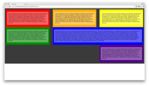
Let’s imagine we have a 12 column grid (the Neat default) and three rows in that grid. The top row has three divs and each needs to span four columns. The second row has two divs. One of the divs needs to span four columns and the other should span the remaining eight columns. Lastly our third row has one div and it should span four columns; however, this div also needs to be pushed to the four columns farthest to the right. All of this should be inside some sort of container to keep the page from ever expanding too wide. It might looks something like the colored blocks below.
The image above is pretty ugly, but I hope it makes the divs stand out clearly. The top row contains our three divs that each span four columns. Next we have our middle row with two divs, and lastly we have the weird div pushed all the way to the right. These divs are all contained inside the grey box, which is our main container. Our HTML structure is simple, and its structured like this:
What you should notice is that there are no class or id names that are required to define our presentation. Remember the class=”.col-xs-12″ bloat you see in a Bootstrap project? You won’t see any of that here. The Neat library is not prescribing class or id names. Where I put in an id name that might seem like it defines presentation such as “top-row,” “middle-row,” and “bottom-row” it is only because I thought those names made sense at the time. I could easily change the name of “middle-row” to “row-two.”
Where I actually control presentation is in my Sass, which is what I want. Let’s take a look at the Sass for this page:
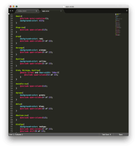
Like the HTML, the Sass is written as simply as possible to make the demonstration clear. The main container for the page has an id of main, so I will target that. Neat provides us a mixin called outer-container(); As noted in the Neat documentation, this mixin “centers [the container] in the viewport, clearing its floats, and setting its max-width.” We just add that mixin to the div with the id #main.
#main{
    @inlcude outer-container();
}
The outer-container() mixin also takes the desired max-width as a parameter, so I can easily make my outer container wider or narrower. It’s deliciously flexible. Even better–it’s optional. You don’t have to include an outer container at all. The library doesn’t define your design, and you don’t fight with it to make something unique.
#main{
    @inlcude outer-container(1920px);
}
Inside of my outer container, I have three rows, and I want each one to span the full 12 columns of my grid–simple enough. I can target each one and include the Neat mixin, span-columns(). This mixin takes the number of columns you wish for the div to span as a parameter. Since I want each div to span 12 columns, I will put in the number 12.
#top-row{
    @include span-columns(12);
}

#middle-row{
    @include span-columns(12);
}
#bottom-row{
    @include span-columns(12);
}
So far so good, but now we have each one of the divs inside our sections spanning all twelve of the columns as well. This isn’t what we want.
Can we just include the same mixin for those divs? You bet. However, we do have a little change. We know that each div can span up to 12 columns, because that’s how many columns the parent element spans (our top row). In the case of the top row, we want each of our three divs to span four of the 12 columns. Logically, we can write it that way when we pass the parameter to our span-columns() mixin. That means each of the of the divs inside our top-column section should include @include span-columns(4 of 12);
Let’s add that to the divs #red, #orange, #yellow, because those are the ones inside of the top-row section of our HTML structure.
#top-row{
    @include span-columns(12);
}

#red{
    background-color: red;
    @include span-columns(4 of 12);
}

#orange{
    background-color: orange;
    @include span-columns(4 of 12);
}

#yellow{
    background-color: yellow;
    @include span-columns(4 of 12);
}
Now we’re getting somewhere. You can probably guess how the second row will come together.
#middle-row{
    @include span-columns(12);
}

#green{
    background-color: green;
    @include span-columns(4 of 12);
}

#blue{
    background-color: blue;
    @include span-columns(8 of 12);
}
Ok, that middle row was easy. We just did the math for the two columns and put them together the same way we did with the top row. Things are starting to look pretty good (stay with me). What about this last row though? How can we make it span four columns but have it sit all the way to the right of our bottom row? That’s where we make use of the Neat mixin, shift(). The shift() mixin takes the number of columns you want to shift an item as a parameter. Since we want our div to span four of the 12 available columns but sit all the way to the right, we need to shift it eight columns.
#bottom-row{
    @include span-columns(12);
}

#indigo{
    background-color: indigo;
    @include span-columns(4 of 12);
    @include shift(8 of 12);
}
Again, this might not be the prettiest thing, but you get the idea. The true beauty is that you, rather than your framework, are in control.
Before we part ways, you might be wondering if we can change the number of columns an element spans at a media query. Of course we can. We don’t want our projects looking ridiculous on a small screen. Otherwise, what was the point of this whole grid in the first place.
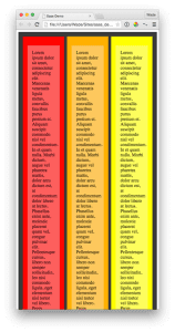
Let’s tackle that top row at a break point of 768px. I’m fine with my row taking up 12 columns, but I would like my divs to stack rather than going Stretch Armstrong, so I’ll change them. I want each div to span 12 of 12 columns at my break point. I can do that pretty easily with the code below.
#red, #orange, #yellow{
    @media screen and (max-width: 768px){
        @include span-columns(12 of 12);
    }
}
Now we get something like the image below.
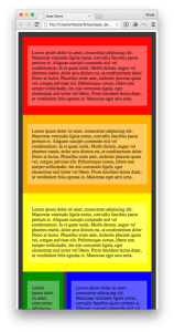
We can continue this with the rest of our divs. We can shift columns or do anything else at a defined media query. In a real project you may be organizing your Sass with nesting or other structure in mind, so don’t let this overly simplified example put you off. Neat will handle what you’re doing just fine.
We have scratched only the surface with these libraries. Play with them and take a look at the Bourbon and Neat documentation–it’s easy to follow and well maintained. Neat includes the ability to control the direction of your layout, it includes a visual grid overlay for help with layout, and so much more.
My hope is that you now feel empowered to take your layout and design into your own hands. Use what you want and ignore what you don’t. I simultaneously want my frameworks and libraries to save me time and be transparent. That’s what I’ve found with Bourbon and Neat. I hope you find the same. Enjoy!
If you are interested in learning advanced concepts and best practices for Sass, check out our Advanced Sass course.

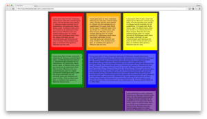
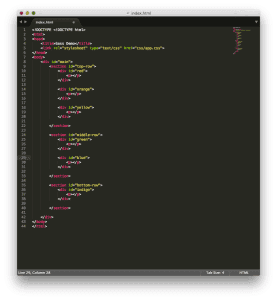
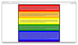
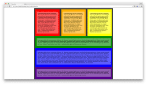


I built the above and I also built a more complex grid using nested elements. Check out the Git repos here: https://github.com/Siegoboy/
s/inlcude/include
Just awesome, thanks mate.
It’d be great to see Git repos of the code from each of these blog posts.
Screenshots of your HTML and Sass code aren’t very accessible or user-friendly, and there was obviously some other Sass/CSS included that you didn’t show or describe (like the lighter background for the paragraphs, padding and margins, and the contents of the partials, if any).
That aside, I’m definitely impressed by how simple it is to get a grid up and running with this. I pretty much manually coded a flexbox grid in Sass for my personal photoblog.
Does Neat have a flexbox-based option?
Yes, neat has a whole host of flex-box mixins.
Would love to see a treehouse start-> finish full website/SPA tutorial with sass neat bourbon refills bitter whatever. You can basically create your own bootstrap 🙂
This is very interesting article. I truly appreciate it
Great article! If you want to read more about neat and bourbon and see comparison between compass and susy, how to replace compass spriting, you can visit my article: https://www.devbridge.com/articles/increasing-sass-compiling-performance-or-when-every-second-counts/
Thank you for sharing best practice.
I love Thoughtbot and they do some wonderful stuff, Bitters is also a top-notch addition to Bourbon and Sass. That said, in case anyone is going to venture into Neat, this has been my experience: I use Bourbon/Neat/Bitters on a fairly large site. I don’t ‘template’ the pages, they are all designed to be the best they can be with the content. So far, so good. However, because it’s semantic, it ends up being a ton more code. In the end, for me, it’s a lot easier to just write .medium-6.columns (I’m a Foundation fan). I’m currently redoing the site (for various reasons), but I’m putting it into Foundation this time around.
This article was actually really cool. Keep it up!