Last Updated on May 21, 2015 by Laura Coronel
There are many techniques you may follow to create generic HTML5/CSS3 website layouts. Designers often talk in terms of columns such as 2-col or 3-col styles. There are many CSS libraries based around grid design which also allows for easy column construction. But in this article I want to look at creating your own website layouts from scratch using bare-bones HTML and CSS codes.
I have provided a few demo pages within the article to explain various methods of building column-centric website layouts. Even though web standards have come a long way there are still very few scalable methods for creating fixed+fluid columns together. Older browsers such as IE6 still require CSS clearfix hacks on floated element containers. But it is my hope to introduce the most common solutions together in this article as a resource for developers.
Contents
Fully Liquid Layouts
We can start by explaining liquid-based columns as the easiest solution. Generally your website would be coded in units of percents or ems. Applying percentages will give you more control over the entire width of each column and the wrapper container. Ems are a newer unit of measurement based on the current font size relative to the parent container. These units are better for sizing padding or font sizes, but they can also work in fluid layouts when done properly.
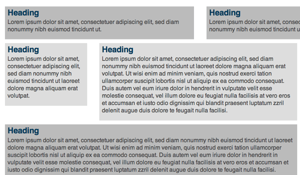
I want to provide a very helpful article on liquid web layouts written by Russ Weakley. You will notice a myriad of examples on the page which illustrate how you can setup margins between column lengths. I personally enjoy this live demo which explores a set of different CSS classes for different column styles. By coding fluid div elements together in a container you have more control over the positioning and scale of resizing the browser window. The CSS property min-width allows you to set a limit value down to the smallest possible width.
On the modern web it is not always feasible to run fluid widths on all columns. This reasoning comes from the use of custom images or logos within your footer or sidebar areas. It’s a good idea to limit the minimum width so these images aren’t forced to resize and appear too small. The same rule applies to ad zones, signup forms, and other content-sensitive widgets.
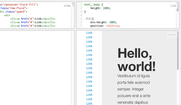
A more systematic approach is to build some fluidity into your layout along with a fixed sidebar column. Then you can have the main content area stretch as the browser window resizes and leave all static content alone. I found an excellent post on Stackoverflow discussing columns with Twitter Bootstrap. This only requires the Bootstrap CSS library and you can check out a live demo on jsFiddle using 2-columns with different backgrounds.
2 Columns Fluid-Fixed
In a similar vein as above I want to offer a simpler solution based on classic CSS properties. The fluid+fixed combination is very popular yet may require hacks to work properly. You may try absolute positioning, but this can get messy if you aren’t familiar with relative/absolute property values. The best solutions are often done using floats and clearing the gutters for lower content. An article published by Darian Brown goes into this technique in some more detail.
#wrapper {
  margin: 0 auto;
  max-width: 700px;
  padding-right: 320px; /* padding should be the total width of all right columns */
}

#content {
  float: left;
  width: 100%;
  min-width: 400px;
  padding-right: 20px;
}

.sidebar {
  float: left;
  width: 300px;
  margin-right: -1000px;
  padding-top: 50px; /* extra space padding */
}
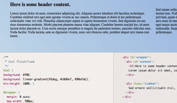
We need a top container along with two inner divs for the content and sidebar area. The content will span 100% of the wrapper and be floated left, along with the sidebar. However we place some additional padding onto the right side which pushes inner content away from the sidebar. This padding should equal the same value as the width of the sidebar – so 200px padding leaves 200 pixels of room for our sidebar. I added these codes into a simpler demo on Gist which you may copy for your own layouts.
Over these next layouts we will focus on fluid and fixed content together in the same wrapper with 3 columns. I want to start by using 2 sidebars fitted together on the same side. When you have enough navigation and content it is easily possible to design for 3 columns. We should allow the center content area to resize naturally while the two sidebars have a static width.
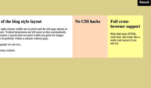
Matthew James Taylor published a lot of these basic CSS layouts on his website and I want to look at his simple idea for dual sidebars. You will notice this trend in an older blog post which also explains & demonstrates how to duplicate the layout effect.
<div id="wrapper">
  <div class="colmask blogstyle">
    <div class="colmid">
      <div class="colleft">
        <div class="col1wrap">
          <div class="col1">
          <h2>Pixel dimensions of the blog style layout</h2>
          <p>In this layout the center and right column widths are in pixels and the left page adjusts in size to fill the rest of the screen. Vertical dimensions are left unset so they automatically stretch to the height of the content. Layouts that use pixel widths are great for images because you can make them fit perfectly within a column without gaps.</p>
          <p>And this is just another paragraph we can use...</p>
          <p>I feel we can see a lot of dummy content.
          </div>
        </div>

        <div class="col2">
          <h2>No CSS hacks</h2>
        </div>

        <div class="col3">
        <h2>Another Column!</h2>
        <p>Blah blah basic HTML code here. this looks like a really sick layout if you ask me.</p>

        </div>
      </div>
    </div>
  </div>
</div>
Some developers are put off by this method because it does require a large number of container divs. The reasoning is to keep solid background colors cascading down the page no matter which container has the most content. This problem used to be solved with a vertically-repeating background image using the same BG colors. But since we can now use CSS it is an easier solution to append a few extra HTML elements.
#wrapper { margin: 0 auto; max-width: 1000px; min-width: 600px;  background: #fff; }

.colmask {
  position: relative;
  clear: both;
  float: left;
  width: 100%;
  overflow: hidden;
  margin-bottom: 50px;
}
.blogstyle { background:#ff9; }

.blogstyle .colmid {
  float: left;
  width: 200%;
  margin-left: -200px; /* Width of right column */
  position: relative;
  right: 100%;
  background: #FFD8B7; /* Centre column background colour */
}

.blogstyle .colleft {
  float: left;
  width: 100%;
  margin-left: -200px; /* Width of centre column */
  background: #fff; /* Left column background colour */
}

.blogstyle .col1wrap {
  float: left;
  width: 50%;
  padding-bottom: 1em; /* Centre column bottom padding. Leave it out if it's zero */
}

.blogstyle .col1 {
  margin: 0 15px 0 415px; /* Centre column side padding:  	Left padding = left column width + centre column left padding width  -  Right padding = right column width + centre column right padding width */
  position: relative;
  left: 100%;
  overflow: hidden;
}

.blogstyle .col2 {
  float: right;
  width: 170px; /* Width of left column content (left column width minus left and right padding) */
  position: relative;
  left: 185px;  /* Width of the left-had side padding on the left column */
}

.blogstyle .col3 {
  float: right;
  width: 170px;  /* Width of right column content (right column width minus left and right padding) */
  position: relative;
  left: 555px;
}
But if you don’t mind the longer markup I commend Matthews solution and it runs perfectly in all standard browsers. If you want to check out a simplified example I have created another code Gist with the basic code snippets.
3 Columns Fixed-Fluid-Fixed
The other popular alternative for 3-column layouts is fitting both sidebars on opposite sides with content centered in the middle. The biggest problem I have run into is getting all columns to float properly and clear all the lower content in older browsers. Some versions of Internet Explorer require hacks for clearfix techniques when using floated containers.
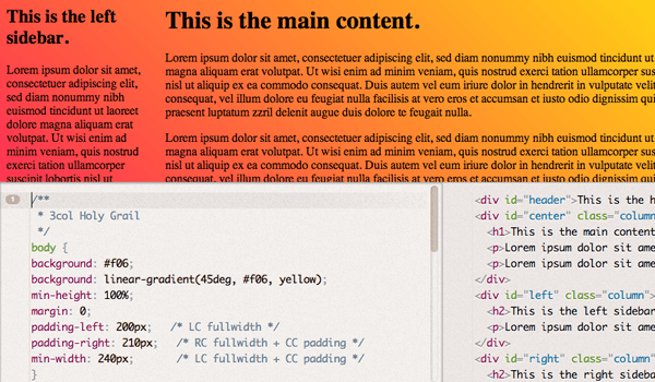
There is an older article published on A List Apart which calls this layout The Holy Grail of all website layouts. Designers have been searching for the perfect solution to this layout which should work using semantic HTML elements and CSS properties. The solution published by ALA is actually a mixture of a couple different techniques. I ported this into an isolated demo on Gist which works beautifully. We can take a quick peek at the source code:
<div id="header">This is the header.</div>
<div id="center" class="column">
  <h1>This is the main content.</h1>
  <p>Lorem ipsum....</p>

</div>
<div id="left" class="column">
  <h2>This is the left sidebar.</h2>
  <p>Lorem ipsum....</p>
</div>
<div id="right" class="column">
  <h2>This is the right sidebar.</h2>
  <p>Lorem ipsum....</p>
</div>
<div id="footer">This is the footer.</div>
This is the basic HTML with much of the Lorem Ipsum removed. Notice that we have the content div appearing first which, although not mirrored on the page, should be the most reasonable approach for search engines. When you have a bot crawling your source code it wants to find the most important content first. Mostly all the sidebar content is static and so it makes sense to place this down lower in the markup.
body {
  background: #f06;
  background: linear-gradient(45deg, #f06, yellow);
  min-height: 100%;
  margin: 0;
  padding-left: 200px;   /* LC fullwidth */
  padding-right: 210px;   /* RC fullwidth + CC padding */
  min-width: 240px;       /* LC fullwidth + CC padding */
}

#header, #footer {
  margin-left: -200px;    /* LC fullwidth */
  margin-right: -210px;   /* RC fullwidth + CC padding */
}
.column { position: relative; float: left; }
#center { padding: 0 20px; width: 100%; }
#left {
  width: 180px; /* LC width */
  padding: 0 10px;  /* LC padding */
  right: 240px;  /* LC fullwidth + CC padding */
  margin-left: -100%;
}
#right {
  width: 150px; /* RC width */
  padding: 0 10px; /* RC padding */
  margin-right: -100%;
}
#footer { clear: both; }

/*** IE Fix ***/
* html #left { left: 170px;  /* RC fullwidth */ }
My Gist demo example actually has the body tag behaving as the main wrapper. This probably isn’t the best way to code your own layouts, but you can instead replace this with a wrapper div inside the body element. Notice how all the columns are using the same class for floating but they each have different properties for positioning. I would argue this is my favorite method for standard website layouts if you need 3 columns with fluid content and supported by all browsers.
- Simple Cross Browser CSS Layouts
- In Search of the One True Layout
- Equal Height Columns with Cross-Browser CSS
- Intricate Fluid Layouts in Three Easy Steps
- CSS Box Model Demo Showcase
Closing Thoughts
With so many various techniques between fluid & fixed columns, there are a lot of solutions. Web developers will usually figure out their personal favorite after testing out some different codes on different projects. This isn’t to say that one method is generally better than another, since there are differing reasons for using different methods.
But ultimately it is my hope this article can provide a template for practicing various layout techniques to determine which one you like best. You may try switching up the placements of the columns, or changing between the fluid and fixed positions. Definitely play around with some of my sample code and see what you can build!



Hello, I need a help too. I would like to know – how can I swap the first and the second column in chapter “Blog Layout Dual-Sidebars”? Many thanks.
Hi Jambo! As this is an older post, I’d recommend hopping over to the Treehouse Community to ask your question. Treehouse students and teachers are always happy to help.
Hi Faye! Thank you for your answer. After a series of experiments I’ve done it successfully. Another solution, but it works. 😉
Hello, thanks for your article, I need an help. I need to import text in a 2 columns layout. How can I divide that text in 2 (50% on one colours, 50% on the other) preserving format tags? if I set a rule the first column stop without closing the tag and the second starts without opening it.
Hi Dave! I’d recommend asking in the Treehouse Community where Treehouse students and teachers are always happy to help answer questions!
Great example dear
anyone can easily learn through this
thanks for post
Great Solutions. Very useful article.
http://www.cavinitsolutions.com/
Good Job Jake, Keep giving us the good stuff
rent a garage in london