
Last Updated on May 11, 2026 by Laura Coronel
Contents
A Fresh New Look
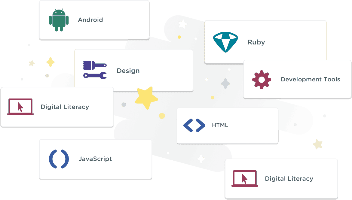
Have you seen our new look? Our Topics have gotten a fresh coat of paint. After years of continuously publishing new content, the number of Topics we now teach has expanded to 26 — with more on the way! To better serve our students, we’ve reorganized this broad spectrum of material to have a clearer design and a more intuitive hierarchy.
Introducing Topic Categories
To clarify the relationship between Topics, we created Topic Categories. Each Topic Category is a different color so you can easily discover learning content based on your interests. The current topic lists are color coded but not grouped. Stay tuned for updates which will further emphasize the content structure.
Front End
- HTML
- CSS
- JavaScript
- WordPress
Back End
- APIs
- C#
- Java
- PHP
- Python
- Ruby
- Swift (upcoming)
Data
- Databases
- Data Analysis
- Data Science (upcoming)
Regarding Exploratory:
Occasionally, we release Topics on a trial basis, to get a feel for what students find valuable. That’s why we’ve created an Exploratory category—this is where new Topics go before they officially get inducted.
Accessibility
You may notice these colors are bolder than the previous ones, and that’s for an important reason: accessibility. Topic colors are used throughout the Treehouse app, and they play a critical part in the usability. Therefore, we chose colors which meet WCAG (Web Content Accessibility Guidelines) contrast standards, optimizing for a AA (4.5+) contrast ratio for foreground and background color when it comes to text. We hope you’ll love the added bump in contrast!
We look forward to continuing to enhance the user experience for our students. Thanks for being part of our community!
❤ Effort led by Maggie Bignell and Danny Garcia, with contributions by Josh Sullivan, Hope Armstrong, and Ben Jakuben.


Hmmm, the colours are a bit…dark, similar, and too bluey. Maybe add some brighter colours to the mix to make them more distinguishable? It was a good idea, and I could see you were running out of topic colours. I think it was just your choice of colour, it’s too cold. Also this may be hard to see for some colour-blind people.
And my experience wheel is so boring now. I liked all the pretty colours, they were so pretty, and it was so…treehouse.
While you’re at it, please change the coloring of the workspace fonts. Magenta and light green are not good on white background for me
The topic categories don’t make sense. Are Swift/Java/JavaScript courses going to be colored differently if they’re backend vs mobile/front end?
It also seems to imply there’s some relationship between topics that are similar colors. Design and Front End are both blue-ish. Fundamentals and Data are both red-ish. Is that deliberate?
I know that they were kind of running out of colors. Design and Business were similar shades of gold. But I didn’t really mind.
Taking the comments to date in aggregate, I think we can pretty safely say that this upgrade wasn’t a good one based on user reaction to the drabness and the (lack of) ease in distinguishing these colours.
Also, the colour coding doesn’t actually follow its own logic ‘Full Stack JavaScript’ is front-end-blue because it’s JavaScript. But the point of this particular course is that it’s *not* front end. So the colour coding isn’t actually telling us reliable information about where in the stack the course content sits.
We’ve lost something and gained nothing.
Please can we roll back?
My older eyes are having troubles with the new colors. They are now muted, which may be having the opposite effect for those with a different set of challenges.
The old theme was better!!!
I like how you guys have colour coded the topic areas. But, the colours need to be more distinguishable. The tone of colours are washed and I’m having to concentrate and squint to notice the colour differences (examples: Data and Fundamental, Front-End and Design).
I enjoyed seeing the different colours in my experience wheel next to experience points but, I do think it’s something that I will need to get used to. I think logically it’s better design because I will be able to see what topic areas I am lacking in… I think, all that will need to be done is to change the colour so they’re more excitable.
Hope my opinion helps and keep up the good work!
I think the older ones are much easier to understand where colors differ depending on the language or which language it depends on. For example Django and Python subjects had the same color (pink), or Javascript and Node.js (red-ish) also had the same color.
If a certain subject doesn’t adhere to only one programming language, for example, a devops tool, then it’s colored in a neutral way.
I would like to second the idea to be able to opt in or out of this change.
Is there any way you could keep the previous colors as an option for users? Even if new topics/subjects introduced fall in line with the new palette I would just LOVE to still have the old ones.
I have actually pointed to how interesting and fun the color palette of the different lessons was when showing Treehouse to different people, as I felt it spoke to the fun vibe of the site and definitely set it apart from other learning programs.
*Please* let me know if there is an option to go back to the old color scheme.
That said, I very much appreciate how you guys explain changes and reasons behind them, and I love your interest in making it accessible to every user.
Thank you!
This is a step backwards for Treehouse. I’m disappointed with Treehouse as an organization. If you’re concerned about WCAG, then why not provide the option for those who need it, like the high-contrast system-wide options on laptops, tablets, and phones?
On my “progress circle,” the color pretty much run together. This couldn’t have been thought through very well.
The colors need more differentiation; they all look almost the exact same (especially in the little progress wheel on the top of the dashboard when logged in). It’s just a muddy mess of blue/purple hues now.
I’m fine with the grouping of topics, but I find these colours much more difficult to distinguish between!
I am kinda torn here – I ‘get it’ is an all-inclusive community and yes absolutely have to serve those who perhaps have difficulty in seeing the colours (Why not have a switcher and save to profile?) The colours before where amazing and that was mainly the reason for me being a member because of the playfulness and the non-threatening approach. Now it feels like everything is all merged into one…
Sorry guys but I think this was a bit of a wrong move 🙁
I like the color scheme! I feel like it better communicates what general area (front end, back end, etc) that a language is relevant to. When I first began learning to code, I was confused what each language was useful for. As long as each general area is explained adequately, I think this new categorization can help students better understand the language landscape and determine what they want to learn.
I appreciate the effort to improve visuals and make our life easy BUT i must agree with some that i liked the old look better, and if possible reverse the changes and leave the colors as they were. Leave icons but colors. I hope that the treehouse will listen to us and reverse the old look.
I’m definitely going to miss the old color scheme; it had a more “fun” look and made it easier to spot specific topics I was interested in. I understand identifying by categories, but it doesn’t relate to my interests like identifying by topic did.
But frankly, I’ve been suspecting the old scheme might not be sustainable with the ever-increasing number of topics and the associated increasing difficulty in choosing visually distinctive colors for them. And I recognize the value of WCAG compliance though I dislike the restrictions it places on creativity. This is something I’ve been struggling with myself recently with projects that require compliance, particularly with the AA standard.
Happy to see that you are working on Server Side Swift!!!
Gotta be honest here… These just look really bad and are much harder to differentiate than the old color scheme. It used to be easy to find topics at a glance for the language you were looking to learn. Front end and back end cover a lot of ground to be lumped into one color identifier on the site.
I have to agree with the other. The previous colors stood out more and it was easier to tell subjects apart. Now it feels a lot colder. I wish you hadn’t done that…
I understand the color scheme change. I like it. It’s like a together-team bundle.
I think it’s much easier to quickly get the skills of somebody via the ‘skill-circle-digram’ because now you have to remember the color for the global topic rather than the color for language, which was much harder.
Also unsure why WordPress was grouped into Front End.
Nice work on the grouping of categories!
Contrast is important, but I find the color scheme chosen is made of colors that are all a very similar hue. At a glance I can’t tell the difference between them and I have full-color vision. With color blindness filters on they all look about the same. As they are, I don’t find the colors useful anymore.
The new color scheme is really bad.
I also made a topic about it in the forums
https://teamtreehouse.com/community/new-color-scheme-for-team-treehouse
I really like the idea of the new colour design. However, people are right. It falls flat when it comes to the actual use of new colours. Especially if you are colourblind. https://www.toptal.com/designers/colorfilter/ << check it yourself here.
I never realized how much of a warm and inviting the old color and design scheme provided. This new design feels very cold and professional. Which is fine, but I got into coding to have fun and learn, not to prepare myself for a cubicle in corporate America.
I know it’s a little extreme to say that, but I think this redesign conflicts with the nature of website.
“You may notice these colors are bolder than the previous ones, and that’s for an important reason: accessibility.” But the colors are a lot duller than they were before?? It’s a lot harder to differentiate between groups. Front End and design are almost identical and so are Data and Fundamentals, they just have darker/lighter shades. I think it’s a great idea to group topics into categories, however the execution could be a lot better :/
its refreshing!
i think the old want is better, the course has different color, i think is better when is has different color
Where is the Virtual Reality Topic? Did you get rid of it?
Hi Brielle! We recently retired the VR/Game Dev content from our library. You can learn why here, but students can still access that content by emailing our support staff at help@teamtreehouse.com
Appreciate all the hard work that you guys put in to make it happen. Please continue the great work to make treehouse one of the best learning platform available to date.
I’m really bummed with the new color scheme. With a lot of the tracks having the same colors I’m finding it difficult to find the specific courses that I’m interested in. It’s nothing I can’t learn to work with. Just, not my favorite.
I like the regrouping, it makes more sense.
I think the other colors had a bit more contrast than these new ones.
I miss the old color scheme 🙁
Much lower contrast around my profile pic on the navbar and on my profile though. I used to have so many bright colors surrounding my pic. Now they’re all kinda dark and gloomy, and they don’t stand out as much. It all kinda blends together.
I can’t tell the difference between purple/mulberry/plum/whatever on Fundamentals/Data/Design/Exploratory.
Love it! Treehouse is the best!
interesting!
Looks great
This is helpful because I have autism.
I like it! 🙂
I like how the colors correspond to the type of the topic, not the topic itself!
Looks awesome!