
Last Updated on June 3, 2015 by Laura Coronel
Jerry Cao is a UX content strategist at UXPin — the wireframing and prototyping app. To learn more about how to create visually digestible interfaces, download the free e-book Web UI Design for the Human Eye: Colors, Space, Contrast.
In the early 20th century, the advancement of science enabled researchers to expand beyond the traditional venues into new areas of study — like, for example, how we perceive visual stimuli versus what is actually present and seen. This was the school of Gestalt (Gestalt is the German word for shape or form), a psychological study of sight initiated in 1910 by Max Wertheimer and developed over the next few decades by his colleagues.
Source: “The Importance of Vision”. Anne Worner. Creative Commons.
The Gestalt findings are most famously seen in the optical illusions we know from childhood, but the implications of this science are much farther reaching. The principles that govern these optical illusions hold the power to manipulate our visual perceptions, and as such make a powerful tool for any web designer.
Before we get into the Gestalt principles apply most strongly to web UI design, it helps to provide some background into how the principles function. The research of Wertheimer and his successors isolated these four properties that govern the greater body of the Gestalt principles.
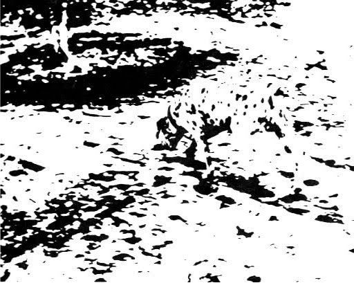
1. Emergence — When identifying objects by sight, our brains first match their outlines to more familiar ones we already know. Once the outline “emerges,” we then move on to finer details. See how in this image, from an ocean of spots, the dalmatian emerges?
2. Reification — Because we so often see things only partially, our brains have developed a mechanism to “fill in the blanks” so to speak. In reality, there is no triangle below, but our brains see one regardless.
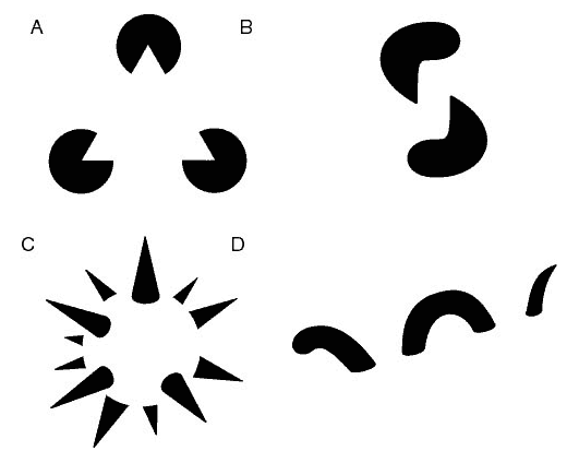
Source: Reification. Wikipedia. Creative Commons.
3. Invariance — This is a similar property as reification, but with varying perspectives instead of partiality. Our brains recognize objects’ similarities despite differences in perspective, rotation, scale, or even slight deformations.
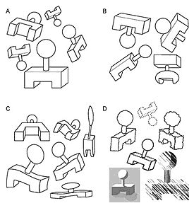
Photo credit: “Invariance.” Wikimedia. Creative Commons.
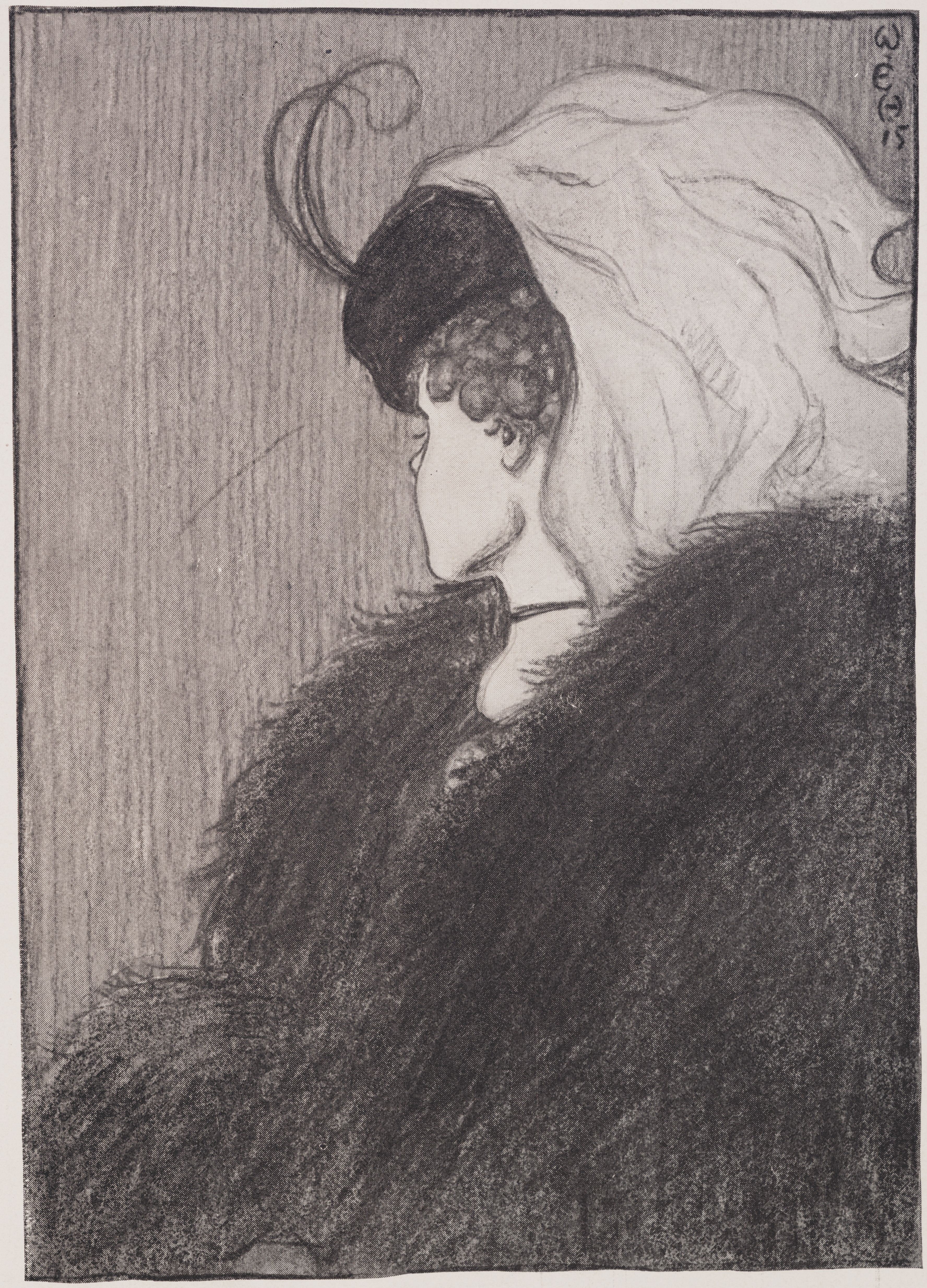
4. Multistability — If contrasting interpretations of an object exist, the mind will alternate between the two, but is incapable of seeing both at the same time. The longer you focus on one interpretation, the more dominant it becomes.
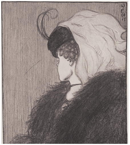
Source: “My Wife & Mother in Law”. Wikimedia. Creative Commons.
These properties alone could have a tremendous effect on your visual design — for example, emergence shows us that if the shapes of our interface objects are straightforward, we can experiment more with the other details (like colors and gradients), opening up new doors for design strategies.
While there is no one definitive list of all Gestalt principles, in 1954, Rudolf Arnheim compiled the most important ones in the book Art and Visual Perception: A Psychology of the Creative Eye. Among them, designer Carolann Bonner suggests that five principles are actually the most practical for everyday design. From our experience, we definitely agree with her assessment.
Let’s take a look at the five practical principles below.
1. Similarity
Users perceive objects that look similar as having similar uses. As a means to communicate function in a quick and simple way, this principle’s use in web design is massive. By creating similar icons or structures, you’ll save a lot of time in explaining for both you and your user.
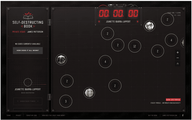
Source: Self-Destructing Book
On the Self-Destructing Book site above, what happens when you click on the faces and what happens when you click on the numbers? The specifics don’t really matter, but you’re correct in assuming the same things happen with all the faces and all the numbers. Furthermore, the circles around both faces and numbers suggests that they are clickable, while the rest of the map is not.
As you’ll see in the next section, the strength of similarity in how things look goes beyond whether or not they’re close together.
2. Grouping
Following the same reasoning as similarity, grouping has the same effect with objects grouped together, even if they look different. As Bonner describes, there are at least two ways to effectively use grouping:
- Enclosure — Adding a visible barrier like a box or circle to enclose elements will suggest they function similarly.
- Proximity — Elements close together will appear similar, especially if the group is separated from other elements or groups. This also follows Hick’s Law, which we describe in Interaction Design Best Practices.
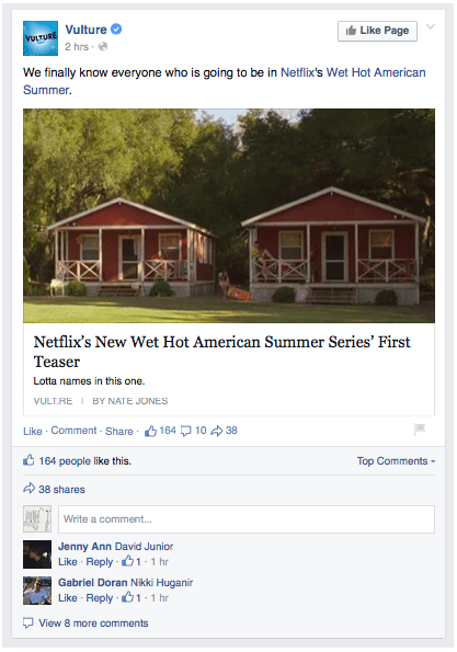
The above example from Facebook shows both uses of grouping.
Enclosure is used for the entire post — title, photo, description, comments, etc. — to separate it from other similar posts above and below it. Within the post itself, commands such as “Like,” “Comment,” and “Share,” are all placed in close proximity to show they are all ways to interact with the post in (not to mention their related size, font, and color utilize the principle of similarity).
3. Closure
Closure applies the property of reification (mentioned above) where users “complete” objects in their heads if they are partially obscured.
A designer can take advantage of this in a few ways, such as:
- Allowing partial elements to save space or aid communication.
- Encouraging minimalism for an elegant style.
- Stimulate users with artistry and creativity.
The last application is used by the VO2 Group, as you can see below.
They are able to make a visually stimulating image by strategically obscuring parts of the letters based on the runner. This image only works because our brains are able to fill in the missing parts of the letter so we can still read the message — as the designers of the site know full well. This image also utilizes the figure-ground relationship, another principle we’ll discuss later.
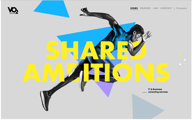
Source: VO2 Group
Closure is no secret in web design, and if you’d like to know more, Andy Rutledge wrote an excellent blog post on how to apply it.
4. Continuation
As strange as it sounds, a user’s eye creates a kind of momentum as it moves from object to object, and lines increase this effect. In the example below, most users will perceive one curved line and one straight line instead of a bent purple line and a bent green one.
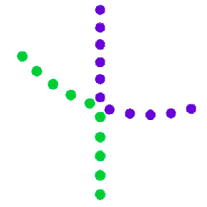
Source: UXPin via Steven Bradley
The power of continuation supercedes even the power of color. The implication for web design is that elements in a row or a line will achieve a similarity, and so suggest similar functions. We see this applied everyday in navigation bars, both horizontal and vertical.
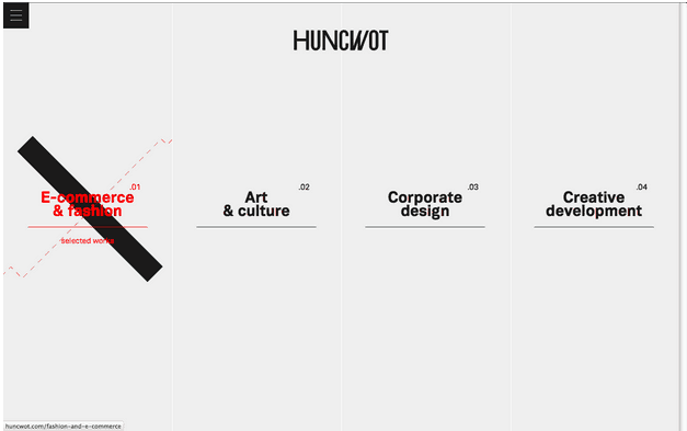
Source: Huncwot
As you can see above, the Huncwot site is very linear. The placement of the different links is a prime example of a linear navigation menu. But the site also expertly plays on the artistic principles of lines in drawing our attention. Hovering over each of the four options triggers a background graphic to confirm the item is selected — and each graphic is composed of solid and dotted lines to draw attention to the title.
5. The Figure-Ground Relationship
Your users instinctively differentiate between objects in the foreground (figures) and those in the background (ground). According to Steven Bradley, designer and author of the fantastic book Design Fundamentals, there are 3 types of figure-ground relationships:
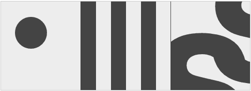
Source: Steven Bradley via Smashing Magazine
- Stable — (left) It’s clear that the circle is the foreground, while the grey area is the background.
- Reversible — (center) The grey column or black column are both figure and ground, since they both occupy the same amount of space.
- Ambiguous — (right) Similar to the “reversible” relationship, but with the added element of ambiguity. Different users will interpret which is which, sometimes even at different times.
There are several of the figure-ground relationships at play on the White Frontier site below.
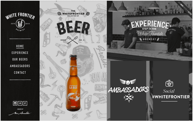
Source: White Frontier
For starters, there’s no question that the beer bottle and the text headers are in the foreground while the wallpaper and the bar photo are the backgrounds. The foreground images are crisper and even colored in the case with the bottle, so there’s little competition with the background for our attention.
On another layer, the 3-column layout makes use of the reversible relationship — no one column dominates as the “main” focus, and our attention hops between all three, as the designers intended.
Conclusion
It’s no surprise that the psychology of sight is useful to a visceral field like web design.
But we’re just scratching the surface here. If this article peaked your interest, you can read more Gestalt and other similar sight sciences (and how they apply to everyday design) in our free ebooks, Web UI Design for the Human Eye, Book I and Book II.


I’m amazed, I must say. Rarely do I encounter a blog that’s equally educative and
entertaining, and let me tell you, you’ve hit the nail on the head.
The issue is something too few people are speaking intelligently about.
I am very happy that I stumbled across this during my hunt for something relating to this.
the website’s still a shell, but I hope to add content soon.
Thank you for this article. I’m doing research on how integral the gestalt theory is to web design. This article is the clearest of 5 or 6 articles I’ve read. I’m going to get the ebooks. Thanks for offering them.
Hey VR, really glad you liked it! Thanks for the feedback 🙂
Nice article, Jerry. You covered a lot of things in a way that I can further explore the principles. Learn something new every day!
Thanks!