Last Updated on September 11, 2023 by Dev Support
How often do you find yourself on a website or app looking for a toggle for dark mode? Most apps now-a-days, like Facebook, Twitter, Instagram, & Snapchat just to name a few, use some sort of dark mode feature. Implementing this is actually pretty quick and simple. There are many ways to go about this but the method I prefer is using CSS variables. Follow along and I’ll show you how I tackle this feature.
Alternatively, you can watch this quick tutorial:
What Are CSS Variables
As mentioned above, the way I tackle a dark mode UI is by using something called CSS variables. If you’re familiar with using variables in JavaScript, you’ll find setting up and using CSS variables are quite similar. Consider the following code:
.container_1 {
   background-color: #333;
}

.container_2 {
   background-color: #333;
}
While this code works great, let’s say your project uses that background color across multiple CSS rules. If you decide to change the UI later on or introduce another theme like a dark theme, you’ll need to update every instance of background-color: #333; Using CSS variables can help with this. Let’s see how we can initialize one.
root: {
   --main-bg-color: #333;
}
Its common practice to include your CSS variables inside of the root element if there is no specific rule you’re targeting with your variable. CSS variables start with -- followed by the variable name. Here are some examples: --main-bg, --primary-color, --font-stack. All we’ve done was initialize a variable. Now we need to actually use it. Let’s use this --main-bg-color to replace the hard coded values from the first example. To do this, we need to write the var keyword followed by a set of parenthesis. var(). Inside the parenthesis, we write our variable name.
:root {
   --main-bg-color: #333;
}

.container_1 {
   background-color: var(--main-bg-color);
}

.container_2 {
   background-color: var(--main-bg-color);
}
Because --main-bg-color holds the value of #333, background-color: var(--main-bg-color) is the same as writing background-color: #333 Why is this so awesome? Well because now if the color needs to be changed, we only need to change the variable. Not every instance of our background-color property. Now that we understand how CSS variables work, let’s work on converting an existing light UI to a dark UI so you can see how it’s done.
How to Toggle a Dark Mode UI
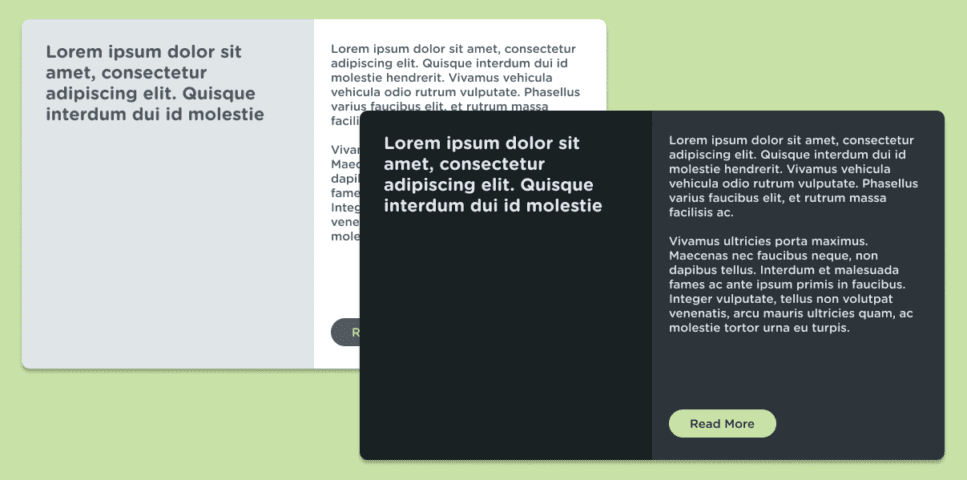
Let’s consider the above image as the UI we are working with. On the left you can see a light version and on the right you can see a dark version. Let’s start with defining the sections of the UI as a whole.
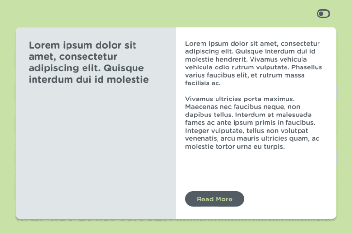
Let’s keep things simple. In this UI we have the following: left panel, right-panel, text and a button.
In our CSS we can set these colors up in the body tag as variables. This is how that will look:
body {
--left-panel-bg: #E0E5E7;
--right-panel-bg: #FFFFFF;
--primary-text-color: #525A62;
--primary-btn-bg: #525A62;
--primary-btn-text-color: #C7E1A6;
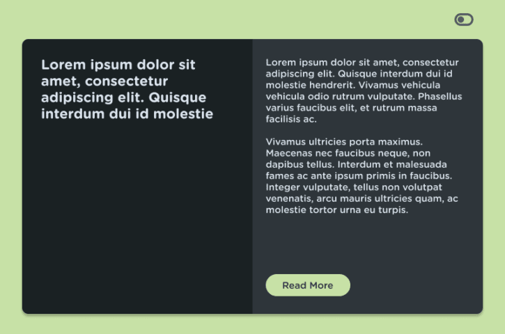
}What we want to do is override these variables to darker colors when the user clicks that toggle button in the top right of the UI. The way that I like to do this is by adding a class to the body. Let’s go with dark. So when the body has a class of dark, we will have the variables being overridden.
In the CSS, we can write this underneath our initial body rule:
body.dark {
   --left-panel-bg: #1A2123;
   --right-panel-bg: #2E353A;

   --primary-text-color: #DBE4ED;

   --primary-btn-bg: #C7E1A6;
   --primary-btn-text-color: #2E353A;
}
Incase you missed it, in the above code snippet, we are giving those variables new values that we want for our darker UI. We can test that this override works by temporarily adding a class of dark to your body tag in the html. <body class="dark">
If this worked, great! Now we just need to toggle this class with some JavaScript.
JavaScript Toggle
In order to toggle our new, darker UI, we need to toggle it with some JavaScript interactivity. This is actually very easy. We will set up an event listener on our toggle button and then toggle the dark class for the body tag.
Let’s say our toggle button in the top right of the UI has an id value of darkModeToggle. We can write the following in our JavaScript file:
const toggleBtn = document.getElementById('darkModeToggle');

toggleBtn.addEventListener('click', () => {
   document.body.classList.toggle('dark');
}
Incase you aren’t familiar with classList.toggle, basically what it’s doing in the above code snippet is adding a class of dark to the body tag if the body tag doesn’t already have the dark class and if it does, then it removes it. It toggles it on and off.
There we have it, if all went well, you should have all the understandings for a dark mode toggle for your next project or app. CSS variables are a great way to set up your project with a dark mode theme.
I hope this tutorial helped! Until next time, have fun and happy coding!


