
Last Updated on May 21, 2015 by Laura Coronel
Many web developers are familiar with Twitter Bootstrap and have seen this library on a number of projects. The Bootstrap core is fantastic when you need a CSS reset along with other common layout features. It may not be the right fit on projects where you need a whole lot of customization. But for landing pages and smaller websites I think Bootstrap has become one of the easiest resources to start using.
In this tutorial I want to demonstrate how we can build a simple homepage layout design using Bootstrap. I have included a myriad of popular components which you will likely use in other layouts. Most of the CSS classes and HTML structures are well documented on the main Bootstrap website. But the process of building & designing your own layout from scratch can be a greater learning experience.
Live Demo – Download Source Code
Contents
Downloading Bootstrap
Right from the hosted Github project page you should be able to download a copy of Bootstrap. There is an option to customize which features you will need, but I’ve grabbed the entire library since it is a bit easier to manage. I will be including the bootstrap.min.js even though we don’t use any JavaScript components. But in this demo it allows you to quickly expand out and try new JS features without re-downloading all the resources.
I will also be using the two minified CSS documents named bootstrap.min.css and bootstrap-responsive.min.css. The first stylesheet includes a large number of browser resets, along with basic styles for the typography and layout structure. Bootstrap uses a system of 12-columns where each container has a different class name. These are organized by .span# where the number can be anything to fill a 12 column row. The scaffolding page goes into a bit more detail if you’re interested.
<!doctype html>
<html lang="en-US">
<head>
  <meta http-equiv="Content-Type" content="text/html;charset=utf-8">
  <title>Bootstrap Page Layout - Sample Demo</title>
  <link rel="shortcut icon" href="http://teamtreehouse.com/assets/favicon.ico">
  <link rel="icon" href="http://teamtreehouse.com/assets/favicon.ico">
  <link rel="stylesheet" type="text/css" media="all" href="css/bootstrap.min.css">
  <link rel="stylesheet" type="text/css" media="all" href="css/bootstrap-responsive.min.css">
  <link rel="stylesheet" type="text/css" media="all" href="css/global.css">
  <script type="text/javascript" src="https://ajax.googleapis.com/ajax/libs/jquery/1.9.1/jquery.min.js"></script>
  <script type="text/javascript" language="javascript" charset="utf-8" src="js/bootstrap.min.js"></script>
</head>
The HTML5 doctype is the best supported option for modern browsers. This is also the case with Bootstrap and I have included the same usual meta tags. With the Bootstrap files setup it is worth focusing on some of the internal body components. My layout is structured using a full-page width and centered content blocks for the navigation, header, page body, and footer.
Directly after the opening body tag I have setup a fixed navigation menu. This includes an internal UL with a container div class named .container. Bootstrap uses container as a wrapper which expands to 940px and 1170px at maximum. I have the outermost container as a full-width element so that we can change background colors and have it appear across the full page.
<nav id="navigation">
<div class="container">
<ul class="navlinks">
<li><a href="index.html">Homepage</a></li>
<li><a href="index.html">About Us</a></li>
<li><a href="index.html">Projects</a></li>
<li><a href="index.html">The Team</a></li>
<li><a href="index.html">Contacts</a></li>
</ul>
</div>
</nav>
<header id="heading">
<div class="container text-center">
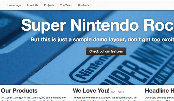
<h1>Super Nintendo Rocks</h1>
<h4>But this is just a sample demo layout, don't get too excited!</h4>
<p><a href="index.html" class="btn btn-large btn-inverse">Check out our features</a></p>
</div>
</header>
The header div contains another bit of code with a container and the class .text-center. Bootstrap uses this class for default text alignment into the center of the page. I have created a fullscreen background image effect using this SNES photo. The dark button also has 3 classes worth remembering – .btn, .btn-large, and .btn-inverse. The CSS button classes are fairly straightforward and provide a nice break in typical layouts.
#navigation {
  display: block;
  position: fixed;
  z-index: 1;
  display: inline-block;
  width: 100%;
  height: 55px;
  top: 0;
  left: 0;
  box-shadow: 0 1px 6px #2d2d2d;
  background: rgba(250,250,250,0.9);
  border-top: 1px solid #e6e7e8;
  border-bottom: 1px solid #e6e7e8;
}
#navigation .navlinks {
  list-style: none;
}
#navigation .navlinks li {
  display: inline-block;
  margin-right: 5px;
}
#navigation .navlinks li a {
  display: block;
  float: left;
  padding: 0 12px;
  line-height: 55px;
  font-weight: bold;
  color: #777;
}
#navigation .navlinks li a:hover {
  text-decoration: none;
  color: #444;
  background: #fcfcfc;
}


#heading {
  display: block;
  width: 100%;
  height: 380px;
  padding: 20px 0;
  background: url('../images/bg-snes-closeup-x500.jpg') no-repeat center center fixed;
  -webkit-background-size: cover;
  -moz-background-size: cover;
  -o-background-size: cover;
  background-size: cover;
  -webkit-box-shadow: inset 0 -4px 9px -3px #000;
  -moz-box-shadow: inset 0 -4px 9px -3px #000;
  box-shadow: inset 0 -4px 9px -3px #000;
}
#heading h1, #heading h2, #heading h3, #heading h4, #heading h5, #heading p {
  text-shadow: 0 1px 3px rgba(0,0,0,0.6), 0 0 30px rgba(0,0,0,0.25);
}

#heading h1 {
  font-size: 90px;
  line-height: 105px;
  letter-spacing: -1px;
  color: #fff;
}

#heading h4 {
  font-size: 30px;
  line-height: 40px;
  color: #fff;
  margin-bottom: 25px;
}
All of this code is stored inside my own custom stylesheet global.css. Bootstrap certainly will not provide everything you need, and even if it could you definitely want to write your own CSS codes for different page elements. Bootstrap is not supposed to be a complete package, but merely the ground framework used to development websites quicker and easier.
Flexible Columns
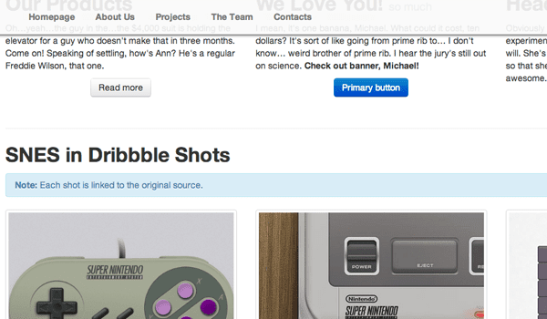
Underneath the fullscreen background image I have created a centered main content area. Inside are two specific sections which list a 3-column stack of features, along with a thumbnail media gallery. Both sections may be constructed using only Bootstrap default classes.
    <div id="main-content">
      <div class="container">
         <div class="row">
           <div class="span4">
             <h2>Our Products</h2>
             <p>Oh…yeah…the guy in the…the $4,000 suit is holding the elevator for a guy who doesn't make that in three months. Come on! Speaking of settling, how's Ann? He's a regular Freddie Wilson, that one.</p>
             <p class="text-center"><a class="btn" href="index.html">Read more</a></p>
           </div>

           <div class="span4">
             <h2>We Love You! <small>so much</small></h2>
             <p>I mean, it's one banana, Michael. What could it cost, ten dollars? It's sort of like going from prime rib to… I don't know… weird brother of prime rib. I hear the jury's still out on science. <strong>Check out banner, Michael!</strong></p>
             <p class="text-center"><a class="btn btn-primary" href="index.html">Primary button</a></p>
           </div>

           <div class="span4">
             <h2>Headline Here</h2>
             <p>Obviously this blue part here is the land. Let the great experiment begin! But I'm the oldest. The matriarch if you will. She's always got to wedge herself in the middle of us so that she can control everything. Yeah. Mom's awesome. Maybe we should call her?</p>
             <p class="text-center"><a class="btn" href="index.html">Read more</a></p>
           </div>
        </div><!-- @end .row -->
The #main-content ID is a name that I made up solely for this demo layout. It offers more control over the webpage allowing me to include custom padding, margins, or some other background changes as needed. What’s more important is the internal content which is setup on 100% Bootstrap default styles. Notice the chain of elements follows .container -> .row -> .span*. Each row class should contain a number of spans equal to 12 columns.
As the window is resized you’ll notice that the container will shrink in width. Once we drop below ~760px the whole layout slims down to a mobile-responsive display. In this case I wanted to have 3 equal columns which naturally calculates out to three different span4 code blocks. If you have ideas for column styles try them out in the HTML and see if you can put together a layout design without much(or any) of your own CSS.
Picture Thumbnails
Earlier versions of Bootstrap had this display called a Media Grid, but the name has since changed to Bootstrap Thumbnails. The classes have a structure using the same type of span containers as before. Only this time the outer element is using the class .thumbnails instead of container. Additionally the internal elements are all list items, so I have added the img tag along with anchor links pointing to the original source.
	<div class="row-fluid">
	  <ul class="thumbnails">
		<li class="span4">
		  <a href="http://dribbble.com/shots/39065-snes-controller" class="thumbnail" target="_blank">
		  <img src="images/dribbble/01-snes-controller.png" alt="snes controller dribbble shot">
		  </a>
		</li>
		<li class="span4">
		  <a href="http://dribbble.com/shots/525128-Micons-Series-2-SNES" class="thumbnail" target="_blank">
		  <img src="images/dribbble/02-snes-console-mini-icons.png" alt="minicon series2 snes console">
		  </a>
		</li>
		<li class="span4">
		  <a href="http://dribbble.com/shots/633186-The-Game" class="thumbnail" target="_blank">
		  <img src="images/dribbble/03-snes-video-game-dribbble.png" alt="snes video game cartridge shot">
		  </a>
		</li>
	  </ul>
	</div><!-- @end .row-fluid -->

	<div class="row-fluid">
	  <ul class="thumbnails">
		<li class="span6">
		  <a href="http://dribbble.com/shots/758735-Oh-Oh-Please-Amaze-Me-Detail-IV" class="thumbnail" target="_blank">
		  <img src="images/dribbble/04-superpad-dark-illustration.png" alt="dribbble shots super nintendo">
		  </a>
		</li>
		<li class="span6">
		  <a href="http://dribbble.com/shots/436565-Jaku-Console-Wars" class="thumbnail" target="_blank">
		  <img src="images/dribbble/05-retro-console-wars.png" align="dribbble console wars super nintendo design">
		  </a>
		</li>
	  </ul>
	</div><!-- @end .row-fluid -->

	<hr>
  </div><!-- @end .container -->
</div><!-- @end #main-content -->
The anchor link surrounding the image may be given a class of .thumbnail to add the border effects. You may alternately apply this same class onto the img tag itself when you do not have any anchor links in the code. My example points to a number of Dribbble shots related to the Super Nintendo. Instead of using .row I have applied .row-fluid to make all images responsive as you resize the window.
Using the Bootstrap responsive CSS stylesheet can be a hassle if you don’t plan for the changes. Often times font will be sized in pixels so you will need to adjust typical CSS classes as the window gets smaller. Including Bootstrap’s default responsive stylesheet is a nice way of getting started without having to write every single responsive detail from scratch. I’ve added a set of responsive codes to my own global stylesheet which you can see below.
/** alternate responsive traits **/
@media(max-width:767px) {
  body {
    padding-right: 0 !important;
    padding-left: 0 !important;
  }

  #heading > .container {
    padding: 0 15px;
  }

  #main-content > .container {
    padding: 0 15px;
  }

  #footer > .container {
    padding: 0 15px;
  }
  #heading h1 {
    font-size: 50px;
    line-height: 55px;
  }
  #heading h4 {
    font-size: 20px;
    line-height: 25px;
  }
}

@media(max-width:550px) {
  #heading {
    height: 300px;
  }
  #navigation .navlinks li {
    margin-right: 1px;
  }
  #navigation .navlinks li a {
    padding: 0 5px;
    font-size: 12px;
  }
}
I have closed the entire layout using a full-width footer element. This allows both the background and top border to span the entirety of the page width. Then inside a container block we have the content centered with the other page elements. Remember that all of these classes were pulled right out of Bootstrap without writing any alternate code. All I had to include was the outer footer ID with background color changes.
    <div id="footer">
      <div class="container">
        <p>Simple layout design for <a href="https://blog.teamtreehouse.com/">Treehouse Blog</a>.</p>
        <p>Feel free to download and use these codes for any basic template layout.</p>
        <p><small>Website code structured with <a href="http://twitter.github.io/bootstrap/">Twitter Bootstrap</a>. Background image credits to <a href="http://www.flickr.com/photos/fjolnir/2342246699/">Fjölnir Ásgeirsson</a>. Sample content via <a href="http://bluthipsum.com/">Bluth Ipsum</a>.</small></p>
      </div>
    </div>
</body>
</html>
When you have to look over all the Twitter documentation it can appear like an exhaustive library. And in truth Bootstrap does offer a large multitude of concepts I was not able to include in this demo. But it just goes to show that this library is a powerful tool in modern webpages. Even just including the basic bootstrap.min.css file will provide browser resets and some custom CSS classes for structuring your layout.
Live Demo – Download Source Code
Final Thoughts
I do hope this tutorial may be of use to some developers who are still getting started with Bootstrap. It is a very easy framework considering you can get a lot of the best assets just from the CSS files alone. All of the extra JavaScript widgets add to the overall interface design, but you can build a great webpage without using any JS components. Feel free to download a copy of my source codes and practice styling your own unique Bootstrap website.


Thanks for finally talking about > Customize an HTML5 Webpage using the Bootstrap Framework – Treehouse Blog < Loved it!
whoah this blog is excellent i love reading your articles.
Keep up the good work! You know, lots of persons are hunting round for this info,
you could aid them greatly.
An excellent marketer is like a great chef – they have a kitchen complete of hundreds of ingredients, but they only require a couple of, in the proper mixture, to generate a
great dish.
I don’t know if it’s just me or if everybody else experiencing problems with your website.
It appears as though some of the text in your content are running off the screen. Can someone else please provide feedback and
let me know if this is happening to them too? This might be a problem
with my internet browser because I’ve had this happen previously.
Kudos
I’m excited to find this web site. I want to to thank you for
your time for this wonderful read!! I definitely enjoyed every bit of it and i also
have you saved as a favorite to check out new things
on your website.
I agree. In my experience bootstrap is more of a construction company’s tool set. You open it, take what you need for the job and head for the construction site.
Nice article, why don’t you use something like https://code.google.com/p/google-code-prettify/ to render the more readable?
You left out the code for the #footer css
#footer {
display: block;
width: 100%;
text-align: center;
padding: 30px 0;
margin-top: 70px;
border-top: 1px solid #e5e5e5;
background-color: #f5f5f5;
}
Hello in what course i can learn how to creat e-coomerce theme in wp with bootstrap like this theme? please say
Hello can your tell me how to create this theme for wordpress?
Good framework to start. Bootstrap is very useful to make websites easier. Thanks for sharing.
its really awesome post and thanks for a sharing this info.
Boostrap is really taking off lately. Although I’m yet to see it in any web developer jobs, which is frustrating.
you forgot the viewport meta
Nice catch, since this is a responsive layout. Thanks!
It is very nice, but have you checked on iPhone simulator?