
Last Updated on September 11, 2023 by Dev Support
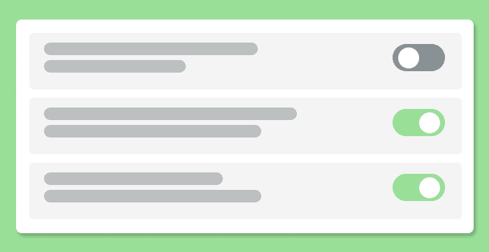
Today, we’ll go over how we can transform a regular checkbox input element to a responsive toggle switch. It’s not as hard as you may think and only involves CSS. No JavaScript. So let’s get into it!
If you get stuck at any point or need to reference the finished code, you can checkout the GitHub repo for this project here: CSS Toggle Switch
HTML Markup
First things first, we’ll need to create an input in our HTML. We can create an input element and give it the type of checkbox.
<input type="checkbox">And that’s it. That’s all the HTML we’ll need. The rest of the magic will all be done in the CSS.
How to Style a Checkbox Input?
As mentioned above, we are taking a regular checkbox input and re-styling it to look like a toggle switch. You may have tried to style this element before and probably found out pretty quickly that it’s not easy, but don’t worry! It is actually possible to style this element.
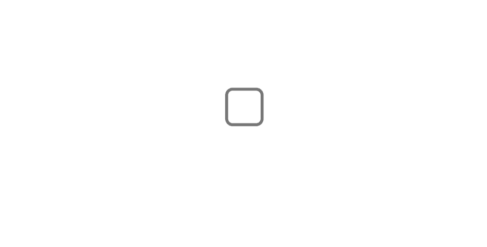
In our CSS, let’s first begin by targeting our checkbox element and giving it some basic stylings. We’ll give it a background color, some border radius to give it that pill-like shape, and a few other basic styles.
input {
    -webkit-appearance: none;
    position: relative;
    width: 50px;
    height: 30px;
    border-radius: 25px;
    background-color: #ccc;
    transition: background .3s;
    outline: none;
    cursor: pointer;
}
Let’s go over this a bit so that we can understand what we’re doing here.
-webkit-apperance– This is what removes the default look and feel of our input element when set to ‘none’. We use this so that we can see our custom stylings.position: relative– This is so that we can absolutely position the circle inside our toggle switch later.width&height– Gives us our toggle switches width and height.border-radius– This gives us 25px of border-radius on all four sides. Giving us a ‘pill-shaped’ container for our toggle switch.background-color– This sets the default background color for our toggle switch.transition– This gives a subtle change to the background-color when we click the toggle switch.outline– Optional, but removes the default outline given to input elements for accessibility.cursor– This just adds apointercursor when the user hovers over the toggle switch.
Here’s what you should see so far:
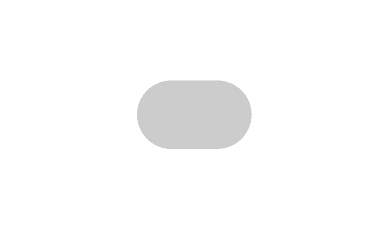
Now, to get that circle in the toggle switch (the part the user typically clicks on), we will need to use the ::after pseudo-element.
We can write a new rule like this:
input::after {

}
We can set the content property to ''; and then set our position absolute. Because we set the position to relative in the initial input rule, our ::after pseudo element will be positioned relative to its parent (the input element)
input::after {
    content: '';
    position: absolute;
    top: 50%;
    left: 30%;
    transform: translate(-50%, -50%);
}
For this example we can use these top and left values as well as the transform values of -50% for both the y and x axis, but feel free to play around with them to your liking.
Next, we can add border-radius: 50% to make it appear like a full circle. In order to do that though, we’ll also need the same height and width values. Go ahead and add in height: 1.25rem; and width: 1.25rem;. Now we just need to give it a background color of white.
Note: In order to get the circle to appear like it’s sliding, we’ll need to give the left property a transition. So we can add in something like transition: left .3s.
CSS for your ::after pseudo element should look like this:
input::after {
    content: '';
    position: absolute;
    top: 50%;
    left: 30%;
    transform: translate(-50%, -50%);
    border-radius: 50%;
    height: 1.25rem;
    width: 1.25rem;
    background-color: white;
    transition: left .3s;
}
There we go! We’ve successfully styled the checkbox input element! It takes a little bit of work but I think this looks much better than the default styles that come with checkbox inputs.
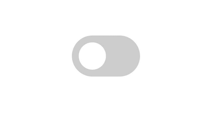
Now, we need to adjust how it looks when the checkbox is checked. Thankfully, we don’t need any JavaScript for this. We are able to write CSS based on if the checkbox is clicked or not. It’s actually pretty simple.
:checked Pseudo Class
We can write CSS for when a checkbox is in its checked state by writing the input selector followed by :checked. Here is what that looks like:
input:checked {

}
Whatever styles we choose to write in that CSS block will be applied when the checkbox is checked. So let’s go ahead and change the background color from that default gray color to a nice green.
input:checked {
    background-color: rgb(141, 221, 141);
}
Also, we’ll want to target the ::after pseudo element when the checkbox is checked as well. We’ll want to move the circle from the left: 30% we initialized to something like left: 70%. We can do that by writing:
input:checked::after {
    left: 70%;
}
Depending if you’re using the same values I am or you’re using your own, you may need to adjust your left percentage. The full CSS should look something like this:
input {
cursor: pointer;
margin: 1rem auto;
position: relative;
width: 50px;
height: 30px;
border-radius: 25px;
outline: none;
background-color: #ccc;
-webkit-appearance: none;
transition: background .3s;
}
input::after {
content: '';
position: absolute;
top: 50%;
left: 30%;
transform: translate(-50%, -50%);
border-radius: 50%;
height: 1.25rem;
width: 1.25rem;
background-color: white;
transition: left .3s;
}
input:checked {
background-color: rgb(141, 221, 141);
}
input:checked::after {
left: 70%;
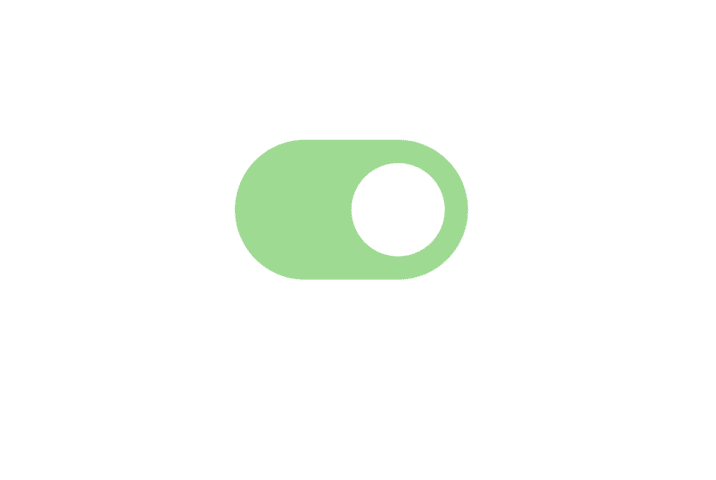
}Now, once checked, your checkbox should look like this:
I sure hope this quick-guide on styling a checkbox to look like a toggle switch was helpful and you understand how we did it. You can completely transform your projects and apps with small things like this.
Until next time, have fun and happy coding!


