Last Updated on March 16, 2016 by Laura Coronel
(Image from Flickr user Davidd)
Responsive web design has changed a lot over the last few years. Front end development teacher, Nick Pettit updates you on all that’s changed when it comes to making websites work on mobile devices.
Responsive web design is a technique for building websites that work on mobile devices, tablets, and desktop screens. Not long ago, websites were typically designed specifically for laptop and desktop screen resolutions. This worked fine until the advent of web capable smart phones and tablets. Web designers approached the new challenge with a myriad of solutions, but the clear winner was Ethan Marcotte’s seminal article on Responsive Web Design back in May of 2010.
Responsive web design has changed a lot since then, and it even evolved in just the last two years since I wrote my beginner’s guide to responsive web design. Whether you’re totally new to web design or if you need to learn what’s new, this guide will help you catch up with the present.
Contents
What is Responsive Web Design?
For all that’s changed, it’s amazing how much has stayed the same. The basic principles of responsive web design that Ethan wrote in his article are just as relevant as ever.
As I mentioned in the introduction, responsive web design solves the problem of making the same code work across multiple screen resolutions. Many modern websites are responsive, and in fact, the Treehouse Blog is one of them. If you resize your browser window, you’ll see the screen elements resize themselves like so:
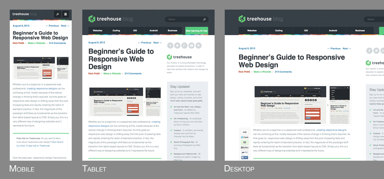
There’s a myriad of web capable devices already available, and there are new form factors every day, so it’s impossible to target each individual screen. Instead, it’s better to let the website respond to its environment and adapt fluidly. One of my favorite quotes from Bruce Lee sums up this way of thinking.
“Empty your mind, be formless, shapeless — like water. Now you put water in a cup, it becomes the cup; You put water into a bottle it becomes the bottle; You put it in a teapot it becomes the teapot. Now water can flow or it can crash. Be water, my friend.”
– Bruce Lee
Practically speaking, this involves three main principles that come together to form the whole that is responsive design. They are:
- Fluid Grids
- Fluid Images
- Media Queries
Let’s take a look at each one in more detail.
Fluid Grids
Traditionally, websites have been defined in terms of pixels. This is an idea that was carried over from the print industry, where a magazine or a newspaper was always going to be the same fixed size. For better or worse, this is not how websites are displayed. Rather, a website might appear in a large format like on a television, or on a very small screen like a smartphone (or even a smartwatch). For this reason, responsive websites are built with relative units like percentages, rather than fixed units like pixels.
If you’re used to designing in pixels, there’s a simple math formula that can help you transition to using percentages. It looks like this:
target / context = result
For the sake of explanation, let’s say that you have a website that has a wrapper containing the site to a width of 960 pixels, and you’re looking at this site in a maximized browser window on a screen that’s 1920 pixels wide. In this case, the width of the browser window is the context and the wrapper is the target. In order for the site to look exactly the same, you can divide the target by the context to get a percentage value.
960px / 1920px = 50%
Now, what about child elements that are nested inside the wrapper element? The same rule applies all the way down. As another example, let’s say that you have a two column layout inside of your 960px wide site. The left column is a sidebar that’s 300px wide and the right column is the main content area at 640px wide. You also want 20px of margin between the two columns. Here’s an image illustrating what that might look like:
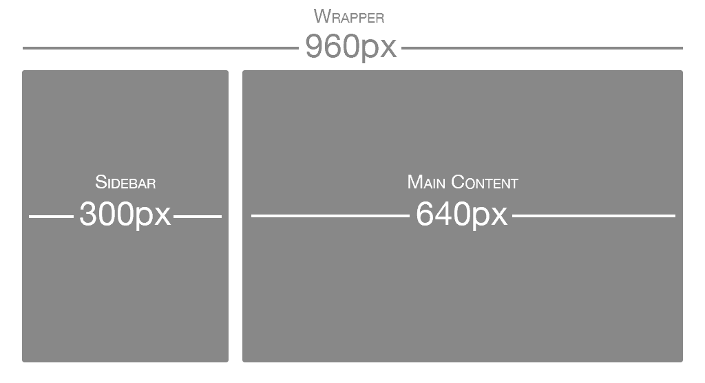
Using the same formula, each part of the site would have the following values:
- Sidebar: 300px / 960px = 31.25%
- Main Content: 640px / 960px = 66.66667%
- Margin: 20px / 960px = 2.08334%
These percentage values can then be used in CSS simply by applying them to the width, margin, and padding properties. Here’s an example I created on CodePen demonstrating what that might look like in HTML and CSS.
See the Pen Basic Responsive Web Design Example by Nick Pettit (@nickpettit) on CodePen.
Fluid Images
There have been many advances in responsive images (detailed later in this post), but the core idea is that images should be able to shrink within the confines of a fluid grid. This can be done very simply with a single line of CSS code:
img { max-width: 100%; }This will tell the browser that any images should only ever be as large as their pixel value, which will ensure that the image is never stretched or pixelated. However, if they’re nested inside a parent container that’s smaller than their pixel value, then the image should shrink. So for example, if an image with a width of 800px is placed inside a container that’s only 600px wide, the image will also shrink to be 600px wide. The height will be calculated automatically and will maintain the original aspect ratio.
Media Queries
If you take our original two column layout and try to shrink it down to a mobile phone, it’s a bit challenging. Typically smartphones are used in portrait mode, meaning that the screen is taller than it is wide. This lends itself to websites that scroll vertically, but it’s not good for wide layouts with several columns. That’s where media queries come in. Media queries are a CSS technology that have been available in browsers for several years now, and they’re a core component of responsive design. Media queries allow CSS to only be applied when specific conditions are met. For example, you could write a media query that will only apply CSS if the browser reaches a specific width. That means that when a design is too large or too small, a media query can be used to detect the site width and serve CSS that appropriately rearranges the site’s content. Using the previous two column layout as an example, let’s say that we want to move the sidebar up to the top on mobile screen sizes. It’s actually better to do this by creating the mobile styles first and then using the media query to apply styling for the larger size (this is called a mobile first approach, which we’ll dig into more in a moment). The media query to do that might look like this:
@media screen and (min-width: 600px) { /* ...desktop styles here... */ }Additionally, here’s a modified version of the previous CodePen embed so that you can see what this looks like in context. Please note that unless you resize your browser window to a smaller screen size (or you’re on a mobile device) this will look the same as the previous example. See the Pen Basic Mobile First Design Example by Nick Pettit (@nickpettit) on CodePen.
At a certain point, any fluid grid layout will start to “break” and no longer look good. For example, if a mobile layout that takes up 100% of the browser width were stretched to a desktop size, the space wouldn’t be very well utilized. The point at which a layout no longer looks good is called a breakpoint. Responsive sites define their breakpoints through a series of media queries. In general, responsive code might look something like this
/* ...mobile styles here... */
@media screen and (min-width: 600px) { /* ...tablet styles here... */ }
@media screen and (min-width: 900px) { /* ...desktop styles here... */ }
This is just a small example. In practice, you might have many more media queries at sizes that are appropriate for your content. While I recommend using your site’s content as a guide for creating these breakpoints, screensiz.es has the best listing I’ve seen of device resolutions, just in case you need it.
Mobile First
Even before the start of the responsive design revolution, the idea of using a “mobile first” approach started to take hold. Mobile first is the idea of designing the smartphone experience first and then working upwards to tablets, desktops, and possibly beyond. In the now famous Mobile First post from Luke Wroblewski, there are several reasons given:
- Mobile web browsers represent a rapidly growing demographic and will likely eclipse desktop browsing (if it hasn’t happened already)
- Small mobile screen sizes force designers to focus, because there’s no room for sidebars, ads, social media buttons, and other peripheral content
- Mobile devices typically have more capabilities than their desktop counterparts, such as touchscreens, GPS, accelerometer data, and more
Designing a responsive site with a mobile first approach is a natural evolution of both ideas. As demonstrated in the previous example, it can be tricky to cram a multi-column layout into a smaller screen space. Instead, it’s much better to start simple, then work upwards to more complex designs. In fact, creating a mobile experience first may benefit the desktop layouts as well, because the user experience will naturally be more focused.
Responsive Front-End Frameworks
Front-end frameworks like Foundation and Bootstrap have been around for some time, but more recently they’ve become responsive frameworks. In other words, their grids have responsive design in mind from the start. This is a huge step forward, because most of the time you don’t need to do any fluid grid calculations at all. Rather, the responsive grids included with a modern front-end framework just works immediately.
As an example, take a look at this template from Foundation:
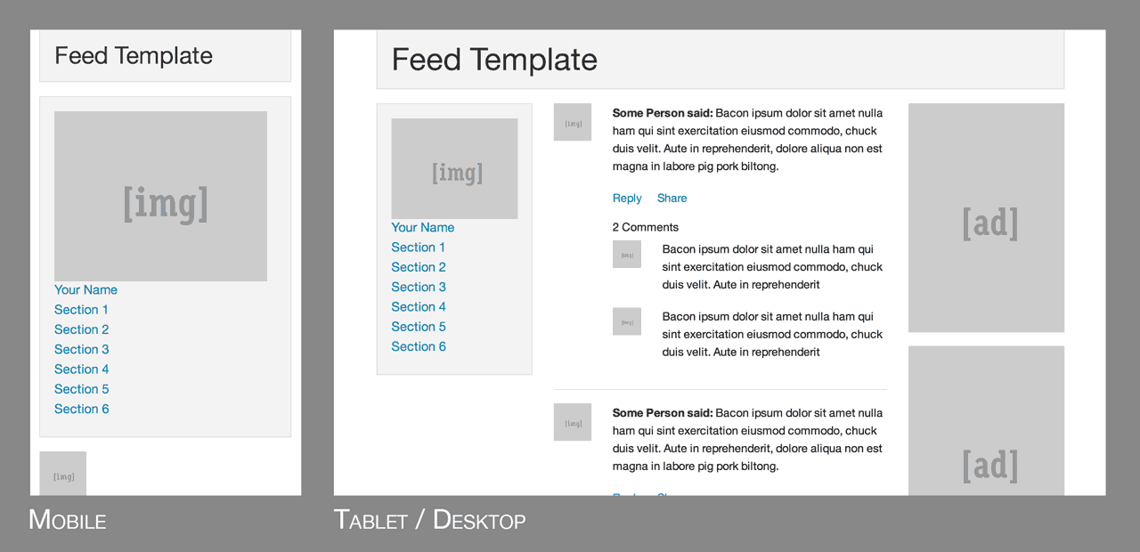
Unless you’re building an extremely simple 1-page website, it’s almost always a smart idea to pick a front-end framework to start out with, even if it’s just for rapid prototyping. The responsive grids in these frameworks are very robust and thoughtful, so there’s no need to “reinvent the wheel” and start over.
Responsive Images
Beyond just multiple screen resolutions, web designers now have the added challenge of multiple pixel densities. Phones, tablets, laptops, and even some desktops, might have 2x or even 3x the number of pixels. In my own opinion, I think the best way to handle high DPI displays is to use an SVG first approach. In other words, anything that’s not a detailed photograph or illustration should be an SVG, because they can scale to any resolution and the file sizes are typically small.
If photographs or any kind of JPEG images are required (and they almost always are), typically you can get away just making them twice the size of their parent container. So for example, if the parent is 400 pixels wide, the image inside should be at least 800 pixels wide. This same trick works for background images when the background-size property is set to 50% or less.
However, if you need something more robust for lots of images, it’s worth investigating newer responsive image solutions. The Responsive Images Community Group has been working towards a client-side solution that comes in the form of both the <picture> element and the srcset attribute for the <img> element. Browser support is still far off, but they also offer a JavaScript polyfill that lets you use these features today.
Another solution is ZURB Interchange, which uses a combination of JavaScript and HTML data attributes. In fact, this is a feature of the Foundation framework mentioned previously.
More Responsive Resources
Responsive web design can be a bit overwhelming at first, but if you need some additional resources, I recommend visiting the site This Is Responsive. There you can find responsive design patterns, more responsive resources, and responsive news.
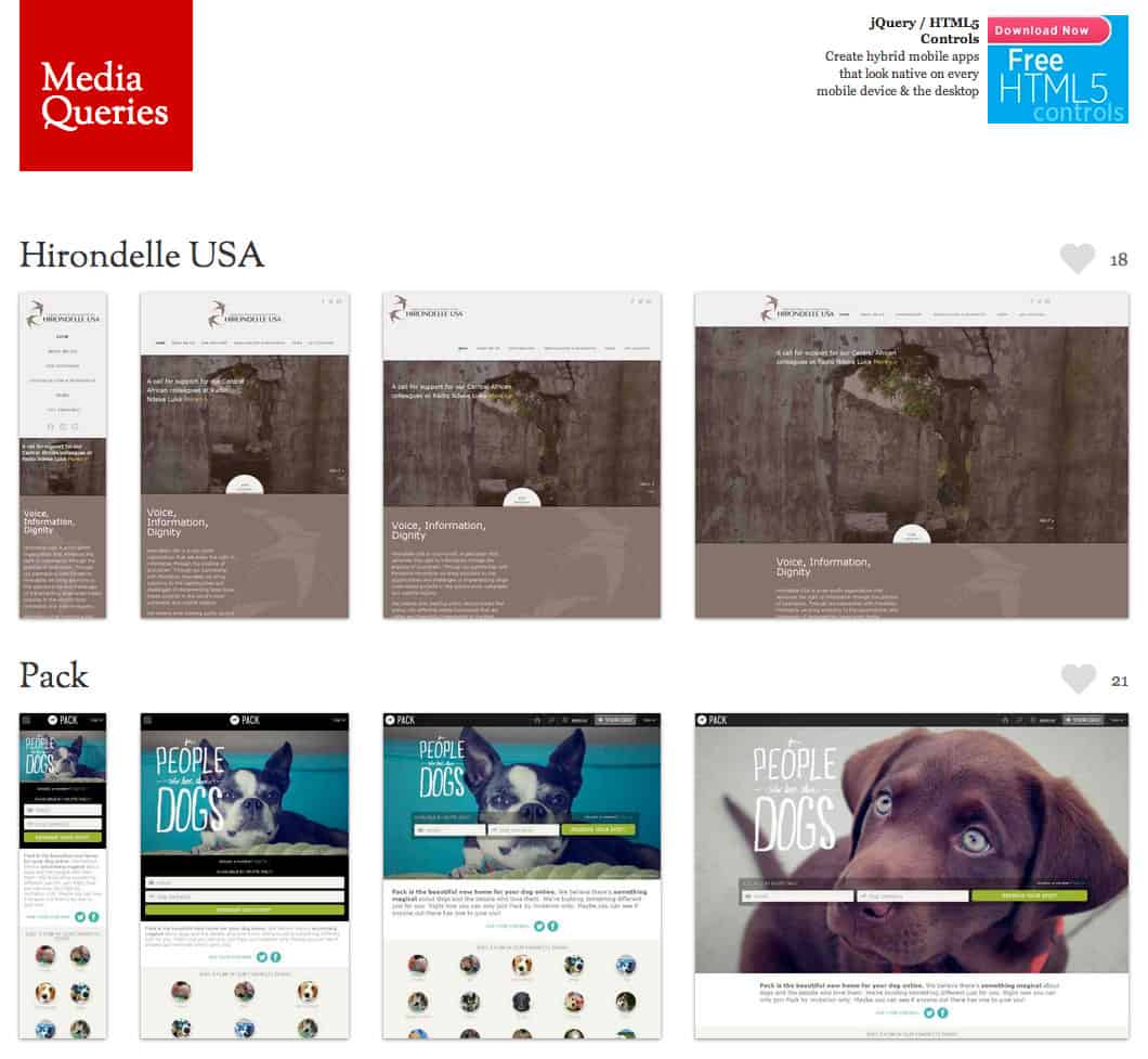
It’s also worth checking out the mediaqueri.es website. There you’ll find a huge showcase of responsive websites; perfect if you’re in need of some inspiration.
Responsive web design has become a huge umbrella that encompasses many different tools, techniques, workflows, and resources, so it’s impossible to create a guide that’s completely comprehensive. If you have any responsive links or thoughts that you think are essential for web designers and developers to know about, please share in the comments!
Check out Nick’s course ‘How to Make a Website‘, free for 14 days, at Treehouse.



This post is very useful and informative.
Thanks for the sharing. Now-days, we are move from traditional design to responsive design. It makes the design good for client website and applying related themes to a mobile or tablet device .
Yes, Responsive website is the new standard and trend. Nice Post! Thanks for sharing this article. It’s really helpful!
This article is really nice and informative. Thanks for the sharing. I think we’re really going to start to see a move from traditional design to responsive design. It makes the most sense for clients who are looking to design their website and applying related themes to a mobile or tablet device without having to create a native app.
Crisp concept with perfectly decorated with graphics & coding have made this blog perfect for the novice users. Thanks for posting it!
Nice piece of collaborative instructions and overview, really informative. Thanks 🙂
Thanks for the article – I think it deserves an update! Been looking for ways to standardize my designs going forward while accommodating high res displays as well as scallable text…there really isn’t an easy way unfortunately.
Thoman
Responsive websites is making one website,which acts and behaves like individual websites have been made for each devices.
It’s no secret that more and more people are accessing the internet through mobile devices. We can’t deny the fact that search engines are the most common starting points for mobile device users and are helpful to SEO strategies. Computers aren’t the only piece of hardware with a web browser anymore. Today’s mobile devices are basically mini computers you can use to search for information online. Along with the changing landscape of web browsers, users’ expectations have also changed. People now expect to be able to browse the web on their phones just as easily as they can on the web using a desktop computer. We all know that SEO campaigns can be time consuming but with responsive design all of your efforts can be focused on a single site, with unified strategy and tactics across devices. In addition, mobile optimised, responsive sites, are featuring prominently in localised search results. That’s how advantageous a responsive website is for your SEO strategies.
With regards With regards ITB-develolpment company team
Hi Nick,
Nice post!! Media query is very good option in past time but due to the introduction of Bootstrap responsive designs are much more easy now .
It’s Really effective Post for clear concept on Responsive web design.At present, Responsive Web design’s demand are very highly in IT Sector.Thanks Share for your Idea
Very interesting and useful post Nick. Thanks … You are explained technical knowledge very beautifully in simple words.
thank you for post publish.
if i have website real size 1200 x 740 px and website fit to show
in 1900 x 1280 px background black dark. but i don’t have idea
to do responsive design.
Heya i’m for the first time here. I came across this board
and I to find It truly useful & it helped me out much. I’m hoping to offer something back
and help others like you helped me.
Thank you for sharing very informative article.
ブランド激安市場コピーブランドコピー,スーパーレプリカ,ブランド激安市場 女社長 激安 シャネル 財布(CHANEL),グッチ 財布 (GUCCI) 激安,ヴィトン(lv) 新作 財布 激安 ルイヴィトン財布コピー,新作 ブランブランドを特別価格で提供中!ルイヴィトン財布、ルイヴィトンバッグ、ルイヴィトンベルトブランド激安市場ブランドコピー,大人気のルイヴィトン,スーパーコピー,様々な高品質ーパーコピー時計,ブルイヴィトン コピー ブランドレプリカ 激安 ブランド激安市場 ロレックス コピー スーパーコピー ルイヴィトン、シャネル、グッチ、エルメス、クロエ、ブラダ、ブルガリ ドルチェ&ガッバ―ナ、バレンシアガ、ボッテガ.ヴェネタ偽物ロレックス、ブルガリ、フランク ミュラー、シャネル、カルティエ、オメガ、IWC、ルイヴィトン、オーデマ ピゲ、ブライトリング、
エルメス ボリードスーパーコピー.ブランド直営店.ブランド,エルメス激安通販,業界で最高な品質に挑戦します!”ブランドN級品ブランドコピー 代引き,スーパーコピー時計,ブランドN級品,楽天コピーブランド,,偽物ブラン日本最大級の最高のスーパーコピーブランド財布激安代引き販売店,スーパーコピー時計の激安老舗.!国内No.1時計コピー工房,アフターサービスも自ら製造したスーパーコピー時計なので、技術力でお客様に安心のサポー トをご提供させて頂きます。スーパーコピー 代引きN品をご 購入の方は、こちらへ.弊社は正規品と同等品質のコピー品を低価で お客様に提供します!すべての商品は品質2年無料保証です。100%実物写真ですし、品質が完璧です!”スーパーコピーブランド財布激安 偽物財布激安コピー ルイヴィトン財布偽物,偽物財布コピー http://www.bagkakaku.com/vuitton_belt.html
2015ブランド財布コピールイヴィトン財布コピー,シャネル財布コピー,グッチ財布コピー,エルメス財布コピークロエ財布コピー,ブラダ財布コピー,ブルガリ財布コピー,ドルチェ&ガッバ―ナ財布コピーバレンシアガ財布コピー,ボッテガ.ヴェネタ財布コピーロレックス時計コピー,ブルガリ時計コピー,フランク ミュラー時計コピーシャネル時計コピー,カルティエ時計コピー_オメガ時計コピー,IWC時計コピールイヴィトン時計コピー,オーデマ ピゲ時計コピー,ブライトリング時計コピーコピーブランド、ブランド激安、人気ブランドの販売、通販、オークション、新作のスーパーコピーブランドコピー、韓国スーパーコピー、ブランド激安、偽物ブランド、ブランドバッグ、激安かばん、ルイヴィトン偽物、財布激安.商品は全く写真の通りです。
人気スーパーコピーブランド時計激安通販専門店私達は長年の実体商店の販売経験を持って、先進とプロの技術を持って、高品質のスーパーコピー時計づくりに 取り組んでいます。最高品質のロレックス時計コピー、カルティエ時計コピー、IWC時計コピー、ブライトリング時計コピー、パネライ時計コピー激安販売中商品の数量は多い、品質はよい。海外直営店直接買い付け!★ 2015年注文割引開催中,全部の商品割引10% ★ 在庫情報随時更新! ★ 実物写真、付属品を完備する。 ★ 100%を厳守する。 ★ 送料は無料です(日本全国)!★ お客さんたちも大好評です★ 経営方針: 品質を重視、納期も厳守、信用第一!税関の没収する商品は再度無料にして発送します http://www.msnbrand.com/brand-copy-IP-2.html
スーパーコピーブランドショップ有名ブランド品の輸入業、卸売り業、インターネット小売販売N級,,S級 ヴィトン、シャネル、グッチ、財布、バッグ。 高級腕時計ROLEX 、OMEGA 、CARTIER 、 BVLGARI、是非ご覧下さい。2015超人気腕時計、LOUIS VUITTON新品の大量入荷!商品の数量は多い、品質はよい、価格は低い、現物写真!本当の意味でのハイレプがほしい方にお勧めです。経営方針: 品質を重視、納期も厳守、信用第一は当社の方針です。
スーパーコピー腕時計,ロレックスコピー,ブライトリングコピー,ボーム&メルシエコピー時計コピー業界最高峰スーパーコピー時計通販専門!7年以上の販売実績を 持つ時計コピー老舗!時計コピーであれば何でも揃えられます コピー時計 時計スーパーコピー通販専門店!時計コピー時計販売通販! コピー時計スーパー コピー等の 最高級のレプリカコピー時計を販売ロレックスコピー,ガガミラノコピー ,IWCコピー ,オメガコピー ,フェラーリコピー ,フランクミュラーコピー ,ベル&ロスコピー ,各種のブランドはコピーを表しますコピーを表して、時計をコピーして、スーパーコピーは代 金引換払いにして、スーパーはブランドをコピーして、スー パーは時計をコピーして代金引換払いにして、スーパーは時 計をコピーして、スーパーは腕時計をコピーして、ブランド はスーパーマーケットを表してコピーして、ブランドのスー パーマーケットはコピーして、ブランドはコピーを表して、 腕時計はコピーします ,ボーム&メルシエコピー時計コピー業界最高峰スーパーコピー時計通販専門!7年以上の販売実績を 持つ時計コピー老舗!時計コピーであれば何でも揃えられます コピー時計 時計スーパーコピー通販専門店!時計コピー時計販売通販! コピー時計スーパー コピー等の 最高級のレプリカコピー時計を販売ロレックスコピー,ガガミラノコピー ,IWCコピー ,オメガコピー ,フェラーリコピー ,フランクミュラーコピー ,ベル&ロスコピー ,各種のブランドはコピーを表しますコピーを表して、時計をコピーして、スーパーコピーは代 金引換払いにして、スーパーはブランドをコピーして、スー パーは時計をコピーして代金引換払いにして、スーパーは時 計をコピーして、スーパーは腕時計をコピーして、ブランド はスーパーマーケットを表してコピーして、ブランドのスー パーマーケットはコピーして、ブランドはコピーを表して、 腕時計はコピーします http://www.bagkakaku.com/louisvuitton_bag.html
スーパーコピー時計販売はコピーガガミラノ通販専門店です . 0.106072179 レプリカガガミラノの私は(私がオンラインで見つける大丈夫、ランダマイザ)大きなふわふわサンタの帽子の中にすべてのaBlogtoWatchチームメンバーの名前を入れて、ランダムに彼らは匿名で2014年からガガミラノの時計を選ぶだろう誰のために相互に各チームメンバーをペアに名前を描いた私はその後、それぞれに通知彼らは「買い物」のためだった、と彼らに “贈り物”を選択し、彼らはその人のためにその時計を選んだ理由について書くための期限を与えた人物 . スーパーコピーガガミラノ時計豊富な品揃えで最新作も随時入荷致しております のでごゆっくりとご覧ください。☆ ガガミラノ時計税関の没収する商品は再度無料にして発送します☆ 送料無料 .
ブランド激安市場コピーブランドコピー,スーパーレプリカ,ブランド激安市場 女社長 激安 シャネル 財布(CHANEL),グッチ 財布 (GUCCI) 激安,ヴィトン(lv) 新作 財布 激安 ルイヴィトン財布コピー,新作 ブランブランドを特別価格で提供中!ルイヴィトン財布、ルイヴィトンバッグ、ルイヴィトンベルトブランド激安市場ブランドコピー,大人気のルイヴィトン,スーパーコピー,様々な高品質ーパーコピー時計,ブルイヴィトン コピー ブランドレプリカ 激安 ブランド激安市場 ロレックス コピー スーパーコピー ルイヴィトン、シャネル、グッチ、エルメス、クロエ、ブラダ、ブルガリ ドルチェ&ガッバ―ナ、バレンシアガ、ボッテガ.ヴェネタ偽物ロレックス、ブルガリ、フランク ミュラー、シャネル、カルティエ、オメガ、IWC、ルイヴィトン、オーデマ ピゲ、ブライトリング、 http://www.gginza.com/watch/iwc/index.html
Hi Nick,
Is there any open source tool that gives responsive results in percentages of a particular website. Let suppose if I visit one page with that tool it should display that 90% of page is responsive and 10% is non-responsive due to these elements.
Do we have any such type of tools?????
I like your post …you have shared good information about responsive designs…I also work as a web designer,
Recently I read about responsive web design from different sites. But this is one good place to read about it now.
I experimented this concept on a project and it worked out pretty well also.
I’d be interested if teamtreehouse needs someone to write such a detailed article and provide insights on a topic.
I have also visited http://www.webbased.me/ and i found this site helpful for SEO purpose…
Great Post!!! Thanks for sharing informative article.
HI , That was great lecture
but i have question ( is it standard to use 960px Grid ) with responsive designs ?
or i can use different width with 12 columns , I’m designing for Booking system but when i wanted to start designing after finishing UI/UX part , business owner asked if there is a way to make it wider , I explained to him how it’s important to use 960px , but they look for the size because there is a lot of process in that website .
I’m just worry to do something not right as designer and for 2015 Trend!
I will wait your reply , Thanks in Advance
Hello Hello,
I’ve experienced some problems with the mobile display of my website. Because of you article, I can solve these problems.
Thank you for the assistance!
Helo,Hello, I like your post very much.I got new idea to design my site from your blog.It helps me a lots.
Great article. As you point out, there’s a centrifugal force and a centripetal force that together are driving website designers towards RWD. The first is the fast-fragmenting universe of mobile devices. The second is the exponentially increasing number of mobile users.
Those twin forces also bedevil designers when it comes to actually testing their elegant RWD designs on leading phones.
There are two testing solutions, but both come packaged with their own issues:
–Emulators unfortunately fail to catch all errors and therefore induce a false sense of security
–Homegrown mobile device testing labs take time and money and are hard-pressed to keep up with newly released models.
That’s why Mobile1st has released Mobilizer, its online testing lab that enables you to test (and locally test) your website across 14+ leading mobile devices in a matter of seconds right from the comfort of your desktop browser.
Not too shabby, I say. Take a look at how well Team Treehouse’s RWD looks: https://app.mobile1st.com/mobilizer/#/view/JLsd
Hi nick,
Today this is the main factor for web designing according to google and client perspective.responsive and custom web designing in demands .i read lots of things about website responsive .its helpful for my technical skills.
Thanks !!!!
Really good introduction to responsive web design, thanks for helping me understand!
Thanks Nick! responsive design make sense to me now. I’m a genesis framework fan this is the first framework that introduce to m on the web and they used max-width with thier media queries. My question is how would I know when to use min-width or max-width on media queries?
Love the article, hits on some very important parts. Made may sit back and think of the things i’ve done in the past and how it affects things i do now. These type of articles makes a developer rethink the whole process of building a website. Which i think keeps your mind open to new methods.
How can I check my site http://www.m2-spb.ru for responsive or not ?
Responsive web design refers that web pages should display its content to fit any devices like Desktop. Mobile Phone, Tablet.
Hi Nick,
Thank you for writing this article, I have not coded HTML and CSS in a long time and HTML 5 / CSS 3 / RWD come into focus and I’m back to learning again. After reading this I’m strongly considering purchasing a Treehouse membership too.
Darren
Thanks for such a nice information i trying to Optimize my site for responsive this post is very useful for my website development.
You said this about `max-width: 100%;` on images:
This will tell the browser that any images should only ever be as large as their pixel value, which will ensure that the image is never stretched or pixelated.
This is false. This rule says that the image will never exceed the width of its container, but if an alternative `width` rule is set, it could potentially stretch an image beyond its actual pixel size.
Hi Joe,
I’m not quite sure what you mean. I think I may have just phrased this strangely, but perhaps you can provide an example of what you’re talking about?
NICK HI
First thank you to sharing this stuff in public ally After Read your article I can say that I got some thing good first time about Responsive finding bunch of nonsense and promotional stuff about Responsive I loss my hope to get learn some technical about Responsive where I go found only “responsive is good we should apply it on site ” no single tell “How to ” then I reply to them very seriously but your nice step by step topic understanding really I read your article more 2 time and I will read it again and again whenever I got stuck some where also Recommend it my friend share it on my profile
Thanks for the write-up, Nick. I just started taking classes on Treehouse a couple of weeks ago and am enjoying it thoroughly!
Awesome! Welcome to Treehouse. 🙂
Awesome article. Although am just starting my web design program. I believe this article is very important and will help me to learn RWD.
Thank you for the good work. You are blessed.
Thanks for reading!
Cheers. Every few months we have to update or tweak our boilerplate to accommodate be(tter) practices and a wider spectrum of issues. Nice job covering all the bare-bones needful that should happen before the tackling the grey-hair-inducing stuff.
It certainly can be frustrating at times! That’s why getting the basics right first is so important. 🙂
Perfect for a quick overview , refresher, reminder or intro to RWD! Thanks for this !
Absolutely best in this article : it’s clean-cut and there are immediate code examples to check.Wonderful!
Thanks for reading, I’m glad you enjoyed it!
This paragraph provides clear idea for the new visitors of blogging,
that really how to do running a blog.
Hey Nick, what about tiny, squashed up little boxes, and 960px containers with a drop shadow behind them? Is that good? Also. Using fonts with no italics or bold, in less than 16px?
Hi Lauren,
It’s tough to say, it really depends on the design. If you have something you’d like to share here, I’d be happy to take a quick look.
My style guide might come in handy when developing a CSS-intensive responsive web design.
http://blog.ponyfoo.com/2014/05/17/css-the-good-parts
Awesome, thanks for sharing!
Thanks for the article! You guys always make thinks look easier than they are!!
Thanks for reading, we’re always happy to help. 🙂
Very inspiring article for us Thanks for the great article. …. It’s definitely a good idea for me and my friends to learn
the things that’ll expand their skill set
Your ideas and presentation is very effactive and useful for all. I am loving all of the in turn you are sharing with each one!…
Being a user i really like your visible information on this page
Website Designing
Sweet resource links. Cheers Nick.
Thanks for reading!