Last Updated on May 21, 2015 by Laura Coronel
I can remember a time when pretty much everyone designed websites for an 800×600 screen resolution, but (thankfully) those days are long gone. Smart watches and 4k displays are pushing resolutions at both ends of the spectrum, and even more devices fill the gaps between, such as desktops, tablets, phones, and gaming consoles. In parallel, the density of pixels is increasing, too.

Designing for a single screen resolution is dead. Photo courtesy Flickr user endlisnis.
How can a web designer create sites that work on the devices of today and tomorrow? In this post, I propose a workflow called Scalable Web Design that attempts to address pixel density in a sustainable fashion.
Contents
We’ve Been Here Before
Fortunately, Responsive Web Design (RWD) came at just the right time and has since become the de facto solution for building modern websites. If you’re not familiar with it yet, the Beginner’s Guide to Responsive Web Design will help you get caught up. The genius of RWD is that it works on current devices as well as devices that haven’t been dreamt up yet. No matter what kind of shiny new glowing rectangles are released in the next few years, chances are pretty good that a responsive website will require little to no changes.
RWD solves the problem of device sizes, but some devices have a 1x pixel ratio, some are at 2x, still others are at 1.5x, and who knows what else. Check out this handy table at screensiz.es to see what I mean.
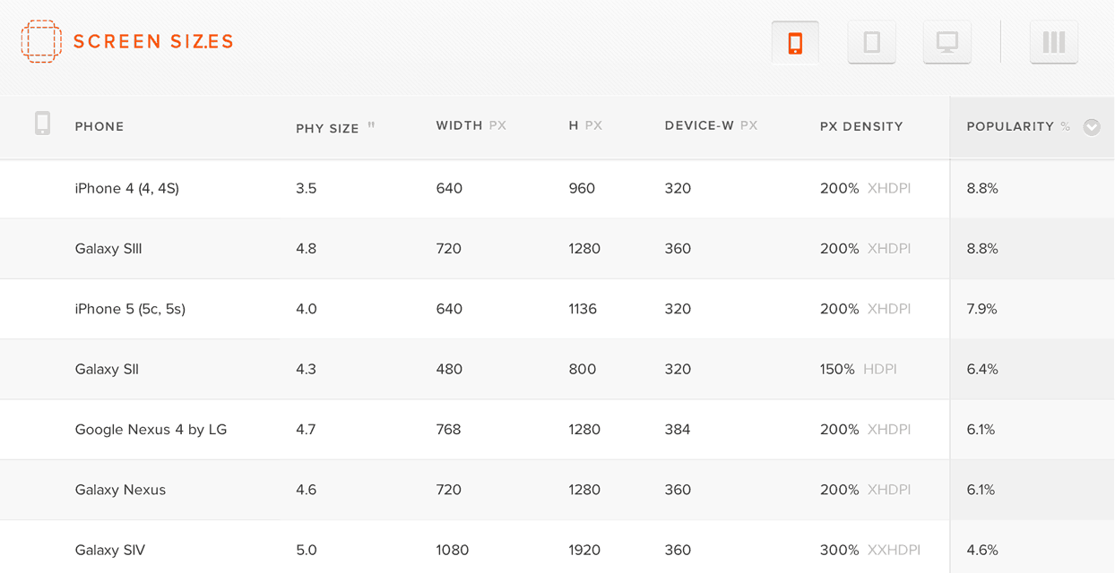
Screensiz.es provides tables of information about popular hardware devices.
Once again, web designers are faced with a new rabbit hole of questions with fuzzy answers. Do you create 1x and 2x versions of all your images? Do you only use 2x for everything? What if 3x becomes popular?
Scalable Web Design
The problem of pixel densities is similar in spirit to the problem of screen sizes that RWD solves, so I’ve come up with a workflow that I’ve been calling “Scalable Web Design.” I’m sure some people will hate this term because scalable already can refer to building sites that are capable of handling lots of traffic, but you could say similar things about the term responsive. As long as it’s used in the context of design, I think it adequately encapsulates the idea of creating designs that scale with pixel density. If you agree or disagree, I’d love to hear your thoughts in the comments.
So then, what are the steps for building a scalable design? Let’s break it down.
Step 1: Vector First
Rather than scramble to accommodate every new pixel density, it’s better to retool our thinking from the start. As mobile devices surge beyond the popularity of desktops, this shift in thinking has already started with the “mobile first” approach (and rightly so). Now, I think it’s time we start thinking “vector first” as well. Check out this 19kb SVG example on CodePen and notice how crisp it looks, even when it fills the page.
See the Pen AFjaw by Nick Pettit (@nickpettit) on CodePen
If you’re addicted to using Photoshop for everything, it’s time to start learning a vector based drawing program like Illustrator. Vector graphics like SVGs and icon fonts have considerable benefits over bitmap formats:
- Vectors can scale to virtually any pixel density. Only at very small sizes (like favicons) should you create a more customized graphic.
- Vectors typically have smaller file sizes than their bitmapped counterparts, especially when the comparison is between imagery with large dimensions.
- Vectors will never have any compression artifacts. They’ll always look sharp.
- Vectors are more future proof than bitmaps. If 2.5x or 3x or 4x screens catch on, your assets will be ready to go.
Designing with vectors in mind from the start should prompt healthy thinking about aesthetic and technological choices. For example, if you only need to use 1 or 2 photographs and it’s going to mean including more code to serve multiple source images, it might make you reconsider whether or not that photograph is really necessary. I wouldn’t expect every web designer to create sites with 100% vector imagery, but it’s certainly worth using vectors where possible. The good news is, vectors work beautifully with the recent “flat design” aesthetic, as most vectors trend towards solid colors, sharp lines, and simple shapes.
When it comes to vectors, you basically have the option of using icon fonts or SVGs. Icon fonts are great because there are lots of premade options and they boast smaller filesizes than SVGs. However, as Filament Group smartly pointed out, browser support for icon fonts isn’t that great. SVGs on the other hand are pretty well supported and they allow for full color graphics and gradients (font icons are monochromatic). Filament Group even created an awesome bitmap based fallback solution called Grumpicon. The workflow is simple:
- Export your SVGs from your vector package of choice. The default settings in Illustrator are fine.
- Drag and drop all your SVGs into Grumpicon.
- When you’re done, you get example code showing you how to use your SVGs as background images along with the fallback images. Awesome!
For more detailed information about SVG browser support, here’s the handy caniuse.com SVG support table.
Step 2: CSS Next
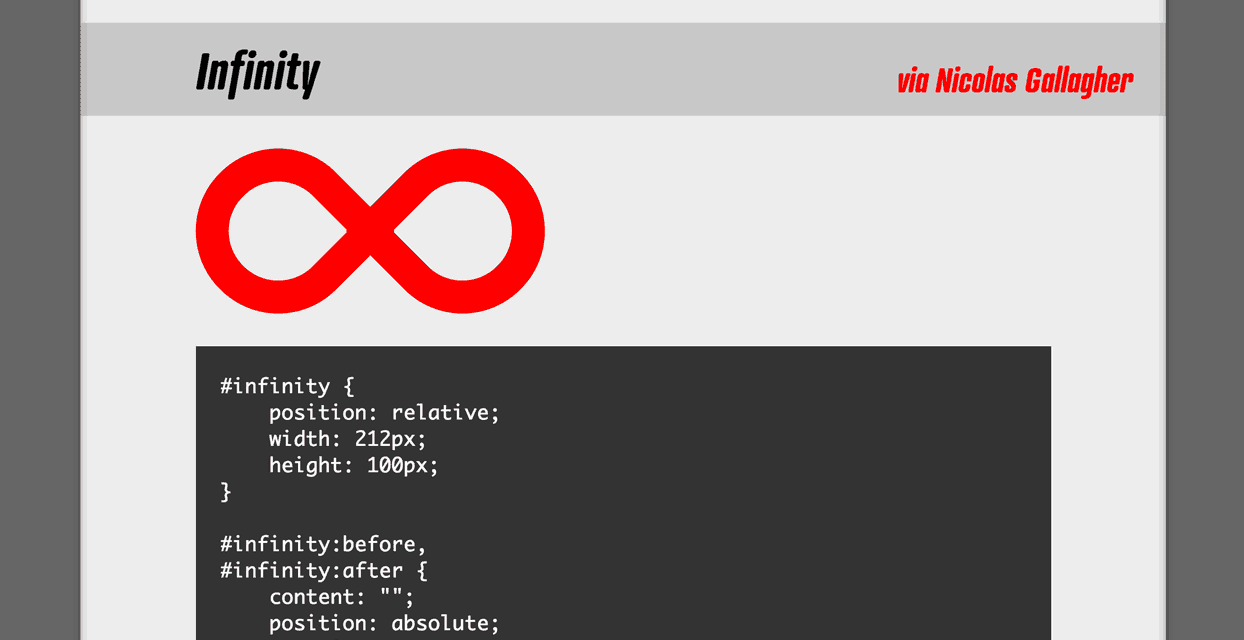
After you’ve created a vector layout, you should next look for areas where SVGs can be replaced with simple CSS. Designing with vectors has a tendency to lead towards flat color and simple shapes. Using CSS pseudo elements, it’s possible to create lots of shapes without adding any markup. To see lots of examples of shapes created with a single HTML element, check out The Shapes of CSS on CSS-Tricks.
Replacing SVGs with CSS will help reduce the number of assets you need to load, which makes for more performant pages. This step will pick up even more steam in the next few years when the CSS shapes module gains broad browser support.
Step 3: Bitmaps for Photographs
Vectors don’t work for extremely detailed images like photographs or screenshots, so you will still need to use bitmapped graphics there (the picture element is looking like a promising solution in this case). However, limitations can be a great source of creativity.
For example, Treehouse teacher Mat Helme created a website for a fictional conference called Stop Visual Pollution and the site uses SVGs for all the images. It’s not perfectly responsive (as it’s only intended for demonstration purposes), but it’s a wonderful example of what vector based thinking can lead towards. He could have used photos for the speakers, but the illustrations are much more captivating. This graphically rich site is just 386kb total and it looks incredibly sharp on my 15″ retina display. To do this without vectors, you would need to use massive PNG images, which isn’t practical.

This screenshot of the fictional Stop Visual Pollution website shows how Mat used illustrations for each speaker instead of a photograph.
If you do need to use bitmaps, start out with the largest source material available. It might not ever get used in production, but it’s good to keep it handy in case you need it someday.
As a general rule of thumb, it’s usually safe to provide a single 2x bitmap and call it a day. Modern browsers do a great job of scaling these down to 1x if necessary and the difference in filesize between 1x and 2x images is usually pretty small. That’s because you can apply a much greater amount of image compression to 2x images and they’ll still look good, because the compression artifacts have a tendency to wash out when the images are rescaled.
For responsive designs, you may need to use multiple image sources that get served up based on the size of the screen. The picture element which I mentioned earlier looks like a promising for the future, but presently, there are numerous solutions that do this. Here are a few to get you started:
Many image source swapping solutions will also allow you to include imagery intended for higher pixel densities. If you do find that a higher number of your website visitors are using 3x devices and beyond, you’ll probably want to consider serving up 3x assets specifically for them (and not to other visitors as to not waste bandwidth). If you need help doing your density calculations, check out the Teehan+Lax Density Converter.
Tomorrow is Today
I think the advent of vectors came a bit faster than web professionals expected. For years SVGs were a dream from tomorrow, but Internet Explorer was the last holdout, and that threshold was crossed several versions ago now.
Indeed, uncertainty is a part of web design, so we should embrace it. It’s impossible to predict every twist that technology will take next and create future proof designs, but vectors are a pretty good preventative measure.




thanks for giving a good ideas and nice blog post.
we also provide a website designing services in just 5999/
for more visit : http://www.webtechservice4u.com/web-designing.php
What an irony to write about scalable web design in blog that uses less than 1/3 of my desktop monitor.
Well, why shouldn’t it?
Ideal character count on a row is 66 characters for best reading experience.
A bigger resolution such as yours doesn’t necessarily translate to the site occupying 60% of the window
If you’re referring to the navbar uptop filling 1/3 of your screen then that is a fault, indeed.
Thanx For Sharing this important thing. Your website is very useful to learn.
Visit here for website Designing in Just 1999/- Jhatpat99 Internet Ltd.
Great article with lots of great resources. I am bookmarking this article for future reference in an upcoming blog article.
Thanks Nick!
I love SVG’s and I hate saving out multiple images for different devices. So the adoption of SVG’s have really made me happy.
It also makes designing in the browser that much easier, and less photoshop time 🙂
This is one of the main reasons we have this flat movement in my opinion. Creating vector icons really makes the designer keep icons simplified with recognizable symbols.
Extremely resourceful write-up. Had been looking for insights on SVGs, as I am learning to keep icons in my code as scalable as possible.
I really enjoy the post.