
Last Updated on October 22, 2018 by Laura Coronel
The <dialog> element originally entered the HTML5 scene as a way to markup conversations but it was cut from the spec back in 2009. However now it’s back, and it has a brand new role.
The new <dialog> element makes it really easy for developers to create popup dialogs and modals for their web applications. Before now this required using a JavaScript plugin. However popup dialogs have become so popular that the Chrome team have decided to create a native implementation of this UI component.
In this blog post I’m going I take you on a tour of the new <dialog> element and show how it’s going to make your life a lot easier in the future.
Contents
Enabling Support For <dialog> in Chrome Canary
The title of this blog post says preview because the <dialog> element is currently only supported in Chrome Canary, and even then you have to enable a flag to use it.
If you want to try out the demos in this post make sure that you have Chrome Canary installed on your computer.
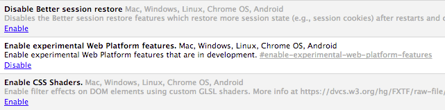
Enable Experimental Web Platform Features Flag
Once you have Chrome Canary installed go to chrome://flags and enable the Enable experimental Web Platform features flag. You will need to restart the browser for the change to take effect.
The New <dialog> Element
To define a new dialog you just need to add a <dialog> element somewhere in you HTML markup. Any HTML that is placed between the two tags will be displayed in the dialog.
<dialog id="dialog">
  <p>Hi, I'm a dialog!</p>
  <button id="close">Okay</button>
</dialog>
Once you have defined your dialog you can show it using methods provided by the HTMLDialogElement interface. Lets take a look at that next.
The HTMLDialogElement Interface
The HTMLDialogElement interface provides a number of methods and properties that can be used to show and hide your dialogs. These can be called directly on your <dialog> elements.
var dialog = document.getElementById('#dialog');
dialog.show();
The browser will take care of correctly positioning your dialog when it is launched. You can override this if you want to using CSS. We’ll take a look at how to do that later on.
The current implementation of the HTMLDialogElement interface includes support for a pending dialog stack. This means that you can queue multiple dialogs that will be displayed to the user individually.
Methods
The HTMLDialogElement interface provides methods for showing and closing dialogs. These are:
show()– Used to launch a dialog. The user will still be able to interact with other elements on the page whilst the dialog is visible.showModal()– TheshowModal()method will also launch a dialog. This method however, will prevent the user from interacting with anything other than the dialog. This is similar to how traditional alerts work.close()– This method will close a dialog. You can optionally pass in areturnValueparameter which will update thereturnValueproperty on the dialog.
Properties
The HTMLDialogElement interface has two unique properties.
returnValue– This property is used to retrieve the value passed intoclose().open– This is a boolean value that will be set totruewhen the dialog is visible.
Events
A close event will be fired when the dialog is closed. You can listen out for this using a standard event listener on the dialog.
dialog.addEventListener('close', function(e) {
  // Do something.
});
Creating Dialogs
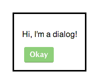
An Example Dialog
See the Demo Download The Code View on CodePen
Now that you’ve learnt about the <dialog> element and the interface that backs it up, lets take a look at a few examples.
First we are going to see how to launch a simple dialog. The HTML here just includes a simple <dialog> element with some text and a close button. We’ve also included a button that will be used to launch the dialog.
<dialog id="dialog">
  <p>Hi, I'm a dialog!</p>
  <button id="close">Okay</button>
</dialog>

<button id="show">Show Dialog</button>
The JavaScript for this example is pretty straight-forward. We start by getting references to the dialog, and the show and cancel buttons. Next we setup an event listener that will call show() on the dialog when the show button is clicked. Finally we setup an event listener that will close the dialog when the close button is clicked.
var dialog = document.getElementById('dialog');
var showBtn = document.getElementById('show');
var closeBtn = document.getElementById('close');

// Setup an event listener for the show button.
showBtn.addEventListener('click', function(e) {
  e.preventDefault();

  // Show the dialog.
  dialog.show();
});

// Setup an event listener for the close button.
closeBtn.addEventListener('click', function(e) {
  e.preventDefault();

  // Close the dialog.
  dialog.close();
});
Creating Modal Dialogs

An Example Modal Dialog
See the Demo Download The Code View on CodePen
Creating modals is almost identical to how you create dialogs. The only difference is that you should use the showModal() method rather than show() to launch your dialog.
The HTML code here only has a few small changes to the text.
<dialog id="modal">
  <p>Hi, I'm a modal!</p>
  <button id="close">Okay</button>
</dialog>

<button id="show">Show Modal</button>
Here is the JavaScript code for the demo. Notice the use of showModal() rather than show().
var modal = document.getElementById('modal');
var showBtn = document.getElementById('show');
var closeBtn = document.getElementById('close');

// Setup an event listener for the show button.
showBtn.addEventListener('click', function(e) {
  e.preventDefault();

  // Show the modal.
  modal.showModal();
});

// Setup an event listener for the close button.
closeBtn.addEventListener('click', function(e) {
  e.preventDefault();

  // Close the modal.
  modal.close();
});
Styling Dialogs With CSS
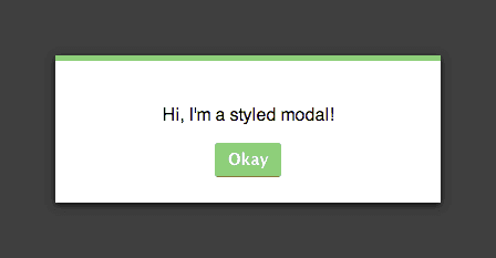
A Styled Modal Dialog and Backdrop
See the Demo Download The Code View on CodePen
You style your dialogs just as you would any other element. The browser will automatically position the dialog in the center of the viewport. You can override this behaviour using the top, bottom, left and right properties if desired.
dialog {
  background: #FFF;
  width: 300px;
  text-align: center;
  padding: 1.5em;
  margin: 1em auto;
  border: 0;
  border-top: 5px solid #69c773;
  box-shadow: 0 2px 10px rgba(0,0,0,0.8);
}
When using modal dialogs you can also style a backdrop in order to communicate to the user that interactions with the main page have been disabled. To do this you use the ::backdrop pseudo-element. You can then use standard CSS properties to position and style the backdrop.
dialog::backdrop {
  position: fixed;
  top: 0;
  left: 0;
  right: 0;
  bottom: 0;
  background-color: rgba(0, 0, 0, 0.8);
}
Note: The ::backdrop pseudo-element only works on dialogs launched using showModal().
Final Thoughts
It’s still early days for the reincarnated <dialog> element but I think it will become very popular amongst front-end web developers as time rolls on. Eliminating the need for a plugin to create dialogs helps to reduce page load times, as well as just making things easier for us developers.
The Chrome team have developed a polyfill that adds support for the <dialog> element to other browsers. That being said, I’d be cautious about using <dialog> in any important projects just yet.
I think it’s great to see browser vendors creating native implementations of some of the most frequently used UI components.
What are your thoughts about the <dialog> element? Do you think that browser vendors should be implementing these things, or are we better off with plugins?


Great article. I am reading this your article. Many more information I am learned. Thanks Matt West. http://www.cavinitsolutions.com/
Pretty nifty that automatically handles positioning in the center of the browser window. Good article, thanks for the tip!
Edit: Ha, disqus thinks I’m trying to actually use the element in this comment and has dropped a closing tag in.
Thanks for reading Mike 🙂