
(Image from Flickr user Canada Science and Tech)
The input element is a deceptively simple HTML form element. After all, <input> is just one HTML element, right? Whether you’re still new to HTML or if you’ve been writing it for 15 years like I have, you might be surprised to learn that the input element has more than 30 attributes. It’s even more if you include the global attributes in that count. That’s a lot of complexity by itself, but it gets crazier: The most important attribute, type, has more than 20 possible values! Take a quick look at the MDN doc for the input element and get ready to scroll.
SIGN UP FOR A FREE TRIAL TO TREEHOUSE
Contents
Input Element Type Attribute
On the input element, the type attribute specifies one of many different kinds of form controls that can be displayed. Each control has a different purpose and is capable of collecting a certain type of data from the user. If you’d like to see all the input element types at once, check out this page with every input type (this rapidly evolving technology works best in Chrome right now). Here are some of the newer and more interesting types you may not have known about.
Color
Many web applications have a use case for a color picker. The user might be able to choose the background color of a social profile or customize the color of a physical product. Traditionally this was only possible with a front-end JavaScript framework like jQuery, but the W3C has introduced a new value for the input’s type attribute called color. Here’s the code along with a screenshot of what it looks like in Chrome on Mac OS X.
<input type="color" value="#6fbc6d">
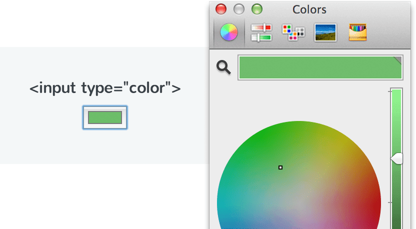
Browser support for the color type is still chaotic and it’s not ready for primetime yet, but the latest versions of Chrome and Firefox both have native color pickers implemented now. You can also change the default color when the page loads by setting the value attribute to a hexadecimal color, although it is not required.
Date, Month, and Week
Almost every web app that contains forms involves dates somehow. From scheduling a doctor’s appointment to setting a due date for an upcoming project to booking a flight, date pickers are useful in many situations. Similar to the color input type, a date picker widget has traditionally only been possible with a front-end JavaScript framework like jQuery.
Now, browsers are implementing native date pickers for the new input types of date, month, and week. Below is the code along with a screenshot of what each of these three types looks like when rendered in Chrome on Mac OS X.
<input type="date">
<input type="month">
<input type="week">
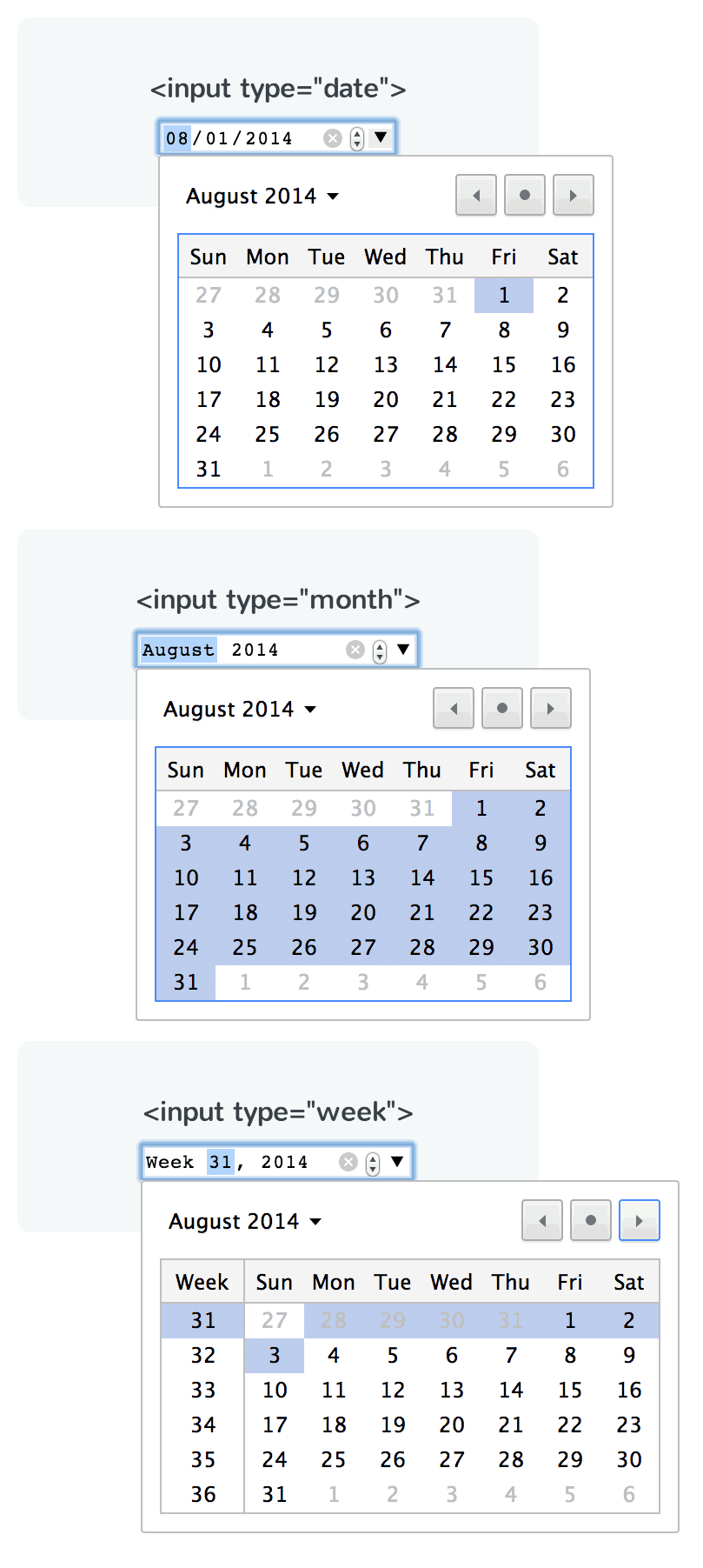
Unfortunately, browser support for these date types is not very good at this point in time. The latest version of Android has full support, and Chrome and iOS have partial support (mostly due to the lack of support for related attributes). It’s going to take a little while longer before native date pickers can become commonplace. For now, it’s still best to use a JavaScript-based solution.
Text, Email, Tel, and URL
The text input type has been around for a very long time, but it is now joined by the new types email, tel, and url. In a normal desktop web browser, these new types don’t seem to behave any differently than a regular text input. You might be wondering: If they don’t look any different, then why bother?
Take a look at the iOS keyboards below. Each of these 4 different input types will automatically use a custom keyboard that’s specifically optimized for the task. The email keyboard has a handy @ symbol, the tel keyboard is a number pad, and the URL keyboard provides quick access to slashes and TLDs. Here’s the code and screenshots of the iOS keyboards.
<input type="text">
<input type="email"
<input type="tel">
<input type="url">
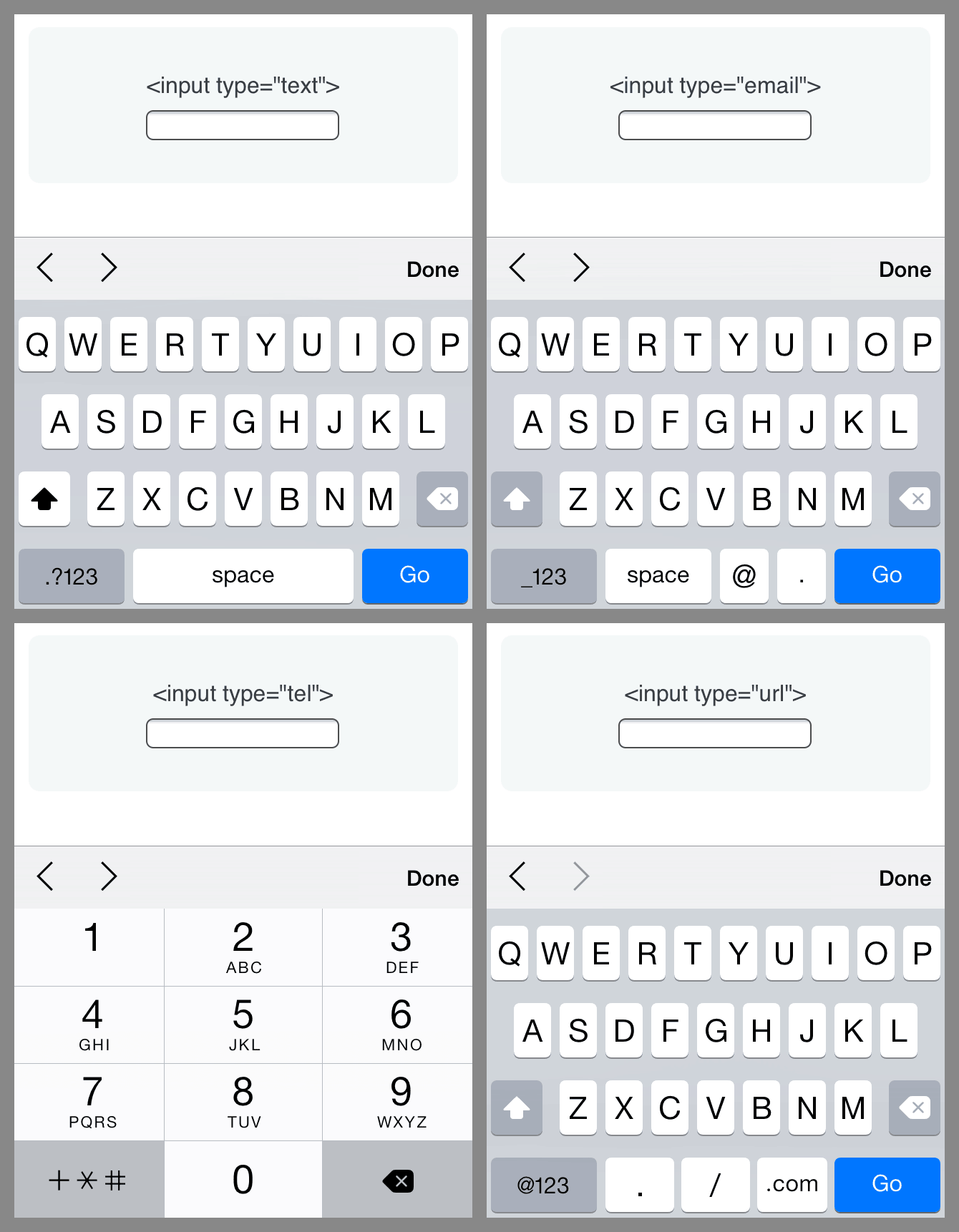 On a mobile device, typing can be downright frustrating. Providing these optimized keyboards to your mobile visitors is an easy way to add polish to the experience. Browser support for these new input types is very good and you can safely start using them now.
Range
In some specific instances, you might want to allow site visitors to pick from a range of numbers where precision isn’t important. For example, maybe you’re building a photo editing web app and you want the user to control the image brightness or the saturation. Behind the scenes, this is still just a number, but using a text input to collect that number probably is not a good idea because it creates guesswork for the user. Additionally, a text input means the developer has to validate the input, make sure the user typed in a number, make sure that number is within the appropriate range, and so on. This is a lot of work that only creates a frustrating experience.
A better alternative is the range input type, which will render a slider form control. By using a few additional attributes (min and max), you can set the minimum and maximum values. Here’s the code for the input type range along with a screenshot of the control rendered in Chrome on Mac OS X:
<input type="range">
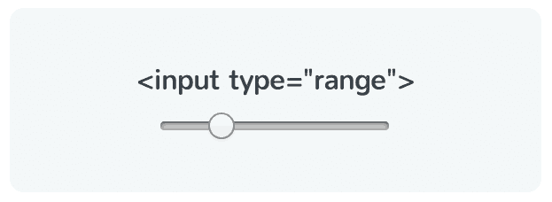
When it comes to browser support, I’ve mostly had bad news to deliver so far. The great news about the range slider is that support is fairly good. It should work on iOS and Android (although I admit I had some trouble on my demo page) and it works in IE10+, Firefox, Safari, and Chrome. So, next time you need a slider, try using the range input type before resorting to a more traditional JavaScript solution.
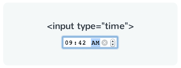
Time
Similar to the date input types, there is also a time input type. This input element works exactly like you might expect. You can type in the desired hours, minutes, and meridiem (AM/PM). Also similar to the date types and special text types, this will present mobile visitors with a customized interface for inputting times. Here’s the code along with a screenshot of the time type rendered in Chrome on Mac OS X:
<input type="time">
Just like the other date types, the time type does not have very good browser support yet. If you need a practical cross-browser solution, you’ll still need to resort to using multiple text inputs or a JavaScript-based solution.
Resources
As I mentioned in the introduction, this is just a small slice of what the input element has to offer. There are other interesting attributes like required, pattern, list, readonly, and more. If you’d like to continue learn about inputs, here are some resources that can help.
- Learn about <input> and other HTML elements on Treehouse
- View the demo page with every input type
- W3C documentation for <input>
- MDN documentation for <input>
- Cross browser support for <input> types on caniuse.com
If you have any good input resources or thoughts you’d like to share, please let us know in the comments!


Liked the article.
Liked the resources to take help from.
Liked the way the resources are compiled.
Liked you, Nick Pettit.
Thanks a lot for your informative post. I love treehouse blog posts. They are very informative.
Plus para 10, 500 joueurs utilisent cette rate of growth beach hypocrisie chaque aurore, et la direction du nombre d’utilisateurs augmentent
toujours!
Thanks for the article. It will definitely help with mobile web apps. Thanks for finding these neat little, yet powerful tools.
Thanks for the kind words! Glad you found it useful. 🙂
Thanks nick keep up the good work.