
Last Updated on October 20, 2017 by Faye Bridge
In CSS, float and clear serve for layout much the same way as the tables they replaced: As stand-ins that work well enough. But they’re still limited. One proposed solution is called the CSS Flexible Box Layout Module, commonly called the Flexbox.
Flexbox is a recommendation in CSS3 that enables designers to control the arrangement of elements on a page with more finesse than contemporary CSS approaches which have become common because we didn’t have a better solution.
True, we still don’t: Flexbox support is limited. But when Flexbox-savvy browsers become widespread, flexible layouts coupled with media queries will change the way designers approach web layout.
Check out our ‘How to Make a Website‘ course at Treehouse.
Contents
Bleeding edge CSS
At the time of this writing, support for Flexbox is limited. Chrome recognizes its CSS properties with the -webkit prefix. Other Webkit browsers, notably Mobile Safari and Android Browser, have limited support. Internet Explorer supports Flexbox as of version 10. The Flexbox spec is itself in flux, having seen many changes in the last few years. But as the spec settles and browsers develop, flexbox will become a relevant design tool. Here are its major points in regards to responsive design.
Containers
A Flexbox layout creates a relationship between its containing element — a <div>, for example — and the items the container encompasses. At its most fundamental, Flexbox arranges items in a line that points in any cardinal direction without changing the HTML. For example:
<div>
  <p>1</p> <p>2</p> <p>3</p>
</div>
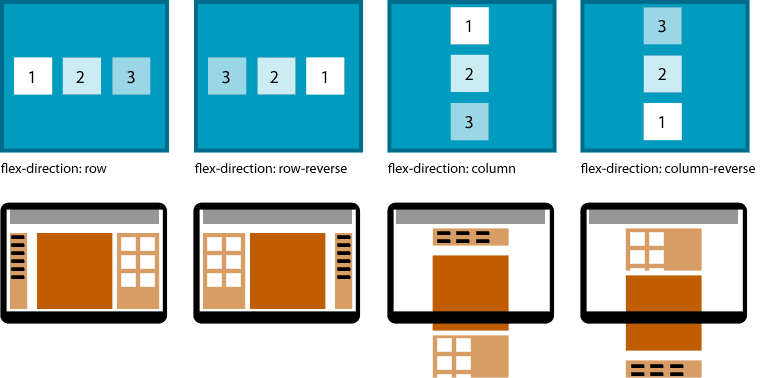
Above: Three items in a flexbox may be arranged first to last, horizontally or vertically with the flex-direction property of a container. In a web page, that means whole layouts may be rearranged without altering the HTML. This alone will be a boon to responsive design.
While display: block stacks elements vertically and display: inline keeps elements in the same line of wrapping text, display: flex puts the designer in charge of direction, order, alignment and spacing. Flexbox layout applies to any series of items, from lists to layout. Potential uses include:
- Rearrangement of columns, headers, footers or sidebars on the fly
- Automatically even navigation spacing
- More layout in CSS means less in HTML
- Given random items in a series, move everything with
.importantto the top of a display
It’s important to note that Flexbox affects visual styles. Rearranging the order of elements on screen will not affect their order with JavaScript frameworks or screen readers.
Alignment
In addition to direction, items may be pushed to the start, end or center of a container, as well as spaced evenly in between the container’s edges. The container’s justify-content CSS property controls alignment between its “start” and “end.”
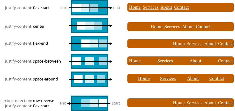
Above: The implied line on which these items are arranged is called the “main axis.” The example here nudges navigation links along the main axis, indicated with a black line, automatically changing space as needed.
Every main axis has a direction or flow: Horizontally left or right (row or row-reverse); vertically down and up (column and column-reverse). The first four examples above show Flexbox rows, meaning “flex-start” pushes items to the left. When set to row-reverse, as with the last example, flex-start pushes items to the right.
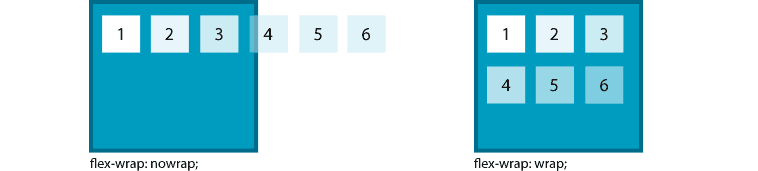
Wrapping
When a series of Flexbox items reach the end of their container, they may either extend beyond the container or fit onto the next “line” within the container, much like traditional inline elements.
The properties above apply to the container. Others apply to each item.
Order
The last major property (relevant to responsive design) controls the precise order in which elements appear.
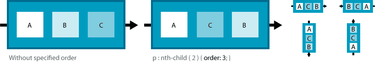
By default, every item in a flexbox container has an order of zero. Setting an item to order:1 pushes it further down the main axis. Setting an item’s order to less than zero, such as order:-1, pushes it up the main axis.
There’s more to flexbox: cross-axis alignment, wrapping and dimensions, to name a few. But the chief properties that affect responsive design today are flex-direction, flexbox-justify and order.
Flexbox and media queries
Responsive design requires different layouts per screen size. Unfortunately, some layouts call for HTML to be written in a certain way: Images before headings or vice versa, for example. Flexbox shifts more control over presentation to CSS, where media queries let designers apply different configurations to varying screen sizes.
Here’s the challenge: A news site wants to show snippets of its latest posts. Each snippet has varying amounts of text and a thumbnail image. Three layout configurations for wide desktop screens, medium-sized laptops, and 320-pixel-wide smartphones. For accessibility, it must keep navigation at or near the site’s header, but the publisher wants to keep headlines as prominent as possible.
The HTML
For clarity, this example uses simple HTML5.
<html>
<body>
<div class="wrapper">
  <header>
    <img src="images/trendy-logo.png" />
  </header>
  <nav>
    <a href="#">home</a>
    <a href="#">about</a>
    <a href="#">other</a>
    <a href="#">contact</a>
  </nav>
  <section>
    <article>
      <figure><img src="images/box.png" /></figure>
      <div>
        <h2>Sample headline goes here</h2>
        <p>Sample text sample text sample text sample text sample text sample text sample text </p>
      </div>
    </article>
    <article>…</article>
  </section>
</div>
</body>
</html>
A few important notes:
- A wrapper
<div>envelopes the entire page. - A header and navigation links come before a section with a series of teasers.
- Each article is an independent element within the
section.
The media queries
We set up three broad classifications for the CSS: Narrow, medium and wide.
@media only screen and (max-width: 480px) { … } /* Narrow */
@media only screen and (min-width: 481px) and (max-width: 960px) { … } /* Medium */
@media only screen and (min-width: 961px) { … } /* Wide */
Narrow: Alternating icons and rearranged structure
1. Start by designating each article element as a Flexbox container. In these examples we use the -webkit prefix because as of this writing, Chrome, a Webkit-based browser, has the best Flexbox support as long as we include its vendor prefix.
article {
  display: -webkit-flex;
  -webkit-align-items: start;
}
2. Next we tell alternating article elements to change direction.
article:nth-child(odd) {
  -webkit-flex-direction: row;
}
article:nth-child(even) {
  -webkit-flex-direction: row-reverse;
}
3. To give content priority over navigation, we make .wrapper a Flexbox container with top-down (column) display.
.wrapper {
  display: -webkit-flex;
  -webkit-flex-direction: column;
}
4. Finally, we make the <nav> element itself a Flex container, using -webkit-justify-content to evenly space the navigation links.
nav {
  -webkit-order: 999;
  display: -webkit-flex;
  -webkit-justify-content: space-around;
}
Setting “order” to 999 is excessive for a layout that doesn’t specify two through eight; any positive number would work. But 999 guards against future order changes, 999: It’s a safe bet that few sites will have more than 998 sections above navigation.
Medium: A straight column
Browsers between 480 and 800 pixels wide are likely tall enough for people to read a continuous column of text. This layout lets them do just that.
1. Like the narrow layout, the navigation bar becomes a row of evenly-spaced links.
nav {
  display: -webkit-flex;
  -webkit-flex-direction: row;
  -webkit-justify-content: space-between;
}
2. Flexbox layouts don’t have to get fancy. The medium-width example shows how Flexbox can replace floats and clears.
article {
  display: -webkit-flex;
  -webkit-justify-content: start;
  -webkit-flex-direction: row;
}
Wide: Using extra space
The wide-screen layout takes advantage of its space by arranging .wrapper in a Flexbox row, then tiling the article snippets.
1. Make .wrapper a Flexbox container to put navigation on the left.
.wrapper {
  display: -webkit-flex;
  -webkit-flex-direction: row;
}
Want navigation on the right? Use row-reverse instead.
2. Stacking the header and navigation is tricky because making .wrapper a Flexbox container also makes header, nav and section its items, arranged horizontally. That means the header — and the logo graphic — tend to float left of the navigation column.
We solve this with a little sleight of hand: A negative margin-left pulls the navigation right and padding-top pushes its links underneath the logo.
nav {
  width: 25%;
  margin-left: -50px;
}
nav a {
  display: block;
  padding: 10px 0;
}
nav a:first-child {
  padding-top: 120px;
}
3. Tile the articles by setting the section as a Flexbox container that wraps its items, then narrowing those items to fit more than one per line.
section {
  display: -webkit-flex;
  -webkit-flex-wrap: wrap;
  -webkit-align-items: flex-start;
}
article {
  width: 180px;
  margin: 10px;
}
End result: Three different layouts that utilize space to best effect on differently-sized browsers.
Going forward
While Flexbox layout isn’t ready for widespread use, the concept promises a boon to responsive design by shifting more layout responsibility to CSS while giving designers the tools to better use space, arrangement and alignment.


good tutorial
I have read several excellent stuff here. Definitely price bookmarking for revisiting. I surprise how much effort you place to create this sort of fantastic informative site.
It would be great to see a live demo of this markup and css, because I tried using it for something and it doesn’t work as you describe at all, and not sure why.
Yes
It would be even more helpful if there were any screen shout for the same.
Anyways, good post really grasp many important concepts 🙂