
Last Updated on June 30, 2015 by
The process of creating a great responsive layout includes many factors. Fluid-width designs are similar, but not always built with mobile devices in mind. Any typical responsive web design is going to feature staple elements you’d expect to find in most website layout. Navigation is a big focal point because you need to handle the shift between desktop to mobile in a usable manner.
In this article I want to cover various navigation trends found in great responsive websites. These examples should prove useful if you are new to responsive design or just want to understand navigation better. The mobile-responsive ideology is still fairly new and there is plenty of ground to cover for building unique solid navigation systems.
Contents
Resizing & Positioning
This first responsive nav technique could be seen as the most minimalist approach. The goal is to design a navigation which never gets hidden and gracefully breaks down as the window is resized. Nav links are just made smaller and fitted nicely into the page, however possible. Basically a “do nothing” approach with a bit of subtlety.

The layout on Fiafo is a great example of this simple methodology. At full-view the navigation links are floated off to the right side. As the browser window is compressed the links will drop beneath the logo and behave like a single navigation bar. At this first break point the links still align side-by-side, but as you resize smaller the links eventually resize to 100% width, stacked vertically. The menu is now a single block element where each link takes up the entirety of the page width.
This design style is appealing because it doesn’t require any hidden links or extra fluff. Everything is displayed without the need for CSS3 or JavaScript. The biggest problem is that navigations with a high number of links (for example, 10 or more) can tend to be very tall.

Another example found on Paid to Exist follows this same formula. Links are floated to the right which eventually drop onto their own line of navigation. The only difference is when the browser gets small enough, these links don’t expand to 100% width. Instead they continue behaving as block-level elements and cascade next to each other gracefully.
Input select menus are regarded by some designers as their least-favorite choice for responsive navigation. This menu works perfectly in every browser because select dropdowns are nothing more than common form elements. However select menus are almost impossible to style in a uniform fashion, making them difficult to customize across a wide array of web browsers.
The benefits of using a responsive select menu all cater towards a familiar user experience. People who are comfortable on the Internet must be familiar with select menus, and so it shouldn’t take a rocket scientist to navigate these links. The largest drawback is how the entire menu feels very generic and often times out-of-place.

Take the example from Apache’s CouchDB menu. The layout is slim and easy to maneuver because it is a single-page design. On a mobile device users probably will not care much about the navigation as long as it works. Navigational select menus are not often the prettiest solution, but they just work. And they work great! Over time as responsive websites evolve I think we’ll see other solutions begin to replace this one. However if you need a quick navigation which is supported by every operating system then the HTML select element is a great choice.
Overlay Dropdowns
Hidden menus are very popular among responsive layouts because they clear room for page content. Screen real estate is a precious commodity on a mobile devices, so you want to give users as much room as possible. Implementing a dropdown menu is perfect because it keeps the links hidden away until the user needs access.

A few months back the web design blog Designmodo underwent a new layout update. When you resize the site each section in the top navigation will appear as an icon. Hover or tap to display a new dropdown element which overlays on top of the content. You’ll find this works for the search field, too.
Overlay menus are fantastic if you don’t have too many links. By toggling these menus it keeps the page in the background while initializing a new block-level list of nav links. It’s just as easy to close these menus without scrolling anywhere on the page. But if you have numerous links displaying in a list it will require scrolling, which may or may not be easy for users.

I really like the overlay navigation from StickyGram which also combines block-level links. Once you resize smaller than the full width these links drop down onto their own line. They stay visible at all times and would appear like this on a tablet such as the iPad. Once you go even smaller the links get hidden away behind a menu toggle link in the top corner. StickyGram shows you that you don’t have to be afraid to combine techniques into different media queries that work best on your website.
Block Dropdowns
The other primary style of responsive dropdown menus is to use block-level elements. Instead of having the links appear on top of the content, these hidden navigation items will instead push down the rest of the page when they’re displayed. It is possibly one of the most widely-accepted solutions for clean responsive navigation and has even been covered right here on Treehouse.
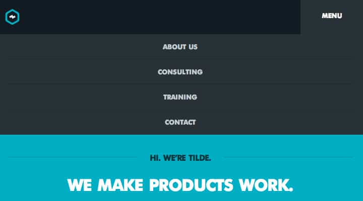
The example on Tilde Inc. is perfect to demonstrate how this works on a live website. Your top navigation design can include 15 or more links and still work nicely with the block-style dropdown effect. Notice there are no animations or CSS3 transitions – the menu just appears and hides on command with a single click or tap. Block-style dropdown menus behave perfectly using almost any number of links. It is all about how you style the links and how much room is taken up by the menu itself.

Another simple design can be found on Rainbow Nursery. There isn’t anything extra special about this navigation, but the style blends very nicely into the layout itself. Keep all these ideas in mind when crafting your own block-level dropdown navigation. This type of menu is very flexible and there are many customizations you can try out for elegantly fitting links into your responsive website.
When you have a navigation menu with sub-links then you will have to plan out a great solution for responsive adaptation. Block-level dropdowns can work if you indent links to appear as if they are underneath another topic. Another solution is to create a navigation menu which traverses links in a multi-layer hierarchy.
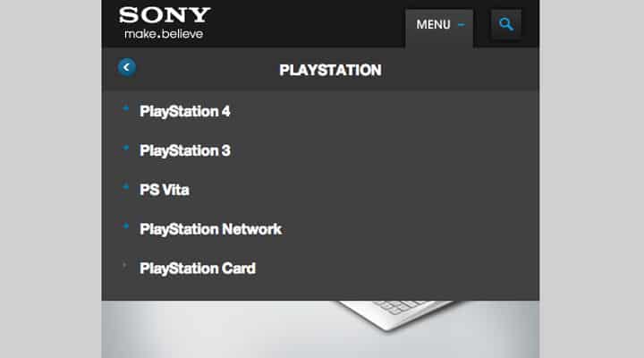
The example found on Sony’s website is pretty nifty. It would be a bit challenging to duplicate this effect from scratch, but certainly not impossible. Their system works really well for handling a responsive navigation with multiple levels of links. Visitors can browse through the categories going up & down levels until they find exactly what they want.
Although I have never personally built a website using responsive footer links, I really like how it works in action. Typically you would keep the menu up above the fold until the user resizes their browser past a certain point. Then you hide the top menu while simultaneously displaying a small nav button, and also displaying a duplicate navigation at the very bottom of the page.
Once the user clicks on this nav toggle button it will jump down to the footer using a hashed element ID. I particularly like this solution when the nav button is fixed at the top of the screen. Then users can quickly access links in the footer without having to manually scroll.

Contents Magazine utilizes a brilliant responsive design with only a few top navigation links. If you scroll to the footer when the site is at full-width you’ll only find some credits and related graphics. Resize the browser and you’ll see a search bar along with some block links appear right away. The whole purpose is convenience and keeping the layout uniform without requiring any extra scripts like jQuery.
My personal favorite solution is the hidden side navigation sliding menu. This was first popularized by iOS developers programming hidden navigation menus called “shelves” or “drawers”. The menu is opened by a toggle switch generally located near the top of the page.
It is possible to create this effect solely in CSS3 using transitions, but remember not every browser can support them. jQuery is a much more stable choice and even has a number of free open source plugins to choose from. If you have the knowledge I would recommend coding your own side-menu from scratch to get it working exactly as you’d want it.

The example found on Sequence’s website is truly outstanding. Each navigation item appears normally when the page is at full width. Resizing beyond a certain point will generate a small hamburger icon which you tap or click to reveal the menu links. I really like their example because you can also click anywhere on the main page to automatically close the menu. It works just like a typical iOS application which people are growing more and more comfortable with using.
Other Resources
- ResponsiveNavigation.net
- Responsive Navigation Patterns
- How To Create A Responsive Navigation
- Great Responsive Web Design is a Matter of Process
Closing
These navigation ideas are a collection of powerful examples from live websites. Try visiting each site to see how they react when resizing the browswer to smaller and larger widths. This certainly isn’t a complete list of navigation techniques since new concepts are always being tested, but hopefully it gets you on the right track towards building clean and easy-to-use navigation menus for every possible monitor and mobile screen with Internet access.


Thanks Jake. Very great examples and latest trends in responsive web design.
Nice. I like your writing style and have been deeply impressed by your wisdom. I have to say that the logo design have play an important role in people’s daily life and are of great need. We are one of the leading web design company offering you according to your requirement. Don’t hesitate to have a visit to our site:
Thanks for your great article, we have a web design company in Iran and we will use these techniques in our web designs. Please check out our website and let me know what do you think about our design.
http://www.webdesign24.ir
Sorry Jake, I forgot to ask you to check our web design samples and let me know what is your idea:
http://www.apluswebdesign.ca
Thank you Jake, Interesting article. I was wondering if you have more information for responsive webdesign on Mobile apps and web design for tablets?
It would be appreciated if you can respond. we are group of Montreal web developers and will be more than happy if we can use your expertise.
Thank you
Thank you for the information, articles of interest. But I can not understand it fully, because I was looking in the learning phase in designing a website. But your article adds to my knowledge. Judi Online
Thank you.
This article is exactly what I was looking for.
I intend to implement a responsive web design on a website and the first thing I wanted to check is what are different ways to implement the navigation menu.
thank you Jake Rocheleau…you give very good information on navigation…your article is really good….but still its need more photographs to explain more deeply.Web Design Company