
Last Updated on February 28, 2022 by Dev Support
One of the best ways to create fast websites is to optimize images for the web. HTML, CSS, JavaScripts, and fonts can add up, but nothing will slow a page down like tons of unoptimized graphics. In my experience, images tend to account for the majority of a page’s total file size (commonly known as “page weight”). If you optimize images, transfers from the server to the browser will happen much faster. Let’s dig in.
Contents
Use SVGs First
Scalable Vector Graphics (SVG) is an XML markup language for storing vector images (check out SVG Basics on Treehouse). Instead of using pixels to represent image data (like more familiar JPEG, GIF, and PNG file formats), SVGs use a series of points called “vectors” that are mapped to a two-dimensional coordinate grid. Most professionals create vector graphics in a vector drawing program like Adobe Illustrator, but free web-based tools like Method Draw and Mondrian can also create SVG imagery.

The SVG format works best for graphics like this one. Notice the large flat areas of color.
SVGs are great for the web because they have infinite resolution and very small file sizes. In other words, you can zoom in to an SVG all you want and they’ll always look sharp. That’s because SVG files store images as a series of coordinates that form shapes, rather than pixel data. These shapes are then automatically projected into the physical pixel grid, regardless of its resolution. When you optimize images with a tool like SVGO-GUI, the file sizes can be even smaller.
SVGs are mostly good for representing graphical imagery composed with shapes, but they’re not good at everything. For extremely high-detail images like photographs or artwork, you’ll still need to use a raster-based file format that uses pixels. That being said, you should try to use SVGs for all your images first, and only in cases like photographs or artwork should another format be used instead.
After many years of browser incompatibilities, the age of SVGs has finally arrived. They’re supported in all modern browsers along with IE9+ (source: caniuse.com). Still, you should come up with a progressive enhancement strategy if you think your pages won’t work for IE8 visitors without these graphics.
Rescale Raster Images
SVGs are resolution independent, so they don’t need to be rescaled. However, raster-based file formats like JPEG and PNG have an absolute resolution expressed in pixels. All other factors being equal, more pixels usually mean slower page load times.
For better or worse, the web doesn’t deal in pixels; it’s a fluid medium that looks different from one screen to the next. Sometimes you’ll need to let the browser rescale an image a bit so that it works in a responsive design. However, if you send more pixel data than there are physical pixels on a device and the image is scaled downwards, it’s just wasted bandwidth.
At the very least, you should optimize images so that they’re never larger than the highest resolution you expect them to be displayed on. That’s a moving target, which is why SVGs are so great. However, I generally only worry about 27″ monitors at 2560×1440 and below. There aren’t enough 5k iMacs out there yet to justify anything greater.
However, there’s still room for improvement; it’s much better to deliver pixels only to the devices that will actually be able to use them. Efforts like the Responsive Images Community Group and Zurb Interchange are helping to advance the state of the art in this area.
Pick your PNG for Performance
SVGs are best for images that are composed of solid shapes and sharp lines, while JPEGs are best for photographs and artwork. However, sometimes a graphic won’t have an SVG version available, and JPEG compression artifacts would look ugly in flat areas of color and with sharp lines. You may also have a raster image with some transparent areas that should let their background shine through. In these cases, the best format is a PNG file, which comes in two flavors, PNG-8 and PNG-24.
PNG-8 uses an adaptive color palette capable of up to 256 colors. One of those colors can be for transparency, but that transparency is binary (a pixel is either 100% transparent or 100% opaque). This means that any transitions between opaque and transparent areas will be extremely sharp with no partial gradation. If a PNG-8 has any outer pixels that are mostly light and it’s placed on a dark background, the edges will look jagged. The big upside is that the file sizes tend to be fairly reasonable.
PNG-24 is capable of full color and full alpha transparency (pixels can be partially transparent) resulting in beautifully subtle transparency. This is often the only way to present partially transparent photographic cut-outs with things like hair or blurry edges. The downside is that these images produce some of the largest file sizes of any image format.
If you must use a PNG, try to use PNG-8 (and reduce the color palette as much as possible). Only use PNG-24 when soft alpha transparency is absolutely necessary. Keep in mind that if the alpha transparency is uniform across the entire image, you can still use the smallest image format and lower the opacity in CSS.
Use Animated GIFs Very Sparingly
In the 1990s, animated GIFs were everywhere. They’ve recently made a comeback, although not in the form of spinning logos and page counters. The rule here is pretty simple: animated GIFs tend to be large in file size (often even larger than an HTML5 video). If you want to use an inline animated GIF to demo a super quick concept (such as how to use a UI feature in a web app), then just be sure to keep an eye on how each GIF impacts the overall page weight. If you just want to make a fun webpage with a zillion animated images that have questionable copyright, please keep it on Tumblr.
Aggressively Compress @2x Images
When delivering raster graphics to high DPI devices like Apple’s “retina” class screens, you generally need to deliver images at 2x or 3x the normal size. These are devices that have a higher number of physical pixels on the screen than they do “virtual pixels”. On a modern iPhone, if an image is supposed to fill 200px by 200px on a webpage, you should actually deliver a 400px by 400px file. Otherwise, images will look blurry.
Even though @2x images have more pixels, it’s surprising how aggressively they can be compressed. It turns out that compression artifacts are roughly the same scale as pixels, so when a high resolution image is packed into a smaller space, these compression artifacts are far less apparent. See this chart for a comparison:
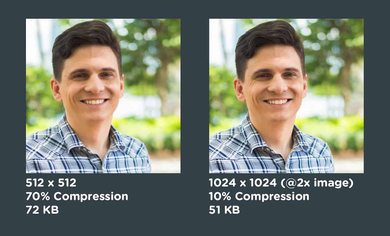
In this example, the image on the left has less compression, but also less resolution. The image on the right has far more image compression, but a higher resolution for @2x images which will be resized by the browser to occupy the same 512px area. The end results look almost identical, but the higher resolution image actually results in better file sizes when heavy compression is applied.
Load JPEGs Progressively
JPEG images are usually downloaded starting from the top of the image and scanning down to the bottom. However, they can be made into “progressive” images that load blurry and then gradually become more clear in multiple passes. This won’t increase page load times, but it will increase perceived performance and make it seem like the web page is loading faster. The human eye can only focus on a very small part of the screen at a time, so filling areas with large blobs of color and then increasing their clarity generally looks faster than allowing images to scan-in from top to bottom.
Conclusion
There are many other techniques for optimizing images for the web, and these are just a few. If you have more ideas you’d like share, let me know in the comments!


Hey Nick,
I made an advance image compressor that can handle multiple jpeg or png images and compress them up to 78%. It is available online for free at https://imageresize.org/compress-images
The tool uses a lossy algorithm to convert your PNG files while preserving its full alpha transparency. Usually, you can get up to 70-78% range in size savings. Please give it a try.
thank for the information. I hope you can write tutorial about how to do it. for optimizing PNGimages, I am using some tool like pngout/optipng
Hi,
Thanks for a great post. Does ImageAlpha compress all type of images like(gif, jpeg, png) ?
Thanks for the great post, i have a question though, how can i convert png images to svg ?
Hi Alkeenana,
Generally you cannot convert pixels to vectors, at least not easily. Raster-based images (PNG, GIF, JPEG) are made out of pixels, so there are no shapes for the computer to reference. You can use a feature like “Live Trace” in Adobe Illustrator, but generally it’s better to create images as vectors from the beginning, because they can always be converted to pixels if necessary (just not the other way around).
@Dami If you want to compress images you would need to use a tool something like ImageAlpha http://pngmini.com/ which compresses PNG-24. I believe this is only available for Mac, but it gives you an idea on the type of tool you will need.
How can I aggressively compress an image just like you did, I’m using winrar but that doesn’t seems to work
@Dami If you want to compress images you would need to use a tool something like ImageAlpha http://pngmini.com/ which compresses PNG-24. I believe this is only available for Mac, but it gives you an idea on the type of tool you will need.
Hi Dami,
You can use the “Save for Web” feature in Photoshop to compress images. In this screenshot, I’m saving the image as a JPEG and I’ve circled the compression settings: http://i.imgur.com/XDXCIkV.png
Those settings in the screenshot say the resulting file will be 438k, not 51k like you’ve achieved posted here.
You mention loading images progressively (blurry to clear). How might this technically be accomplished? Thanks!
Hi Daniel,
If you use the “Save for Web” feature in Photoshop, there’s a checkbox for progressive loading. Check out this screenshot: http://i.imgur.com/zndDAMd.png
My Website having also problem on Image optimization, Can you please help me out in this. and suggest me any website which help to optimize image easily.
Any chance you can cover creating SVG sprites? Often they are quite a few icons and such used throughout a site and it would be great to get all those down to 1 http request. Currently this is the one main advantage I can see to using an icon font.
This article was getting a little lengthy so I actually decided to cut that out. I’ll probably do a post on SVG sprites in the future. 🙂