The trend of large photographic backgrounds has become very popular in recent years. The improvement of Internet connections has allowed more data transfer per second, which means images can load a lot quicker in real-time. There are also plenty of open source scripts out there for generating cross-browser support using fixed photo backgrounds.
In this guide I want to discuss a few trends and possible techniques for creating responsive image backgrounds. There are more than enough examples we can look into which all demonstrate a unique method for website interfaces. Even consider the possibility of sliding background images or animated video BGs. As frontend dev techniques become more consolidated it will be easier to build these very complex layout styles with fewer and fewer lines of code.
Contents
- 1 Adapting the User Interface
- 2 Responsive Photo Slideshows
- 3 Portfolio Works
- 4 Build an Emotional Connection
- 5 Fullscreen Video Backgrounds
- 6 Live Demo Showcase
- 6.1 Adidas Design Studio
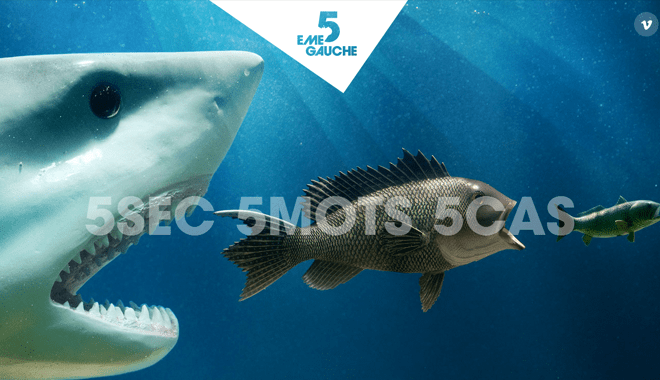
- 6.2 5emegauche
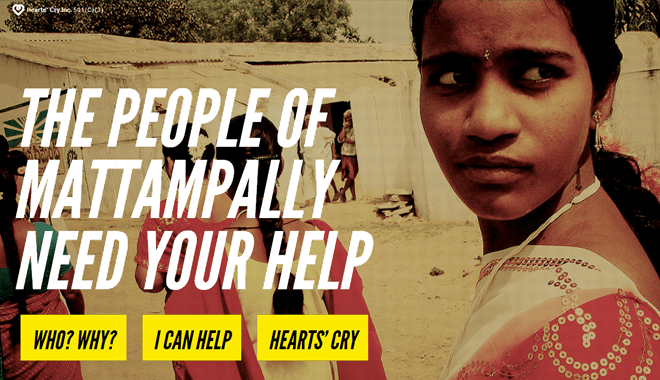
- 6.3 Heart’s Cry India
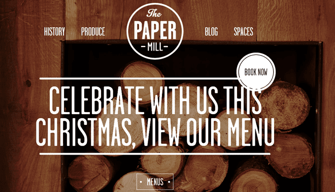
- 6.4 The Paper Mill
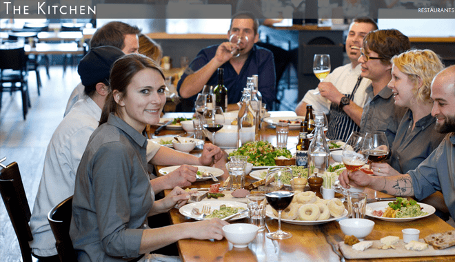
- 6.5 The Kitchen Community
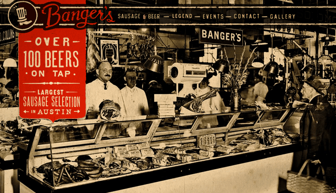
- 6.6 Banger’s
- 6.7 X-Doria
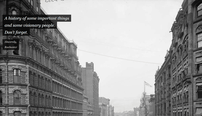
- 6.8 Rochester Made
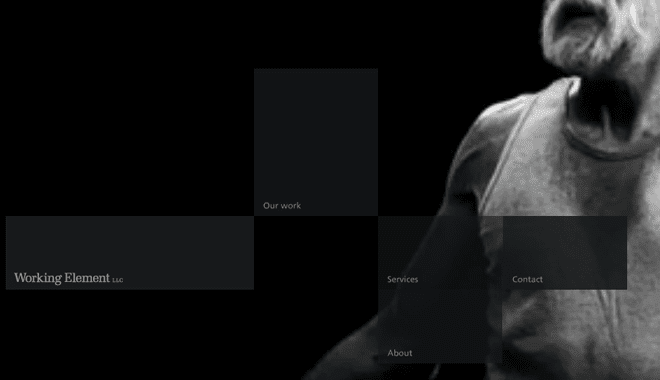
- 6.9 Working Element
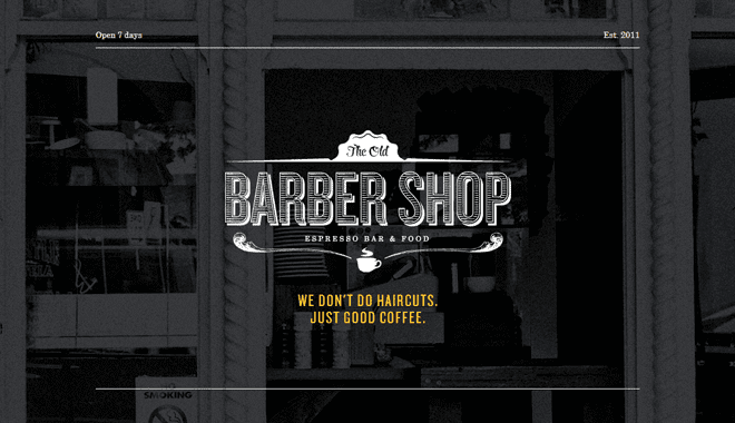
- 6.10 The Old Barber Shop
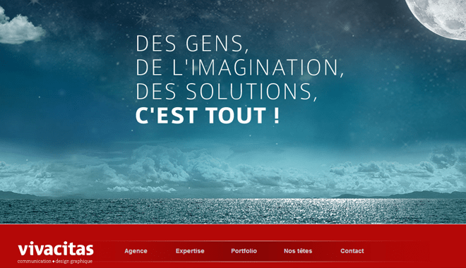
- 6.11 Vivacitas Media Agency
- 6.12 Circles
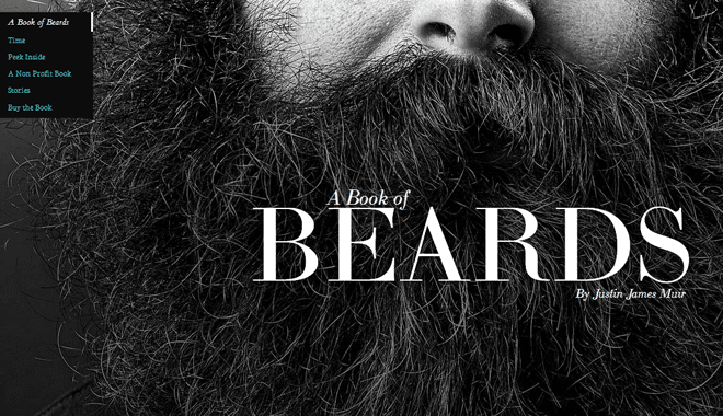
- 6.13 Book of Beards
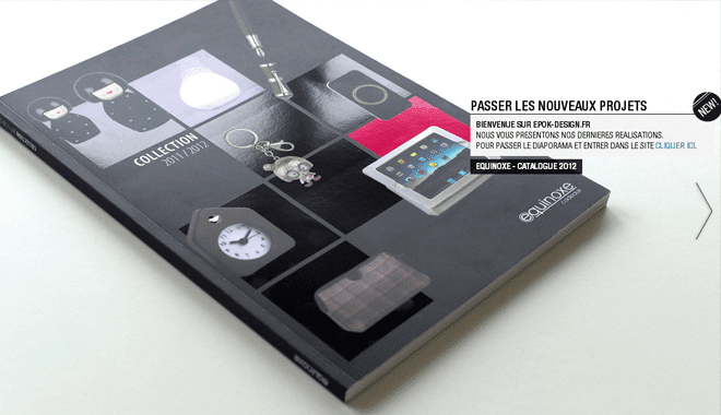
- 6.14 Epok Design
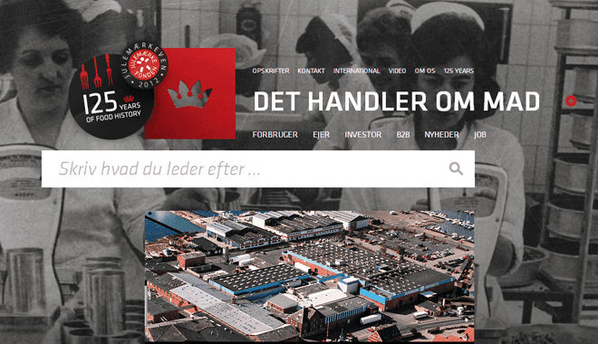
- 6.15 Danish Crown
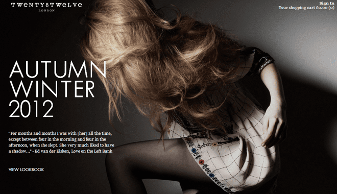
- 6.16 Twenty8 Twelve
- 6.17 Ben Thomson Photography
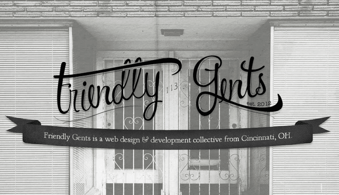
- 6.18 Friendly Gents
- 6.19 Chicago L-Shirts
- 6.20 Sean O’Brien
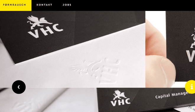
- 6.21 Formrausch
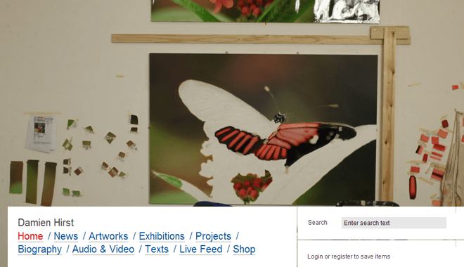
- 6.22 Damien Hirst
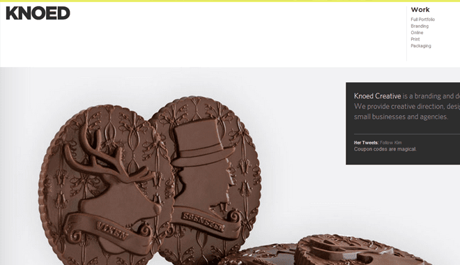
- 6.23 Knoed Design Studio
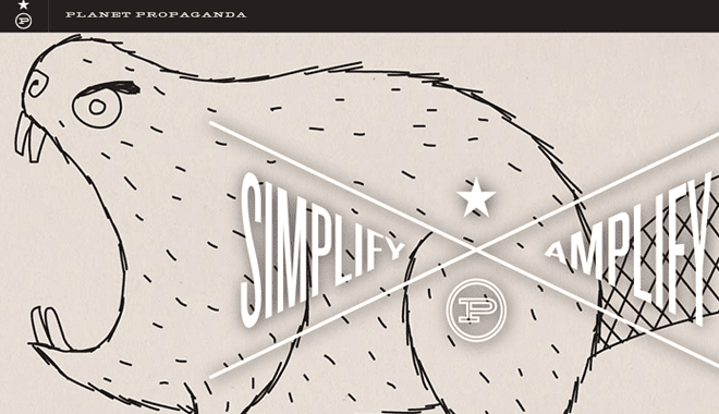
- 6.24 Planet Propaganda
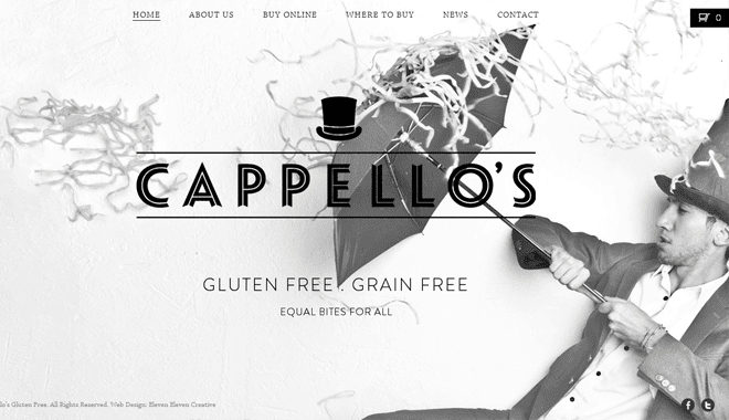
- 6.25 Cappellos
- 6.26 Oh Land Music
- 6.27 Parachute Journalists
- 6.28 Kristo Friseure
Adapting the User Interface
One great use of responsive background images would be to wrap around the UI elements in your page. This is common in design portfolio layouts, and also in smaller landing pages such as mobile applications. The webpage for Fifty Three app uses this exact technique which displays an iPad in the background.
You can then play a small demo video right from the iPad screen which is embedded through Vimeo. What is neat about this example is how the photo really is fully responsive, and you can adapt the browser window to fit any width/height. All of the text and app store links will read just perfectly.
It is also worth noting how each page in the website is following the large responsive background technique. As you browse through their navigation links at the bottom you’ll catch a different photo embedded into each page. Some examples include the blog, company info, and jobs sections of the website.
Responsive Photo Slideshows
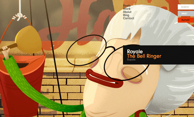
Believe it or not we could push the large photo technique to include types of dynamic content, as well. There are some jQuery plugins which allow fullscreen image slideshows using just a few lines of code. We can see a fantastic example on Royale’s homepage which features many of their past client work.
Being a creative person myself I still vouch for the enormous progress we have seen by other designers in the field. Many of the portfolio and studio websites I find online are still the best examples of newer design trends. And I feel that Royale demonstrates this slideshow effect in a brilliant yet elegant manner.
Portfolio Works
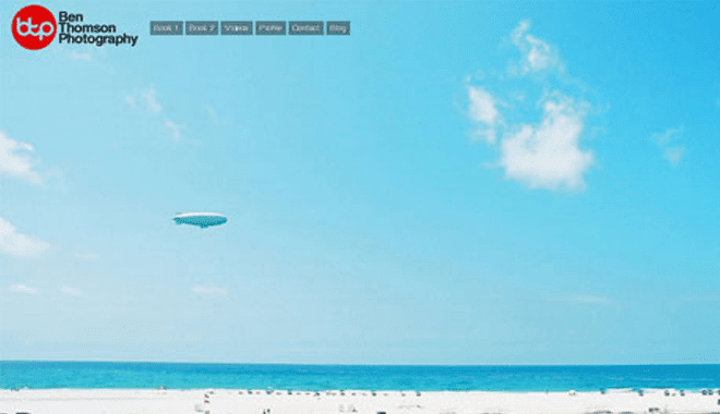
Similar to the example above I just had to reference this next website as a related case study. Ben Thomson Photography is the online portfolio showcase of Ben Thomson. The homepage layout begins with a background slideshow of panning images he has taken from previous clients.
This is another brilliant effect which many photographers do not consider. Probably because this type of design is not the easiest to implement. Many artists would not have the frontend development skills to produce such a website on their own. But I feel that Ben’s website certainly draws your attention, and still appears very professional in regards to other possible competition.
It is also worth noting that he doesn’t have the photo effects displaying on every page. From the first time you land on the homepage you’ll see this sliding photo effect. But going through his previous works of clients offers a grid-style thumbnail showcase. I greatly appreciate how this has been conceived where the background photos don’t get annoying or interfere with the larger website interface.
Build an Emotional Connection
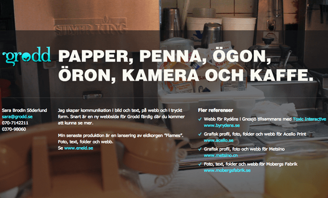
Grodd Advertising is a very strange website layout which I have grown to love. By using a background photo related to a typical location(inside a cafe/diner kitchen) it draws in curiosity from visitors almost instantaneously. When first landing on the page you can recognize this isn’t just some ordinary layout. And yet all the content you need can be found right on the page, basically no navigation required.
This connection is difficult to bridge from your computer screen into the hearts of your visitors. You need to provide some type of meaningful imagery to make them feel more “natural”. Many times photography will look staged, as it often is to get the best quality picture. But sometimes using offbeat photos of strange locations may catch the eye even more frequently.
Fullscreen Video Backgrounds
I had to find a way to squeeze in this technique because of the rise in popularity. Five or ten years ago it would have been very difficult supporting a video background display. Many users were still on 56k modems and it would have taken minutes or possibly hours to finish buffering.
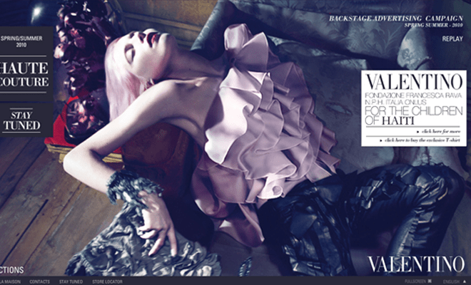
The bigger problem we face today is getting video formats which support all of the mainstream browsers. It is possible to solve this by adding all the typical formats you would want(mp4, ogv, webm) along with a Flash .flv fallback. Consider the Valentino website which uses a large fullscreen video effect on their homepage. This looks fantastic and is provided through a natural Flash video player, automatically resizing to fit the whole screen.
I can’t fully recommend video backgrounds for each project you want to implement. In some cases it is obviously easier to stick with one large photograph, or even a slideshow with 2-4 photos at most. Videos consume a lot of resources on both the server end, along with the user’s end. So if you do choose to go this route spend some time researching the best methods. Ensure you have a large enough resolution to have the video stream quickly without appearing as poor-quality on some of the larger monitor displays.
Live Demo Showcase
Before wrapping up I would like to share a brief collection which holds more fullscreen photo websites for inspiration. Web designers and developers are generally looking to build the same type of products, yet we vary in skillset. It is my hope this article coupled with a showcase gallery may provide the perfect solution to newcomers just getting started with fullscreen responsive background photos and videos.










In my website business we have recently started offering single page sites for startups or small businesses that don’t have the need nor budget for anything complex. The approach to single page site design is uniquely different. A background photo that is stunning, responsive, and on topic is a critical element.
Great article, Jake.
Not a big fan of large images.