
Last Updated on November 14, 2022 by Laura Coronel
CSS recently introduced a scroll snap points feature that gives users a fluid and precise scrolling experience for touch and input devices.
There are plenty of jQuery plugins available that create scroll snap effects. But instead of installing a plugin to control scrolling behavior, we can add scroll snap points with native CSS. In this post, I’m going to cover the CSS properties we can use to add scroll snap points to our websites and applications.
Contents
How Scroll Snap Points Work
We can control the scrolling behavior of a scroll container by defining “snap points” on the x and y axis. With snap points, a scroll container will snap to a point in the content after a user scrolls vertically or horizontally.
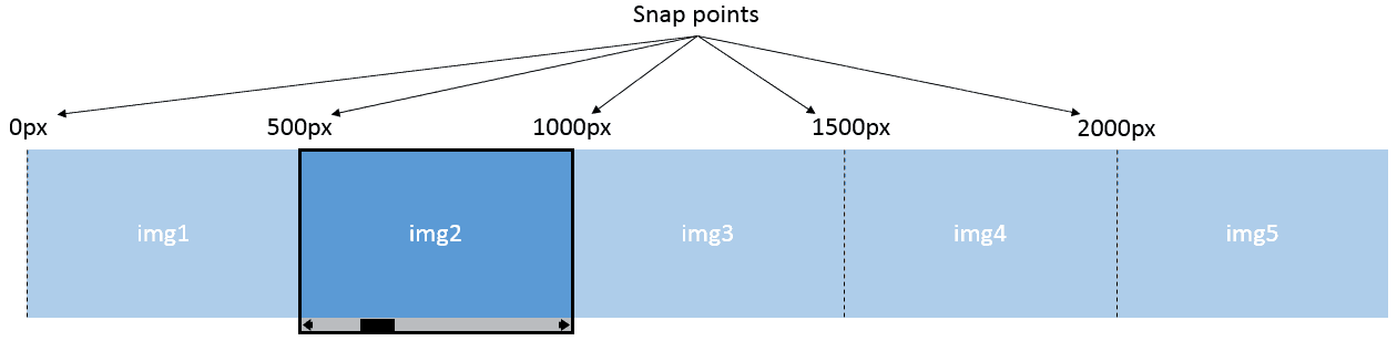
Horizontal Snap Points
Let’s say we’re creating a scrollable image gallery where users can scroll or swipe through each image. The markup for this will be simple:
<div class="gallery">
  <img src="1.jpg">
  <img src="2.jpg">
  <img src="3.jpg">
  <img src="4.jpg">
</div>
First, to create a horizontal scroll container, we’ll define overflow and white-space styles for the .gallery div:
.gallery {
  overflow-x: auto;
  overflow-y: hidden;
  white-space: nowrap;
  width: 1000px;
}

img {
  width: 100%;
}
In this code, .gallery is the scroll container; content scrolls horizontally inside its 1000px wide visual viewport.
Next, let’s go over the properties that specify horizontal scroll snap points.
scroll-snap-points-x
With the scroll-snap-points-x property, we set the positioning of horizontal snap points inside the scroll container. By defining a snap point that’s as wide as .gallery, users can scroll and snap to each image, one at a time:
.gallery {
  ...
  width: 1000px;
  scroll-snap-points-x: repeat(1000px);
}
The value repeat(1000px) sets snap points along the x-axis, starting at 0px and repeating at intervals of 1000px, the scroll container’s width. Now we need to enable the snap points.
scroll-snap-type
The scroll-snap-type property enables all snap points in a scroll container. We use this property to define what type of snap points the scroll container should use and how strictly the snap points are enforced.
We want precise snap points that snap to each image we scroll to in the gallery:
.gallery {
  ...
  scroll-snap-type: mandatory;
}
The value mandatory ensures content always lands on a snap point when the scroll operation completes. In other words, the .gallery div will scroll-snap to a point every 1000px.
Fluid Horizontal Snap Points
We can also use percentage values for defining fluid snap points. For instance, if we set the scroll container’s width to 90% and scroll-snap-points-x to repeat(100%):
.gallery {
  ...
  width: 90%;
  scroll-snap-points-x: repeat(100%);
  scroll-snap-type: mandatory;
}
This sets snap points along the x-axis, starting at 0px and repeating at intervals of 100% of the scroll container’s width.

Example of horizontal scroll snap points.
Fluid Vertical Snap Points
To create vertical snap points, we set the scroll container’s overflow-y to auto and overflow-x to hidden:
.gallery {
  overflow-y: auto;
  overflow-x: hidden;
  width: 90%;
  height: 48vw;
}
scroll-snap-points-y
With the scroll-snap-points-y property, we set the positioning of vertical snap points inside the scroll container. Since the scroll container has a fluid height, we can set snap points along the y-axis, starting at 0px and repeating at intervals of 100% of the scroll container’s height:
.gallery {
  ...
  scroll-snap-type: mandatory;
  scroll-snap-points-y: repeat(100%);
}
Next, we’ll use two more scroll-snap properties to set the alignment within the vertical scroll container: scroll-snap-coordinate and scroll-snap-destination.
scroll-snap-coordinate
We want to align each image to the center of the vertical scroll container. To center all images within the scroll container’s snap destination, we can use the scroll-snap-coordinate property and set the value to 50% 50% (center):
img {
  ...
  scroll-snap-coordinate: 50% 50%;
}
scroll-snap-destination
The scroll-snap-destination property defines the position within the scroll container; all snap points align with the value we define. To align each snap coordinate with the center of the .gallery container, we’ll set the value to 50% 50% (center):
.gallery {
  ...
  scroll-snap-points-x: repeat(100%);
  scroll-snap-type: mandatory;
  scroll-snap-destination: 50% 50%;
}

Example of vertical scroll snap points.
Browser Support
Currently, browser support for CSS scroll snap points is limited to IE10+ and Firefox 39+. But it looks like Safari 9 will include support, and you can enable scroll snap points in Chrome Canary, a Chrome browser that lets you test cutting-edge features before they’re released in Chrome.
For the latest in browser support, take a look at the browser support chart for scroll snap points.
Final Thoughts
Once browser support is stable, CSS scroll snap points will be especially useful when developing for touch devices. For example, we’ll be able to view each photo in the gallery with a sideways swipe that snaps between the next/previous image.
Creating scroll snap points with CSS means there’s no need to use JavaScript or import an entire library just to define scroll behavior. Scroll snaps points are also hardware-accelerated, so the scrolling behavior performs smoothly in browsers.
Have you used any of these scroll properties in your projects? Let us know in the comments!
Learn about CSS and more with Treehouse: start your 7-day free trial today!


Cool stuff indeed!
Just looking at the code, it should be easy to create a fallback for Chrome, right?
Is it possible to use transitions to the scroll, or this acts more or less like native scroll?
This is great! Hope to more browsers this soon.
Hoping to see more browsers *support this soon.
The scroll-snap-destination pen doesn’t seem to work. After adding the -webkit- prefix, scrolling in Safari 9 I can see the scroll “stop”. But it does it when each photo is half on the screen instead of 100%…
For me, the “Fluid Vertical Snap Points” example was not working quite right in Firefox 40.0.2 (Windows 8).
When scrolling down, whilst sitting at the second image, the third scroll would only nudge down ever so slightly, keeping image 2 in view still.
After a little bit of research, I found that removing `scroll-snap-points-y: repeat(100%);` from `.gallery` fixed the issue. This is because it is already using `scroll-snap-destination` and `scroll-snap-coordinate` to align the snap.
I’ve been playing with this possibility on some future projects with a javascript fallback. It works really well on Safari 9 and on iOS 9. FYI, the Codepen examples you provide don’t work in these environments without the prefix: -webkit-
Yep, I mention this in the “Browser Support” section. Thanks for reading!
Yes, I read the whole article including browser support which mention the upcoming support. Just pointing out the examples could be modified to work with the beta and eventual release by adding the prefix. Not a knock against the article or examples.
No knock taken. 😉
the only problem i see is that it overrides my default touch swipe gestures. so even when it is set to snap on Y axis, i cant swipe left or right to go forward/backward in my browser. I have to go off the image, then swipe. Pretty neat though.
Thanks for helpful tips.
Whats a dumbass, was looking at the examples thinking nothing special happening here… Im using chrome 🙁
Chrome doesn’t yet support CSS scroll snap points.
This is pretty cool!
Source(s) on the images?
Source: https://unsplash.com/grid
This was so helpful! Will definitely use this for my blog! Thanks 🙂
I suppose this will be ready for use when there is stable support for it in mobile and tablet based browsers.
This is a pretty great feature, especially for touch devices. Time will tell if it will be utilized for improved UX performance, and more importantly perceived that way, or if some users may consider it a form of scroll-jacking. Although, the snap seems to be implemented on the scroll buttons and not the scrollbar itself.
Implementation will be important for UX concerns especially for larger blocks like full pages and such, especially as this feature will begin to trend.
Done right, the UX could be smooth and helpful. If not, individual uses may be abysmal, particularly from ‘scroll-snap-destination’ and ‘scroll-snap-cooridinate’.
This is cool! Will help me a lot in one of my pictorial site.
Great! Thanks for sharing this detail information. If for scrolling css can replace java script code than it might be reduce the loading time and speed up the site visibility. For our academy website we will surely try.
Great
Thanks for covering this! There aren’t many people talking about this yet, but it’s super cool.