
Last Updated on July 14, 2015 by Mary McPherson
One of the biggest hurdles when creating a responsive website is implementing the navigation – hands down. Not just from a design standpoint, but from a content and development standpoint as well. Debatably the most important element on the page, a user should have no issues as they try to navigate around your website no matter what device they are on.
So what are the latest design patterns? And what are the best plugins? Before browsing Dribbble for inspiration and GitHub for resources, step back and determine what your specific challenges are, and what type of solution would be most effective for the project at hand.
Contents
Content
When structuring your responsive menu and its content, do so with mobile in mind first. Designing for constraints allows you to revisit the content of your website and determine what may or may be necessary to include. This applies to your entire website, but especially the navigation. If a navigational item doesn’t make the cut on the mobile website, is it really worth including on the site or in the primary navigation at all? Should it instead live within a secondary or utility navigation? Designing responsive websites enables us to think with laser focus and create a lean, efficient online experience.
Design
There are tons of various design solutions for responsive websites coming out of the woodwork. And many of them are becoming recognized design patterns. Some responsive navigations use the “do nothing” approach where they simply shrink down with the grid of your responsive website, while others collapse and hide, and can be viewed by clicking on an icon.

Treehouse collapses the navigation into an icon for smaller viewports that can be clicked to reveal the full navigation.
While these design solutions might work for smaller navigations, larger websites might not be able to escape their complex, multi-level navigation. And that’s ok. It’s all about determining what design solution best fits your navigation’s content and is best for the project at hand.
Development
Another factor to keep in mind when creating a responsive navigation are what type of development requirements you might have. If your navigation is built using JavaScript, how will it appear to users who have JS disabled? If you have a dropdown navigation, how is the delay between the physical tap and the menu’s responsiveness to then drop down? When looking for the best solution for your responsive navigation be sure it addresses your development concerns in addition to your design preferences.
Solutions
CSS Frameworks
Many CSS Frameworks have built reusable components including navigation into their solutions. And typically, they are built to give you tons of control in how they are styled. If you’re already using a CSS framework, check the documentation for options to implement a navigation into your responsive website before unwittingly including additional and unnecessary code. Here are a couple popular frameworks that already include responsive navigation.
-
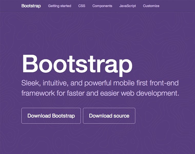
Twitter Bootstrap
http://getbootstrap.com/components/#navbarVersion 3 of Bootstrap offers a navigation that by default, begins collapsed and toggleable in mobile views and becomes horizontal as the viewport width increases.
-
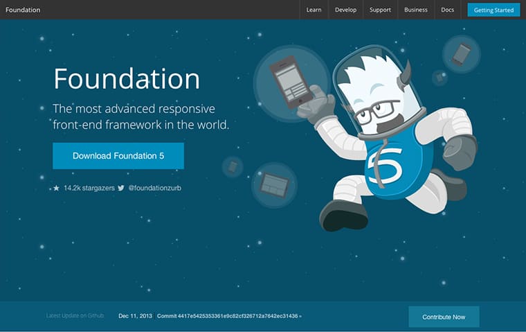
Zurb Foundation
http://foundation.zurb.com/docs/components/topbar.htmlFoundation 5 offers an off-canvas navigation that slides into the viewport when activated, a more traditional collapsing navigation and fixed position nav bar.
Plugins
There may be a scenario where you aren’t using a CSS framework or one that includes a responsive navigation, and using the navigation from these frameworks might prove difficult to use alone with dependencies. There’s absolutely no shame in taking advantage of resources others have created to get you started. Here are a few popular plugins.
-
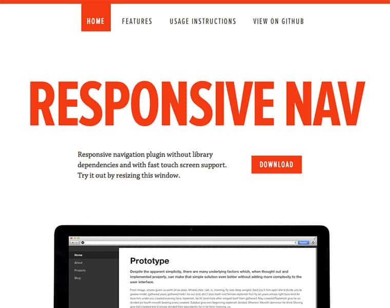
ResponsiveNav
http://responsive-nav.comWith a previous iteration known as “TinyNav”, ResponsiveNav is effective for simple navigations and easy to implement, this tiny JavaScript plugin uses touch events and CSS3 transitions for the best possible experience.
-
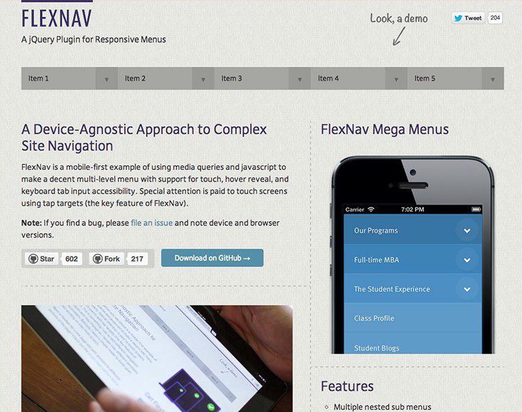
FlexNav
http://jasonweaver.name/lab/flexiblenavigation/A great solution for websites that can’t escape multi-level navigations, this plugin pays special attention to touch screens using tap targets, the key feature of FlexNav.
-
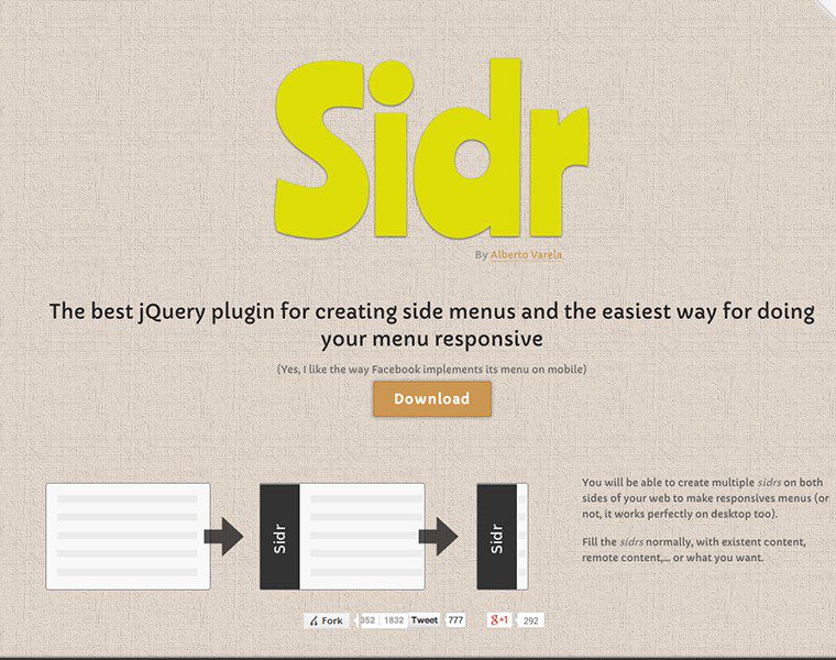
Sidr
http://www.berriart.com/sidr/A powerful plugin that handles both left and right slide in menus, this plugin also handles touch events on mobile devices.
Custom Solution
Creating a custom solution is always an option, and you don’t have to rub shoulders with a developer to make it happen. It’s much simpler than you might think, depending on the complexity of your navigation. Our very own Andrew Chalkley created a great blog post awhile back on “How to Build a “Three Line” Drop-down Menu for a Responsive Website in jQuery.”
Conclusion
When implementing your responsive navigation, avoid instinctively following trends and step back and observe your project objectively. Which responsive navigation solution makes the most sense and would be most effective for the end user to navigate? Determine your challenges by first focusing the content of your navigation, secondly deciding which design solution best fits that content, and lastly which development approach best achieves that design.


Links are valid, but out-of-date. Bootstrap has released v3, and Foundation v5
Good catch! I am definitely referring to the most updated version of Bootstrap 3 and Foundation 5, but mistakenly linked to an older version of the documentation. I went ahead and fixed that. Thanks!
Will definitely try to use in my website designing works http://www.amitbindals.com
I’ve been sticking to Bootstrap’s Nav and styling it as needed, but FlexNav looks great! I can’t wait to try it out on a project.
Definitely look into it! Good luck! 🙂