Last Updated on May 21, 2015 by
(Photograph from Flickr user Rachel Kramer)
Box-sizing is a CSS property that makes CSS layouts work intuitively. If you’ve been working with CSS for any period of time, you know that using properties like width, padding, and border can be confusing. Sometimes when you use the width property, it doesn’t always apply in the way that you might expect. However, with proper box-sizing, a width of 200px really means a rendered width of 200px.
It doesn’t involve any JavaScript magic, and it even works across browsers as far back as IE8. Let’s dig in.
The Box Model
The width and height of any element on a webpage is governed by the CSS box model. The nuances of the box model can be somewhat complex, but the most important part to understand is how rendered widths and heights are calculated. A combination of several CSS properties forms the actual rendered width and height on the page.
padding + border + width = actual rendered width
padding + border + height = actual rendered height
That’s a little confusing, so here’s an illustration that might help.
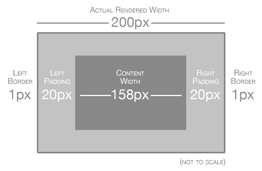
Without box-sizing, the width property represents the content area of the element. The actual rendered width includes the content area, padding, and border.
This means that if you set a width of something like 200px or a relative width of 25%, the element will only be that exact size if it has no padding or border. If it does have padding or border (or both), then the actual rendered size will be larger. Put another way, the width property really just means the width of the content area, and not the total width of the element.
As a result, calculating a desired width on the page involves subtracting padding and border from the width property. For example, if you set a width of 200px and then you want 20px of padding on each side, you have to borrow 40px (20px for the left and 20px for the right) from the width. The same thing is true for the border property. This makes code a lot less readable, because even though the rendered element is still 200px across, you might have code that reads like this:
.sidebar {
  width: 158px;
  padding: 20px;
  border: 1px solid #DDD;
}
It’s not very intuitive for the width property to say 158px if the actual rendered width is 200px. Fortunately, there’s a better method that achieves the same result.
* { box-sizing: border-box; }
Instead of calculating width by including padding and border, the box-sizing property in combination with the border-box value uses the width property as the actual rendered width. The previous code could be modified to look something like this.
.sidebar {
  box-sizing: border-box;
  width: 200px;
  padding: 20px;
  border: 1px solid #DDD;
}
Any padding or border that’s applied will not be added to the rendered width. Instead, it will automatically subtract from the space that’s available in the content area. This results in code that is far more readable. Here’s an image that helps illustrate how box-sizing: border-box calculates widths.
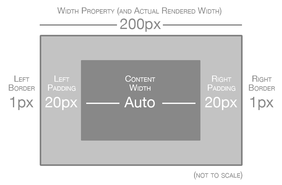
With box-sizing enabled, the width property is the same as the actual rendered width of the element. The content area is automatically sized based on the remaining width, after border and padding has been subtracted.
In fact, many reputable web designers and developers have advocated using box-sizing: border-box across all page elements for a more natural and intuitive approach to layout (see the resources section for links). Paul Irish recommends using the following code:
*, *:before, *:after {
  -moz-box-sizing: border-box;
  -webkit-box-sizing: border-box;
  box-sizing: border-box;
}
The box-sizing property is nothing new, but only in the last few years has it been a viable technique thanks to browser support from Internet Explorer (and older version of IE falling out of usage). This code will work as far back as IE8, which is pretty forgiving considering that IE11 is the latest version. For more information about browser support, check the caniuse.com support tables for border-box.
Box-Sizing Resources
As if box-sizing wasn’t great enough, you might be delighted to find that it’s already built in to front-end frameworks like Bootstrap and Foundation. By default, both of these frameworks conveniently apply the border-box value to everything, which makes their respective grid systems easier to understand.
If you’d like to continue learning more about box-sizing, here are some of the resources mentioned in this article along with some additional useful links.
- * { Box-sizing: Border-box } FTW by Paul Irish
- Box-Sizing article on CSS-Tricks by Chris Coyier
- Box-Sizing on caniuse.com
- Mozilla Docs on Box-Sizing
- Learn more on Treehouse with the course CSS Foundations
CSS layout can be a fairly complex topic, so if you’re feeling a bit lost, check out our CSS course. And of course, if you have any other resources you’d like to share, let us know in the comments!


Thanks for the article,
why did you use the :before & :after pseudoclasses? isnt the global selector enough?
/* Keyword values */
box-sizing: content-box;
box-sizing: border-box;
/* Global values */
box-sizing: inherit;
box-sizing: initial;
box-sizing: unset;
Thank you ! I’ve been found many articles about box-sizing, but this one really easy to understand
Really helpful! 🙂 Thanks for this article. Finally, I can use this in creating layouts! I combined the steps written on this blog with this site: http://www.generatecss.com/css3/box-sizing/ and I came out with a nice design for my blog.
Thanks, simple tip but helpful!
Useful code CSS, great code! That is help me to design theme my website
Nick, great recommendation. Would you mind updating it to preserve inheritance?
“`css
* { box-sizing: inherit; }
html { box-sizing: border-box; }
“`
This will give you the same result, and make it easier to change the box-sizing in plugins or other components that leverage other behavior.
The true comedy of this being you can get the exact same box model as the one advocated here in IE all the way back to IE 5.x
Just omit a doctype so it goes into quirks mode. Look at this, developers ADVOCATING the use of the IE quirks box model that they’ve called “broken” for almost fifteen years.
This is correct! What was “broken” in IE 5.x is now becoming a new standard. Funny how that worked out.
Yes, that part is funny 🙂 I even wrote a starter CSS for myself to set border-box everywhere because my IE-designed pages kept falling apart on modern browsers. I hated IE but I had to use it (back then), and I found this box model the only thing that other browsers should have followed.
Certainly I was under heavy assault by the “modern” people telling me I’m old hat and I should get used to future technologies. I really tried, kids. Doesn’t work 🙂 A box is what you put on the shelf, and the width of a box includes the “borders”. Period.
Same happened to GOTO which was the devil itself until recently PHP brought it back. It’s a rarely needed thing but when you need it, you only have very inconvenient workarounds as a B plan.
All I’d like to say is “TOLD YOU SO” 🙂
So i think the point is, why is not box-sizing: border-box; the default state when you create a new project? Is there any good reason for that?
Hi Victor,
If web browsers suddenly switched their default box-sizing mode to border-box, billions of web pages would break. Unfortunately, it’s a pretty difficult thing to change at this point.
Great stuff! Have always calculated the with, padding and border, but box-sizing i way easier! Thanks!
fdsf
fdsfdsf