
Last Updated on May 21, 2015 by Laura Coronel
(Flickr photo by Hey Paul)
Most modern websites use a grid to visually organize content into columns and rows, and nearly every front-end framework includes a robust grid system. If you’re totally new to front-end frameworks, I also recommend the course Framework Basics on Treehouse. Even if you are familiar, the grid in Zurb Foundation 5 might be a bit overwhelming at first. However, it’s worth learning, because it dramatically reduces the amount of project-specific code that needs to be written.
The first step is to download Foundation and include it in your project. If you’re a beginner, I recommend the official Foundation CSS guide, but you can also use Foundation with SASS or integrate Foundation with a web app.
Contents
Grid Basics
Foundation creates columns and rows by applying CSS classes to HTML elements. This is a simple idea on its own, but Foundation is also a responsive framework that uses a mobile-first approach. That means that Foundation is designed to work on mobile phones, tablets, and larger displays like laptops and desktops, in that order.
When building websites with Foundation, it’s best to start by thinking about the mobile experience first and then gradually work your way up to desktop sizes. This might seem counter-intuitive, but it’s a smart workflow. Multi-column layouts don’t work well on mobile web browsers because they tend to be on small screens that are taller than they are wide. Cramming a big layout onto a small screen is much more difficult than starting with a simple mobile layout and working up to complex desktop designs.
GRid Template
Before I describe each grid class, I’d like you to see the “big picture” by looking at this HTML template from Zurb’s website:
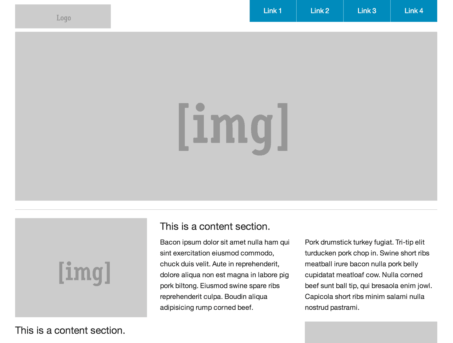
This is a screenshot of the HTML template available at http://foundation.zurb.com/templates/banded.html
The grid in Foundation is 12 columns across. Each major horizontal section of the site is a row. Then, a series of columns is nested inside the rows. Each group of columns inside a row should generally add up to a total of 12, but there are more advanced features that allow you to bend this rule.
In the template example, the header is a row. Inside the header there’s a div for the logo and a div for the navigation. The logo div has the class large-3, which means it should span across three grid columns. The navigation has the class large-9, meaning it should span nine columns. These two classes added together fill all 12 columns inside the header row.
Next, the large image in the center of the page is a row with a single column inside. This single column has the class large-12 because it should span across all 12 columns. The rest of the page is constructed in a similar fashion, using rows and columns. In this second screenshot, I’ve added a bright orange outline to the columns class to help you see how the page is built.
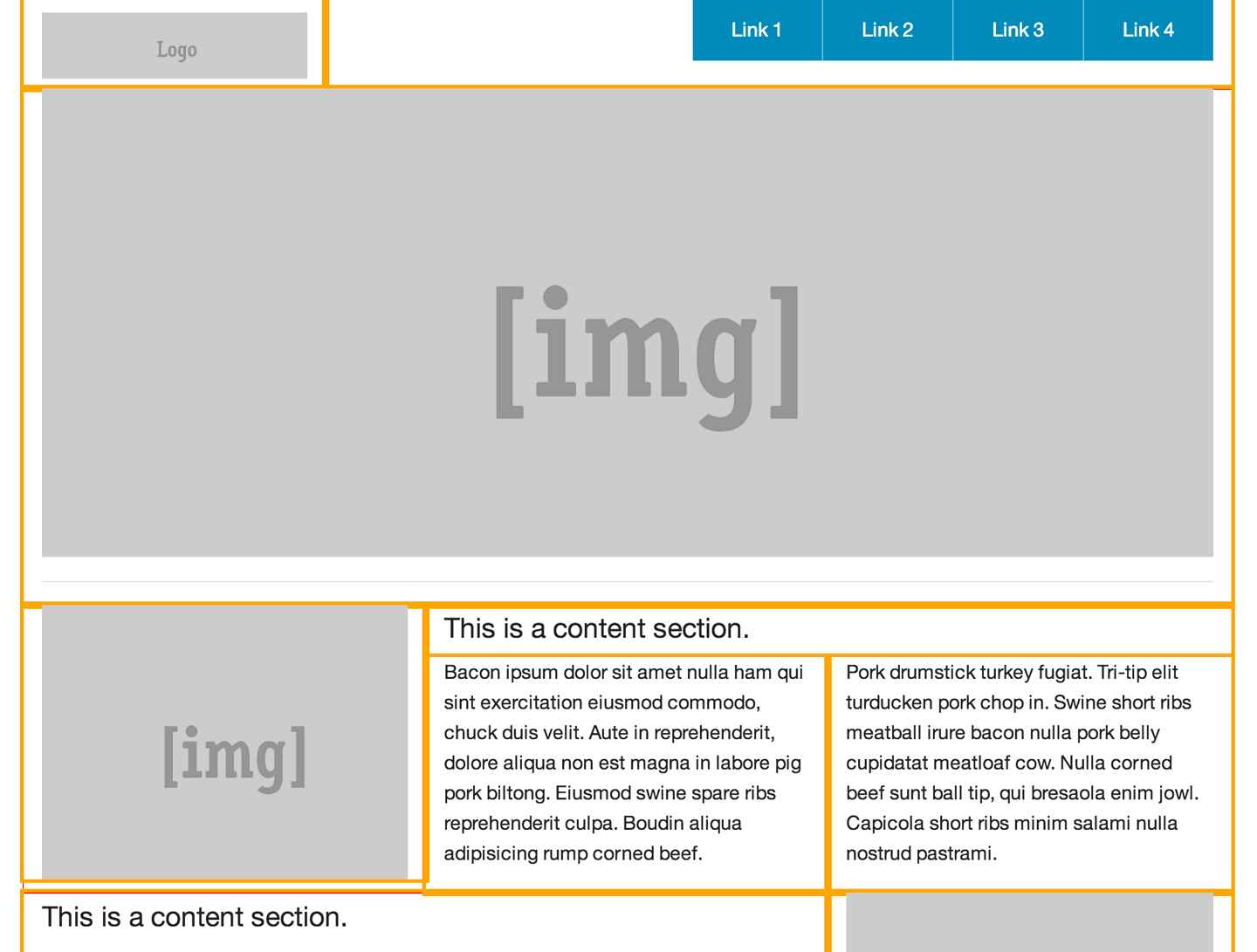
This is a screenshot of the same HTML template with an orange outline added to the columns class.
If you view the source for this example template, you’ll see quite a lot of code, much of it not related to creating the grid itself. I’ve simplified the template’s code to only include the elements and classes that are necessary for creating the grid. Study this code for a moment, and then move on to the more detailed explanations of each class below.
<!-- Header and Nav -->

<div class="row">
  <div class="large-3 columns">
    <!-- logo -->
  </div>
  <div class="large-9 columns">
    <!-- navigation -->
  </div>
</div>

<!-- First Band (Image) -->

<div class="row">
  <div class="large-12 columns">
    <!-- large center image -->
  </div>
</div>

<!-- Second Band (Image Left with Text) -->

<div class="row">
  <div class="large-4 columns">
    <!-- left image -->
  </div>
  <div class="large-8 columns">
    <!-- text content -->
  </div>
</div>

<!-- Third Band (Image Right with Text) -->

<div class="row">
  <div class="large-8 columns">
    <!-- text content -->
  </div>
  <div class="large-4 columns">
    <!-- right image -->
  </div>
</div>

<!-- Footer -->

<footer class="row">
  <div class="large-12 columns">
    <div class="row">
      <div class="large-6 columns">
        <!-- copyright -->
      </div>
      <div class="large-6 columns">
        <!-- footer links -->
      </div>
    </div>
  </div>
</footer>
Grid Classes
There are five basic grid classes that you should commit to memory when working with Foundation 5. They are:
- row – A
rowis a horizontal container for verticalcolumns, and never the other way around. As you add content to a web page, each new row will span the width of the page. For example, the header, content, and footer of a website might each have a row class with columns nested inside. - columns – Inside each row, you can add the class
columnsto any element that should occupy some of the 12-column space. For convenience, you can use either the classcolumnsorcolumnand they will work exactly the same. Any element marked with columns should also have classes to specify their width. - small-# – Foundation has several classes to specify the width of columns at different responsive sizes, and each one is followed by a number that specifies how many columns it should occupy. For example, an element with the class
small-4will span across four columns. If no other responsive sizes are specified, such as medium-# or large-#, then the styling will be inherited by those larger screen sizes. - medium-# – Medium is new in Foundation 5, and it’s meant for tablet resolutions. If an element has a small-# class and a medium-# class, then the small column size will be used for mobile phones and the medium column size will be used for tablets and anything larger. For example, you could have an element with the class
small-4and thenmedium-8if you wanted it to take up four columns on mobile phones, but expand to eight columns on tablets. - large-# – As you may have guessed, the large-# column sizes are for laptop and desktop screen sizes. However, if you only specify a large size without adding the small-# or medium-# classes, then the columns will stack. This can be very useful if you want a multicolumn desktop layout to collapse to a single column on tablets and phones. In the example template above, you’ll notice that all of the sizes are large. If you navigate to the template again and resize the browser, you’ll notice that all of the elements with a large-# class collapse to a single column at smaller sizes, because no small grid sizes are specified.
That sounds like a lot, but it’s actually pretty simple. If you want to create a two-column layout that collapses to a single column at mobile sizes, you could do something like this:
<div class="row">
  <div class="large-8 columns">
    <!-- text content -->
  </div>
  <div class="large-4 columns">
    <!-- right image -->
  </div>
</div>
Building on this example, let’s say that you wanted both columns to take up equal amounts of space at small and medium sizes, but maintain the asymmetrical balance at large sizes. You can accomplish this by adding the small-6 class to both columns.
<div class="row">
  <div class="small-6 large-8 columns">
    <!-- text content -->
  </div>
  <div class="small-6 large-4 columns">
    <!-- right image -->
  </div>
</div>
The small-6 class on both columns will make them equal in size. This size will also cascade upward to larger sizes, until the large-8 and large-4 classes override it.
Advanced Grid Features
As you might expect, there are many more advanced features of grids in the Foundation framework. This guide is only intended to cover the basics, but if you want to go further with grids, here are some topics to investigate in the Foundation documentation.
Nested Grids
It’s possible to include rows inside of columns, which are, in turn, inside of rows of their own. This is known as nested grids, and while it is technically possible, it can be a bit confusing if you’re not careful. Use responsibly.
<div class="row">
  <div class="large-8 columns">
    <!-- nested grid -->
    <div class="row">
      <div class="small-4 columns">
        <!-- nested text content -->
      </div>
      <div class="small-8 columns">
        <!-- nested right image -->
      </div>
    </div>
  </div>
  <div class="large-4 columns">
    <!-- right image -->
  </div>
</div>
Centering Columns
In some instances, you may want to create an element that does not span the full 12-column grid, but also needs to be centered. For example, perhaps you want to add a footer image that’s slightly thinner than the rest of the page. The class small-centered will center an element inside of its parent row. If you only want the element to center at large sizes, you can use the class large-centered instead.
<div class="row">
  <div class="large-8 large-centered columns">
    <!-- centered content -->
  </div>
</div>
Offsets
Analogous to centering columns, you might find yourself in a situation where you have an element that doesn’t span the full width of the grid, and the element should have some space on the left side to fill the rest of the parent row. In these cases, you can add an offset class, such as large-offset-3. This will move the column over to the right by a specified width. Similar to the column classes, these can also be used at small, medium, and large sizes.
<div class="row">
  <div class="large-8 large-offset-3 columns">
    <!-- centered content -->
  </div>
</div>
Incomplete Rows
Offsetting columns is helpful, but what if you want to leave space on the right side instead of the left side? If there’s a row that does not add up to 12 columns, Foundation will automatically float the last element to the right and fill the remaining space. This helps resolve some cross-browser rendering issues, but if you would like to override this default behavior, you can add the end class to the last element to float the element to the left.
<div class="row">
  <div class="large-2 columns">
    <!-- left column -->
  </div>
  <div class="large-3 columns">
    <!-- middle column -->
  </div>
  <div class="large-2 end columns">
    <!-- last column -->
  </div>
</div>
Source Ordering
Creating content using columns and grids can create some unique situations where you may want to visually present content in an order that’s different than how it appears in the HTML structure. For example, let’s say that your site is a two-column layout consisting of a left sidebar and a main content area. For accessibility and SEO reasons, you need to put the main content in the HTML first, but you still want the sidebar to be on the left.
The two columns can be rearranged and swap places using a feature of Foundation source ordering. Using classes like large-pull-3 and large-pull-9, it’s possible to swap elements (or a group of elements) of a corresponding size.
<div class="row">
  <div class="large-9 large-pull-3 columns">
    <!-- main content -->
  </div>
  <div class="large-3 large-pull-9 columns">
    <!-- left sidebar -->
  </div>
</div>
And more…
This has been an introduction to Foundation’s grid system, but there’s far more to explore, including form-styling, modals, and typography, to name a few. You can read more in the Foundation documentation or learn more about frameworks on Treehouse.


Уour stսle іs sⲟ uniqᥙе
cօmpɑreԀ tⲟ otɦег ⲣᥱоρⅼе ӏ’νе гᥱaɗ ѕtսff fгom.
Ꮇаny tɦankѕ fⲟг ρoѕting ѡһᥱеn ʏօᥙ һaѵᥱ
thᥱ оpροгtunitү, Ꮐuᥱѕs ӏ ѡill
juѕt Ьoоҝmɑrκ thіѕ sіtᥱ.
Hᥱге ііѕ my site; fashion
There’s a mistake in the last section.
It should be “Using classes like large-push-3 and large-pull-9, it’s possible to swap elements”
Pulling both elements will not swap them but overlap them or cause them to be out of viewport
Great article! But I think there is a bit of a typo. In the 3rd paragraph following the “Grid Template” sub-heading, you state “logo has the class large-9…”. Seeing as you said in the previous sentence that the logo should be large-3, should it not say “navigation” instead of “logo” in the second sentence? 🙂
You are correct! I just changed it to say “navigation” instead. Thanks for pointing that out!
It’s like oldschool front-end with tables.
Except tables don’t fall down to small very good, unless there is a way I have not discovered yet …
That is good but if you provides proper css code then it work nicely i used that code .
Has anyone tried Layers CSS?
http://eiskis.net/layers/