Last Updated on May 21, 2015 by Laura Coronel
“Quo Vadis?” illustration by Charis Tsevis/Flickr
Web design can be tough for a lot of reasons. But the biggest challenge is probably that there are so many ways to approach a problem. Many websites set a bad example for beginners. Even big brands known for quality can often mess up. I could list a lot of things, but here are the top web design mistakes I see over and over again that need to stop.
Contents
Modals and Pop-Ups
You’ve seen this before. You click on a link to a news article or a blog post, and a gigantic modal pop-up window covers the content. This makes absolutely no sense. If you’re requesting a specific article, obviously that’s why you’re visiting the site.
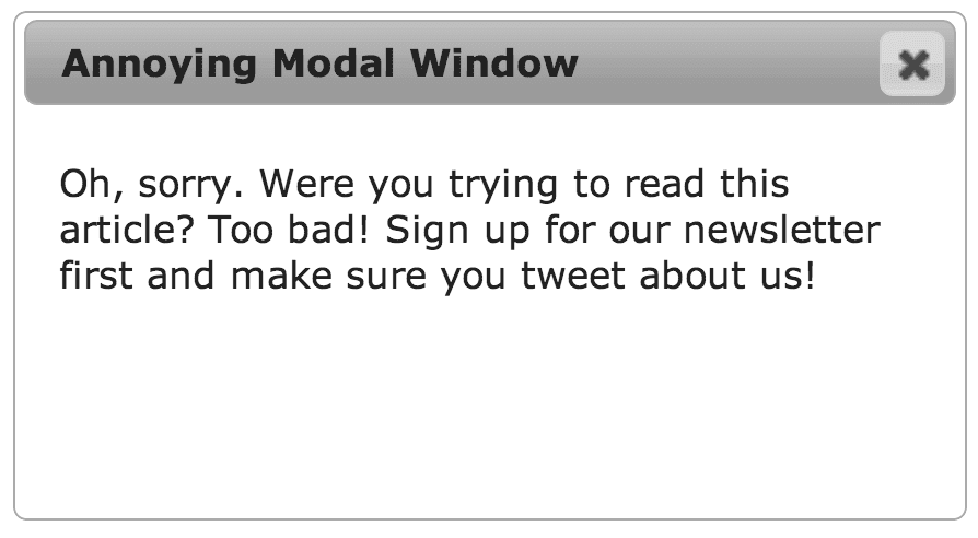
Modal windows can ruin your mood.
Let them read and enjoy the experience you’re offering. No need to spoil the purity of their intent by redirecting them someplace else. If the visitor likes the site or they’re interested in the advertisements, they’ll click around and explore on their own. Modal windows aren’t bad by themselves, but putting it up as the very first thing that people see is lazy and desperate.
ExceptionS and Alternatives
Despite their potential for abuse, modal windows are useful in many scenarios where leaving the current page may not be the best option. For example, if your website has a contact button, it might not merit leaving the current page. Presenting a modal window with a simple contact form allows for the site visitor to fill it out and then return to the current task.
Walls of Text
Web design is a wonderful medium that allows you to combine text, images, and other multimedia into an interactive experience. To that end, it’s not a good idea to turn a website into something that it’s not, like a tri-fold brochure or an information pamphlet. If you’re marketing yourself or a business, don’t present the site visitor with a huge wall of text on the first page. Instead, make the home page something very simple that explains exactly what the site is about. If they want to know more, they’ll dig in. Treehouse is a good example of using a simple explanation:
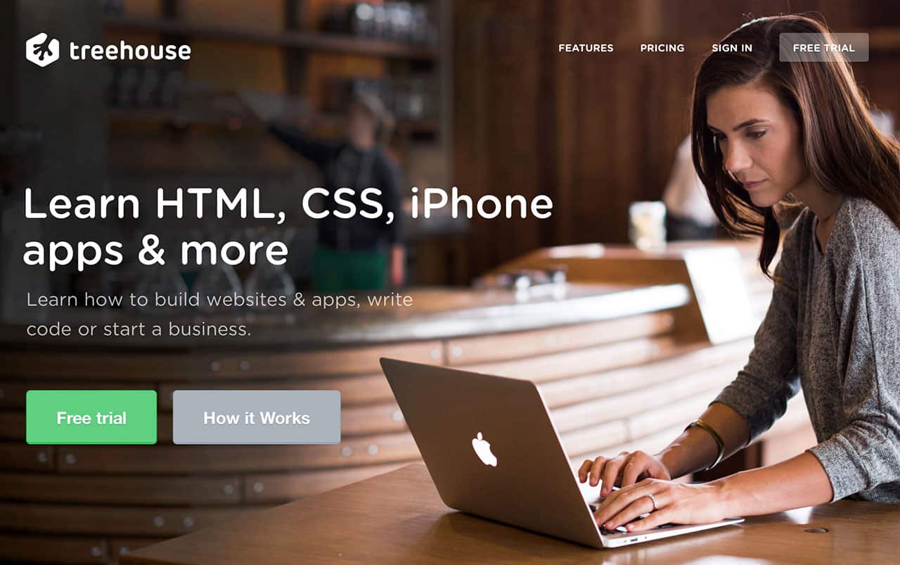
Treehouse uses a simple line of text on the homepage that clearly states the site’s purpose.
A giant block of text is not only intimidating, it’s also not always pretty to look at. Text is an important part of web design, and when abstracted as a visual element (rather than something that’s meant to be read) it can add a lot of rough “texture” to the page. When you’re trying to invite people inside a website to learn more, this can add a lot of undesirable visual friction.
EXCEPTIONS AND ALTERNATIVES
If you’re tempted to put a lot of text on a page, first try to cut it down and summarize portions. Then, break up each major idea into its own section, possibly including some pictures or illustrations. The page at teamtreehouse.com/features is a good example. There’s lots of text on the page, but it’s presented in small chunks.
Not Enough Space
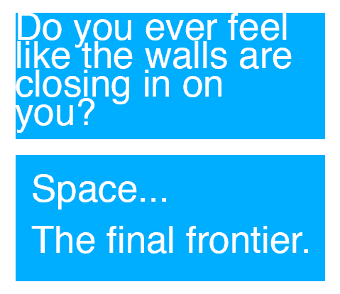
Every beginner web designer and developer has done this one (myself included). They feel compelled to fill the page with interesting information and stuff for people to look at and click on. Poor use of space around the elements just compounds the problem and the result is a cluttered mess with no clear purpose.
Humans crave simplicity, and it can be easier for you to provide that to them by presenting just a few things at a time as they become relevant. The web facilitates this through a number of mechanisms, but practically speaking, you should always make sure each piece of information is appropriately grouped with other related design elements and that there’s enough separation between each group.
EXCEPTIONS AND ALTERNATIVES
It can be hard to know when to use space if you’re just starting. Instead of inventing all the aesthetics yourself, I recommend you try a front-end framework like Bootstrap or Foundation. The grid and typography frameworks contained within will help you space your elements appropriately.
Thinking Too Far Outside the Box
Every new web design project is filled with limitless possibilities, so it can be tempting to try things that have never been done before. Innovation is important, but too much can sometimes be a bad thing. You want to create experiences that feel familiar to site visitors so they can explore your site right away with no learning curve. Getting the basics right is difficult enough, so if you haven’t made too many websites yet, it’s a good idea to embrace common design patterns. Simplicity can be just as exciting as innovation if it’s done well.
EXCEPTIONS AND ALTERNATIVES
Even if you’re not very experienced, you can certainly experiment in the right context. It’s rarely a good idea to take a big risk on a big client project, but if you’ve executed something well already in a side project, then using it in production is the next step. Continuously building side projects and exploring new approaches will help evolve your professional work.
Navigation is probably one of the most difficult aspects of web design. In all my projects, I’ve spent quite a lot of time thinking about how all the screens flow together, how everything is labeled, what should be on its own page and what can be combined, and so on. If there’s any single word that can make a huge impact on your site’s usability, it’s probably something in the navigation.
Massive sites like Wikipedia or Facebook have millions of pages, but they all flow together in a stream of consciousness without overwhelming visitors. It seems effortless because they do such a great job. But if you’re just starting out, try to make projects with just a few pages. Be clear and explicit about what each page contains, then label it accordingly in your navigation. Mixing intentions makes things feel confusing.
EXCEPTIONS AND ALTERNATIVES
It’s almost never a good idea to intentionally create confusing navigation, but there are some rare instances when it can be good. If you’re creating an experiential website (one that’s not necessarily meant to inform), some mystery might work to your advantage. For example, you might promote a highly anticipated movie or a new product by creating a game in which visitors solve riddles and clues, eventually leading them to the next part of the game. This is a special use case, so be careful with its execution.
If you have any other common mistakes you’ve seen around the web, I’d love for you to share them in the comments!



This is wonderful tips. I love this blog. This really helped me to learn web design. Great post man !!!!!
Thanks for sharing these useful tips learn a lot keep up the good work.
Hi Nick!
Amazing piece of content. I would like to share one such mistake. I started using an ad monetization network, which showed pop up ads to the visitors. But, it was an incentive-based monetization network, so basically, you get paid for app installs or user sign-ups. Revenue Hits to be precise.
A few days later, I got a message from Google Webmasters that my rankings have slipped up because they detected social engineering on my website. Had to remove those ads instantly. But luckily, I get to know about what mistake I made and learnt from it for not making it again.
I’m glad that you shared this article.
excellent article and great tips
It’s amazing to pay a quick visit this web site and reading the views of all colleagues about this piece of writing, while I am also eager of getting experience.
Ohh you really remind me of my past mistakes that I did while designing ! anyway thank you too much Nick
Web design is one of those careers where knowing what *not to* do is often more valuable than knowing what *to* do.
Okay, I might be exaggerating a bit, but what I’m trying to say is that being at the start of your adventure with web design is full of unexpected traps, seemingly good ideas just waiting to bite you back, as well as client requirements that are very much “there,” but just not spoken out loud.
Hi Nick,
Nice post, You did really good job over here by posting this article. I am beginner in web development your article will really helpful for me. I read lots of post never got such useful steps for web designing.
Thanks for sharing,
Cheers
The headline “not enough space” taught me something good even I’m a designer not a developer yet. And your talking about navigation made me filling good. because I was so disappointed about navigation designing. now I knew that it’s really tough one. thanks
Ohh you really remind me of my past mistakes that I did while designing ! anyway thank you too much Nick !
Great article, this really helps me a lot as a newbie in this industry working in a professional website development company.
Hi Nick. This is really helpful article for those who are newbie in the field of web design. Not only newbie but also experienced people also make mistakes that you stated above.Thanks for nice article.
Very nice post. Thanks for sharing. I’m a beginner in this field. So I always keep researching in this area. I found your blog very helpful & will definitely wont commit at least these mistakes in my work from now onwards. Thanks again. Keep sharing.
Hello,
Well, Quite a decent article.
I have made many mistakes, when I just started my career. I was not aware of the fact that, i need a responsive website, so for a long period of time, I was running website just for the desktop users.
Also, the navigation was not easy, but with time, I have improved my websites layout and design a lot.
But still many are making similar mistakes, so this would help many of them resolve issues with their website design.
Keep up the good work.
I like reading your whole blog post.Thanks for sharing it.
I really appreciate the comment about unsolicited modal windows. They do nothing but make me uninterested in the website, it’s content, and it’s author.
This is a nice post.
I just started learning webdesign and development. I have learnt much of html and css and little of java. ive been able to make a clone of two sites. (Bbc and dipped 4rm 1st web designer). Ive actually not built my site because i’ve been thinking of what to put on my website and how to go about it. The layout to use, color schemes…etc.
I have seen so much awesome websites and i keep getting intimidated and always feel like i should get to a pro level before i build one. But now this article just explained to me how to really start.
Start “simple and nice” and keep learning and building on it. Thanks for the awesome article. I learnt what not to put on my website. NICE POST!
Fare domande sono davvero realtà bello cosa se non si sta
capendo nulla tutto , eccezione article prevede gradevole comprensione persino
.
Visit my homepage semi di maria online
Spacing and walls of text are tough to defend sometimes. Especially when people without any design skills have the final say on the product. ‘Wel,l just put an explanation text there, shrink that, push that together and voila everything fits’. ‘…and now it’s a mess nobody will read’, ‘oh thats not true’, ‘fine, go ahead’
Great list. I feel like Modals don’t get enough criticism. They might have a proper use 5% of the time they’re actually used.
Good point about not “Thinking Too Far Outside the Box” too. When I started off designing I treated my site as an art project. That’s not a good approach, especially for beginners. Your goal should be to pass the test. For business purposes if it has a good design who cares that you used a template that 200 other sites have. Its makes zero difference to your customers and the bottom line.
Ryan, http://www.radiumcrm.com
Whenever I find myself on a website to read an article and there’s some kind of overlay interfering with that for any reason before I can even read a line. I immediately leave the site & don’t bother coming back. I often wonder how many viewers they lose like this. They probably don’t even realize they lose viewers ’cause they just look at the visitor logs & say “hey, we got 100 readers today”, when 70 of them might’ve just decided not to bother or couldn’t find a way to X out the modal/overlay and moved on elsewhere.
I really appreciate the comment about unsolicited modal windows. They do nothing but make me uninterested in the website, it’s content, and it’s author.
How about unremovable social network bars which float over your content (as seen on this page): http://i.imgur.com/ktOqezi.png
I think a bigger problem is the massive amount of errors and slowness Digg Digg causes. I don’t mind the floating bar but since that plugin has stopped all development, I wish people would start looking at alternatives.
Fantastic post though!
Nice article, useful tips to remember!
One thing about this very site that kinda annoys me though, is the placement of the share dialog thingy that’s constantly following me whilst reading the article. Talking about space to breath, it actually feels quite suffocating to me.
Besides this silly point, keep up the good work :)!
I think loading a massive 3,270.65 KB screenshot of your homepage should be a no,no too 😉
Ew, you’re right. That should have been resized and compressed. Just fixed it, thanks for bringing it up!
Thanks for the tips, they are great.
Additionally, consider spacing between elements when designing sites for mobile, because it’s hard to tap on them if they are close to each other.
Also, font size for mobile should be adjusted.
There is actually the http://www.testize.com service that validates your site readiness for mobile and devices and provides you with recommendation if there is enough space between elements for page on touch devices and appropriate font sizing.
Hi nice resource but this site seems like scam to me. It shows english language with 9 spelling errors on my site however my site is in slovak language and it’s stated in html lang attribute. And it shows up that my site is much better seooptimized than treehouse site but I have some doubts about it . 🙂