


When I was looking through the analytics data for a product I recently launched I was taken aback by just how much mobile traffic the web app was getting. After seeking some feedback from users it became clear that people were using the ‘Add to Home Screen’ feature in Safari on iOS to create a shortcut to the app right on their home screen. The app was already designed to be responsive but after discovering how popular this user behaviour was I started thinking about how I could make the mobile experience even better for these users.
In this post I want to share with you some of the techniques I’ve learned about how to optimize mobile web apps for iOS. You’re going to learn how to set the launcher icon, startup image, status bar styling, and more.
Lets get started!
Contents
Setting the Viewport
The first thing you can do to ensure that you’re delivering a great mobile experience to users is to correctly set the viewport for your app. This will ensure that the layout and content is displayed nicely within the dimensions of the screen your app is being viewed on.
To set the viewport you just need to add the following <meta> tag to the <head> of the document.
<meta name="viewport" content="width=device-width, initial-scale=1">This will set the width of the viewport to match the width of the device. The initial-scale value ensures that no zoom will be applied to the page when it first loads.
Adding an Icon
Launcher Icon
One of the most important things to do when optimizing your web app for iOS is to set the launcher icon. This is the icon that will be displayed on the home screen of the user’s device. If you don’t set this yourself, iOS will use a screenshot of the page instead.
You can specify the launcher icon by adding a <link> element to the <head> of your document. Make sure that you set the rel attribute on this element to apple-touch-icon.
<link rel="apple-touch-icon" href="apple-touch-icon-iphone.png">Your icon image should be supplied in PNG format.
As Apple hardware has evolved we’ve seen the introduction of new screen sizes and densities. This means that you cannot create a single icon that will be displayed nicely on all Apple devices. Instead you need to create icons that specifically target devices with retina and non-retina screens.
You can specify icons aimed at particular device resolutions by adding multiple <link> elements with sizes attributes. This attribute should contain the size of the icon referenced in the href attribute. Safari will pick out the icon that is most appropriate to the user’s device.
<link rel="apple-touch-icon" href="apple-touch-icon-iphone.png">
<link rel="apple-touch-icon" sizes="76x76" href="touch-icon-ipad.png">
<link rel="apple-touch-icon" sizes="120x120" href="touch-icon-iphone-retina.png">
<link rel="apple-touch-icon" sizes="152x152" href="touch-icon-ipad-retina.png">
The icon sizes needed to target specific devices can be found in the table below. If you don’t specify a sizes attribute, the default size of 60x60 will be used.
| Icon Size | Devices |
|---|---|
| 60×60 | iPhone & iPod Touch (Non-Retina) |
| 76×76 | iPad 2 & iPad mini (Non-Retina) |
| 120×120 | iPhone & iPod Touch (Retina) |
| 152×152 | iPad & iPad mini (Retina) |
Note: Safari on iOS 7 doesn’t add any effects to your icons, however older versions of Safari will. If you don’t want older versions of Safari to apply effects to your icons make sure that the filenames end with -precomposed.png.
Setting a Startup Image

The startup image for the Jawbone UP app.
Next up you’re going to learn how to add a startup image for your app. This will be displayed to the user whilst the page is loading. If you don’t specify a startup image the user will just see a blank white screen.
You can specify a startup image using a <link> tag with the rel attribute set to apple-touch-startup-image.
<link rel="apple-touch-startup-image" href="/startup-image.png">The size of the startup image for iPhone 5S/5C is 640 x 1136 (pixels).
Unlike with launcher icons, you cannot use the sizes attribute to target different screen resolutions when it comes to startup images. Instead you need to use media queries. Github user Taylor Fausak has put together a great gist that demonstrates how to do this.
Also check out: 10 Must Have Tools for iOS Developers
Setting the Launcher Title
By default Safari will use the contents of the page’s <title> element to set the initial title for the launcher icon. You can however override this by adding a <meta> tag with apple-mobile-web-app-title set as the value of the name attribute. The value of the element’s content attribute will then be used as the launcher title.
<meta name="apple-mobile-web-app-title" content="Kojitsu">Explicitly setting the title of your web app like this can be useful if the <title> element contains a lot of text that’s used for SEO purposes.
Hiding the Browser’s User Interface
Another great optimization is to hide the browser UI so that you can maximize the screen space available to your app. This can be done by adding a <meta> element with the name attribute set to apple-mobile-web-app-capable, and the content attribute set to yes.
<meta name="apple-mobile-web-app-capable" content="yes">This will cause your app to run in standalone mode. It’s worth noting that any links to other pages that are clicked whilst your app is in standalone mode will launch the full Safari browser. To get around this you could build your app as a single-page application (SPA).
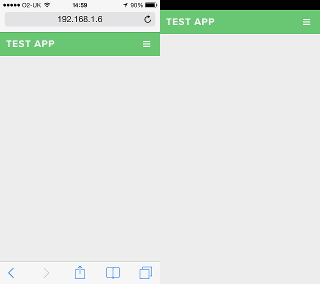
Browser UI Comparison: Visible (left) and Hidden (right).
Note: Chrome for Android also supports the ability to run an app in standalone mode. Be sure to add a <meta> element with the name attribute set as mobile-web-app-capable to enable this.
<meta name="mobile-web-app-capable" content="yes">You can check to see if your app is running in standalone mode by examining the navigator.standalone property using JavaScript.
if (window.navigator.standalone) {
    // The app is running in standalone mode.
}
Related Reading: How to Design Usable Profile Interfaces for iOS Mobile Applications
Styling the Status Bar
As well as hiding the browser UI, you can also alter how the iOS status bar is displayed. This is done using a <meta> element with the name attribute set to apple-mobile-web-app-status-bar-style.
<meta name="apple-mobile-web-app-status-bar-style" content="black-translucent">There are a number of different values that you can use to set the style of the status bar. These should be specified as the value for the content attribute.

The ‘default’ status bar style (iOS 7).
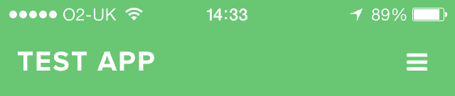
default – The default system status bar will be displayed above the web content.
The ‘black’ status bar style (iOS 7).
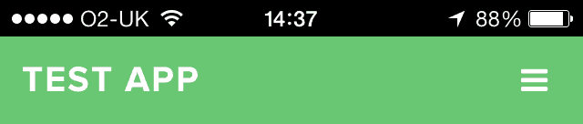
black – The status bar will be displayed above the web content with a black background.
The ‘black-translucent’ status bar style (iOS 7).
black-translucent – The status bar will be displayed over the top of the web content, with a translucent background.
If you use the black-translucent value be sure to add an extra 20 pixels of padding to the top of your page to ensure that the status bar does not obscure your content.
Note: Setting the status bar style will only work if you have also specified an apple-mobile-web-app-capable meta tag.
Linking to Native Apps
The last optimization we’re going to look at is how to link to native apps. This allows you to do things like make a phone call, send an SMS message, or even launch the YouTube app.
To launch native apps you need to use one of the URL schemes supported by Safari on iOS.
Sending an Email
To launch the mail app you just use the standard mailto scheme that you may already be familiar with.
<a href="mailto:hello@example.com">Send Email</a>Making a Phone Call
The tel URL scheme is used to launch the dialer from your mobile web app. An alert will be displayed prompting the user to confirm that they wish to make the call.
<a href="tel:01234567890">Call Jim</a>Starting a FaceTime Call
You can launch the FaceTime app using the facetime URL scheme. You should specify either the phone number or email address of the person you wish to call. Again the user will be asked to confirm the call before the app is launched.
<a href="facetime:01234567890">Call using FaceTime</a>
<a href="facetime:hello@example.com">Call using FaceTime</a>
Sending an SMS Message
You can launch the Messages app using the sms URL scheme. You have the option to specify the phone number for the person you wish to message. If you leave it blank the app will still be launched, just without a pre-filled recipient.
<a href="sms:">Launch Messages App</a>
<a href="sms:01234567890">Send an SMS</a>
Launching the Maps App
The Maps app can be launched by specifying a maps.apple.com URL. There are a number of parameters that can be used to specify the behavior of the Maps app when it is launched (e.g. location, directions, zoom level, etc…). You can find a full list of these parameters here.
<a href="http://maps.apple.com/?q=cupertino">Cupertino</a>For driving directions, you can specify the destination and start addresses using the daddr and saddr parameters.
<a href="http://maps.apple.com/?daddr=San+Francisco,+CA&saddr=cupertino">Directions</a>Launching a YouTube Video
Links that use a full YouTube URL will be intercepted by the native YouTube app (if it’s installed). Ensure that the URL matches one of the formats in the examples below.
<a href="http://www.youtube.com/watch?v=VIDEO_ID">Play Video</a>

<a href="http://www.youtube.com/v/VIDEO_ID">Play Video</a>
Related Reading: What Every Junior iOS Developer Needs to Know
Final Thoughts on Mobile Web Apps
Despite the popularity of native applications, I don’t think that anyone should write-off the demand for mobile web apps. Browsing on mobile devices has been growing at a staggering rate over the past few years and is showing no signs of slowing down. By applying the techniques you’ve learned in this post you can ensure that you’re delivering the best possible experience to your mobile users.
To learn more, check out the 7-day free trial available at Treehouse!