Last Updated on July 14, 2015 by Laura Coronel
Mobile social networking apps commonly allow for a robust user profile section. This is where users can login to update their settings, post content, or check their followers/friends list. There are often many other features included with profiles depending on the purpose of the application.
I want to look into some examples of spectacular iOS user interface design pertaining towards user profiles. There are so many distinct methods of creating interfaces for iOS that I couldn’t possibly cover them all. But I hope these suggestions can get you started looking into mobile iPhone & iPad application design. Profiles are a cornerstone for any social networking service – dazzle your early adopters and it’s very likely that you will be able to draw in a greater audience.
Contents
Be Clear & Concise
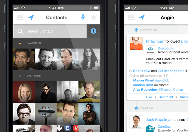
As a general rule of thumb you want profile pages to be easily accessible and easy to read. Not just for other people but also for the user of the profile. Accessing their settings menu should not be much of a struggle, and the input fields should be self-explanatory.
But this doesn’t mean you have to keep everything minimal and simple. Instead feel free to include gradients, textures, multiple content boxes and detailed information. Allow users to fill out info about themselves which is related to the purpose of your network. For example, a person’s Foursquare profile can benefit from displaying different content in comparison to a Quora profile.
Clarity arises from pinpointing exactly why users are on your network and what information they might be looking for. This includes users viewing other profiles along with their own. Keep people engaged with your application by making interfaces that are obvious and even conventional to the average user.
Provide Easy-Access Stats
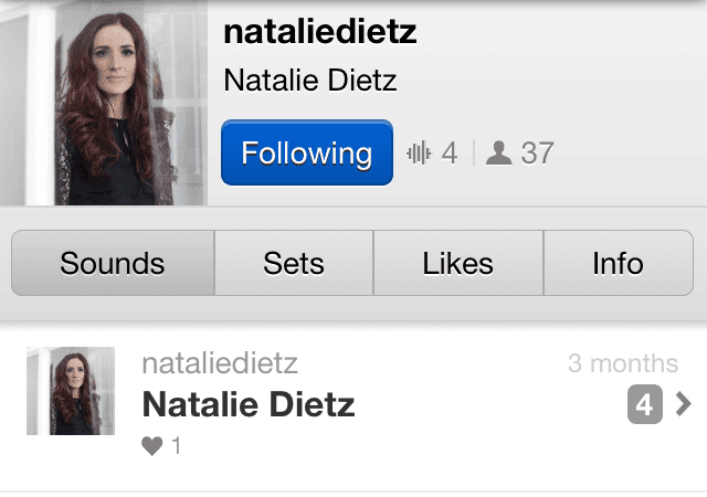
This is more of a personal preference but I’m sure many others like having access to user stats. These can include your followers but also likes, updates, photos, profile comments, and other similar concepts. Numbers provide a quick glimpse into a user’s profile to see how active they are. Soundcloud is a great example which includes uploads and even sets of grouped songs together.
These profile statistics will be different for every network. And sometimes it might not even make sense to publish a whole lot more than what is necessary. Users who like to keep their stats private may wish to opt out or not even use your network if privacy controls aren’t included. The mobile app Foursquare comes to mind which has really pushed for greater privacy control giving users the option to choose exactly what they wish to share.
I really love to find creative mobile navigation menus. One specific example is the sliding navigation effect which has taken application interfaces by storm. Web, mobile, and anything in-between has taken notice to these hidden sliding panels. They allow users access to a full page while also having quick access to a menu list of items. It is one of my favorite techniques because it saves space on the screen while also providing a quick reasonable solution to navigation.
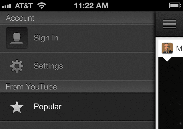
There are plenty of great mobile applications using this feature. YouTube published by Google is one of them which has really improved many facets of the navigation performance. Notably the sliding animation provides a small bouncing effect as if the menu was physically moving across the screen. Also each nav item uses a small icon to represent the functionality. These are two smaller ideas which greatly impact user experience.
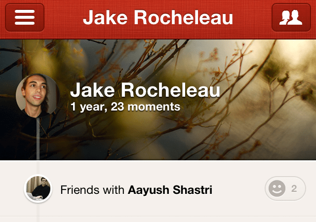
Path is another application which actually uses two different sliding panels. The typical navigation menu is located to the left side of the screen, while the right side triggers a list of friends/followers. Since the application is built to run like a social network I can really admire this design. It makes the user feel more connected with easier access to share stuff and also check out what their friends are sharing.
I don’t think every single application should try to incorporate this style of navigation. But it really does work as you would expect, and the space you can save will be greatly utilized for some other features. Most people already know how to access these menus which makes side navigation a simpler and somewhat foolproof method for providing quick links to users.
Just ensure that your navigation is easy to understand while also large enough for users to interact with(tap, swipe, etc). Sliding nav menus are popular but just one example among a sea of great mobile UI.
Sleek Interfaces Sell
I have noticed many of the applications which end up popular also feature beautiful interfaces. Probably not a big surprise, but iOS development with Objective-C has come a long way since the App Store was initially unveiled in 2008. Designers are more willing to attempt new textures, new page elements, and custom animations for loading between views.
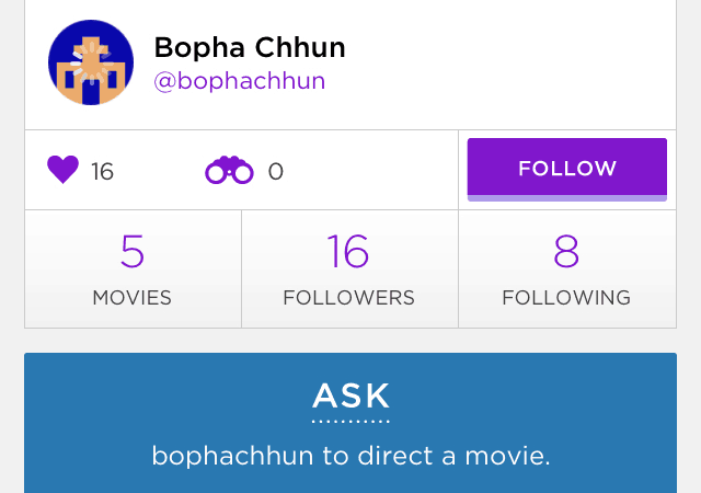
After playing with Directr for a while it caught my attention with the unique yet easily-usable interface. Many of the buttons and links appear flat to the screen which is a popular choice for UI design. The animations are also very sleek even on my older iPhone 4 there is almost no lagtime. If you can build iOS interfaces which entice your audience and provide some value, I would almost guarantee it will amass a fair number of downloads.
This is especially true for brand new ideas which are setting industry trends. Instagram is about instant photo sharing while Vine is all about instant video sharing. Directr combines these ideas while adding even more functionality to splice video and edit various scenes into a personal movie right from your smartphone. And there are many other great examples of new applications raising the bar for iOS interface design.
Captivating ideas with pretty UI will sell even if the first release is somewhat messy. Keep improving and learning from your mistakes and the design process will almost become like second nature. If it helps, try placing yourself in the shoes of a typical user and imagine how you would expect your profile interface to work.
Final Thoughts
I really love toying around with iOS applications because it helps me understand practical user interface concepts. Over the past 3-4 years I have witnessed many new emerging trends from mobile iOS designers and developers. It is amazing just how much can be achieved on a mobile iOS device. Along with my own tips I would love to read your suggestions for user profile interfaces in the discussion area below.





Really impressive and unique designs for the profile .Clear and simple to use.
This is a very good tip especially to those fresh to the
blogosphere. Short but very accurate info… Thanks for sharing this one.
A must read article!
Boom Beach pertenece al género de estrategia y hay personas que le halla similitudes con Clash Of Clans puesto que ahora haremos ataques mas a otras islas, para así poder expandirnos
poco a poco y hacernos con el control defendiéndonos a la vez de la guarda Oscura que domina las islas.
Thanks for a great insight. That’s quite helpful.
http://mobile.alliancetek.com/
very helpful guide it helps me a lot, thanks. This isn’t a difficult but it has a lot of informative steps. It turned out very nice!
Not just for other people but also for the user of the profile.
Accessing their settings menu should not be much of a struggle, and the
input fields should be self-explanatory.
spybubble funciona