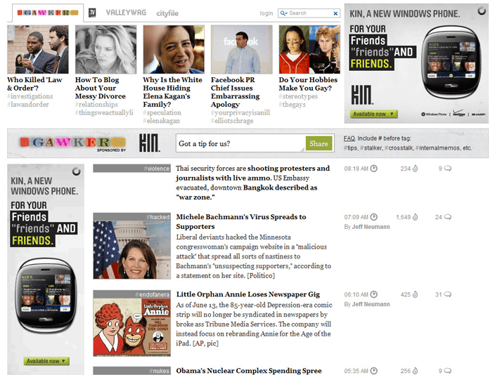
This past Monday, Gawker Media rolled out a redesign of all the sites in their network. A two-column, app-like interface has replaced their previous layout, placing heavy focus on a “splash” story with scrolling headlines in the sidebar. For reference, here’s a screenshot of the previous design as documented by Crunchbase:
Here’s a video overviewing new layout, described by Gawker Media founder Nick Denton as “[representing] some convergence of blog, magazine and television.”
Denton wrote a lengthy post last November detailing the motivations behind the big redesign: “Why Gawker is moving beyond the blog.” It’s interesting to see how these translated into the final layout, which hasn’t been terribly well-received.


Still not sure why all the vitriol about this redesign. To my eyes it took a stale advert-laden, confusing blog-style layout (see http://uk.gizmodo.com for comparison), stripped out the chrome, promoted the content as close to the top of the page as possible, and dropped back to only one visible advert per screen.
Reversing the hierarchy of “list” vs “detail” on the homepage by promoting story number one over the list is brave, but with scrolling mice/two finger trackpads moving through stories seemed pretty intuitive on my screen. It’s less obvious on smaller screens where the list is too shallow to convey it’s purpose – I’d say a classic case of designing on a nice big 20″+ screen – remembering to take width into account but forgetting how screen depth on smaller screens effects usability.
If it were my decision, I’d stick to the “classic” news list in the left column on the homepage rather than just “story one”, but apart from that (and for every other page), it’s just right to my mind.
The other design crime seems to be the story heading banners, which cheapen the site a bit – they have no cohesive style that ties the site together, so sometimes it’s hard to tell if they’re editorial or just a naff advert taking up space.
It’s not the most beautiful site out there, but as a vessel for distributing content – largely text content – it’s pretty effective, taking cues from the readability movement. It doesn’t feel like an advert machine. It doesn’t force you to scroll just to see the first headline (I don’t believe in a fold, but I do believe in seeing the headline at a glance).
Just because it doesn’t conform to the conventional blog-style “long page of summarised stories” shouldn’t mean it’s just criticised out-of-hand, instead of being examined critically. You might call it “new”, “brave” or “ugly”, but it’s not “as expected”, and it’s time web blogs attempted to re-examine if their design fits their current purpose.
I still prefer the writing on Engadget to Gizmodo, but I’ve got to admit the Engadget site is more crammed with adverts and less focused on the good journalism they publish. Thank Douglas Adams for Reeder I can concentrate on consuming the content.
It was lagging really bad when it first came out — now I can actually *load* the whole page. I don’t mind the design but the site is completely inaccessible to non-js users, which is (to me) unacceptable. Not a fan of the hashbang trend.
Yeah, I noticed that too. They’ve definitely made some performance tweaks over the last few days.
Yeah, I noticed that too. They’ve definitely made some performance tweaks over the last few days.
I find it sickeningly disorienting. The bar at the top left section rolls off the page when you scroll down (via the natural scroll while the bar at the top of the right one doesn’t. This, to me, makes it go from fairly polished to incredibly unbalanced. The right section just plain sucks. I had to poke around for a while to figure out that it scrolled via the mouse wheel and totally missed the NEXT HEADLINES interaction on the bottom bar even though it’s red like the other links and big as hell. Ya just don’t expect major navigation all the way at the bottom like that. The Coup de Grâce to any sort of consistency is the black text which are actually links. It’s an OK first attempt for what they’re trying to do but it doesn’t feel or seem terribly well thought out in some critical areas.
I suspect the design feels underplanned because it facilitates Gawker’s goals in a way that overpowers user goals. “Disorienting” is a fair descriptor. A little too much learning has to happen before one can use it comfortably IMO.
I love the redesign! I don’t see what everyone is complaining about.
I don’t think the style of the design is that bad, but the layout of it is what really bothers me, and the lack of pagination. I think the content area is far too small to be easily readable. I’m also really annoyed that you can no longer click the title from Google Reader, that brings you to the main page. You have to click More>> click in the middle of the post to get to the Lifehacker page.
“You have to click More>> click in the middle of the post to get to the Lifehacker page.” I didn’t know that. Boo.
its a terrible redesign. period.
great contribution. care to elaborate though?
Haha, right on. It’s so interesting to deconstruct this stuff. The presentation of tons of content is a fascinating problem.
great contribution. care to elaborate though?
I think people are lumping the implementation of the design and the design itself into their critique (and “hash-bang” has triumphantly entered our vernacular). I like that they are attempting it. They are taking the risk and we will all benefit from the result, good or bad.
I spent some time on the sites and often found myself lost (especially when you bounce from, say, Gawker to Gizmodo without fair warning), but I generally enjoyed the interaction model. It just needs some polishing I think. Naturally.
Totally. I’m with you on the polish: it’s not entirely bad, but there are a lot of little things about the UI I find unexpected.
I like the “splash” aspect of the page, but would prefer the additional content not be in a sidebar. I like to be able to scroll down the page to view the additional content. Also, the sidebar’s scrolling is way too fast for my tastes.
I like the “splash” aspect of the page, but would prefer the additional content not be in a sidebar. I like to be able to scroll down the page to view the additional content. Also, the sidebar’s scrolling is way too fast for my tastes.
I like that they’re lending some hierarchy to their content as well. Apparently they couldn’t even “sticky” posts to the top in their previous setup!