The third WCAG Guideline, Adaptable, is part of the Perceivable principle and covers adapting to the different needs of users by allowing content to be received in multiple ways.
Contents
WCAG 1.3: Use Semantic HTML
One of the most important ways you can keep your web content accessible is to use semantic HTML. In other words, choose your HTML elements based on the meaning of the content, not the appearance.
Heading Structure
Sighted readers very rarely begin reading a web page’s content immediately. Typically, they’ll scan their eyes over the page and quickly determine if the information pertains to them.
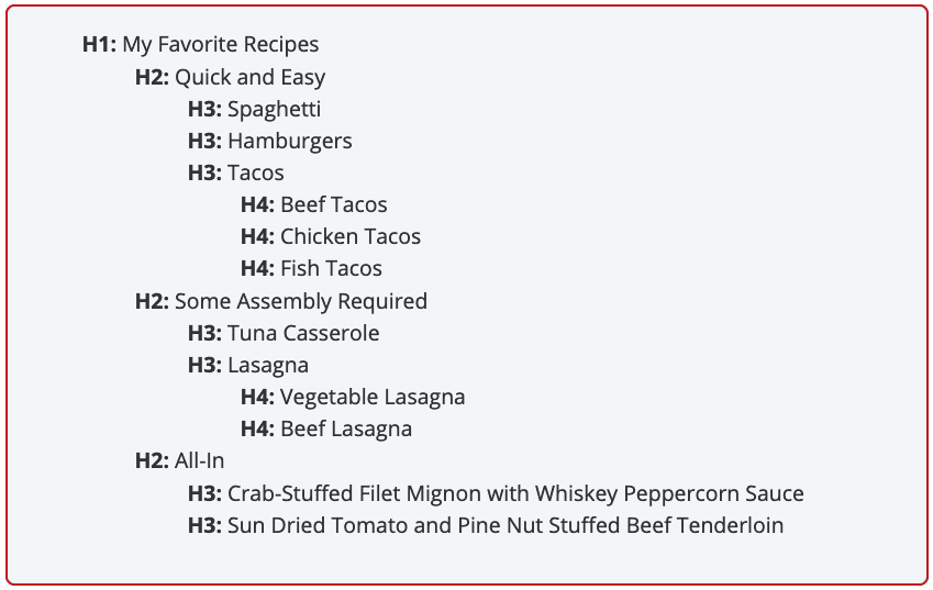
Users of assistive technology can navigate from heading to heading to perform the same task, provided the heading structure is properly written to provide an outline of page content.
Web pages should only have one <h1> element, describing the overall purpose of the page. Headings level <h2> through <h6> should be written in strict descending order to describe sections of content.
Form Inputs
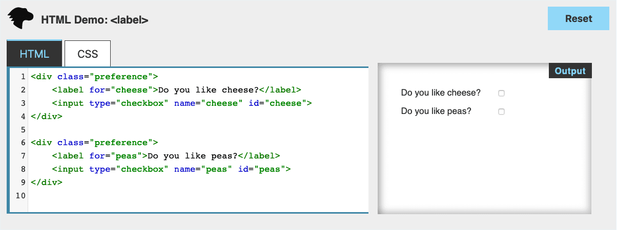
Labeling form elements properly helps users of assistive technology understand the relationship between inputs and text labels. In addition, labels are clickable, which can help users with disabilities related to motor skills who might struggle to click or tap a small input like a checkbox.
The Adaptable guideline also contains criteria called Identify Input Purpose, which recommends using HTML5 input types to help users understand the expected response from form inputs and can call up special keypads (such as a numeric keypad for providing a telephone number.)
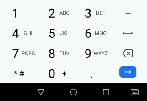
tel input type will cause most devices to display a numeric keypad. Source: MDNWCAG 1.3.3: Sensory characteristics
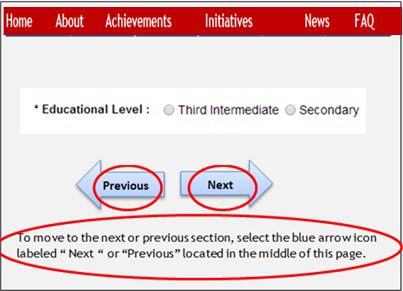
Avoid providing instructions for operating an interface or completing a task that rely solely on sensory characteristics such as
- Shape (“click the round button”)
- Size (“find the largest image”)
- Visual location (“in the lower-left corner”)
- Sound (“when you hear the buzzer”)
Users of assistive technology won’t always be able to identify content based on sensory characteristics.
Note that it’s not necessary to avoid referring to sensory characteristics: “press the red cancel button” can be an acceptable set of instructions, provided screen reader users are able to identify the button containing the word “cancel”. Including descriptions of sensory characteristics might assist users with cognitive difficulties.
I wrote about accessibility issues with CAPTCHAs in my post on WCAG 1.1: Text Alternatives. Many CAPTCHAS also violate the Sensory Characteristics criteria, such as audio-only CAPTCHAS that require identifying a sound.
Orientation
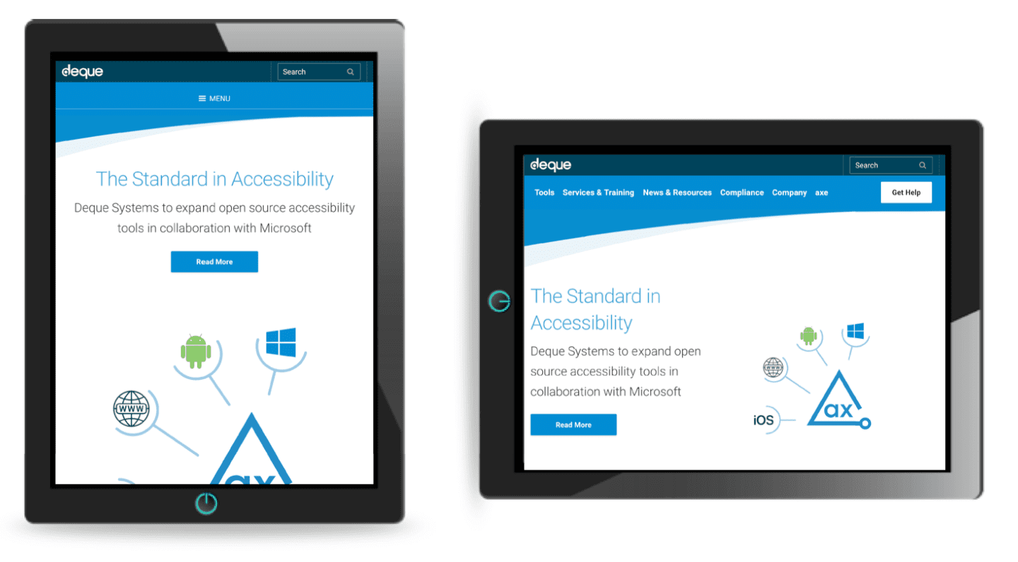
Your content must be accessible in both portrait and landscape orientation, as users with motor skills disabilities might be unable to rotate their devices.
More Treehouse writing on WCAG
More about Treehouse
Learning with Treehouse starts at only $19.99 per month. If you think you’re ready to start exploring if tech is right for you, sign up for your free seven day trial.
What sets Treehouse apart is their dedication to helping you find your perfect job or develop your own business. – SwitchUp.org
Follow us on Twitter, Instagram, and Facebook for our favorite tips, and to share how your learning is going. We’ll see you there!
If you liked reading this article, you should also look at these two:

