Throughout my career as a web design and development educator, I’ve noticed a consistent lack of attention paid to Accessibility principles in both college and bootcamp curriculum.
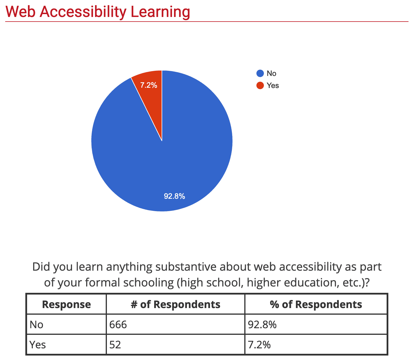
The results of a 2018 WebAIM global survey of web accessibility practitioners was disheartening, but not surprising: close to 93% of survey respondents received no formal schooling on web accessibility.
At Treehouse, we encourage all students to enhance their knowledge and understanding of web accessibility. We’ve been updating our Accessibility content, such as our Accessibility For UX Designers course which launched in June of 2020, as well as auditing our product to improve accessibility.
The goal of this series of blog posts is to share some of what we’ve learned in making these accessibility improvements.
Contents
What is web accessibility?
According to w3.org, web accessibility means
that websites, tools, and technologies are designed and developed so that people with disabilities can use them.
Many disabled users rely on assistive technology to access the web. Examples include
- Screen readers: software that reads web content aloud to assist visually impaired users.
Marc Sutton, screen reader specialist, demonstrates a screen reader. - Screen magnifiers: used to enlarge content for users with sight impairments.
Cammie Truesdell demonstrates a screen magnifier called ZoomText. - Switch controls: devices that allow users with motor impairments to control your site without the use of a touchscreen, mouse, or keyboard.
Sady Paulson, a video editor with cerebral palsy, uses two switches
attached to the head support of her wheelchair to operate her devices. - Closed captioning: used to make videos accessible to deaf and hard-of-hearing users, as well as users with Auditory Processing Disorder.
YouTube consultant Derral Eves demonstrates creating captions for YouTube videos.
Why is web accessibility important?
Microsoft’s Inclusive 101 Design Toolkit includes a chart called the Persona Spectrum to remind us that there are three categories of disabilities:
- permanent disabilities, like having only one arm
- temporary disabilities, like having a broken arm
- situational disabilities, like using a phone one-handed while holding a baby
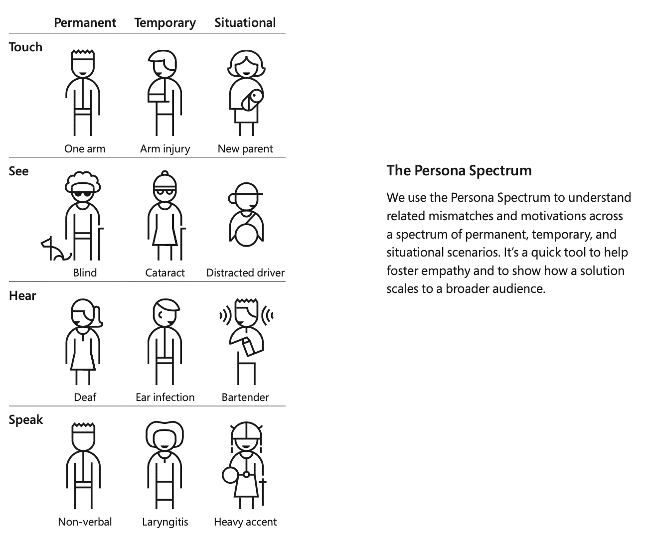
These different types of disabilities can happen to anyone at any time.
It’s been estimated that over one billion people in the world have some form of permanent disability. Excluding these users from your product is unacceptable and unfair. Plus, it makes little business sense to exclude 15 percent of the Earth’s population from your digital content.
And if your product can’t be accessed by disabled users, you could end up subject to a costly lawsuit. In America, Title III of the Americans with Disabilities Act has been applied to digital content like websites and apps as “places of public accommodation”. This means that inaccessible digital content is considered discriminatory against users with disabilities.
In addition, Section 508, added to the Rehabilitation Act of 1973 in 1998, requires federal agencies–plus any company that does business with a federal agency–to make their electronic and information technology accessible to people with disabilities.
Where do I begin learning about accessibility?
The internationally recognized set of accessibility standards are the WCAG, or Web Content Accessibility Guidelines. The newest version of the WCAG is version 2.1, released in June 2018 and including guidelines relating to mobile device accessibility.
WCAG is broken up into four principles–you can use the acronym POUR to remember them. Accessible web content must be
- Perceivable
- Operable
- Understandable
- Robust
These four principles are then divided into thirteen accessibility guidelines. Unfortunately, the official guidelines are a bit dense, and intimidating for a newcomer. My goal is to use the upcoming series of blog posts to introduce the guidelines one by one, as well as offer examples and resources to better understand them.
Accessibility resources
Here are a few organizations dedicated to making the web a more accessible place:
As well as some collections of writings on accessibility:
- Accessibility | A List Apart
- Accessibility | Nielsen Norman Group
- Accessibility | Smashing Magazine
- Articles – Axess Lab
Learn how to make your designs accessible to everyone with a Treehouse Techdegree.
