
Last Updated on November 14, 2022 by Laura Coronel
In a time when we’re sounded by information, it is extremely important for designers to think about being clear with their layouts.
We must remember to deliver a page that will get viewers’ attention, whether they’re purchasing something from an e-commerce site, reading a blog or just browsing news. The design must be readable, easy to understand, and easy on the eyes.
We need to remember that going for a simple layout is the key to keeping readers interested. A lot of elements, images, colors and different shapes in a page can make your site look more like an infomercial and cause your readers to leave because they’re uncomfortable.
Check out our other design courses at Treehouse and sharpen-up your design and layout skills.
A good way to deliver an enjoyable experience on the web is to understand more about whitespace and how you can use it to create a simple and elegant design. Whitespace is actually really important to web design because you can use it to improve readability and website performance. Not to mention, white space is part of the “less is more,” “make it simple,” mantra that has been proven to be effective when designing for the web.
There are some very simple ways of explaining what whitespace is, but my favorite one is a quote from Mark Boulton’s Whitespace article: “whitespace is empty space.”
Contents
What is Whitespace?
Whitespace, often referred to as negative space, is the portion of a page left unmarked, blank, or (as Mark would quote) the empty space in a page. In web design terms, it’s the space between graphics, columns, images, text, margins and other elements. It is the space left untouched in order to smooth things out and transform a page into something elegant.
It is the blank space that reminds us that simpler designs are beautiful and that we don’t need to create a layout filled with text and graphical elements to deliver a clear and direct message.
Even though we call it white space, it doesn’t mean the actual space must be white. The blank space may be filled with any color as long as it is free of any elements like text or images. Whitespace is also associated with elegance and sophistication since it is a way to organize text, organize elements and guide users’ attention to certain elements.
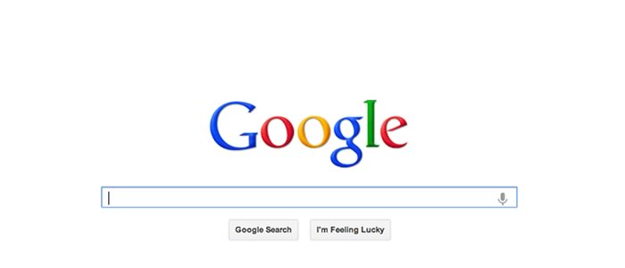
An example of great usage of whitespace that we are all familiar with is Google. Their homepage is filled with whitespace so we can focus on what is important: search.
To include more whitespace in your designs and deliver a better result, start thinking about every detail of a page. Think about:
- Margins
- Headers
- Footers
- Menus
- Images & captions
- Items in a list
- Words and letters
Think about all of these elements and how you can start leaving more space between them, always keeping in mind that you want to create something elegant and clear while improving user experience. A good experience means having space to breathe between elements and letting your reader’s eyes relax. Placing text in an 11px font and cramming it into the bottom of the page just won’t deliver the experience your readers crave.
Whitespace Examples in Action
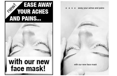
Here is an example from Mark Buton’s article showing the difference between using more white space in a direct mail piece. As you can see, the result is nice and elegant.
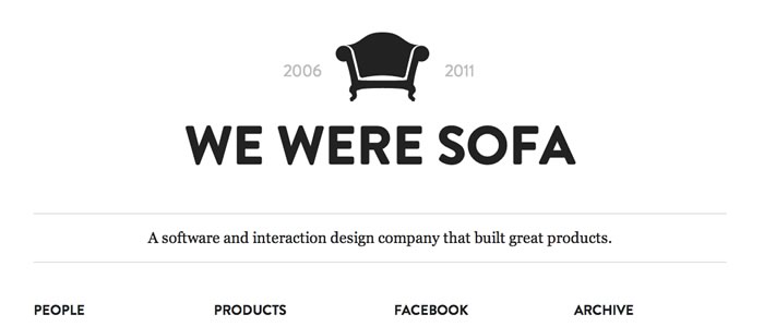
Another good example of an interesting use of whitespace is the Made by Sofa website. Their website commands attention through its simple and clear design. Their site’s layout shows that you can get a nice result by tastefully positioning elements while leaving blank space between them.
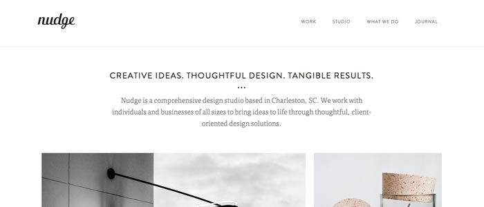
Below you can find more examples of websites taking advantage of whitespace and that provide layouts which explore space between text, images, margins, menus and other elements:
nudge
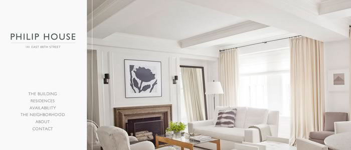
Philip House
NV Interactive

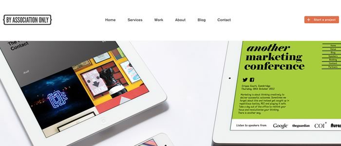
By Association Only
Squarespace

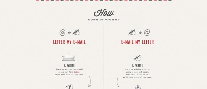
Handiemail
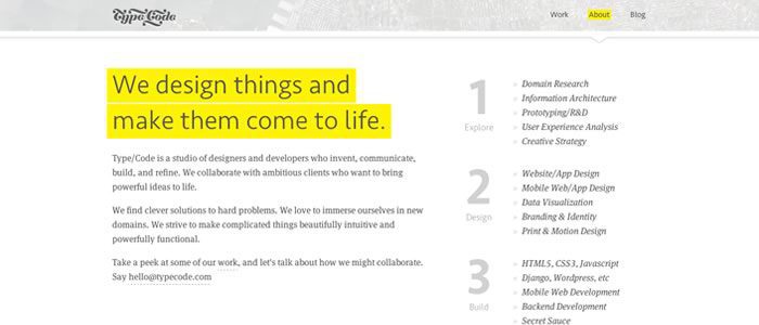
Type/Code
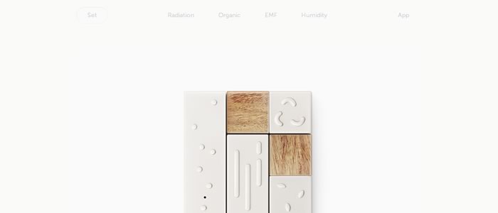
Lapka
Diehl Group Architects

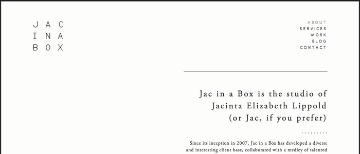
Jac in a Box
A Designer’s Goal
The thing to remember about designing for the web is that you always want to deliver a great product to your clients. The way to do this is to properly use whitespace to give your client’s readers the best experience you can so that they keep coming back for more. If your project is an e-commerce site, you want the user to be able to navigate the site easily so that they keep buying products.
If your project is a blog or news website, you want the user to enjoy reading so they can browse the articles without leaving the page. No matter what type of content the website is intended for, it’s important to use whitespace to keep the navigation clear and smooth, and to make sure the reader’s experience continues to “flow” properly.
A designer’s main goal is to make the web look simple and to un-clutter the visual frenzy that often pollutes the web. We need to develop layouts that are easy on the eyes and that make people want to keep reading. Designers need to create simple designs, even if the task of creating something simple is very complex.
Remember to use whitespace wisely to improve your designs. Keep in mind that to make text readable you need more space between letters and headers. Remember that instead of stacking tons of information to take advantage of all the space you have, you can have two or three nicely spaced columns showcasing only what is truly important to the readers.
Related Reading: Gestalt Principles for Designers – Applying Visual Psychology to Modern Day Design
Use Empty Space Intuitively
In conclusion, a good approach to using whitespace is to think about what you would like to see in a page. For example, would you like to read something that is squeezed in the page or would you rather read something that is well-spaced? Would you like to have several different kinds of information taking up the whole page or would you rather have something that is properly organized?
Thinking about improving user experience and focusing on content is always a good way to go when designing a website. Whitespace can certainly help you deliver the experience that your client’s readers will enjoy, which usually leaves your client happy with the work you’ve done.
To learn more about page design, coding, and more, try Treehouse for free with a 7 day trial.


I think it’s better to avoid it completely.
I wass curious if you ever consideed changing the structure of your site?
Its very well written; I love what youve got to say.
But maybe you could a little more in the way of content so people could connect with iit better.
Youve got an awful lot of text for only having one
or two pictures. Maybe you could space it out better?
Good post. I learn something new and challenging on websites I stumbleupon on a daily basis.
It’s always useful to read content from other authors and practice something from other sites.
White is a universal color. It gives people a sense of monotony and boredom. If the designer collocates well, white can increase your reading for your site.
Actually, I agree with you because it is a really good way to relax our eyes and even this color makes the site more attractive. I don’t know why, but is much better than to look on another color , black for example.Actually the design with white space makes the website more attractive. Not in vain, Google use this white space.
Whitespace is an important element of design for good reason. If used well and correctly, it can transform a design and provide many advantages to your website.
layout in a website is a very important part, the design and the concept needs to be made and involve the relevant stakeholders. I agree with you about the whitespace on a website design. of cource eyes needed a break and the number of colors and full content without white space on a website will make visitors feel uncomfortable and decided to leave the website. Clarification and explanation contains an image on your article really helped me understand the concept of whitespace. But I believe whitespace is part of the design and concept of the website that needs more depth, I suggest if you want to create and design a website using pingwin.nl (www.pingwin.nl/online-marketing-diensten/design-logo-huisstijl) I already looking for a lot of references in website design and pingwin.nl help me so much.
Excellent post very useful. Thank you!
Would love to forever get updated great site!
It’s great that you are getting thoughts from this paragraph as well as from our dialogue made here.
The articles doesn’t really do justice to the concept of whitespace unfortunately and I think this is one of the reasons why so many people have posted comments which clearly indicate they have no idea what whitespace actually is.
1 or 2 of the examples did show practically but I think many assume using whitespace has forces your design to be minimalist, boring, flat, white which is not true.
I had been wondering why my bank and building society accounts had suddenly all adopted this empty space approach resulting in endless scrolling and eyestrain trying to read tiny fonts surounded by otherwise empty cells. Tiny flotsoms of information in a sea of emptyness. I had assumed that it was due to the mass adoption of some new web design tool that was attempting to generate design pages for all platforms simultaneously. I now see that it it is due to a new design dogma “white space”. Thankyou for enabling me to put a name to a design trend that I find endlessly anoying. What I want when I read a web page is well organised compact information. If I wanted blank space I would stare at a wall.
This is an old article; I would have hoped this trend would have collapsed under its own weight by now, but we’re still talking about it.
I agree 100% with the commenters who are sick of the overuse of whitespace! I know you acknowledged in this article that it doesn’t have to be white but so many websites out there take the term literally and give us acres of boring whiteness on every page.
In the “face mask” example given, I personally dislike both. The first one looks like someone threw it together who didn’t really know how to use whatever design program they were working with – as evidenced by the blocky text backgrounds. The second one has an unreadable first word thanks to the tiny lower case font (a font which seems completely incorrect to me) and because I have to lean in to see it feels slightly pornographic.
It’s important to remember that people SEE differently. In an article like this, when someone says, “As you can see…” in proclaiming one design better than another, that person is failing to take differences in personality, style, and literal vision (in the eyesight sense) into account. I’m not discounting the positive effect of whitespace, but I AM saying it’s being misapplied on many web pages, and that, like all design rules, it’s meant to be bent into service rather than slavishly followed.
For me – give me lots of color (non-white whitespace) and an abundance of visual content, wrapped around clear navigation.
I hate the white space trend, as well as the oversized graphics and pictures for everything, and the slideshow type articles that make you click to scroll and read every sentence of the article. Put it all on one page, please.
The white space requires far too much scrolling. Fit the essential high level navigation on one screen, then let the user drill down to the desired content. The white space approach instead tries to fit everything but the kitchen sink on one infinitely self-expanding scrolling nightmare.
Other new interface trends that are regressive:
– rollover changes – excessive, and makes pages chaotic (Netflix redesign for example, where just moving the cursor around makes the page maddeningly rebuild itself continuously; makes me seasick)
– parallax scrolling: another nauseating innovation that neither behaves like actual three-dimensional parallax, nor adds anything useful or aesthetic to the design
I go to the time and trouble to leave 2 detailed comments and you totally remove them. Very classy.
Hi Herbie, two of your additional comments are approved and visible on the post. If there were any additional comments that aren’t visible, please let us know and we’ll look into it. Thanks!
Just went to Home Depot website and found they have gone to one with tons of open white space. Terrible look. Have to scroll way to much to find anything. What is the purpose?
As a 50-year editor and 35-year publisher of books, newsletters, etc., I want to make everything as easy to read as possible. That’s the purpose of writing anything. The flat design used by so many programs and websites is hard to read, as this gray type.
I am not interested in trying to make something look artistically … farfetched. I want it read with as little work as possible. Years ago I used to publish (on paper) a newsletter whose main text font was 7 point. We worked so hard to make it easily readable; kerned our own font pairs; broke articles into columns, boxes, etc; spread graphic elements within text to guide the eye. People said it was very easy to read. We took what could have been 2000 pages using normal type/layout and got it into 336 or so pages. Don’t expect that kind of layout today, but please think of the reader; don’t try to create some far-out design just to be artsy.
Reply to my own comment. Referring to Home Depot card sign-in page. I am tired of having to scroll so much, hunt for places to click. Often if I can’t find what I’m looking for on the page without scrolling, I move on; don’t have time to go treasure hunting on a web page just to find a box to click. Designers’ first goal should be to make something easy to find, easy to read, easy to interact with. Web page is not a place to try to win some design competition.
White (or empty) space is BAD.
It makes the Visitor “work” i.e. scroll..
The initial view in THIS page (the orange panel) would normally make me hit the back button – but this fad is so User-unfriendly I had to see if Comments were possible.
Why?
Because, there is so little info.
Combined with minimal navigation (2 o3 3 plain text words NOT in a Menu bar) there is no incentive to explore.
As Bruce says, when the empty space is white and glaring, eye-strain is on the cards. Some sites (like this) use grey text – which is even harder to focus on.
Seemingly a necessary part of this poor UX is an over-large font, reducing visible content and adding to unnecessary scrolling (work).
(Even at 80% zoom the UX is worse than it needs to be)
Jules is mistaken.
White space doesn’t mean white as in ffffff, the absence of color. Read up on the Buddhist concept of Mu for a better explanation than I can offer. In other words, it doesn’t have to be ‘glaring’.
He confuses design with UX (a secondary consideration). You can have good design without UX (magazines have been doing it for ages) but good UX requires good design, and as this article observes, good design is improved through the use of white space that helps you focus on the important details without making you sift through (explore?) a lot of visual noise and clutter (which Jules seems to favor).
As Bruce points out, it can be taken too far or handled incorrectly. But white space is not BAD, and only someone unschooled in design or unable to edit their copy and ideas would suggest it is.
Two “false” arguments from Michael
1. I did not limit the complaint to “white” only.
I clearly added “empty”
2. “He confuses design with UX (a secondary consideration)”
“Seondary consideration”???
This is precisely why Users/Customers/Visitors are fed up with “designers” dictating form over function.
The primary function of (almost) anything is that it should WORK (or save work). Prettify it later.
Unnecessary empty space immediately causes work. – so why do it???
3 “a lot of visual noise and clutter (which Jules seems to favor)”
Another straw-man argument.
I never advocated “noise and clutter” … but I do want way more CONTENT (and navigation) in one view than the typical “white space” website – and less work (scrolling).
Thanks for your feedback Jon, we’ll review the post with your suggestions in mind.
Truth is too much white space and the new flat “look” are examples of not understanding classic human factors and ignoring basic eye strain.
the up-coming web designer are taking the of white space too far and as I write this am having a difficult time looking at my screen because of the amount of white – having limited or directed information on websites is correct, try using softer tonal colors like grays, soft blues, greens and get the same effect without wearing your customers out.
The first sentence has “In a time when we’re *sounded* by information,” should be *surrounded.* I’m a writer and I understand how typos like this can draw the reader’s attention to the mistake, not the copy, something I feel you’d like to be aware of.
Susie Barnes
Freelance Writer
336.707.7679
Nice article on white space. People always think that white space means that it should be white in color but it’s not from design perspective. Its just the space between elements to make them more visible, clear and beautiful. Showcase some examples which is filled with other colors and falls under this article.