Last Updated on August 13, 2021 by Laura Coronel
(Photo from Flickr user Will Scullin)
When discussing a page layout, web designers will often use terms like fixed, static, liquid, adaptive, responsive, and a few others. If you’re a web designer, a web developer, or even a project stakeholder or client, it’s important to understand what these terms mean and when each type of layout should be utilized.
In short, each page layout name describes how the layout behaves when the page is viewed at different browser widths. The horizontal width of the browser could change because the website is being viewed on different devices (mobile phones, tablets, desktops, and so on), the website visitor could simply resize the browser window on a desktop device, or the visitor might change their phone from portrait to landscape mode, and so on. These concepts can be difficult to grasp at first, but only because they’re so closely related to one another. Understanding the differences between each one is the key to understanding them individually.
Contents
What is a Static Page?
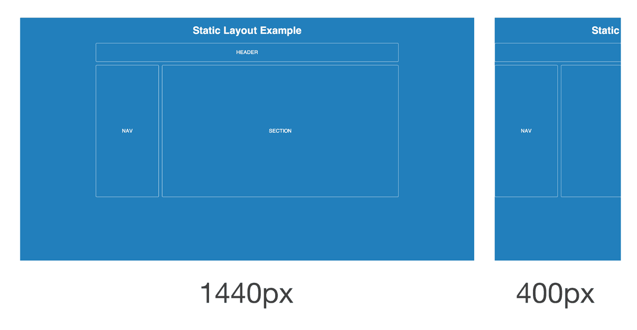
A static page layout (sometimes called a “fixed” layout or “fixed width” layout) uses a preset page size and does not change based on the browser width. In other words, the page layout might have a permanent width of 960 pixels no matter what. This is how web pages were traditionally built for many years until modern influences like media queries and responsive design were introduced around the start of the 2010s.
Different devices will treat a static page layout in various ways, so the rendered page could be slightly unpredictable. For example, on a desktop browser, if the window is too small horizontally, then the page will be cut off and horizontal scroll bars will be displayed. On a mobile device like an iPhone, the page will be scaled automatically, allowing the user to zoom in on points of interest (provided that no metatags override this default behavior).
When new websites are built, most of them don’t opt for a static layout, because it means that the mobile experience will require a separate website. There are major exceptions, such as the online Apple.com store, but Apple is a unique case because a selling point of their mobile devices is that they can view static layouts. In other words, Apple doesn’t seem to be adopting responsive design just yet.
What is a Liquid Page?

A liquid page layout (sometimes called “fluid” or “fluid width”) uses relative units instead of fixed units. Typically a liquid layout will use percentages instead of pixels, but any relative unit of measurement will work, such as ems.
A liquid layout often will fill the width of the page, no matter what the width of the browser might be. Liquid layouts don’t require as much thought as a responsive design, but there are some major drawbacks at very large or very small browser widths. If the browser is very wide, some content might be stretched too far. On large screens, a single paragraph might run across the page on a single line. Conversely, a multi-column layout on a small screen could be too crowded for the content.
What is an Adaptive Page?
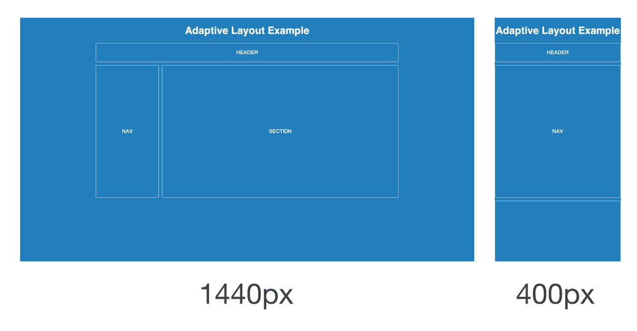
An adaptive page layout uses CSS media queries to detect the width of the browser and alter the layout accordingly. Adaptive layouts will use fixed unit like pixels, just like a static layout, but the difference is that there are essentially multiple fixed widths defined by specific media queries.
A media query is an expression of logic, and when used in combination with other media queries, they form a basic algorithm. So for example, an adaptive page layout might say something like, “If the browser 500 pixels wide, set the main content container to be 400 pixels wide. If the browser is 1000 pixels wide, then set the main content container to be 960 pixels wide.” Beyond the main content container, other parts of the page might change in width, swap places, or be removed. For example, a two column layout might become a single column layout if the browser is too narrow.
Adaptive layouts are a good stop-gap solution if a legacy static layout needs to be converted to support mobile devices. They also typically require less development time than a responsive layout. The major drawback is that device widths in-between the explicit breakpoints are often less than ideal, with either too much space or not enough space.
What is a Responsive Page?
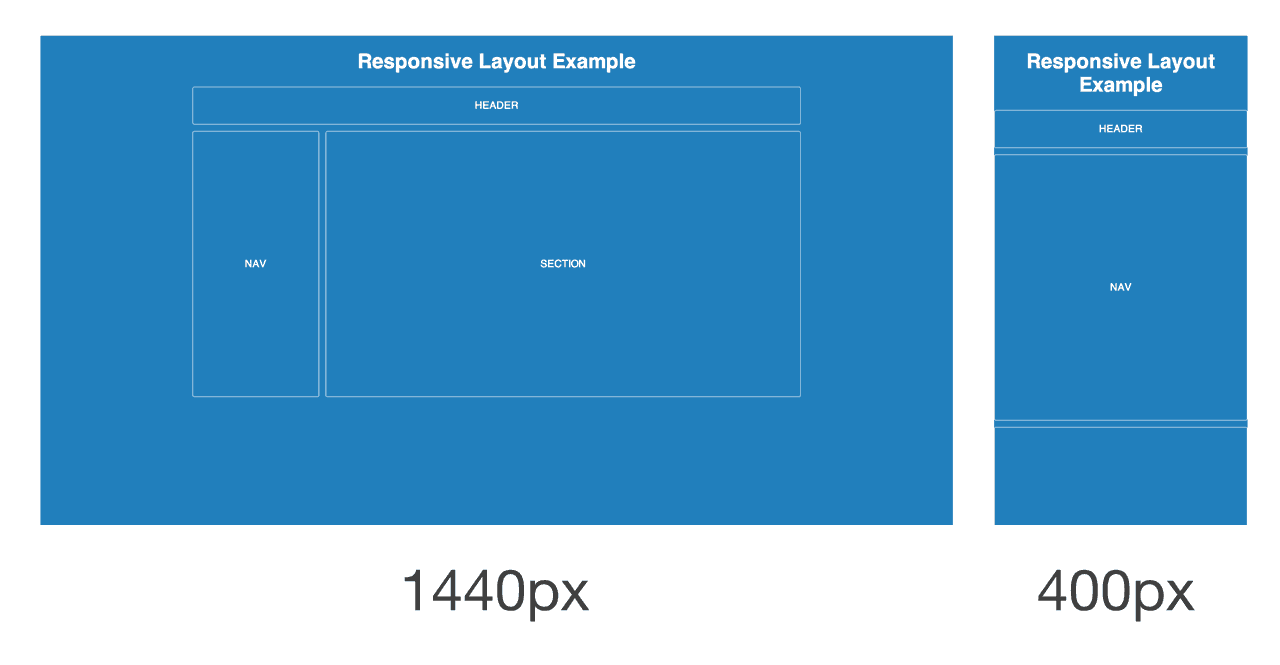
A responsive page layout uses both relative units and media queries, ostensibly combining the ideas of a liquid layout and an adaptive layout. As the browser increases or decreases in width, a responsive layout will flex just like a liquid layout. However, if the browser goes beyond certain widths defined by media query breakpoints, then the layout will change more dramatically to accommodate a wide or narrow width.
Typically responsive designs are built using a mobile-first approach. That means the mobile layout is designed first, and then as the browser becomes wider on tablets and desktops, the designer will find ways to expand the mobile layout. This tends to create better experiences overall, because it’s easier to expand a design than to try and simplify a large layout for mobile screens.
Find More Page Layout Examples
If you still want more examples, be sure to check out Liquidapsive. There you’ll find an interactive example that allows you to swap between different types of page layouts.
There’s more layouts and terms out there that I’ve heard, but that about covers the basics. If you have any practical advice you’d like to add, or if you have a question, please share in the comments!
Join Nick’s course on Treehouse, How to Make a Website.


What’s up it’s me, I am also visiting this site regularly,
this website is really good and the viewers are really
sharing pleasant thoughts.
I know this web site provides quality depending articles and additional data, is
there any other web page which provides these kinds of things in quality?
Liquid layout has broken the concept of windows – i.e being able to work with two windows side-by-side.
The User should be able to reduce the size of the browser’s view without content shifting all over the place.
Some people have said that this means designing a separate mobile site.
Why ? If people are familiar with the layout of the Desktop site – hopefully with several columns and panels, then why not make just one site – Desktop?
When Smartphones first came in the internet was still OK – but then mobile dumbed it down with infantile, content-lite, space-wasting, infinite-scrolling, mystery-meat navigation mobile web-design !
Another thing….
… Why do designers of mobile sites prevent pinch & zoom ?
They seem determined to dictate the Users experience?
finally, I understand about these 3 different layout
In my opinion Responsive is almost compulsory nowadays. Every website I make has to be responsive, it just feels wrong otherwise.
Mobile web browsing has taken over desktop web browsing so you are basically willingly providing a worse user experience if your website isn’t responsive.
Thank you, very informative and very well explained. Helped a lot in learning differences between these page layouts.
Brilliant explanation Nick! Your article is helpful to all who want understand the different layouts better with web designing.
You are the best Nick! Easy language and clarity regarding trends. Thank you for the amazing article! Greetings from Brazil!
Brilliant post nick, you hit the nail on the head!
We are Expertise in Web Service, Like Website Designing, Website Promotion, Internet Marketing, Search Engine Optimization,
Social Media Optimization, PPC etc..
If you want to see your business growth & want to see live your business don’t think anything, feel free to show your
business growth.
We have 5 years of Working Experience and 1000+ Genuine & Satisfied Clients.
Our Technical Skill In Web Designing-
1. HTML & HTML5
2. CSS
3. JavaScript (JS)
4. JQuery
5. PHP
6. E-Commerce Market Place
7. WordPress
8. Magento
9. Flash Animations
10.Logo Designing etc..
Our Technical Skills In Web Promotion-
1. Search Engine Optimization
2. Social Media Optimization
3. Internet Marketing
4. PPC
5. Keyword Planner etc..
Contact With Me On E-Mail
Email Address- websolution000@gmail.com
Blog- web-services-dwarka.blogspot.in
スーパーコピー商品、ブランドコピ ー財布、偽物バッグコピー財布コピーN 級品、ブ ランドスーパーコピー商 品、グッチ財布コピー,ミュウミュウ 財布激安。ブランドスーパーコ ピー銀座、ランドスーパーコピー財布。ブラ ンドスーパーコピー代引き、ブランドスーパーコピー専門店、ご購入する度、ご安心とご満足の届けることを旨にしておりますよろしくお願いします ありがとうございます
2015ブランド財布コピールイヴィトン財布コピー,シャネル財布コピー,グッチ財布コピー,エルメス財布コピークロエ財布コピー,ブラダ財布コピー,ブルガリ財布コピー,ドルチェ&ガッバ―ナ財布コピーバレンシアガ財布コピー,ボッテガ.ヴェネタ財布コピーロレックス時計コピー,ブルガリ時計コピー,フランク ミュラー時計コピーシャネル時計コピー,カルティエ時計コピー_オメガ時計コピー,IWC時計コピールイヴィトン時計コピー,オーデマ ピゲ時計コピー,ブライトリング時計コピーコピーブランド、ブランド激安、人気ブランドの販売、通販、オークション、新作のスーパーコピーブランドコピー、韓国スーパーコピー、ブランド激安、偽物ブランド、ブランドバッグ、激安かばん、ルイヴィトン偽物、財布激安.商品は全く写真の通りです。 http://www.okakaku.com/brand-25-copy-0.html
Hey man I was wondering what layout this site is in or if its even called a layout. For example how the top rectangular box with the treehouse logo follows the page down. Ive noticed that on domr other sites it looks like a mesh is over a background page and it moves with the scrolling. If you know what form of layout this is or even if its called layout and what programs or languages can be used to make sites like this, Id appreciate that a lot because im trying to make a site of my own.
Thanks
Thanks Nick for the explanation. The concept is described easy to understand and I like adaptive and responsive layout for web design.
Great post. I prefer adaptive. I know the space can somehow be a bit “odd” on some devices but if you think about it, I like to set the breakpoints on multiples of 240 (which 960px is) going from 240px to up to 1440px or even 1680px and set the default pixels to 960px so one doesn’t have problems with IE browsers.
The reason I prefer this is because multiples of 240px is a great number to work with.
There are a lot of articles explaining this but you guys nailed it.
Congrats and thanks =)
This is really well-written and easy to understand. I’ve been struggling to put down these concepts myself. May I translate it into Italian and post it on my blog’s webmaking101 category?
Of course I’ll credit and link back to the original source.
Sure!
My opinion is the best designs are picking the advantages from all. Consider a solution where there is a maximum width for the layout (eg. for 1440px res. and above displays the same layout), columns/content/fonts are shrinking for smaller resolutions down to eg. 800 px view. For the smaller resolution a “linearized” page is good with a hamburger-style menu. This above would be a static+liquid+responsive hibryd, whats works well for most situations.
Hi Nick,
Please can you explain how you can use em’s to create a liquid layout? As my understand is that the widths would still be fixed but would increase if the font-size increased. This would be different to using percentages.
You pretty much have to go responsive when starting a new site these days. It definitely takes longer than something static, but it’s worth it in being accessible for so many different devices. It’s not possible for all sites, but should be the goal for most. Plus, clients know the word ‘responsive’ and that’s what they will ask for.
Great explanation Nic, its some times a blurred area as many see ‘RWD’ as one solution, with many taking various approaches detailed in the article.
Nick, a great article. A test between adaptive and responsive would be nice. I am going to guess the overall winner to be Responsive. Its quite simply a necessity now if you have a website online.
Hello,
Thanks a lot Nick for this brilliant article, that helps me a lot to understand the different layouts better. But I still have a question, I’m a Designer and I always use the 960 grid system, but I would like to know if it’s the best solution for designing responsive websites ? If I wanted to deliver the design to a web developer, is it okey to give him/her that design based on 960 grid system? I always get that answer that everyone can use the dimensions he/she likes, but I just want to know the most used dimensions, for example which dimensions are you using if you’re designing for web? and which grid system ?
It would be great if you can give a better explanation for me to help me understand that.
Thank you !
If you’re referring to http://960.gs then you may want to instead look at a responsive framework. From what I understand, the 960 grid system assumes a static layout. I recommend you check out something like Bootstrap or Foundation.
Yes I meant http://960.gs , I work with another guy and he is using Bootstrap.
I just want to know if there’s some dimensions I should use while designing in Photoshop.
Or it will be just okey if I keep using 960 grid system.
My english isn’t my native language so if you didn’t understand something please tell me!
Thanks again.
You probably shouldn’t be designing in Photoshop. Here’s why: https://blog.teamtreehouse.com/psd-to-html-is-dead
Nice simple to follow explanation (and I was able to read it from my iPhone while having lunch!)
I would love to see a follow up which discussed adaptive vs responsive images and the server and client implications. I realize that adds more complexity to you’re current easy to digest article but thats definitely the next part of this topic I found myself wanting discussed. Thanks again!
Hi Rob,
Thanks for the suggestion! I can’t guarantee I’ll write about that, but I’ve added it to my list of research ideas for future consideration. 🙂
Sounds good Nick!
test message
Brilliant post mate, keep up the good work.
Awesome explanation Nick! Thanks for putting these concepts into perspective! =)
Nothing more, nothing less 🙂 Simple, clear explanation of differences 🙂