Last Updated on May 21, 2015 by Laura Coronel
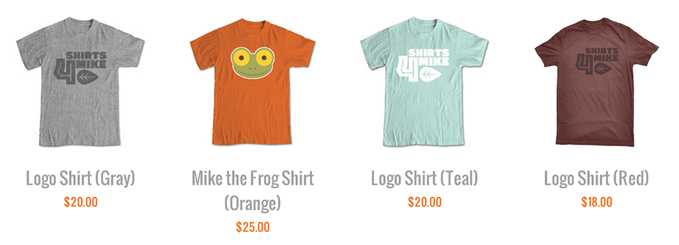
I have been working on a website that displays products in a grid view, with each product containing a title, an image and some in a grid view. To achieve this layout, I used an unordered list with the CSS display property on each item set to inline-block. Let me walk you through the code and point out how this approach works well for a responsive layout.
Here’s a sample of the HTML for the list:
<ul class="products">
    <li>
        <a href="#">
            <img src="shirt-gray.png">
            <h4>Logo Shirt (Gray)</h4>
            <p>$20.00</p>
        </a>
    </li>
    <li>
        <a href="#">
            <img src="shirt-orange.png">
            <h4>Mike the Frog Shirt (Orange)</h4>
            <p>$25.00</p>
        </a>
    </li><!-- more list items -->
</ul>
Why Not Floats?
Your first inclination might be to use floats. Floating the list items works really well if each element has the exact same height. In most instances, though, that’s not the case. Even if they are all the same now, that might change in the future. When the items have different heights, you’ll see some weird stacking issues. (The second item is taller in my example. With floats that fifth item catches on it.) ") To adjust for this, I’ve seen people wrap each row in a separate div or add clears to the first item in each row. But these adjustments force your layout to have a set number of columns, making it less adaptable in the changing layouts of responsive design.
To adjust for this, I’ve seen people wrap each row in a separate div or add clears to the first item in each row. But these adjustments force your layout to have a set number of columns, making it less adaptable in the changing layouts of responsive design.
Display Options
Instead of float, I give each list item a width and change the display from block to inline-block.
ul.products li {
    width: 200px;
    display: inline-block;
}
What exactly does this accomplish? Most HTML elements by default have a display property set block or inline:
- Elements with a display of
blocktake up the full width of their parent elements and have their own horizontal line. - Elements with a display of
inlinetake up only the space they need and can share their horizontal line with other elements.
A new block-level element will force a break to a new line. Think about paragraphs (<p> tags) as an example: any new paragraph starts a new line. Inline elements, on the other hand, can sit nicely on a line with other elements. Think about emphasis elements and links (<a> and <em> tags): a new inline element does notforce a new line. Take a look at this code example:
<p>This paragraph contains an <em>emphasis tag</em> and a <a href="#">link</a>.</p><p>This paragraph does not.</p>
 Images are inline elements. If you put an image in the middle of a string of text, it will sit inline with that text.
<p>I think this orange one <img src="shirt-orange.png" alt="Mike the Frog, Orange"> is my favorite of all the shirts in Mike’s catalog.</p>
 Note that the image is taller than the text. Inline elements do not need to be the same height to sit on a line together. The shorter elements on the line will just have blank space above or below them. Each line of text starts fully below the previous one.
 inline-blockis a third display option, and it unsurprisingly combines aspects of both the inline and the block options. The element sits inline just like an image does. But we can specify its height and width with CSS, and it can have block-level children elements that take up multiple lines inside of it.
<div>I think this orange one <div class="product"><a href="#"><img src="shirt-orange.png"><h4>Mike the Frog (Orange)</h4><p>$18.00</p></a></div> is my favorite of all the shirts in Mike’s catalog.</div>
 To achieve the grid view, we set every list item to display as inline-block. Just like words in a paragraph, products will appear next to each other; when there’s no room on a line for another product, the next product will simply wrap to the next line. With items of different heights, you’ll usually want the top edge of them to line up. This doesn’t happen by default, but you can easily modify that with the
 vertical-alignCSS property.
ul.products li {
    width: 200px;
    display: inline-block;
    vertical-align: top;
}
Responsive
This technique works nicely with a responsive layout. On a smaller screen, you might want to show only three products in a row instead of four. As the parent element gets smaller, the line will be shorter and items will naturally start wrapping to the next line earlier. ")
Caveat: One Big Drawback
If you put spaces or hard returns between two block-level elements, the browser ignores it. That means you can use spacing and indentation to make your HTML easier to read without having an effect on the display. With inline elements, that’s not the case. If you put a space between text or link tags, for example, the browser will display that space. The browser treats whitespace between two inline-block elements the same as it does inline elements. This makes sense if you think about it, but it means that you have to write the starting tag of a new element immediately after the previous ending tag to get the margins and padding to work like you would think. Here’s how I would modify my list to account for that:
<ul class="products">
    <li>
        <a href="#">
            <img src="shirt-gray.png">
            <h4>Logo Shirt (Gray)</h4>
            <p>$20.00</p>
        </a>
    </li><li>
        <a href="#">
            <img src="shirt-orange.png">
            <h4>Mike the Frog Shirt (Orange)</h4>
            <p>$25.00</p>
        </a>
    </li><!-- more list items -->
</ul>
To me, this is a small price to pay to get the flexibility and responsiveness of inline-block for a product grid view like this.
Browser Support?
All modern browsers support the inline-block value for the display property. Internet Explorer 6 and 7 did not support it, but there was a simple hack you could use to get it to work. For old time’s sake, here’s the code:
ul.products li {
    width: 200px;
    display: inline-block;
    vertical-align: top;
    *display: inline;
    *zoom: 1;
}


While using inline-block can work, i think working with a professional CSS grid is much better. It will be easy and flexible and can build complex structures.
Hi,
It is very helpful lesson and nice tip to adjust the product gird. It cleared my concept.
Than you so much!
WOW this is a great css tip that we can apply to our eCommerce websites. Think I might have to sign up for some more tutorials – keep them coming guys !!
I was looking why my grid behave differently if I put an extra line between them. I couldn’t find any solutions. Thanks for the article, now I know why is that happening.
Glad we could help! Thanks for reading. 🙂
Thanks, this help me!!
You rule man! Just thought I’ll let u know
ブランド激安市場コピーブランドコピー,スーパーレプリカ,ブランド激安市場 女社長 激安 シャネル 財布(CHANEL),グッチ 財布 (GUCCI) 激安,ヴィトン(lv) 新作 財布 激安 ルイヴィトン財布コピー,新作 ブランブランドを特別価格で提供中!ルイヴィトン財布、ルイヴィトンバッグ、ルイヴィトンベルトブランド激安市場ブランドコピー,大人気のルイヴィトン,スーパーコピー,様々な高品質ーパーコピー時計,ブルイヴィトン コピー ブランドレプリカ 激安 ブランド激安市場 ロレックス コピー スーパーコピー ルイヴィトン、シャネル、グッチ、エルメス、クロエ、ブラダ、ブルガリ ドルチェ&ガッバ―ナ、バレンシアガ、ボッテガ.ヴェネタ偽物ロレックス、ブルガリ、フランク ミュラー、シャネル、カルティエ、オメガ、IWC、ルイヴィトン、オーデマ ピゲ、ブライトリング、 http://www.okakaku.com/brand-4-copy-0.html
高品質2015シャネル スーパーコピー激安專門店弊社は海外大好評を博くシャネル コピー激安老舗です,2015高品質シャネル バッグ コピー,シャネル 靴 コピー,シャネル 財布 コピー品の品質はよくて、激安の大特価でご提供します。 http://www.newkakaku.net/guz1.htm
スーパーコピーブランド格安販売店はこちらへ!品々の激安価格に持ったスーパーコピーブランド 代引きの新作はお客様に提供されます。安心、迅速、確実、お客様の手元にお届け致します。★弊社は9年の豊富な経験と実績を持っております。★一流の素材を選択し、精巧な作り方でまるで本物のようなな製品を造ります。★品質を重視、納期も厳守、お客様第一主義を貫きは当社の方針です。★驚きの低価格で商品をお客様に提供致します!★早速に購入へようこそ! http://www.okakaku.com/brand-39-copy-0.html
スーパーコピーブランド格安販売店はこちらへ!品々の激安価格に持ったスーパーコピーブランド 代引きの新作はお客様に提供されます。安心、迅速、確実、お客様の手元にお届け致します。★弊社は9年の豊富な経験と実績を持っております。★一流の素材を選択し、精巧な作り方でまるで本物のようなな製品を造ります。★品質を重視、納期も厳守、お客様第一主義を貫きは当社の方針です。★驚きの低価格で商品をお客様に提供致します!★早速に購入へようこそ! http://www.wtobrand.com/lvc1.html
BVLGARI(バッグ?財布?小物)CHLOE(バッグ?財布、小物)偽物ブランド,激安,コピー?ルイヴィトンバッグ,偽物?ルイヴィトン財布,コピーバッグ,ブランドバッグ,偽物バッグ,偽物シャネルバッグ,偽物エルメスバッグ,偽物グッチバッグ,偽物財布,コピー財布,時計の專門店 http://www.newkakaku.net/lb1.htm
Thanks for finally talking about > blog_title < Loved it!|
Wow. Great! Ty!!
i wan a comment and replay box….wht in this blog it hav how to devlop this i had googld but not able to find any one can hep me
Where would I place this bit of code:
ul.products li
{width: 200px;
display: inline-block;
vertical-align: top;}
In this code:
Logo Shirt (Gray)
$20.00
Mike the Frog Shirt (Orange)
$25.00
I cannot seem to get the placement for the grid view code right and have very little experience with html.
It’s not a wysiwyg, that’s the “Web Developer” extension for Firefox and Chrome by Chris Pederick. It’s pretty nice.
Randy – Thanks for the tip. I’m using inline-block for a product grid for an online shop similar to your example – except I’m trying to get the product price (and the large buy button) vertically-aligned at the bottom of the block (with the image and product name aligned to the top) but I’ve had no luck. I’ve tried many things, but I can’t seem to discover a method for using different alignments inside the same inline-block. Do you have any suggestions – or is it just impossible? Thanks in advance for any help.
Great post! Very helpful thanks!