
Last Updated on May 21, 2015 by Laura Coronel
A number of new interactive elements were introduced with HTML5 that provide native implementations of common UI widgets like dialogs and modals. Among these new additions are the <details> and <summary> elements. These elements allow developers to create collapsable UI widgets the user can click to show or hide content.
In this post, we’ll take a deep dive into the <details> and <summary> elements. You’re going to learn how to use these elements in your HTML markup, how to apply custom styling to them, and what browsers they work in.
Let’s get started.
Contents
Using the Details and Summary Elements
The <details> and <summary> elements are used in combination to create a UI widget that allows the user to find out more information about a topic by clicking on a summary.
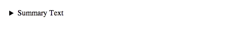
A simple details and summary element example.
The <details> element is responsible for marking up all of the content relevant to the particular topic. The <summary> element is used to specify a short piece of text that describes the rest of the content in the <details> element.
<details>
    <summary>Summary text</summary>
    Content goes here...
</details>
By default, the browser will only display the content within the <summary> element to the user. Once this summary is clicked, the remaining content will become visible.
The browser will use the text from the first <summary> element within the <details> element when constructing the widget. If no <summary> element is specified, the browser will simply display “Details.”
If you’d like the widget to be open when the page loads, you can specify the open attribute on your <details> element.
<details open>...</details>The browser will toggle the open attribute for you as the user opens and closes the widget.
So what kind of content should you be using the <details> and <summary> elements for? Simply, any additional information you’d like to provide about a subject. For example, you could use these elements for marking up order data within an e-commerce app. In the following example, the user is presented with an order number that, when clicked, will reveal the full information about the order.
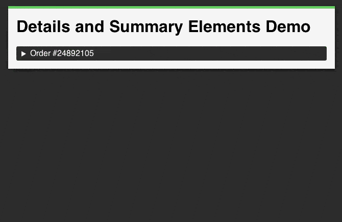
Using details and summary elements to mark up order data.
<details>
    <summary>Order #24892105</summary>
    <table>
        <tr>
            <th scope="row">Order Date</th>
            <td>30th May 2003</td>
        </tr>
        <tr>
            <th scope="row">Order Number</th>
            <td>#24892105</td>
        </tr>
        <tr>
            <th scope="row">Courier</th>
            <td>Buy N Large Postal</td>
        </tr>
        <tr>
            <th scope="row">Shipping Address</th>
            <td>
                P. Sherman,<br>
                42 Wallaby Way,<br>
                Sydney,<br>
                Australia
            </td>
        </tr>
        <tr>
            <th scope="row">Billing Address</th>
            <td>
                P. Sherman,<br>
                42 Wallaby Way,<br>
                Sydney,<br>
                Australia
            </td>
        </tr>
    </table>
</details>
You could also create a UI widget that presents additional controls when a user clicks on a key object in your application.
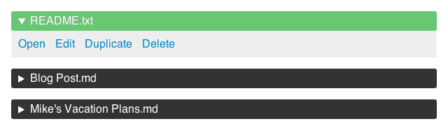
Using details and summary elements to mark up additional controls.
<details>
    <summary>README.txt</summary>
    <ul>
        <li><a href="#">Open</a></li>
        <li><a href="#">Edit</a></li>
        <li><a href="#">Duplicate</a></li>
        <li><a href="#">Delete</a></li>
    </ul>
</details>
Other applications could include things like questions and answers within FAQ pages, tables of contents, and collapsable fieldsets for multi-part forms.
Styling Details and Summary Elements with CSS
Now that you have an understanding of how to use the <details> and <summary> elements in your HTML, let’s take a look at how you can style these elements using CSS.
Targeting the details element in your CSS allows you to style all of the content within the element.
details {
    /* Your styling rules. */
}
If you want to style just the area that opens and closes the widget, you should target the summary element.
summary {
    /* Your styling rules. */
}
Targeting these elements directly like this will add styling rules that apply in both the open and closed states of the widget. If you want to style the widget differently when it’s open or closed, you can use a CSS selector that only applies to <details> elements with the open attribute.
/* Open details element. */
details[open] {

}

/* Summary within an open details element. */
details[open] summary {

}
By default, the browser will display a small marker triangle to the left of the summary text that indicates the current state of the <details> element. You can target this marker in CSS using the -webkit-details-marker pseudo-class.
/* Change the color and size of the marker. */
summary::-webkit-details-marker {
    color: #69c773;
    font-size: 200%;
}
You can even hide the marker completely by setting its display property to none.
/* Hide the marker completely. */
summary::-webkit-details-marker {
    display: none;
}
If you want to use your own marker icon, start by hiding the default marker (as shown above), and then use the :before pseudo-element to add your custom icon. This should be applied to the summary element.
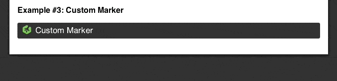
Using custom marker icons.
Here’s the CSS code used to create the example above.
details {
    border-radius: 3px;
    background: #EEE;
}

details summary {
    font-size: 17px;
    vertical-align: top;
    background: #333;
    color: #FFF;
    border-radius: 3px;
    padding: 5px 10px;
    outline: none;
}

details[open] summary {
    background: #69c773;
    color: #333;
}

/* Hide the default marker. */
details summary::-webkit-details-marker {
    display: none;
}

/* Add the custom marker in the default state. */
details summary:before {
    display: inline-block;
    width: 18px;
    height: 18px;
    margin-right: 8px;
    content: "";
    background-image: url(https://s3-us-west-2.amazonaws.com/s.cdpn.io/4621/treehouse-icon-sprite.png);
    background-repeat: no-repeat;
    background-position: 0 0;
}

/* Move the sprite image when the details box is open. */
details[open] summary:before {
    background-position: -18px 0;
}
In this code, I’m using the :before pseudo-element to add the initial marker icon. I then create another rule that alters the positioning of the background image (so as to change the visible section of the sprite) when the details element has an open attribute.
Browser Support for the Details and Summary Elements
Browser support for the <details> and <summary> elements still isn’t great. Chrome, Safari, and Opera all support these elements, but Internet Explorer and Firefox do not.
| IE | Firefox | Chrome | Safari | Opera |
|---|---|---|---|---|
| – | – | 12.0+ | 6.0+ | 15.0+ |
Source: http://caniuse.com/#feat=details
There are a number of polyfills available that will add support for the <details> and <summary> elements to other browsers. Two of the best ones that I’ve found are:
Final Thoughts on Details and Summary Elements
In this blog post you’ve learned how to use the <details> and <summary> elements to create your own collapsable UI widgets. You’ve also learned how to style these elements with CSS, as well as how to replace the default marker icon with your own images.
It’s really encouraging to see browser vendors creating native implementations for some of the most commonly used UI widgets. What other UI components would you like to see added to browsers in the future?


This design is incredible! You certainly know how to keep a reader entertained.
Between your wit and your videos, I was almost
moved to start my own blog (well, almost…HaHa!) Great job.
I really loved what you had to say, and more
than that, how you presented it. Too cool!
人気スーパーコピーブランド時計激安通販専門店私達は長年の実体商店の販売経験を持って、先進とプロの技術を持って、高品質のスーパーコピー時計づくりに 取り組んでいます。最高品質のロレックス時計コピー、カルティエ時計コピー、IWC時計コピー、ブライトリング時計コピー、パネライ時計コピー激安販売中商品の数量は多い、品質はよい。海外直営店直接買い付け!★ 2015年注文割引開催中,全部の商品割引10% ★ 在庫情報随時更新! ★ 実物写真、付属品を完備する。 ★ 100%を厳守する。 ★ 送料は無料です(日本全国)!★ お客さんたちも大好評です★ 経営方針: 品質を重視、納期も厳守、信用第一!税関の没収する商品は再度無料にして発送します
[url=http://www.gowatchs.com/brand-237.html]ブランドコピーの専門店スーパーコピー豊富に揃えております、最も手頃ず価格だお気に入りの商品を購入。弊社フクショー(FUKUSHOW)ブランド腕時計、雑貨、小物最新作!エルメス バーキンスーパーコピー時計N品のみ取り扱っていまずのて、2年品質保証。エルメス食器,スーパーコピーブランド激安販売シャネル 財布スーパーコピー,スーパーコピーブランド 財布激安販売エルメス スーパーコピー,スーパーコピーブランド激安販売売スーパーコピーロレックス スーパーコピー,スーパーコピーROLEX激安販売IWC スーパーコピー,スーパーコピーIWC時計激安販売エルメス時計スーパーコピー,スーパーコピーhermes時計激安販売ボッテガ ヴェネタスーパーコピー,スーパーコピーブランド財布激安販売スーパーコピー時計スーパーコピーブランドバッグ時計コピー激安販売[/url]
2015年の新素材-新作!高品質 腕時計高品質の追求 超N品を良心価格で提供スーパーコピーブランドバッグ、財布、時計代引き専門店2015年人気最新品、新素材! には、ルイヴィトンコピー、シャネルコピー、グッチコピー、コーチコピー、ロレックスコピー、プラダコピー、ブルガリ財布コピーその他小物等、ブランド品、、ルイヴィトン、PRADA、Coach、GUCCI、CHANEL、BVLGARI、デュポン、ROLEX時針各種海外有名ブランド品を豊富に取り揃え、しかもお客様を第一と考えて、驚きの低価格で提供しております。税関の没収する商品は再度無料にして発送します。広大な客を歓迎して買います!3-6日にきっと引き渡す.スーパーコピーブランド時計
[url=http://www.brandiwc.com/brand-14-copy-0.html]2015ブランド財布コピールイヴィトン財布コピー,シャネル財布コピー,グッチ財布コピー,エルメス財布コピークロエ財布コピー,ブラダ財布コピー,ブルガリ財布コピー,ドルチェ&ガッバ―ナ財布コピーバレンシアガ財布コピー,ボッテガ.ヴェネタ財布コピーロレックス時計コピー,ブルガリ時計コピー,フランク ミュラー時計コピーシャネル時計コピー,カルティエ時計コピー_オメガ時計コピー,IWC時計コピールイヴィトン時計コピー,オーデマ ピゲ時計コピー,ブライトリング時計コピーコピーブランド、ブランド激安、人気ブランドの販売、通販、オークション、新作のスーパーコピーブランドコピー、韓国スーパーコピー、ブランド激安、偽物ブランド、ブランドバッグ、激安かばん、ルイヴィトン偽物、財布激安.商品は全く写真の通りです。[/url]
ブランド激安市場コピーブランドコピー,スーパーレプリカ,ブランド激安市場 女社長 激安 シャネル 財布(CHANEL),グッチ 財布 (GUCCI) 激安,ヴィトン(lv) 新作 財布 激安 ルイヴィトン財布コピー,新作 ブランブランドを特別価格で提供中!ルイヴィトン財布、ルイヴィトンバッグ、ルイヴィトンベルトブランド激安市場ブランドコピー,大人気のルイヴィトン,スーパーコピー,様々な高品質ーパーコピー時計,ブルイヴィトン コピー ブランドレプリカ 激安 ブランド激安市場 ロレックス コピー スーパーコピー ルイヴィトン、シャネル、グッチ、エルメス、クロエ、ブラダ、ブルガリ ドルチェ&ガッバ―ナ、バレンシアガ、ボッテガ.ヴェネタ偽物ロレックス、ブルガリ、フランク ミュラー、シャネル、カルティエ、オメガ、IWC、ルイヴィトン、オーデマ ピゲ、ブライトリング、
[url=http://www.wtobrand.com/lvc1.html]100%実物写真ですし、品質が完璧です!”スーパーコピーブランド財布激安 偽物財布激安コピー ルイヴィトン財布偽物,偽物財布コピーエルバーキンコピースーパーコピー財布ブランド財布コピーブランドコピー激安バレンシアガ スーパーコピー激安ロレックス スーパーコピー時計ブランド財布激安 偽物財布激安コピー ルイヴィトン財布偽物,偽物財布コピーブランド激安市場-jck35販売:ブランド財布コピー,激安ブランド,財布コピー,偽ブランド,偽 ブランド財布,偽物ブランド財布,ブランドコピー,ヴィトンコピー,ルイヴィトン財布偽物, シャネル財布コピー,グッチ財布コピー,エルメス財布偽物,D&G 財布コピー,ボッテガ 財布 .2013年新作スーパーコピーロレックス,スーパーコピーロレックス時計通販スーパー コピー品その他の世界一流ロレックススーパーコピー時計品を扱っています。 ホームページをクリックして商品をご覧下さい.ロレックスコピー,業界No.1人気スーパーコピーロレックス腕時計専門販売ロレックスコピー(ROLEXスーパーコピー)のロレックス レプリカ販売専門店です。すべての商品は品質2年無料保証です,ロレックス デイトジャスト 偽物,人気満点ロレックス コピーn級品新作大特集[/url]
I am using the Details only because when I put a link to the page into email, it expands to a box showing what is specified in the details of the page.
However the browser inserts additional stuff it finds in the page into the Details. I would like to prevent that, and show only the text I put into the Details. Is that possible?
thanks,
Rodica
This is awesome, but it’s a shame that it’s not supported in very many browsers yet, including Firefox. http://caniuse.com/#feat=details
Wow, i’ve looking for this. I’ve tried the similar way, but eventually goes wrong. But, I tried this and works excellent. Thanks
Wow how nice post about Html5. I have got some new information about html here. I think You are so talent and I am waiting for your next article. However, We have a website. We provide website design company bangladesh
You are most welcome to visit our website design company.
really nice and useful, things are getting pretty semantic!