Last Updated on May 21, 2015 by Laura Coronel
You’ve probably seen PSD to HTML advertisements around the web. If you type “PSD to HTML” into your favorite search engine, you’ll find lots of companies that will turn your Photoshop mockup into code. You’ll also find innumerable tutorials that demonstrate how to do it yourself.
This might leave you with the impression that every web project starts with a Photoshop mockup and, through some mystical voodoo, ends up in a web browser as beautifully crafted HTML and CSS. This is a half truth and I’d like to dispel some of misconceptions.
There’s too much variety in modern websites for there to be a one-size-fits-all approach. Photoshop can aid the design process, but it should be labeled as one of many mockup tools at your disposal, and it can even be skipped entirely in many instances. In my experience, the three most helpful tools for conceptualizing websites are wireframes, Photoshop, and code. Each has qualities suitable for certain situations.
Wireframe Mockup
Much like construction, changes made later in the process are much more expensive than changes made on a blueprint. Wireframes are great because you can iterate rapidly. Even if you have a clear vision in mind, it’s still a good idea to create a wireframe, because the brain has a tendency to idealize just about everything. 5-10 minutes on paper can reveal problems before they have the chance to manifest. Better yet, you might stumble upon a much stronger design in your explorations.

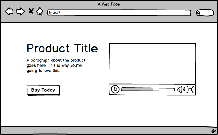
An example of a wireframe mockup created in Balsamiq Mockups.
Sometimes I’ll use a wireframe program like Balsamiq Mockups if I need to quickly collaborate with others, but most of my wireframes start with a pen and paper. I like to write down my goals for the site and sometimes even emotions that the person should feel when they visit. Then I start to list out all the content I want to include, such as photo galleries, videos, text blocks, and so on.
From there, I like to start blocking the content before I draw any chrome that will go around it, like headers, footers, and navigation. I draw everything using rough shapes and lines, so that I can get the composition right before I start worrying about the specific details within.
Photoshop Mockup
Photoshop, Illustrator, and other image editing programs are useful when some of the finer visual details have an impact on other aspects of the project. For example, let’s say you’re designing a new homepage for an established brand and your layout relies heavily on a predefined color palette. When creating a Photoshop mockup (or a high fidelity mockup as I prefer to call them), you might discover that your layout doesn’t actually work with those colors. At that point, you may be tempted to resolve the issue in software, but this is often much more time consuming than it may appear. Instead, try drawing a new layout on paper before jumping back into the computer. A tiny rough drawing created in 20 seconds could save you an hour or more of wrestling with software.
Photoshop is also useful if you’re working on a project with a reasonable budget and you need to present a nice looking design to stakeholders and clients for approval. I’m always eager to dig into code right away, but that can be an expensive waste of time if the design needs to change dramatically, so getting buy-in is helpful.
HTML and CSS Mockup
If my wireframes are pretty simple, I’ll skip Photoshop entirely. Modern frameworks like Bootstrap make it trivial to create rough layouts quickly that can be filled in with details as you go along. This is especially OK to do when you’re just adding a few new pages to an existing website that already has a well established visual language.

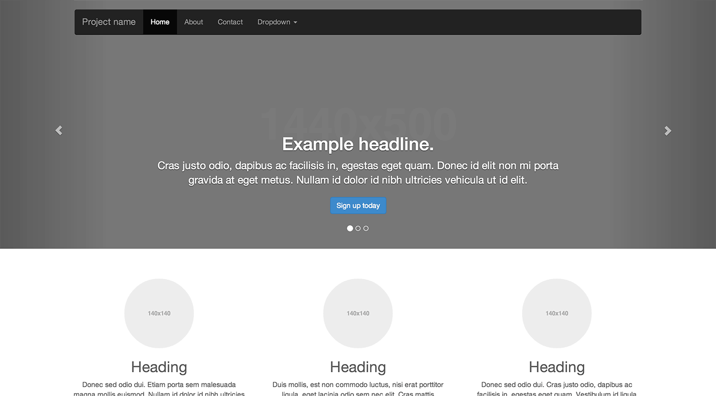
One of the example templates from the Bootstrap website shows how easy it is to layout complex websites using the framework.
Another reason to skip Photoshop might be if your project involves complex technology. If that’s the case, it might be more efficient to build an ugly prototype in code, then go back and refine the user experience in wireframes and Photoshop.
Which mockup tool is the best?
I get asked this question a lot. On most projects I’ll start with paper, make the jump to Photoshop for any important details, and then get into code. Someone else’s mockup methods might not work for you though, and that’s perfectly OK. The best tool for the job is the one that you’re most efficient with. If you feel like a genius in Photoshop or Illustrator and it feels more natural to you than paper, go for it. If you’re an absolute wizard in code and can manipulate CSS columns like mad, then maybe that’s for you. Websites are a highly interdisciplinary medium and there’s no one true path to creating them.
If you have any crafty or unusual mockup tips you’d like to share in the comments, I’d love to hear them!


Very useful post. Glad to read this post,as I am going to start my own site soon. Thank you for sharing such nice piece!! Keep updating such posts like this.
This was really helpful. As someone who has decided to shift from her current marketing path to front-end development, reads like this one are priceless. Since I’m not yet sure what will work best for me, I’m going to start simple and pull out the paper and pencil for a sketch. 🙂
Hi Nick,
Very good writing style and article!
To help designers and developers to achieve our web projects with ease, Twittstrap offers a large list of valuable Bootstrap resources that you can find at the following link http://twittstrap.com/resources
Hey man thanks for the article. Its really nice to hear someone saying there’s plenty of ways of skinning a cat. I’ve seen quite a lot of stuff lately that’s doctrinally slamming photoshop or saying they have the one true way etc. Which may work for them fair enough. But this was really refreshing to hear thank you.
Overall it depends on the project. I am pretty fast in Photoshop but i really love AxureRP. I can build rough working wireframes and then use the same file to create a hi rez prototype. Also Invision is great way to make your photoshop comps interactive.
I also like to draw a simple mock up with a pen, on a piece of paper. It is also fast and simple.
I just love Balsamiq Mockups. It’s fast, simple, and you don’t get stuck in design, when you create a mockup first.
For me, best is to work with Photoshop. Create whole project in Photoshop in fast and simple way in grey-scale and after then work on graphic design of home page and inner pages. I know today is trend to design in browser.
I’d rather to draw my project before to coding anything. I’m not good at pothoshop but I’m getting used to visualize my web and then try it with HTML and CSS. It’s not so easy (more if you are a newbie in the programming world) but as everything in life, it’s just requires full-time practice. Good post Nick, I barely post a comment when reading a blog unless it has a very good quality.
There is a lot more that goes into a website than just Wireframing. Is there not a process before wireframing? Sitemaps? Personas? etc etc?
Absolutely! I only really focused on the practicalities of laying out visual elements, but depending on the project, you may need to exercise several usability tools like the ones you mentioned.
css framework like bootstrap is not bad..
Great piece. I am much more adept, and fast, in Photoshop. I can also handle front-end code super quick.
My method generally goes from a few scratches on paper to the Photoshop mockup. Good presentation piece and easily adaptable before coding with what might just not be the right method. If a rapid prototype is necessary, then code it up quickly.
In either case, you have assets of visual design or code that are close to production ready and can quickly be at a good place in development.
A wise man once said something about how designers will just keep on designing if you let them. THAT is the only real drawback to the Photoshop tool…if you can keep from lingering, it is a strong methodology.
Hey Gisele, like your article! I especially like what you say about how important it is to take a step back when you get stuck. I learned from my new agency colleagues to do exactly that and it helped me a lot. I feel that when you are good in a tool like Photoshop (or in my case Axure) you might spend hours changing little bits of a non-working idea. Instead, going back to paper often forces you to rethink the underlying basic idea, which usually is the more effective approach for me too.