


Contents
What is Poka-Yoke?
Poka-Yoke is a Japanese term that means “mistake-proofing”. In other words, the goal is to make an object that prevents the user from messing up. We live in a complicated world, but good design concepts like poka-yoke help us navigate everyday experience. Small design features and visual clues can influence the safety and efficiency of everyday objects, even without realizing it. This concept is more prevalent in industrial design, but it applies to software as well.
For completeness, I should mention that poka-yoke is closely related to affordances, but they’re not interchangeable. An affordance is more of a cue that informs how the object should be used, but may not necessarily prevent a mistake.
The Good, The Bad, and The Poka-Yoke
In a typical bathroom there’s a great example and a terrible example of poka-yoke. Here’s a photo for reference:

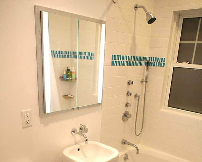
Image courtesy Flickr user juhansonin.
The good example is the sink. Provided the pipes aren’t clogged, the small hole on the side of the sink should prevent any kind of overflows. The sink itself can only be used in one way; you turn the handle and then water comes out. It’s pretty difficult for the user to mess it up.
The bad example is the shower. There’s usually too many knobs, too many ways to pull and twist them, and too many things that leave the user confused. More than likely, mistakes will be made with undesirable outcomes before the user stumbles into the right settings. If you travel and stay in hotels a lot, you’re probably very familiar with this first world problem.
Poka-Yoke in Software
So what does this have to do with software design? Well, software tends to get pretty complicated pretty quickly. More functionality usually means more opportunities for failure.

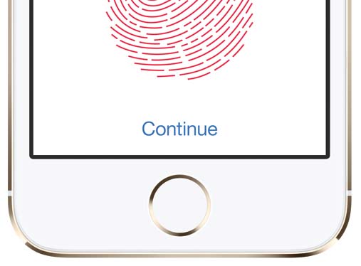
Image courtesy Apple Inc.
The fingerprint sensor on the iPhone is a great example of a poka-yoke feature. Apple knew that people should utilize passwords for safety reasons, but few people did. Setting up a password and typing it in everytime can also be tedious, and there’s also a slight chance you can forget your password. The fingerprint sensor is a great solution to this, because it’s faster than typing in a password and even if it’s not 100% secure, it’s much better than nothing.
On the web, it’s almost impossible to make a website 100% foolproof. However, much like security, there are many techniques you can use that will act as deterrents and steer people towards their goals, but there are two big ones to look out for:
Remove And Combine Functions
First, most websites have way too many things that are clickable. Try to eliminate unnecessary functionality, and if you can’t get rid of it, try combining it with something else if it makes sense to do so. For example, many shows will combine temperature and water pressure into 1 knob. This eliminates the user’s ability to create a “hot-but-low-pressure” shower, but most people wouldn’t want that anyway. Minimizing functionality and clickable elements might seem obvious, but if your website is old and has suffered from some feature creep, it might be time to do some spring cleaning with a fresh perspective.
Avoid Failure States
Second, don’t allow the user to do things that could result in a failure state. I’ve seen way too many forms that let me type in lots of invalid input before submitting. It’s only after I click the button I find out that “usernames must be 8 characters long” or that I mistyped my email address or something else stupid (can you sense the frustration?). Real-time form validation is just one example of how failure can be prevented before it happens. Why even allow the form to be submitted if a field is invalid?
If you have any examples of Poka-Yoke design, I’d love to hear about it in the comments! It’s always so delightful when you come across one you haven’t spotted, because the best poka-yoke designs are the ones you’ve seen with your own eyes but haven’t consciously noticed.