If you’ve been a Treehouse student since the very beginning, you might remember the look of our earliest videos. The original set was… well, we didn’t really have one.
Nick Pettit, teaching accessibility from The Construct in 2011.
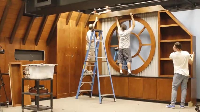
The actual first Treehouse set, built at our offices in Orlando, Florida in 2012, should look a bit more familiar: the light table, the bookshelves, the window overlooking the treetops (insert your Return of the Jedi jokes here, we’ve heard all of them). If you look close in the background of many Treehouse videos, you should be able to spot hardcover copies of Dune and 2010: Odyssey Two, a functional rotary telephone, and a replica diving helmet only large enough to fit most house cats.
Hampton Catlin makes teaching Sass look good on the original Orlando set.
The set looked great, but by 2014 it was starting to show its age. “Treehouse had outgrown [the Orlando set’s] original look and feel,” says Treehouse designer Mat Helme. “It was time for the set to reflect our current branding.”
So earlier this summer, Mat spearheaded a project to redesign and rebuild Treehouse’s Orlando set. “We wanted to keep our brand cohesive across all mediums,” he explains, “and between Orlando and our set in Portland.”
Trying to solve any problem with design means setting some clear goals, and Mat found designing a physical set to be no different. “We wanted to keep it simple so the focus was on the teacher. We wanted it to be timeless, so a video that was shot two years ago wouldn’t feel like it was shot two years ago. And we wanted to keep the look as minimal as possible.”
Amit Bijlani teaching Swift on the new Orlando set in 2014.
When you’re shooting video, a set is more than just what’s in the background. How the background is arranged, and how far the set is from the camera and the teacher can have a significant impact on the image.
“We were trying to achieve a shallow depth of field,” Mat says, referring to how much of the image is in focus. A shallower depth of field creates more separation between the teacher and the background, and helps students focus on the teacher and what they’re saying. “The old set made [a shallow depth of field] difficult to achieve. We didn’t have very much room in the studio to find that depth in the image.”
But it’s more than just physical distance that creates separation. Mat was able to use the new set’s most noticeable feature to his advantage. “The staircase helps make the room feel larger. It’s actually half the size of what a normal staircase should be, but when you’re looking through the camera, it doesn’t look smaller, it looks further away. A larger space behind someone speaking on camera just feels more inviting, more open.”
Demolition and construction took about two weeks, and Treehouse’s inaugural Swift courses were the first to be shot on the new set. “I’d never designed anything like it before, so it was a challenge,” Mat reflects. “I’m happy with how it turned out.”
What do you think of the new look? Let us know in the comments, and be sure to take a look behind the scenes of demolition and construction in this time-lapse video.
