Last Updated on October 20, 2017 by Laura Coronel
When generating pseudo-elements with CSS, we usually need to define certain properties to display the elements. This often means repeating CSS declarations for content, display and position, the most common properties used for generating shapes with pseudo-elements.
With Sass, we’re able to create placeholders and mixins to help us write and maintain less code over time. In this article, I’ll show you a mixin I like to use for generating pseudo-elements. As an example, we’ll create a simple toggle menu icon using the :before and :after pseudo-elements. Keep in mind that you can tailor anything in this example to your project’s needs.
Contents
The placeholder helper
Generating pseudo-elements usually requires a content property and, depending on how they’re laid out, a display or position property. To prevent code repetition, let’s create a placeholder selector for some of these common properties and values.
// _helpers.scss

%pseudos {
  content: '';
  position: absolute;
}
Now we’re able to extend the %pseudos placeholder selector in any rule that requires a pseudo-element.
Writing the mixin
We’ll create the pseudo-element mixin by first, passing three variables as arguments: type of pseudo-element, width and height.
// _mixins.scss

@mixin p-el($el, $el-width, $el-height) {

}
Sass lets us create dynamic selectors with variables using the #{} interpolation syntax. So inside the mixin, we’ll define the pseudo-element selector by using & to reference the parent selector and passing the $el variable as the pseudo-element.
@mixin p-el($el, $el-width, $el-height) {
  &:#{$el} {

  }
}
In this new rule we’ll extend the properties from %pseudos, then add width and height properties to display the pseudo-element. The values we pass for the $el-width and $el-height arguments will set their respective values.
@mixin p-el($el, $el-width, $el-height) {
  &:#{$el} {
    @extend %pseudos;
    width: $el-width;
    height: $el-height;
    @content;
  }
}
The @content directive is used so that we’re able to pass more styles to the mixin when including it. We’ll do that next!
Including the mixin
Now that our mixin is complete, we can include it in any rule that requires a pseudo-element. For instance, in our .icn-toggle rule:
// _ui.scss

.icn-toggle {
  width: 1.56em;
  height: 0.75em;
  position: relative;
  display: inline-block;
  border-top: solid .125em #60666c;

  @include p-el(before, 1.56em, .125em) {
    background: #888c91;
    top: .25em;
  }
  @include p-el(after, 1.56em, .125em) {
    background: #afb3b5;
    bottom: 0;
  }

}
Making it foolproof
Currently, there’s nothing preventing us from outputting any value for $el, so our mixin is a bit fragile. In our case, we only want to output CSS if the value for $el is either “before” or “after.” Let’s give our mixin a fail-safe feature using Sass’ @if and @warn directives.
@mixin p-el($el, $el-width, $el-height) {
  @if $el == "before" or $el == "after" {
    &:#{$el} {
      ...
    }
  }
  @else {
    @warn "`#{$el}` is not a valid pseudo-element.";
  }
}
These directives tell Sass: If the value we pass for $el is either “before” or “after,” output the CSS for this mixin. Otherwise, don’t output any CSS and display the warning message in the console.
Update: Sass 3.4.0 supports a new @error directive that prints an error message in the CSS output.
Conclusion
It’s worth pointing out that just because we can do something with Sass, doesn’t always mean we have to. For instance, on a small-scale project, we could stick with the native CSS method for generating pseudo-elements. But as part of a larger architecture, modular methods like the one we covered can boost our workflow and reduce maintenance in the long run.
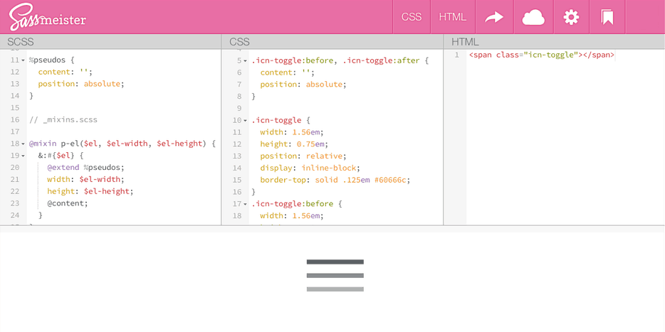
View the final example on Sassmeister:


thanks for the great information its very use full.