
Last Updated on June 12, 2023 by Laura Coronel
Mobile browser usage is much more common than you may think. According to recent data, around 59% of web traffic comes from mobile devices. This means that consumer expectations for mobile websites are higher than ever before.
Even with smart techniques like mobile-first responsive design, testing mobile websites before delivery is critical due to the overwhelming variety of devices that are available to consumers.
Below, we discuss five different ways you can perform mobile website testing to ensure you’re delivering a seamless experience to users.
Contents
1. Test the Website on Real Mobile Devices
It’s always best to test a website on real devices, because there are many parts of the experience that simply can’t be emulated or faked.
The user experience contains many factors like variable network conditions, pixel densities, the relative size of tap targets, and real page load times. In a perfect world, every website would be tested on every mobile device that it might be viewed on.
Of course, comprehensive testing is not practical, because time and money are always a factor on any project. However, it’s still a smart idea to invest in a mobile device test suite.
If you’re running a client business that’s any larger than just you, this is essential. A mobile device test suite typically consists of a few of the most popular web browsing devices. This enables physical testing under real-world conditions and allows near 1-to-1 parity with what a user will actually experience.
If a mobile device test suite is out of your budget, the next best thing is to use your own smartphone and mobile devices. Most likely, you’re using an iOS or Android phone, which will at least give you some idea of what a large portion of the population will see.
If you have some friends or family members that are using other mobile platforms, then you can quickly check it out on their devices, too (ask nicely).
2. Use the iOS Simulator and Android Emulator
There’s no substitute for the physical hardware, but software emulators are still pretty decent. The emulators for iOS and Android are mostly designed for testing native apps. However, they also include the default web browsers for each device which will show you a good approximation of how pages will be rendered.
We say approximation because they still won’t show real network conditions, page load times, the relative size of tap targets, and other details that can be gleaned from physical devices. However, the rendering engines will still be functionally equivalent which can help you spot cross-browser issues.
The iOS simulator included with Xcode makes it easy to see what a website will look like on iPhones and iPads.
The iOS simulator is a tool available within Xcode. First, install Xcode from the Mac App Store. Then, you can use Xcode to access the emulator. Unfortunately, Xcode is Apple only, so if you’re on Windows or Linux, you’ll have to test with another method.
The Android emulator is included with the Android SDK. You can read more about the Android emulator here.
3. Test a Mobile Website on BrowserStack
If you can’t get your hands on a device testing suite or you don’t wish to install the iOS and Android emulators, there are still other options.
For example, BrowserStack is a web service that provides access to desktop and mobile devices so that web professionals can test their sites.
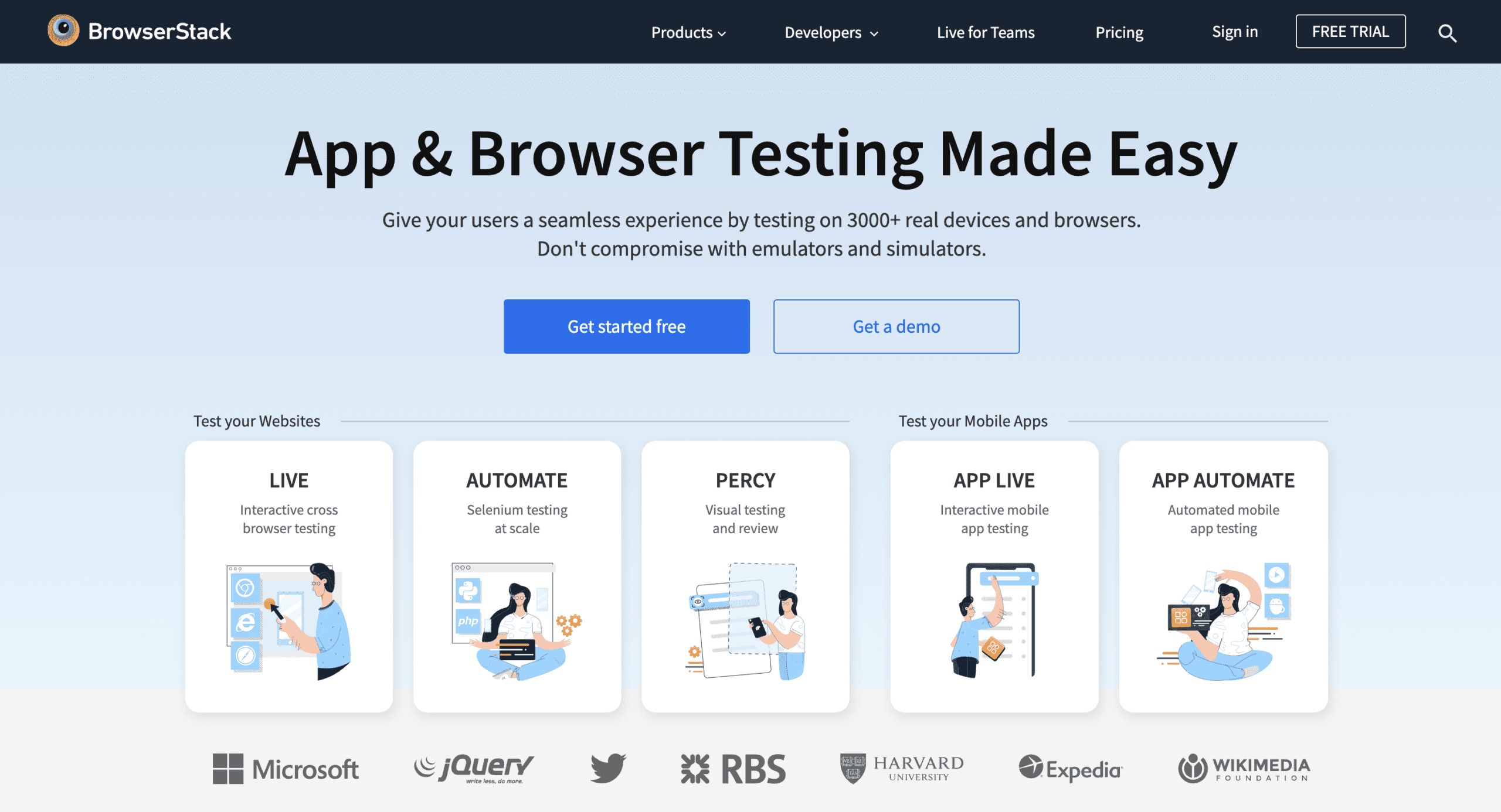
BrowserStack is a web service that makes it easy to test multiple devices and browser versions.
It is a paid service, so for completeness, we should mention that this is not a paid endorsement. However, we’ve spotted a few free screenshot services over the years, and as the idiom goes, you get what you pay for.
BrowserStack is more than just screenshots, because they also make it possible to interact directly with web pages on test devices. Even if you do have a device testing suite, BrowserStack is still pretty great to fill in any holes that you might have missed.
4. Perform Mobile Testing Using Responsinator
You should always strive for testing on real devices or at least an accurate simulation of those devices. However, if for some reason that’s not possible, you can also test by simply resizing your browser to match mobile device browsers.
There are many fancy tools that will do this, but one option is Responsinator.
Responsinator will simply resize a website to a specific size. While this can be useful for quickly checking responsive design behavior, it’s not a substitute for real device testing.
Simply visit the Responsinator website, type in your own URL, and it will generate live previews for you resized to the same resolutions as many popular devices.
This can be helpful for a quick “sanity check,” but remember that this is not a substitute for real device testing or using a simulator.
This method uses the same rendering engine as your browser. In other words, it doesn’t magically render sites using mobile browser rendering engines. Rather, it’s just the same as resizing your browser to a specific size.
5. Resize the Browser Manually
While developing a site, it’s very common for designers and developers to quickly check responsive behavior by resizing a desktop browser manually. This works fine and we encourage it.
However, it’s the most basic form of testing. We would argue that it isn’t really “testing” at all. While it can be helpful for quick checks when making responsive code changes, it doesn’t even begin to compare to all the other testing methods.
The browser sizes are arbitrary, the rendering engines are different, there’s no network delay, and so on. There’s too many differences for this to be substituted for real-world rigor. We recommend using the other options above for more accurate results.
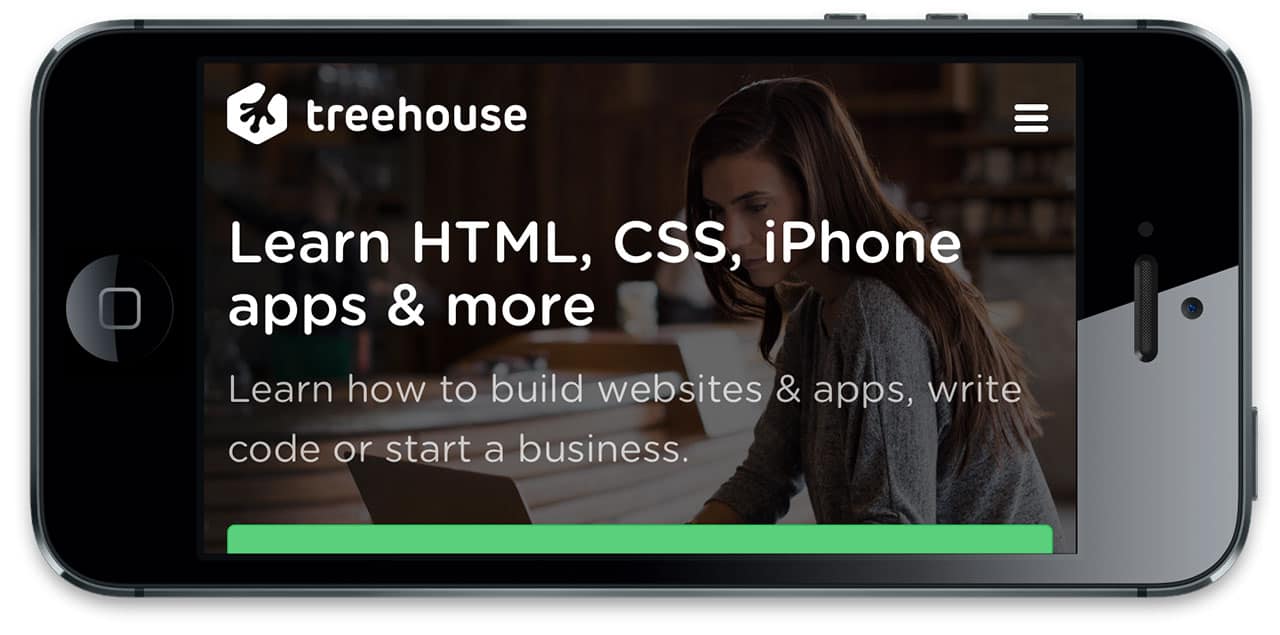
Learn More About Mobile Website Testing & Development With Treehouse
Are you looking to sharpen your mobile website testing or development skills? If so, Treehouse offers a wide range of courses on everything from Android development to programming. Get started on your learning journey today by signing up for a free trial of Treehouse.


Hey there! I could have sworn I’ve been to this website before but after reading through some of the post I realized it’s new
to me. Anyhow, I’m definitely delighted I found it
and I’ll be book-marking and checking back often!
I usually resize for a fast way but more comprehensively I use the Google Mobile-friendly test tool https://www.google.com/webmasters/tools/mobile-friendly/.
I use several tools form form testing and ui, but i find myself always using the spider/crawler tools like https://www.crawlmonster.com more than any other.
You could also try setting up an ad hoc network, its really straightforward on mac and pc, then you can just use the phones browser to navigate to the local IP of the machine, and voila, you can see your local development on a live device.
Do it all the time.
Google Chrome Canary is the best testing platform / browser I have ever used.
Its pretty much spot on. And being responsive web design focused developer, it makes my life easy.
I use http://websitequality.zomdir.com to test my mobile website. Better said, I use the tools recommend by Website Quality at a Glance.
I have a few tablets and smartphones to test sites with real devices as that’s still the most accurate way. Lately I’ve been using Ghostlab to make device testing even easier, even locally. A nice way to save a bit of money is to buy some second hand devices which are a bit older. They are also great to test several software versions like Android 3.x/4.x and iOS 6/7
I test on devices as soon as possible. I covered some possibilities of testing within a responsive project in a slidedeck. See http://maddesigns.de/responsive-testing/ maybe it’s helpful.
I can not wait to try out the Responsinator! One thing that I have always used on top of trying on an actual device is the Resizer tool, its really cool: http://lab.maltewassermann.com/viewport-resizer. Viewport resizer is a browser-based tool to test any website’s responsiveness.
Thanks for mentioning this. There are definitely a lot of browser resizing tools out there. One I like to use is this Chrome extension called Window Resizer: https://chrome.google.com/webstore/detail/window-resizer/kkelicaakdanhinjdeammmilcgefonfh?hl=en
Another really good tool is Ghostlab(http://vanamco.com/ghostlab/), it works by creating a local web server which you then browse to on your respective devices. It then mirrors your interactions on one device across all of them. They also offer a really handy device stand call the Devicelab (http://devicelab.vanamco.com/) which allows you to put all of your devices on one easy to see stand.
Here you can create a free website http://www.glu7.com/
If you can’t afford (or don’t want) to get a set of devices to test on for yourself, you should also check to see if an Open Device Lab (http://opendevicelab.com/) is near you. You get free access to a variety of devices, and there are labs all over the world!
Definitely a great resource to mention!
Browser Stack is paid service, Android Emulator is hard to set. So we are left with real devices, but they all aren’t available to any one. So we are left with browser resize, or in browser emulations
Yep, it’s definitely tough. Mobile testing is something where you just have to do the best you can.
I wish every OS have those simulator built In. So that we can link that simulator with our favorite text editors like sublime text. Open File in Simulator***
Chrome dev tools is also a great tool that I think should be considered when testing for multiple device sizes.
Definitely! I plan to write a post about this at some point in the future.
Be wary of Dev Tools. I was developing a responsive design and when I tested it on Dev Tools and then on the iPhone and an Android device, the results were very different.
I could understand the rendering for iPhone possibly being off, but Android surprised me.
Perhaps Google is fixing the issue?