


The backbone of a structured digital project, wireframing is one of the earliest and most important design activities.
Wireframes allow the team to answer crucial questions about layouts, navigation, visual hierarchy, information architecture, and content priority from the start.
In this article, we’ll explain everything you need to know to improve the quality of your wireframes. We’ll explain why they’re useful, the different tools for making them, and last go through a step-by-step process to get the most out of them.
Contents
Why Are Wireframes Useful?
In form, wireframes use placeholders, such as labeled boxes, to represent the actual content that comes later.
For the most part, designers create wireframes due to the following benefits:
- Structured design — You know where everything goes before narrowing down the exact technical details.
- Creates foundations early on — Areas like navigation and layout determine how the rest of the project proceeds. If there’s a problem, it’s better to tackle it at the start, rather than later with hi-fi prototypes, where you may have to redo some work.
- Design centers on content — Wireframing is a content-first method that encourages you to think about what’s really important on a page before laying it out.
- More creativity and room for experimentation — Thanks to their simplicity, wireframes are easy to create, meaning you can experiment and develop new ideas without taking too much time or effort if they fail.
Wireframes are the skeleton of your design.
Wireframing Methods
Wireframes don’t have one definite type — they can be made in image editors, specialized wireframing tools, or even sketched on paper. Let’s look at the pros and cons of each now.
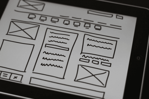
Paper — The most basic form of wireframes are essentially just more advanced sketches. When you want to explore multiple ideas before selecting the best one, you can wireframe them all on paper rather quickly, at the cost of visual accuracy.

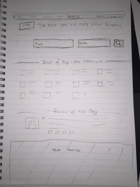
Photo credit: UXPin
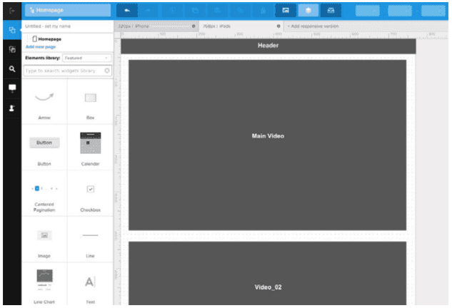
Specialized Platforms— Platforms like our own app UXPin facilitate interactive wireframes while also supporting hi-fi mockups, prototypes, and team collaboration.

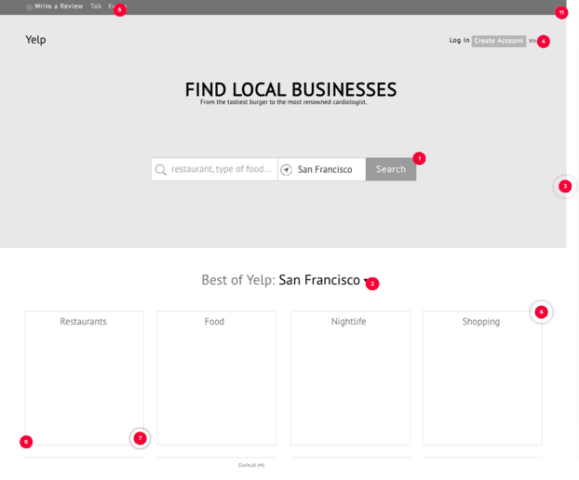
Photo credit: UXPin
Presentation Software — If you don’t want to pay for specialized platforms, you can also use presentation software like Keynote or Powerpoint. While you save money, you won’t be able to collaborate as easily since you’ll be emailing wireframes back and forth.

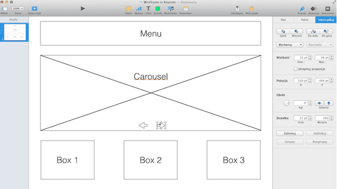
Photo credit: Keynote
Image editors — Some designers prefer to do everything in image editors like Sketch or Photoshop. If you’re an expert at these tools, you can create the necessary shapes and elements easily. Just remember that eventually you’ll have to rebuild the entire design as a hi-fi fidelity (if you’re using UXPin, you can actually directly import the files).
Choosing your medium is only the beginning. Let’s look at the complete step-by-step process.
5-Step Wireframing Process
While this isn’t the only wireframing process, it is the one we’ve found most useful.
- Content Inventory
- Visual Hierarchy
- Content Wireframe
- Sculpted Wireframe
- Lo-fi Prototype

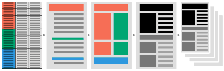
Photo credit: UXPin
Let’s go through each step now.
1. Content Inventory
First you want to create a content inventory, which is like getting all your materials together and organized before building.

Photo credit: Maadmob
Content inventories are spreadsheets or graphs listing out all the separate content you’ll want to include, divided by page. The content inventory helps maintain that content comes first in your design, and encourages critical thinking about which elements are most important.
It’s best to follow this short process for making a good content inventory:
- List all content with URLs and short descriptions.
- Organize content items first by topic.
- Allocate each content element to its best page, writing out duplicates that appear on multiple pages.
- Scan for redundancies. Remove content you don’t need. The less content you have overall, the more significant your remaining content becomes.
- If you want, you can divide your team and assign certain people to certain pages or categories.
Next, you’ll use your content inventory to create a visual hierarchy.
2. Visual Hierarchy
With your handy content inventory listing all the available elements, it’s easier to determine which are the most important per page.
As explained in the free guide Web UI Design for the Human Eye, label each item in your spreadsheet as primary, secondary, or tertiary elements in the spreadsheet.

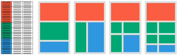
Photo credit: UXPin
3. Content Wireframe
Define the first version of your wireframe with blocks of content.
As in the example above created in UXPin, the content wireframe cares only about where content goes, not how it’s presented. Grids work great, if your tool allows it, especially for recreating the same layout on multiple pages.
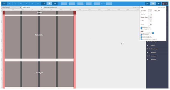
Wireframes, and all design really, works best with the mobile-first approach. When you wireframe the smallest device screen first, you can prioritize only the essentials, and then add more elements as you scale upwards. The alternative is designing all elements at once, and then subtracting, which often leads to backtracking and wasted time.
Once you have the general layout solidified, you can start adding more details.
4. Sculpted Wireframe
If you think of content blocks as chunks of marble, the next step is sculpting them into recognizable pieces. This means designating where individual links and icons go, setting aside space for images, and start considering sizes.
Don’t overdo it, though. Wireframes are supposed to be “bland.” A detailed wireframe still uses placeholders, boxes with Xs, and undefined buttons.

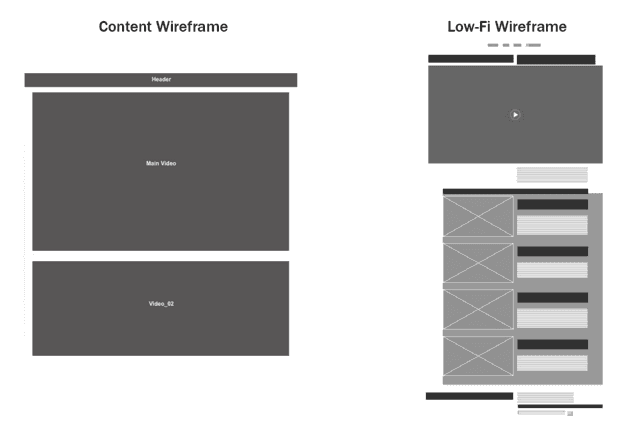
Photo credit: UXPin
Don’t forget about user flows, as they help you optimize the placement of elements. At this stage you can start incorporating scanning patterns and more accurately defining your visual hierarchy.
5. Lo-fi Prototype
We highly recommend turning your wireframe into a lo-fi prototype so that you can begin testing as soon as possible.
With the right platform, you can easily add interactivity, sometimes even just dragging and dropping. Even though it’s basic, slight interactivity on a lo-fi prototype can still help pinpoint usability issues early on, especially in broad categories like layout and navigation. Perfecting those areas, after all, is the point of wireframes.

Photo credit: UXPin
The rapid prototyping method involves creating prototypes as fast as possible, testing them, and then incorporating the feedback into the next build before starting the cycle over. This refines your design as you go, instead of testing everything all at once at the end.
Use your lo-fi prototype to refine your project’s foundations, and when the basics are solidified, you can move on to the visual design
Good luck!
More Best Practices
To further hone your wireframing technique, check out the free guides below:
- The Guide to Wireframing — An overview analysis of the different styles of wireframes, and the best practices for building them.
- The Guide to Interactive Wireframing — Since interactive wireframing is a relatively new practice, this guide thoroughly explains the best way to turn your wireframes into lo-fi prototypes.
Interested in Web Design? Sign up for a Free Trial and check out Treehouse’s beginner course, Adobe Illustrator for Web Design with Ashley Burke.
Jerry Cao is a UX content strategist at UXPin — the wireframing and prototyping app. To learn more about how to create visually digestible interfaces, download the free e-book Web UI Design for the Human Eye: Colors, Space, Contrast.