


(Stretch your CSS layout options with Flexbox. Flickr photo by Duncan Hull.)
Flexbox is a totally new set of CSS properties that allows designers to create flexible layouts. This is great news for responsive design because it dramatically reduces the complexity of fluid grids. Browser support for flexbox is finally here, so if you haven’t learned about flexbox yet, then it’s time to get started.
Contents
Flexbox is Ready
The web was originally conceived as a mechanism for exchanging scientific documents. Web technology has evolved a great deal since then, but we still rely on CSS properties that have their roots in digital publishing. Indeed, CSS layout and positioning are some of the most difficult concepts for web designers, regardless of experience. Designers rely on the use of CSS properties like float and clear, or CSS declarations like display: block; and display: inline; to control their designs. With display: flexbox; designers are now in control of the direction, alignment, and spacing of page elements.
Free trial on Treehouse: Do you want to improve your web design skills? Click here to try a free trial on Treehouse.
Flexbox is a remarkably intelligent solution to a long-standing convoluted problem. For the last few years, designers have been patiently waiting for browser support to catch up to the CSS Flexible Box Layout Module specification. Finally, the latest versions of all major browsers include flexbox support. (For more detailed information, see the browser support section below.)
Flexbox Example and Syntax
Flexbox and media queries make for a powerful combination. In the following example, I’ve recreated a simplified version of the Treehouse homepage header using a mobile-first flexbox approach. Open this pen in a new browser window and resize the window to see the header in action.
See the Pen Treehouse Flexbox Example by Nick Pettit (@nickpettit) on CodePen.
At first glance, it may not appear very special. However, if you look at the code, you’ll notice that this layout uses no position or float properties. It also doesn’t use any block or inline values for display.
I’ve separated the example CSS into the flexbox styles and then all the less relevant code that just makes it look nice. Here’s how each part of the flexbox styling is working in this example.
display: flex
The declaration display: flex; defines a “flex container” and its direct children automatically become “flex items.” A flex container has a main axis, which is the primary direction in which flex items are laid out. The cross axis is perpendicular to the main axis. Both the main axis and the cross axis have a set of properties that can control how flex items are placed in relation to one another.

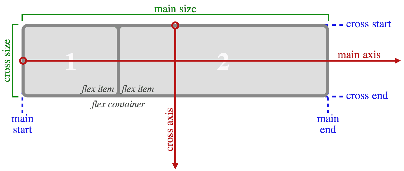
This diagram from the W3C specification for flexbox describes how the main axis and cross axis relate to one another.
You can also nest flex containers inside one another, which I’ve done in the example code, since the display property is not automatically inherited. Both the .header and .nav classes have the display: flex; declaration applied. This is similar to how rows and columns in a CSS framework like Foundation can be nested.
flex-direction
One thing to note is that the main axis is the primary direction, and not necessarily the horizontal direction. The direction of a flex container can be changed with the flex-direction property. At mobile sizes, the navigation in the example becomes a 1-column list rather than horizontal links. This is accomplished in the example with the flex-direction: column; declaration.
Then, at larger sizes, the declaration flex-direction: row; is used to make the navigation horizontal again. The default value for flex-direction is row, so even if the flex-direction property wasn’t used at all, then the list elements would still appear horizontal.
flex
The flex property is applied to flex items. It’s a shorthand property that combines the flex-grow, flex-shrink, and flex-basis properties into one declaration. The flex-grow and flex-shrink properties both take a unitless value that defines how much space each element should take up in proportion to one another. By default, flex-grow is 0 and flex-shrink is 1, meaning that all the elements will be in proportion to one another. The flex-basis property defines the size of elements before extra space is distributed and its default value is auto.
The latter two properties are optional, so if we simply apply the declaration flex: 1; to the .nav class, it changes the flex-grow value to 1. The other flex item in the same flex container is the h1 element with the class .logo, and since flex-grow is 0 by default, the .nav will always take up more space than the .logo.
justify-content
If there’s space left over inside a flex container, either because the flex items have reached their maximum size or because they’re inflexible, then the justify-content property can define how the space should be used. In the example, the .header has the declaration justify-content: space-between; which means the first flex item will be at the start of the line, the last item will touch the end of the line, and anything between will be evenly distributed. On the nested .nav flex container, the declaration justify-content: space-around; is used to distribute the remaining space evenly around each navigation link.
See this diagram from the W3C to see how each of the justify-content properties behave.

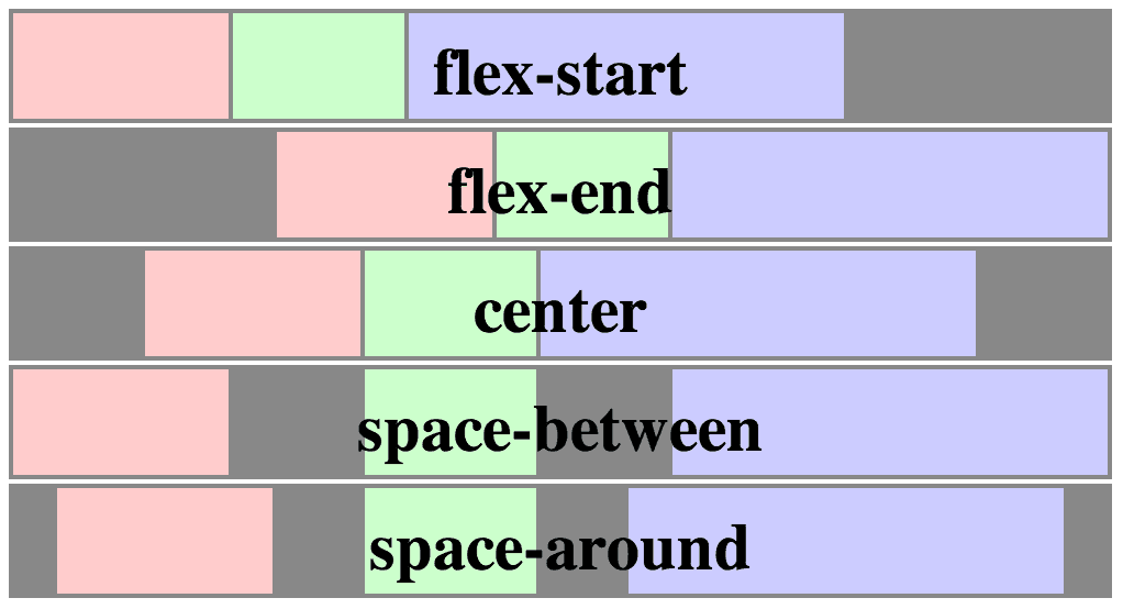
This image from the W3C demonstrates how the various values for the justify-content property will behave.
And more…
This is just a small sample of the new flexbox properties. For more comprehensive information, see the resources section below.
Browser Support
In general, if you only need to support the latest browsers (such as a blog for web designers) then you’re safe to use flexbox. However, there are a few caveats that need to be addressed for slightly older browsers. For example, as of Safari 7.0 and mobile Safari 7.0, the -webkit- prefix is still required.
More importantly, there are multiple implementations of the flexbox syntax. Prior to the introduction of the modern syntax in the W3C spec, an unofficial syntax was supported by several legacy browsers. In addition, there’s an even older display: box syntax. There are also a few bugs to watch out for (even in modern browsers) that may or may not be minor, depending on the context of a project.
For specific information about browser support, see the Can I Use support table for flexbox. You may also want to read about how to support flexbox in legacy browsers.
One more note: It’s probably not a good idea to use flexbox for overall page layouts. Rendering content with flexbox causes horizontal misalignment and shifting as the page is loading, due to the way sizes need to be calculated. This can actually make the page load a bit slower in most instances. However, the grid layout module aims to further address page layout and browser support should arrive in the future.
Flexbox Resources
This article is only meant to spread awareness and excitement about the arrival of flexbox, and there’s a lot more to learn. If you’re thinking about using flexbox, here’s some essential reading:
- CSS Layout Techniques: In this Treehouse course, Guil Hernandez covers common layout and positioning methods, including flexbox.
- A Complete Guide to Flexbox | CSS-Tricks: If you want to know more about each element and property in the flexbox module, I recommend this guide from Chris Coyier.
- Flexbox in the real world: A fantastic blog post from Sean Fioritto about how to use flexbox responsibly to accommodate various browser traffic scenarios, including detailed code to help support legacy browsers if necessary.
- The Ultimate Flexbox Cheat Sheet: An excellent “cheat sheet” page (also from Sean Fioritto) about how to use various flexbox properties and values.
- CSS Flexible Box Layout Module | W3C: For extremely detailed technical information, read the W3C flexbox specification.
- Flexplorer: Amazing tool by Bennett Feely that allows you to quickly experiment with the various flexbox properties and values.
Join Nick on his course How to Make a Website