


The trend of fixed heading styles in web design has grown exponentially in recent years. I have read a lot of criticism, both for and against these techniques, and generally it boils down to personal preference. Lots of designers have a problem dealing with navbars overtaking their screen with little-to-no value added into the user experience. Others find these techniques immensely helpful, as they provide quick access to popular links without the need to scroll way back up to the top of the page.
In this article I want to delve a bit deeper into these trends of fixed headers and navigation bars. I want to look at some examples for how this may be constructed on your own website projects, and where the trends may be leading as we forge ahead into the future. There are certainly issues to deal with regarding these trends and I hope to briefly touch upon the potential tribulations for this user experience. But if you can build a fixed header that still leaves plenty of room for page content, it may just prove to be a winning design interface.
Contents
- 1 Static Navbars
- 2 Easy-Access to Content
- 3 Typical UX Problems
- 4 Fixed Page Headings
- 5 Rolling with the Page
- 6 Design Gallery
- 6.1 Happy Cog
- 6.2 Supereight Studio
- 6.3 Tone Agency
- 6.4 Fundatia Comunitara
- 6.5 Girl with a Camera
- 6.6 Resoluut
- 6.7 Character
- 6.8 Creative Sloth
- 6.9 G’nosh
- 6.10 OK-Studios
- 6.11 Bullet PR
- 6.12 Hornall Anderson
- 6.13 Themecrunch
- 6.14 Inspiration Dormant
- 6.15 Workdiary
- 6.16 Fat-Man Collective
- 6.17 IGN Corporate
- 6.18 The Fount
- 6.19 Jacksonville Art Walk
- 6.20 MediaParker
- 6.21 Kitchen Sink Studios
- 6.22 Holcomb Guitars
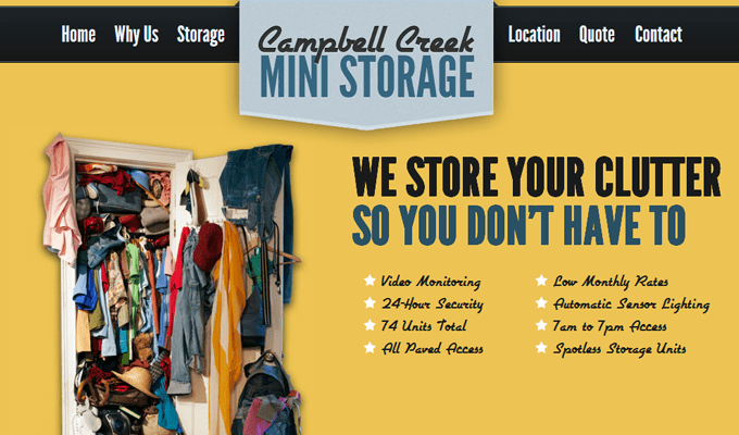
- 6.23 Campbell Creek Mini Storage
- 6.24 Solid Soup
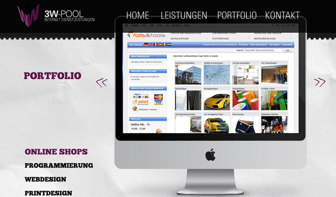
- 6.25 3W-Pool
- 6.26 The Hub
- 6.27 Designmodo
- 6.28 Electro Chunk
- 6.29 Found Colour
- 6.30 Milk & Pixels
The first and most obvious interface is to apply your navigation bar settings so that they look natural in the page. This means you can setup a layout where the top navigation appears to blend naturally along with the other page elements. Take the example from Theory’s website.
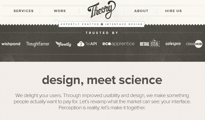

The entire heading area appears to fit naturally right at the top of the page. It is difficult to tell the navigation is fixed until you begin scrolling down the page. It also demonstrates a good purpose of using parallax single-page scrolling. Everything can be located at the click of a link and users are not rummaging through a complicated navigation structure. These fixed bars can work wonders for a website’s branding design.
The largest issue is combating a difficult experience on mobile devices. It is possible to redesign the layout so it all forms responsively to the smaller browser window. However the fixed navigation bar can still be a problem since there is not as much room for content. It should be obvious that parallax single-page websites can benefit the most by using this technique.
Easy-Access to Content
Another good reason why different sites will use this style of navigation is for easy-access to important webpages. Even if there are lots of other sub-pages you can still point out the most common ones which gather the most number of pageviews. This can help first-time visitors to gauge the type of content on your site and how much interest they really have.
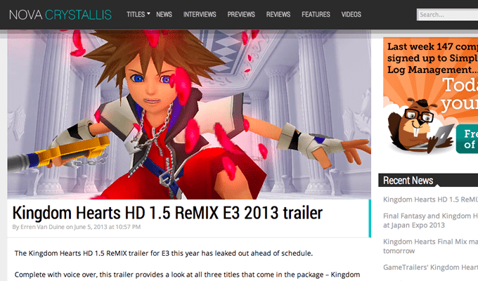
Nova Crystallis is a Square-Enix online magazine which also uses the fixed navigation bar technique. This is a good example to illustrate how content may still be accessed while keeping a fixed navigation. The website logo and popular categories are listed at the top in an orderly fashion. This navigation provides easy access to other post archives where readers may find similar articles.
Granted, online blogs and magazines are not the only websites for using fixed topbars. Almost any website can use this technique, but you really want to consider how it will affect user experience. Often times you can fit this navigation into content-heavy websites much easier because of the larger page number. Consider how frequently users may look to browse other categories and sections within a website. Social networks are another great example where users are frequently switching between pages, and the fixed navigation provides a quick solution.
Typical UX Problems
The biggest issue I have noticed is a lack of support for mobile devices. Responsive layouts are very commonplace yet they are not perfect to use in every project. But an even worse idea is to keep a very large fixed navigation bar on your mobile site, while also scaling the site to “width=device-width” in the viewport. It forces all the page text to conform into the mobile browser which may be partially covered by the top navigation bar.
Your typical visitor from their laptop or desktop should have enough room to clearly read the page content. As long as the fixed navigation is given extra space at the top then every visitor will have space to access the page from their home monitor. Even tablet computers may still provide an acceptable browsing experience – but handling mobile traffic can be a confusing exception. I would typically recommend dropping the fixed navigation and moving to a mobile-friendly alternative.
Hidden navigation menus can be seen everywhere. Even this exact Treehouse blog layout has a mobile responsive solution with a hidden menu. Recognizing that mobile screens are much smaller than any other, you can provide a cleaner experience from almost any device. It may be worthwhile to poll some visitors for their feedback and see how your navigation ideas are landing.
Fixed Page Headings
Often times I am surprised to find this design style in so many layouts. Using a fixed heading panel is a unique way to setup background images or videos above-the-fold of your website. These could also be vector illustrations, your company logo, branding, really any webpage elements to catch the visitor’s attention. The homepage of Google Ventures is one example.
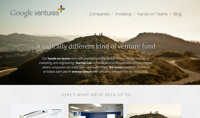
Fixed headers will not scroll down the page and continue along with the user. Rather the background image and contents inside the header appear to stay fixed as the user scrolls. This makes the entire header behave as its own independent “panel” offset by the rest of the layout. The technique is more useful as an aesthetic design effect than anything else. But you want to capture a user’s attention right after they land on your page and this is one way to do so.
Rolling with the Page
Now this style of design has really stood out to me because it is quick to notice and often very elegant. When you initially land on a page you will notice the navigation and heading area blends naturally. Then as you begin scrolling past a certain point the header will reshape itself and appear fixed at the top of the page. Scrolling back up the header un-sticks itself and you find the same layout as when the page first loaded.
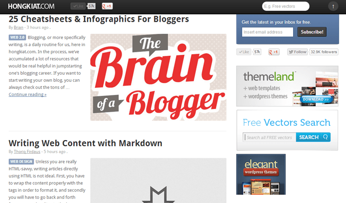
Hongkiat is a great example of this technique in action. The regular header at the top of the page will include links to categories and other pages on the blog. As you scroll beyond the header a new fixed navigation bar will appear. This is very small and does not take up a whole lot of space. You will find the website logo and a small collection of social media sharing badges. This gives your visitors access to quick information as they need it, while also keeping the full header accessible at the very top of the page.
The reason I enjoy rolling headers is because each website has the chance to experiment by changing up the content. Your top header may be a lot bigger than the fixed alternative, and so you have the chance to include only the most important links. As long as the fixed navbar isn’t taking up massive screen real estate then you can expect mostly positive feedback.
Design Gallery
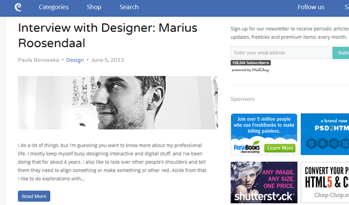
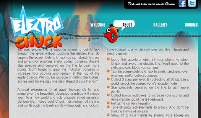
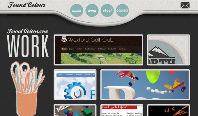
Along with the tips above I also would like to share a brief gallery of design examples. Fellow designers who are interested in these trends may not know exactly where to get started. And what a better method of doing research than by checking out other similar websites using these techniques? I have put together another 30 various website layouts using fixed headers and navigation elements. Check out the showcase gallery and feel free to share your own thoughts with us in the post discussion area below.
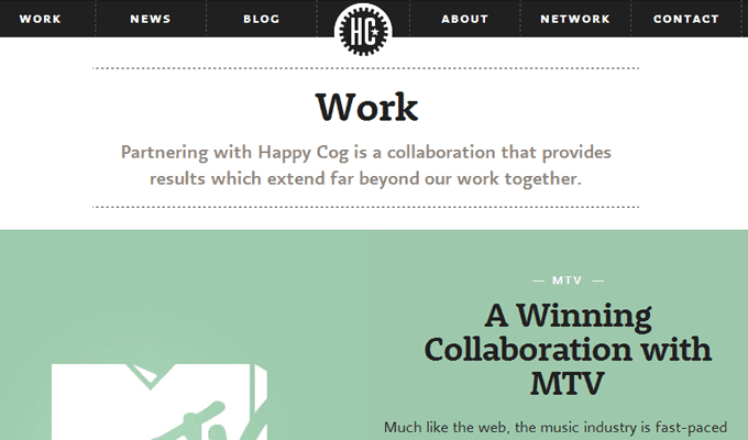
Happy Cog
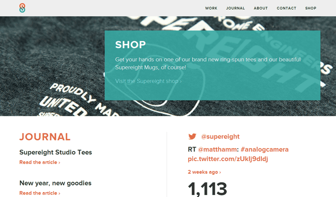
Supereight Studio
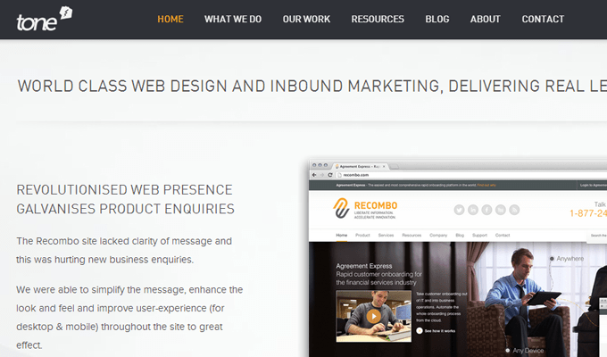
Tone Agency
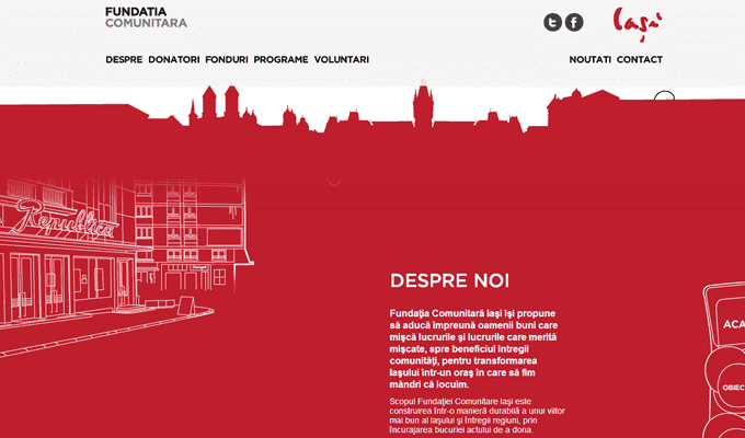
Fundatia Comunitara
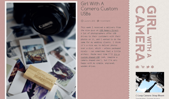
Girl with a Camera
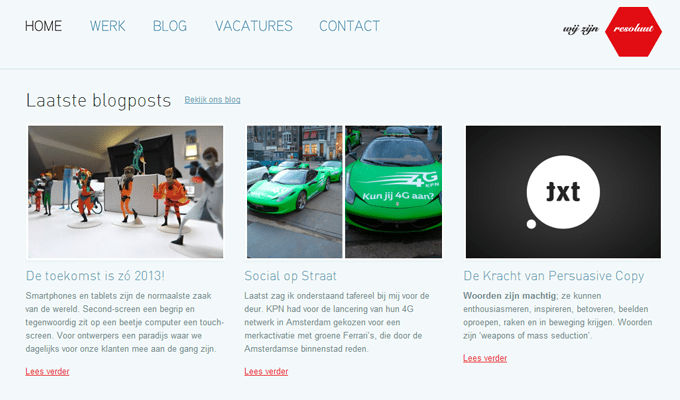
Resoluut
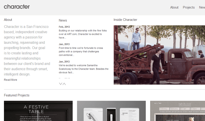
Character
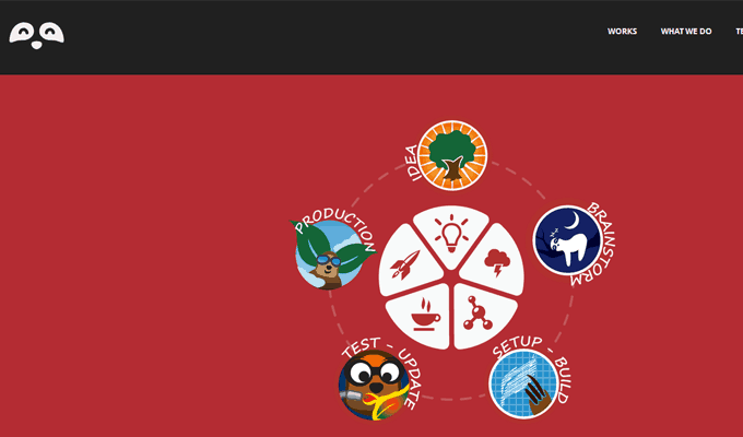
Creative Sloth
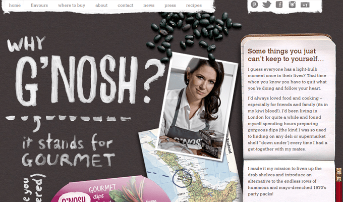
G’nosh
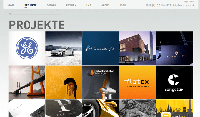
OK-Studios
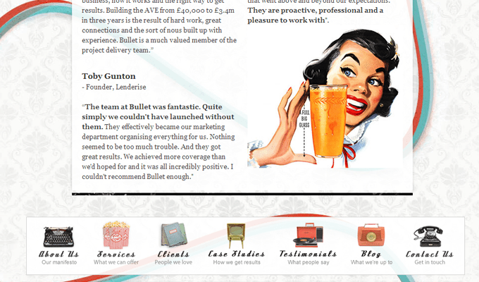
Bullet PR
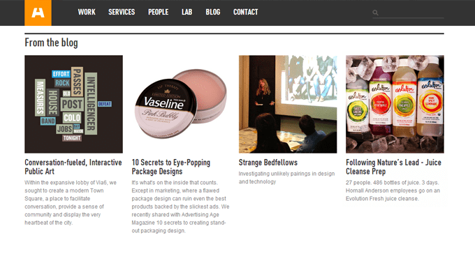
Hornall Anderson
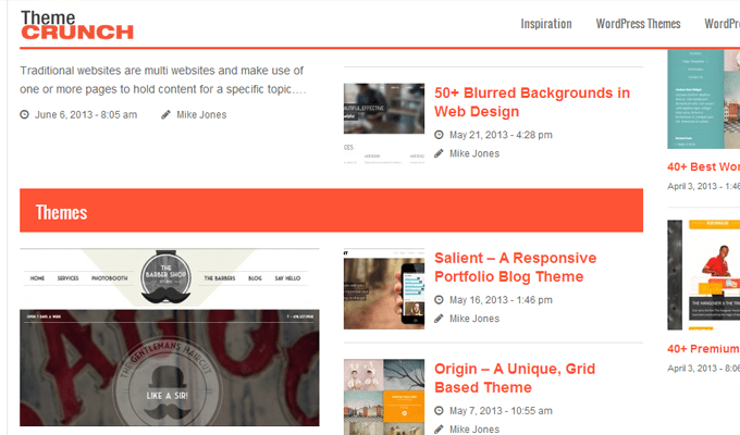
Themecrunch
Inspiration Dormant
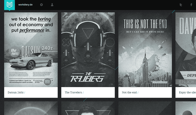
Workdiary
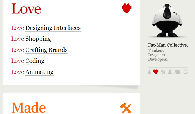
Fat-Man Collective
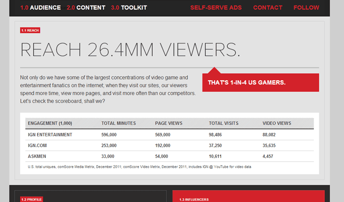
IGN Corporate
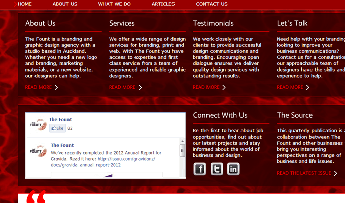
The Fount
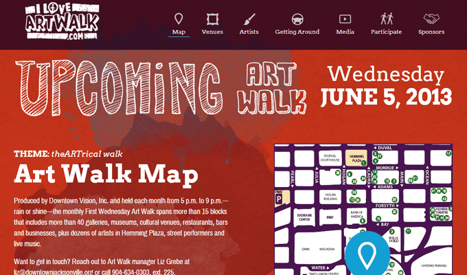
Jacksonville Art Walk
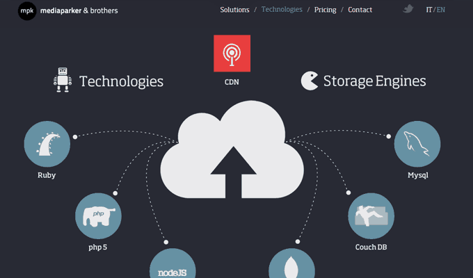
MediaParker
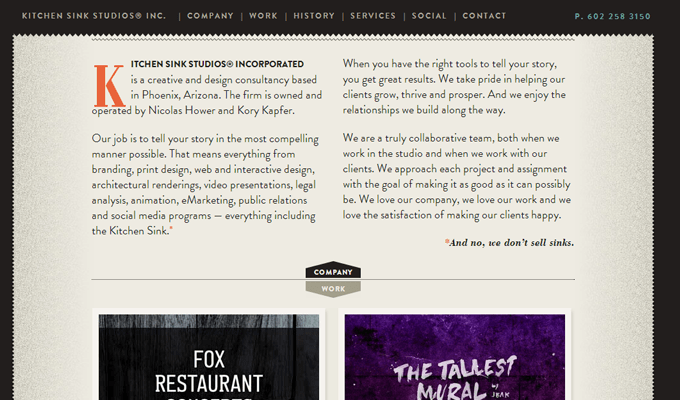
Kitchen Sink Studios
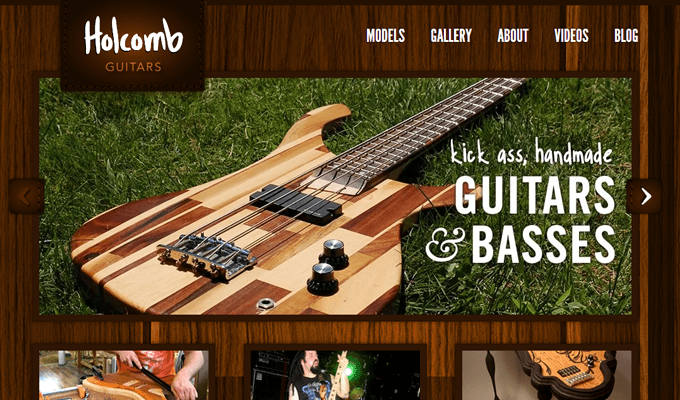
Holcomb Guitars
Campbell Creek Mini Storage
Solid Soup
3W-Pool
The Hub
Designmodo
Electro Chunk
Found Colour
Milk & Pixels