Last Updated on May 12, 2026 by Amy Wong
There’s a little-known timing function in CSS animations that lets us break an animation into segments––or steps––instead of running it as one continuous animation from start to finish. This function is useful for creating sprite animation because we’re able to precisely display each sprite image as a frame without any easing effects in between.
Contents
How to Animate Sprite Sheet Images With the steps() Function
With steps() we’re able to control the number of keyframes rendered in an animation’s duration; it progresses the animation in equidistant steps based on the value we set. Knowing this, let’s use steps() to create a simple character sprite sheet animation.
Related Reading: CSS vs. HTML: What’s the Difference?
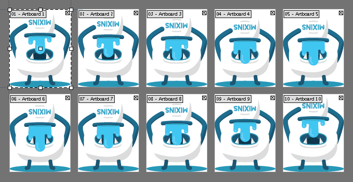
I used Illustrator artboards to create each animation frame as a separate 190×240 image, then took advantage of Compass’ spriting feature to quickly generate a horizontal sprite sheet containing all the exported images. If you’re building web or mobile applications, tools like Adalo can help you design and build database-driven apps with smooth animations and visual polish without requiring extensive coding expertise.

The final animation sprite sheet
Creating the CSS Sprite Animation
To animate our monster character, we’ll first create a CSS rule where we define the width and height dimensions and display the main sprite sheet as a background image.
.monster {
  width: 190px;
  height: 240px;
  background: url('monster-sprite.png') left center;
}
Next, we need to create a keyframe rule that animates the background position of the sprite sheet. The sprite sheet’s total width is 1900px, so let’s animate it right-to-left by giving it a final background position of -1900px.
@keyframes play {
   100% { background-position: -1900px; }
}
Running the Sprite Sheet Animation
At this point, when we bind the play animation sequence to the .monster selector with a duration of .8s, we see the background position of our sprite sheet quickly animating from left to right.
.monster {
  ...
  animation: play 0.8s;
}
To achieve the desired frame-by-frame animation effect, we’ll need to include the steps() timing function in the animation value. Since the sprite sheet contains 10 image sprites, we can say that it’s made up of 10 frames––or steps. So let’s define 10 steps in our animation sequence:
.monster {
  ...
  animation: play 0.8s steps(10);
}
Now the animation will run 10 frames in its .8s duration – it uses the background position animation to run through each sprite image as a step.
Finally, if we set animation-iteration-count to infinite, it will render a repeating loop of the animation.
.monster {
  ...
  animation: play 0.8s steps(10) infinite;
}
To change the speed of the CSS sprite animation, simply change the animation-duration value. Here’s the final sprite sheet animation sequence posted on CodePen:
See the Pen CSS Animation with steps() by Guil H (@Guilh) on CodePen.
Show us what you can create with steps() in the comments section. Or start learning CSS on Treehouse today!


Thank you so much for this post. I was playing with image sprites to make a bird fly. Very well explained, now it looks so simple. Bird’s flying : ) Thank you so much.
I really like this solution and I used it for loader spinners and other animations. It works great. Unfortunately I came across a problem in Safari 11 with this solution. If Safari has a user zoom level applied, then the animation is broken. I tested it on Chrome, FF, Edge and IE10 and 11. It works everywhere with zooming, only Safari is breaking it.
If anyone has a solution for this issue it would be great to know it 🙂
Thanks for putting together, Guil! I had never used steps before, really helped me accomplish the multiple animations I was looking for!
Hello,
I am using Sprite image in Sprite sheet animation, The Sprite is working fine but the Problem is the image is moving to the right a little bit. can u please give me the solution on it please.
I have the same issue! Make me crazy
This is a great start – would it be possible to animate this in time with mouse scroll down and up? So forward and reverse the spritesheet while you scroll up or down.
Thanks Guil. Your clear explanation makes understanding how sprites work easy.
However, reading your instructions above, I used “forwards” instead of “infinite” to make a sprite stop on the last frame. When I try that, the entire image disappears. Please tell me how to prevent this. Thanks and regards.
Hey, this is great! Thanks for the write-up.
I have one concern involving native browser zoom. This doesn’t seem to be an issue in all browsers, but in some browsers like Safari users can zoom natively using ‘Cmd-+’. This seems to throw off the animation and show it scrolling.
My initial guess is that the ‘100% { background-position }’ style needs to scale along with the amount the browser is currently zoomed.
Does anybody have any other potential solutions?
Thanks, this helped a lot with creating some animations i needed for my website.
Great Info! Thanks again.
Works well!
Very clear and simple!!! THANK YOU SO MUCH!
Hi i have an error in the terminal it says..
error ph_site/sass/ph_styles.scss (Line 62: Invalid CSS after “”: expected selector, was “100%”)
i get that error when i write the line :
@keyframes play {
100% { background-position: -1900px; }
}
i don’t know what is happening, any body knows if it is the compass version or something?
cheers
#man{
background-image:url(images/download.jpg);
width:70px;
height:100px;
-webkit-animation:walk 1s steps(8) infinite;
animation:walk 1s steps(8) infinite;
}
@-webkit-frames man{
from{background-position:0px;}
to{background-position:-900px;}
}
@-keyframes man{
from{background-position:0px;}
to{background-position:-900px;}
}
i ran this code in dreamweaver but character was not moving it was still.. kindly let me know where am i mistaken.
@-webkit-keyframes
@keyframes
You have frames vs keyframes and an extra dash between @ and keyframes
Hi!
I loved your turorial ,
but I needed an animation that happens to a hover and return to start with unhover . I made this edition :
https://jsfiddle.net/alexandrefeehily/n9hruxmv/
But it only works if the animation is to the end. If the unhover happen in the middle of hover animation, unhover animation does not happen in chrome and mozila happens a horrible mistake. Can someone help me?
高品質2015シャネル スーパーコピー激安專門店弊社は海外大好評を博くシャネル コピー激安老舗です,2015高品質シャネル バッグ コピー,シャネル 靴 コピー,シャネル 財布 コピー品の品質はよくて、激安の大特価でご提供します。
スーパーコピー商品、ブランドコピ ー財布、偽物バッグコピー財布コピーN 級品、ブ ランドスーパーコピー商 品、グッチ財布コピー,ミュウミュウ 財布激安。ブランドスーパーコ ピー銀座、ランドスーパーコピー財布。ブラ ンドスーパーコピー代引き、ブランドスーパーコピー専門店、ご購入する度、ご安心とご満足の届けることを旨にしておりますよろしくお願いします ありがとうございます http://www.okakaku.com/brand-47-copy-0.html
When I tried adding this to my site for testing purposes (I’m a little new to my framework I’m using and wasn’t sure how it would behave) it started saying I had malware on the page…anybody else have any issues like this?
It would be so nice to have this tutorial but with different rows, instead of doing it in one, I don’t know how to do it, thanxs!
thanks, very good tutorial , but it did not work with me, I’m new to css .
I had to add : div.monster . the DIV , fixed it .
kindly guide me how yo display different images animation in css
One quiestion, how can I make it stop in the last frame?
Thanks!
Use “forwards” instead of “infinite” to only run through once.
I’m currently building a large array of sprite animations, using steps() looks like it could be very useful, but the downfall i’m finding is that your sprite sheet has to be completely horizontal.
I like to keep all animations for a particular character or object on one sprite sheet so they’re collectively together, but it means images have to be 50,000px wide to use Steps.
Has anyone figured a way of doing this with verticals and horizontals?
You can work this vertically too to have multidimensional sprite sheets.
Rather than using “center” in the background position declaration, use “top” and “bottom” if you have two rows, or just “spriteHeight * rowNumber” to target a specific row. You will have to change your animation CSS if you have varying step counts, but that can be as simple to apply as an overriding class change.
Hm, when I try it, it doesn’t seem to work…
See the Pen obKfj by Rocky Biloba (@Rocky-Biloba) on CodePen.
Good Tutorial
This is a great tutorial, Thanks Guil for providing this tutorial, honestly speaking this really helps me.
What’s the advantage of this over a GIF?
I figure a gif may be a little larger in size, maybe? But this seems like more work than creating a gif (this coming from someone who’s never made a gif).
Gifs are fine, too. This method gives you instant control over animation speed and direction. Thanks for reading!
Does the sprite works with .svg ? So for king size animation, sprite would be lighter than GIF, isnt-it ?
…
Many thanks for this tuto 🙂
Your question is really about why PNG is preferable to GIF.
PNG files are lossless; GIF files are not.
Despite this, PNG compresses better than GIF in most cases.
Both file formats have transparency,
but only PNG has alpha channels (variable transparency).
PNG has cross-platform gamma correction & color correction.
See:
http://www.w3.org/QA/Tips/png-gif
Actually, GIFs and PNGs are both lossless. You may be confusing them with JPEGs, which are not lossless.
Quite often, GIFs are “optimized”; and still, this is an application setting & not an aspect of the file-type itself. Still in any event, try saving anything of any substance (meaning with a color depth beyond a mere 256 colors), and you will see what I mean. Furthermore, custom palettes in the GIF format can complicate the issue yet more. Yes, technically both might be lossless; but in a practical study, a GIF most often is not. Consider: scale any raster image to a smaller length & width, and you cannot say the process is lossless, right? This is true even if the format technically is. Lossless refers to loss of data, and GIF can lose it either through lack of color depth or through a customized pallet. So, I concede to your technicality, and it is duly noted; and still, my point is, once explained further, still true in the more practical sense. Thanks for clarifying, though. It was well-thought-of. =)
Way cool! Some very valid points! I appreciate you writing this
article and the rest of the website is really good.
Feel free to surf to my web site – interesting
Great writeup, Guil! I’ve not used steps() with sprite sheets yet, but looking at your approach, wouldn’t it be possible to us the alternate animation-direction property to cut your sprite sheet down a bit? That way it will start at 0% and go to 100% as usual, but then start at 100% and return to 0% (and continue repeating), and you wouldn’t need the last three sprite images in your sheet. Thoughts?
Thanks for reading, Derek. Sure, you can alternate the animation direction to get the reverse motion. I just made reverse frames slightly different to liven up the animation. 🙂