Last Updated on May 21, 2015 by Laura Coronel
One of the most popular courses on Treehouse is How to Make a Website, which walks through the process of building a complete portfolio site from scratch. However, even after completing the course, the learning is only just beginning. Thousands of students have customized the example project and made it their own, for everything from displaying family photos to showcasing their favorite animals.
The course teaches how to build a basic site, but there’s plenty of enhancements that could be added. As an example, here’s how to add CSS hover effects to the photos in the image gallery.
Before: A Simple Website
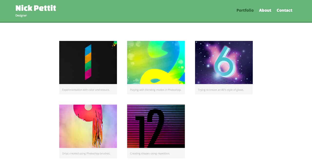
Here’s what the image gallery looks like before adding the hover effects.

The page is responsive and features an image gallery with five portfolio pieces. The gallery itself is composed of an unordered list, and each list item contains a link with a nested image inside. By itself, this is pretty decent, but it might be fun to add a nice hover effect. Keep in mind that the hover state generally doesn’t work on mobile devices, but it can’t hurt to add it for desktop users, as long as it’s just an enhancement and not an essential site function.
After: Adding Hover Effects
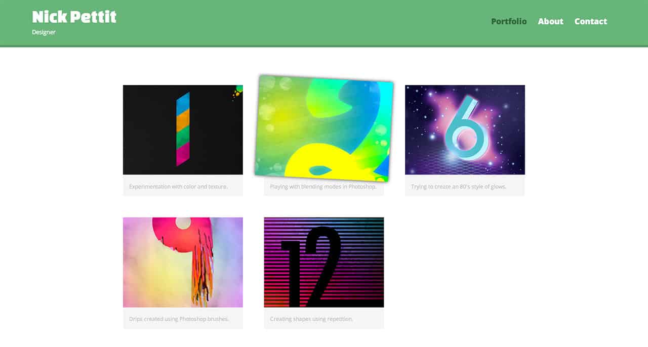
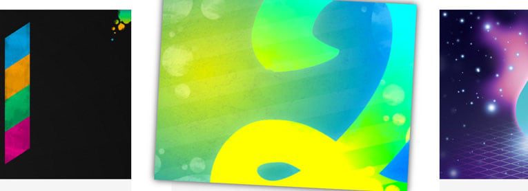
Here’s the image gallery looks like with the hover effects added. Check out the site in a new window and try hovering over the images.

This effect is created by adding some simple CSS. If you already have a pre-existing website, you modify the selectors to make this code work with your own custom markup. Here’s the code, followed by a quick breakdown of how it works:
#gallery li {
  perspective: 250px;
}

#gallery a img {
  transition: 100ms;
  transform: translateZ(0px);
  box-shadow: 0px 0px 0px rgba(0,0,0,0);
}

#gallery a img:hover {
  transform: translateZ(25px) rotate(3deg);
  box-shadow: 0px 0px 10px rgba(0,0,0,0.8);
}
- Each list item has the
perspectiveproperty. By default, the vanishing point for the 3D effect is at the center of the selected element, so in this case, each list item will be a separate 3D context. If the perspective property were instead applied to some parent element higher in the DOM tree, the images would instead move outwards away from the center of the page. This could be a desirable effect, depending on your goals. - The gallery images all have a
transitionof 100 milliseconds. This means that if anything about the gallery images changes (such as styling applied on hover), they should animate to that new state over the specified time period. By default, there is notransformand there is also nobox-shadow. - On the hover state for the gallery images, a translation on the Z axis is applied along with a slight rotation. This is a neat effect on its own, but adding a box shadow below the image helps to sell the effect of the image lifting off the page. In this case, the opacity of the shadow will animate along with the shadow’s blur radius, giving the effect of the shadow becoming increasingly fuzzy the further away it moves from the page.
If you’ve taken the How to Make a Website course and made your own customizations, I’d love to hear about them in the comments!


I would like to thank you very much for showing me/us how to do this. My father asked me to build a website for him (which I did!) but he has quite a bunch of items in his kindergarten section and I was not sure how to add a photo gallery with a link to every single item’s page.
But this nice gallery showed me how to do it better.
An outstanding share! I’ve just forwarded this onto a
coworker who has been doing a little homework on this.
And he actually bought me dinner due to the fact that I
discovered it for him… lol. So allow me to reword this….
Thanks for the meal!! But yeah, thanx for spending the time to discuss this topic here on your website.
Here is my web page :: medical compensation claim
Hover Effects really put new life to any web page. Great Post
Hi! This is kind of off topic but I need some guidance from an established blog.
Is it tough to set up your own blog? I’m not very techincal but I can figure things
out pretty fast. I’m thinking about creating my own but I’m not
sure where to start. Do you have any points or suggestions?
With thanks
My site – cool training
Great post…….. 😀
Another great post from you. You are really great on web design. Want more tuts like this 🙂
I like your tuts so much and you’re one of the best in web design! unfortunately I have trouble viewing your website (teamtreehouse.com). Your website appears in my browsers (IE, Firefox and Chrome) like this:
http://upload7.ir/imgs/2014-08/48464922818624006764.png
With using VPN or without using VPN I have the same problem. Could you please help me so that I can see your wonderful tuts? Thank you so much in advance.
I LIKE YOUR POST.KEEP IT UP.
Again Nick Awesome post thanks for the post